When we last updated you on the progress of the showhouse that we’re working on for Habitat For Humanity (you can read more about it here, here, and here), its exterior was largely complete and it was awaiting some paint. Well, then it snowed for three weeks in a row, which is a complete rarity in Richmond, so while we continued to scurry around finalizing materials like light fixtures, tile, and cabinetry (more on that here), we weren’t able to update you on our color choice. UNTIL NOW! Can you tell I’m EXCITED?! Get those jazz hands up, y’all.
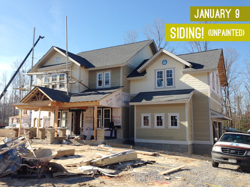
We knew from the get-go that we wanted it to be in the navy family with crisp light trim and some rustic touches (like chunky wood porch beams and some stone around the foundation). The builder was completely on board when we pitched him our navy concept, so we were tasked with choosing the shade so his guys could get painting. Our first step was to bring a ton of swatches that we thought could work down to the job site and hold them up against various planes of the house (the front, the side, etc) just to see how they looked in different lighting situations. Here are the nine swatches that we brought:
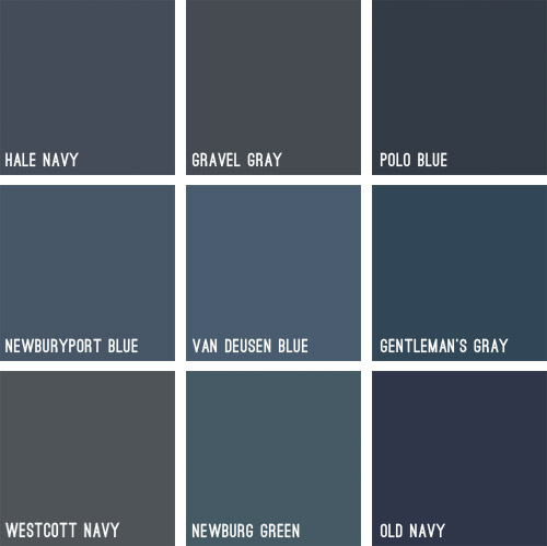
Some immediately eliminated themselves (Gravel Gray and Polo Blue looked almost like black when we held them up, Westcott Navy looked a smidge too gray, and Van Deusen Blue oddly read much lighter – like a medium blue). After a little more debating, we whittled our collection of swatches down to just three contenders:
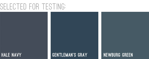
We liked that Hale Navy had some charcoal-ish undertones, Genteman’s Gray was pretty pure in that “it’s just navy” scheme, and Newburg Green was a smidge lighter with a hint of a green undertone (you can learn more about paint undertones here). Between the three of them, there was a nice range (unlike getting test pots of three identical navy colors) and we honestly thought all three of them could work, which was comforting. So off to the paint store we went…
We came back with three test pots to apply right to the house’s siding. Clara helped with the mixing:

We just brushed them right on, being sure to remember which one was which. After each one dried we applied a second coat and waited for that to dry so we could get a true read on each color.
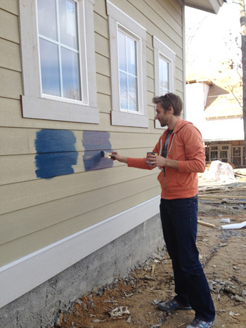
Clara even got in on the action at the end. Start ’em young.
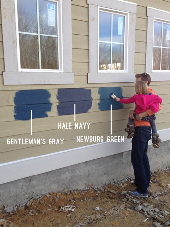
These are just iPhone pictures on a cloudy day, so they don’t really capture all the nuances that we could see in person, but after two coats of each color had dried, it was clear to us that Hale Navy and Gentleman’s Gray were slightly darker and more intense, while Newburg Green was a bit less “midnight-ish” and a little less serious and formal, if that makes any sense at all.
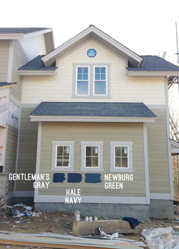
It’s weird to describe colors as being more or less formal, but something about Newburg Green felt more casual and friendly in person. Gentleman’s Gray and Hale Navy certainly would have been handsome, but Newburg Green was just calling our names a little louder. We also thought it would have a bit more contrast with the roof (we worried the other two might blend in with it too much since they were darker/grayer).
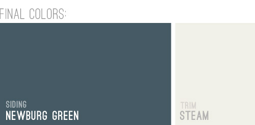
And so it was decided. Newburg Green was IT. And after holding up a bunch of trim swatches, we ended up with Steam as our trim color of choice. It would still read as a nice clean white on the house, but it wasn’t too stark or blinding, which we liked.
And here she is all painted and lovely! We’re really happy with how it looks with the tone of the roof and the Steam colored trim. And aren’t those two round windows in those peaks adorable?! The paint color really seems to emphasize the pretty architecture, thick trim, and sweet details like those windows. Of course there are still a bunch of unfinished elements going on (we have awesome chunky columns that will be going in above each of those stone pillars around the porch, and then all of that wood will be sealed, which will give it a slightly deeper but still warm & rustic tone).
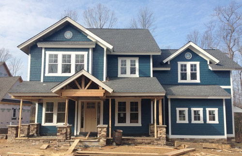
And we can’t forget how much of a difference a little landscaping will make. It’ll take the look from “The House That Sprung Up Out Of Nowhere” to “The House That’s Integrated With Its Surroundings.”
But let’s look at the front door for a moment. We’re currently debating a bunch of colors for it, so we thought it would be fun to have you guys weigh in too. It arrived in this tone (we didn’t paint it this color, but it isn’t able to be stained), so we messed around with a bunch of color options in Photoshop (over two dozen!) and these were the ones that seemed to work the best with the other elements that we had going on. Some of the nixed colors surprised me (I’ve always loved navy houses with yellow doors but it just looked too crazy on this house) and the ones that we ended up liking also surprised us (who knew we’d ever even consider a blue-gray-green door on a navy house?). So without further ado, here are our six finalists:
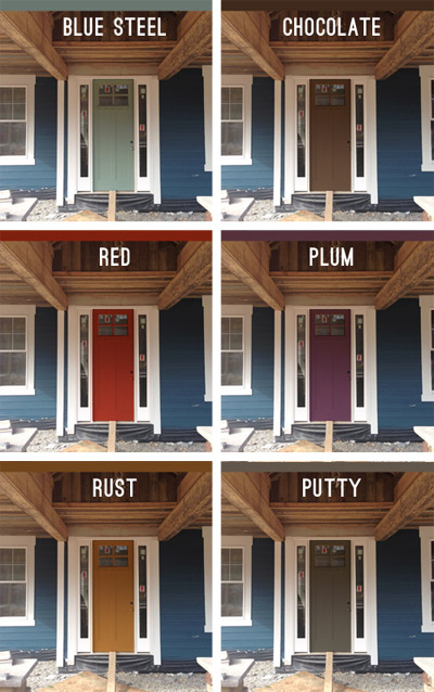
Note: Photoshop is not real life – so the door will most likely look a lot more dimensional (and generally better) than these fake renderings when it’s actually painted.
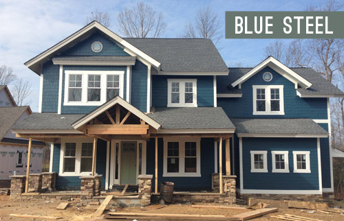
But let’s zoom out and break things down for a hot second (although the colors are generally a lot easier to see in the up-close grid above). First we have a paint color we’re affectionately calling Blue Steel, which is a greeny blue-gray. None of these are real colors from a paint deck (we picked all of them in photoshop), but we’d choose a swatch that has the same undertones if we opted for any of these choices.
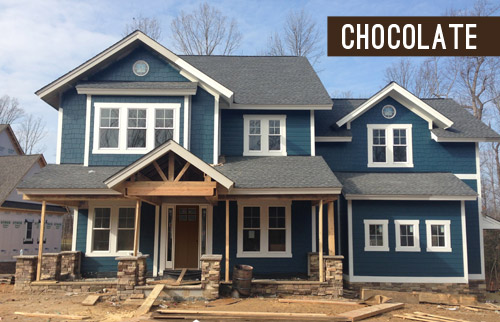
Next we have something in the chocolate range. Sort of like this:
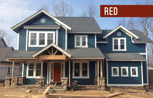
Another color we considered was red, for that nautical, all-American look.
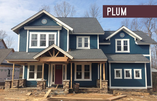
We also played around with the idea of a rich plum door, although this one’s a lot easier to see in the zoomed-in grid above.
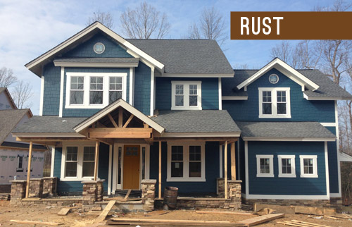
We thought something in the rust family could be a nice nod to the natural tones in the stone and the porch beams (which will end up a bit richer/darker than they are now, but should still feel warm as opposed to cool).
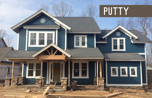
Lastly we have putty, which ties into the tones in the roof and some of the colors in the stone around the porch.
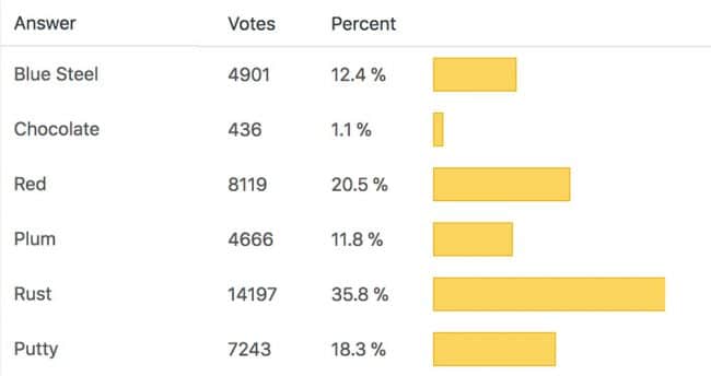
So don’t be shy, we’d love to see which way you guys lean! We can’t finalize the door color until the porch beams are all installed and sealed, but we’re hoping that’ll be pretty soon.
VOTING ON THIS POLL HAS CLOSED
As for the inside, exciting stuff like tile and hardwoods are going in and we’re beginning our furniture/rug hunt along with trying to pin down a bunch of interior paint colors, so we can’t wait to share that progress. Hopefully in the next week or two!
Psst – Wanna see the finished showhouse? Click here for Our Full Showhouse Tour, which includes final pictures of every room, the floor plan, budget info, a video walk-through, and shoppable showhouse furniture & accessories.

cheri s in iowa says
Well done on the siding paint color! I think the plum, rust, and blue steel just scream “there’s awesome things going on in here!”
Also, we are waiting on a delayed truck from the midwest as well! We are in the midwest, but slightly east of the bad weather this week.
Erin says
I LOVE the plum color! From a distance it looks neutral, almost brown, but I think it would be a fun surprise when guests (or trick-or-treaters!)approached the front door. Can’t wait to see the poll results and the final choice.
Ami says
Hey there, it’s me again. Yes, I have experience living with a white front door…ha, ha. Makes me sound so exciting! The answer is no, I have never had issues with keeping it clean. As a matter of fact, that is one part of my house I’ve never even given much thought to. It always looks clean and fresh. I’ve never repainted it (after 20 years here) and I have the same color scheme going on as you’ve chosen for this house, including the roof. I love the fact that I can add any colors I want in the way of flowers or seasonal decor and the door never clashes with anything. So there you go…hope that helps.
YoungHouseLove says
So good to know! Thanks for the info Ami!
xo
s
Erin says
We have an 100 year old Sears Catalog house and painted it a very similar color last year. It transformed the house completely (while we were painting I heard a passerby actually say, “it’s like a whole new house.”) We love it. We chose to paint the door a light green color. I was inspired by a photo I saw in Farrow & Ball’s Great Ourdoors competition. It’s a great resource for front door inspiration!
YoungHouseLove says
That sounds awesome Erin!
xo
s
Kristen says
What about a wood door, with a finish that matches the finish of the wood beams on the front of the house? I think that would look much nicer and “go” better with this house than a painted door would.
And for the love of ceramic animals, please don’t go with purple! I suppose if it must be painted, I would choose red–but I’m not a fan of wood painted brown-ish colors (why wouldn’t you just stain it instead of painting it, is what I always think when I see that).
YoungHouseLove says
Alas, we tried to mention that in the post (lots of words = hard to pick everything out) but the door isn’t stainable, so we have to work with it as-is and paint it. We tried to include some colors that are wood-like though (rust, chocolate) to pick up on the stone and those beams as well :)
xo
s
kalibrooke says
Looks fantastic! I went Newburg/Rust…glad to see it’s really coming together.
Also — what did you use for the voting plugin? It’s simple and it’s great to see the results live (unlike Rafflecopter, which I love for other things, but it hasn’t been ideal for my work). Thanks in advance!
YoungHouseLove says
Sure! It’s a WordPress Plug-In called Yop Poll. Here’s a link for ya: http://wordpress.org/plugins/yop-poll/faq/
xo
s
kalibrooke says
Thanks, you guys!
lauren says
RED! RED! RED! I like rust too.
Coincidentally, this is the exact color combo we want to do when we replace our siding this summer. I thought I wanted a navy blue, but I love this slightly lighter greener blue! Looks fab.
Angie says
Hahaha! LOVE Blue Steel…but mostly for the nod to the infamous Zoolander pose! The house is looking so gorgeous this days!! Can’t wait to see more fabulousness!
Kati says
Also not a member of the white/beige police, but I think a white door would be a winner! My parent’s home has burgundy red shutters and crushed shell brick exteriors (looks tan and grey-ish) and their white front door just looks so crisp and clean!
Theirs also is not difficult to maintain clean. It would just look so nice, but you guys are always so smart with color choices, can’t wait to see the real deal in real life! It’s so exciting that this is coming together! You have a new house and a new baby coming together all at the same time… collective “awwwwwww.” :-)
Michelle in Michigan says
I LOVE, LOVE, LOVE this house and the exterior paint colors. I like the steel blue and red door but I think the red pops best!!
Alex says
Rust! Definitely. Ties in nicely with the wood, which looks a bit lonely at the moment. Red is nice but so…expected and “woo America!” Putty’s not bad either, but lacks the pop that Rust has.
Amanda Bolan says
We have a white exterior door – we are an alley community so everyone parks in the back and then comes in through the back door. I love the look of it but it is hard to keep clean with kids constantly banging bags, sports gear, etc on it on their way in and with my contractor hubby always bringing tools, ladders, and whatever else in and out. We keep it pretty clean with a magic eraser, but it is on our agenda to paint it eventually.
YoungHouseLove says
Thanks for the info Amanda! That’s what John was worried about, with the wear and tear over time and marks getting on it and all that. He’s so practical. Haha!
xo
s
Lisa | Winter Heights says
Wow, the house color you chose is fan-tastic! I love it! This isn’t helping my urge to paint something navy. But no rooms left! Maybe a navy door to get it out of my system? :))
Looking forward to the interiors! What a lucky homeowner who gets to live here.
Ann Marie @ Twice Lovely says
I surprisingly love the Blue Steel option! I also like how the Putty ties into the stone work on the front.
Kim says
Red. Hands down favorite. Second is rust. From skimming the comments it doesn’t look like I’m picking the popular response, but it seems like a clear winner to me. Funny how everyone’s opinions are so different!
laura says
I was torn between Blue Steel, Rust and Red. Red is kind of common though so I guess because of that it would be my last choice of the three. Can’t wait to see the finished project! Love the siding color with the rustic beams and stone.
Jessica Leonard says
My vote was for rust, but I think you could go a little more yellow, like a mustard, and it would look awesome!
Jessica Leonard says
Also, bring in plum colored accents on the porch. I love that color combo!
Susan says
Nice choice–our dining room is Newburg Greena and we love it. The sideboard is plum and it looks awesome :)
Liz says
Just wondering if you considered painting the two different types of siding different colors?
YoungHouseLove says
We drove around the neighborhood looking at homes with two tones and others in all one color and were drawn more to the ones that were all one color with trim that pops instead. Seemed to feel nice and unified, but there were certainly gorgeous two-toned homes as well :)
xo
s
Ann says
When I’m painting test strips, I always do a little diddy of the initials of the name of the color by each strip with the paint brush. Seems crazy, but you’re gonna be painting it anyway, so I figure might as well save the crazy and literally have it written on the wall! Love it! Y’all rock.
YoungHouseLove says
Smart! We took a picture of the cans (with the color names on top) in the same order as the swatches with our phone, so we had record of which one was going on in what order :)
xo
s
Grace says
I have to be honest, I do not care for any of the door colors! The house color is so beautiful I would stick to a simple neutral door, my vote being white. I’m not sure that a white door would dirty any faster than some of the lighter colors like blue steel. I would also vote for a deep charcoal gray or black.
YoungHouseLove says
Thanks for all the suggestions guys! It’s so much fun to hear what you’d do!
xo
s
Heidi says
Amazing! I would go for Rust! It does look a bit like yellow but I love it! Can’t wait to wee the result. If ever, you would be considering doing a make-over in Europe, I hope you would pick my house :) I’m about to pick a color for the façade but can’t make up my mind.
Ann says
Now that you’re experiencing building a house, do you ever think you’d want to build your own (either hypothetically or in real life)? I think you had a post where you said it was much more difficult than you imagined… like picking out all the choices at once or something, so as someone contemplating it for our next home, just wondering what your thoughts are. The idea of complete new-ness is appealing to me
YoungHouseLove says
I think it would be both thrilling and terrifying to build our own home, much like this process has been. We are so in love with our current house and our neighborhood that we’re planning to be here for the long haul though, so I don’t think it’s very likely that we’ll build something – at least maybe until we’re sending kids off to college?! Haha!
xo
s
mallory @R.Simple Life says
Oooh, I love them all! I’m weirdly surprised that I’m drawn to the two colors I would NOT have imagined would grab me… the brown and the rust. They just look so good with the rest of the house!
Jessica says
I wanted to vote for 2 or 3! Haha it was so hard! I chose blue steel since I just painted my front door bm wythe blue, so I am so loving that color right now! I love the house color!
Do you find it difficult to love your fixer upper as much while building a new house? I know your passion is to fix up some unloved homes, but I feel like it would be so hard to stay content in an older home as I designed a new home (especially one this awesome!). I am in no way saying your house isn’t amazing, I was just wondering if it ever gives you a hard time..?
YoungHouseLove says
We are weirdly obsessed with our house and our neighborhood (like, seriously, it’s crazy how bad we have it for this house) so I think as much as we love the excitement of a new build, there are just things about this sweet older home in this lovely older neighborhood that have our heart, if that makes sense. We definitely can appreciate the perks of a new home though, like the amazing horizontal paneled doors that we just got put on the inside of the showhouse. THEY’RE SO PRETTY and NEW! Can’t wait to share photos…
xo
s
Leah says
The house is looking amazing! I think blue steel is my favorite, and not just for the name. How about something even greener, like a soft leaf green? Too much? (Like the green on the bottom row here: http://www.apartmenttherapy.com/color-roundup-front-door-fever-130050)
YoungHouseLove says
I loved the idea of working a green door in there but they all looked crazy in photoshop. Could have just been our bad skillz though, so we’re planning to hold up swatches to be sure when the beams are up and sealed.
xo
s
JennP says
Hale Navy was the one that jumped out at me at first, but now that I see it all finished, you totally made the right choice! I totally get what you mean by ‘less formal’. I’m 100% team PUTTY for the door! I don’t even think there’s a close second. I love how it picks up the color in the stone and looks polished but doesn’t compete with the bold siding color.
YoungHouseLove says
Aw thanks JennP!
xo
s
Carrie K says
My jaw literally fell open when I saw the house all painted prettily! Looks great you guys!
Sarah in Indiana says
I love the paint color! I voted for rust for the door–I really like the contrast with the blue-green paint. BUT I think the columns will make such a big difference in the look of the house that it could change my vote. I feel like the stained wood of all those chunky columns will provide a lot of contrast on their own, and I’m curious to see how well the rust tone would play with the stained wood tone.
Kate says
I love posts like this one! It’s looking fantastic.
Brenda says
You know, purple is my favorite color, and I love purple and blue together. But the plum door just doesn’t call as hard to me as the rust. It’s not quite orange but compliments so nicely with the blue and the trim. Can’t wait to see how it continues to progress!
Shannon Fox says
The red honestly probably looks the best. However, I’m tired of red…it’s kind of been there, done that. I really like the rust option as well, but worry that it will compete with the chunky beams. In the end after much staring, I think I like the putty. I didn’t want to like it as it’s the more boring choice, but it looks the best to me!
Emily says
I love the color but my heart bleeds a little for painted siding. We bought a house with white aluminum siding and the previous owners (at some point) thought it was a good idea to paint it white and freshen it up. Fast foward several years and we buy it with flaking paint. We’re saving up to replace the siding and I’m using this photo as my ammunition to get away from having a white house and adding some color to it! (I grew up in a blue house so I love blue houses… he grew up in a white one) But my color choices will be limited by the color choices that siding comes in. No more paint!
Alli says
This totally makes my day!
Last year we painted all our exterior doors Newburgh Green. I love the color so much, but now that you guys have picked it, I feel extra trendy :)
http://alliferg.blogspot.com/search/label/home%20exterior
YoungHouseLove says
Wahoo! Love it!
xo
s
Kathy says
Not a fan of the plum – it’s too bad you couldn’t do a really beautiful stained wood door. The house itself is all the color you need! And with landscaping – even more color.
Marcia says
I’m loving the Red door, but Rust and Plum are also really nice. I think that the larger porch is going to make the door a little darker/harder to see so I’m not sure that the Steel Blue or Putty will really show up that well.
Tiffany says
I don’t like any of those colors for the door, they all look too dreary. To make it pop I think an orange or yellow color would look awesome. :)
Carmen says
It looks fantastic! I am a bit biased though because we just did a very similar color on our new construction. Ours is vinyl siding rather than paint, but it’s a lovely deeper blue with grayish undertones. We also did chunky white trim and the result is awesome. We have lannon stone on the bottom third of the front and pillars. We decided to go with a wood tone door. We wanted the focus to be on the blue white contrast. We get so many compliments on our color selections. Can’t wait to see how the rest of the project comes along.
Lacey says
Love the color! Looks great! What kind of siding is that on the house?
YoungHouseLove says
I believe it’s HardiePlank (or is it HariPlank? I googled it and both came up, haha!). Hope Justin can drop in with that info for ya!
xo
s
Jessica says
I grew up in a blue house with a red door, so that’s definitely where my vote went!
Janet Martin says
Red or Plum! (I personally would have loved yellow)
Jacqui Bee says
I like the look of Rust especially if it picks up on a tone from the stone work.
Mandy says
I like Putty for the door!
Danielle says
I love the color so much – i am obsessed with blue as it is and now it’s making me want to change my house color, my husband will love that idea ;)
We have gray vinyl siding and I would love the change it up but it’s not in terrible shape to justify the cost at this point. We have a center hall colonial and I would love to build a front porch to it at some point and love the stone work you have so maybe at some point I’ll hve to change the siding if that becomes a reality!
Jo @ Let's Face the Music says
Love the deep blue but I need something lighter on that door. Due to the portico it looks like a dark hole in a dark house. I want it to say “welcome”. As too whether a white door is high maintenance, no more than any other door especially since yours is protected from the weather. And since the house is painted there will be a certain amount of maintenance to that anyway. Jo @ Let’s Face the Music
Jeanne G. says
RED. I love it.
Christine says
I’m surprised an orange isn’t the running for the front door…. a tomatey-orange? I guess that would be, ‘Tomarange?’ That’s what I’d prefer.
YoungHouseLove says
Love all the suggestions guys!
xo
s
Joelle says
my vote is a black door too. I don’t love those colors, and i feel they all clash with the blue. the blue is gorgeous…LET IT SHINE! We have a lot of new construction in my neighborhood and as I drive around my favorite new houses are always the ones with the black door. Looks so sharp, and crisp.
Sandy says
The navy is beee-yooo-teee-ful! Wow, I love it so much! I would have liked to have seen a yellow door choice. You do have a nice selection of door colors though. I usually like the idea of a red door but with this house it looked just a bit too “I’m patriotic!” or nauticalish. The purple I’m not crazy about only because it looks too much the same intensity as the house color and I love a good contrast. The Purple and blue are too close together on the color wheel for my taste. But that’s just me…I know whatever you choose will be gorgeous. Can’t wait to see more!!!!!
Anne says
The rust looks great with the wood exposed right now, but once that’s trimmed/ painted it won’t look as great. I think the Blue Steel will look best once everything is finished.