When we last updated you on the progress of the showhouse that we’re working on for Habitat For Humanity (you can read more about it here, here, and here), its exterior was largely complete and it was awaiting some paint. Well, then it snowed for three weeks in a row, which is a complete rarity in Richmond, so while we continued to scurry around finalizing materials like light fixtures, tile, and cabinetry (more on that here), we weren’t able to update you on our color choice. UNTIL NOW! Can you tell I’m EXCITED?! Get those jazz hands up, y’all.
We knew from the get-go that we wanted it to be in the navy family with crisp light trim and some rustic touches (like chunky wood porch beams and some stone around the foundation). The builder was completely on board when we pitched him our navy concept, so we were tasked with choosing the shade so his guys could get painting. Our first step was to bring a ton of swatches that we thought could work down to the job site and hold them up against various planes of the house (the front, the side, etc) just to see how they looked in different lighting situations. Here are the nine swatches that we brought:
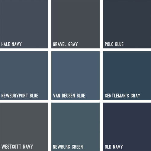
Some immediately eliminated themselves (Gravel Gray and Polo Blue looked almost like black when we held them up, Westcott Navy looked a smidge too gray, and Van Deusen Blue oddly read much lighter – like a medium blue). After a little more debating, we whittled our collection of swatches down to just three contenders:
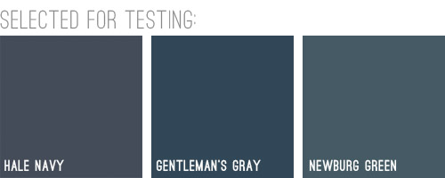
We liked that Hale Navy had some charcoal-ish undertones, Genteman’s Gray was pretty pure in that “it’s just navy” scheme, and Newburg Green was a smidge lighter with a hint of a green undertone (you can learn more about paint undertones here). Between the three of them, there was a nice range (unlike getting test pots of three identical navy colors) and we honestly thought all three of them could work, which was comforting. So off to the paint store we went…
We came back with three test pots to apply right to the house’s siding. Clara helped with the mixing:

We just brushed them right on, being sure to remember which one was which. After each one dried we applied a second coat and waited for that to dry so we could get a true read on each color.
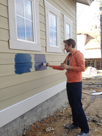
Clara even got in on the action at the end. Start ’em young.
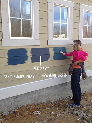
These are just iPhone pictures on a cloudy day, so they don’t really capture all the nuances that we could see in person, but after two coats of each color had dried, it was clear to us that Hale Navy and Gentleman’s Gray were slightly darker and more intense, while Newburg Green was a bit less “midnight-ish” and a little less serious and formal, if that makes any sense at all.
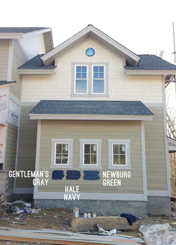
It’s weird to describe colors as being more or less formal, but something about Newburg Green felt more casual and friendly in person. Gentleman’s Gray and Hale Navy certainly would have been handsome, but Newburg Green was just calling our names a little louder. We also thought it would have a bit more contrast with the roof (we worried the other two might blend in with it too much since they were darker/grayer).
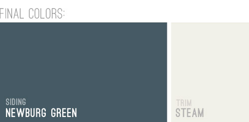
And so it was decided. Newburg Green was IT. And after holding up a bunch of trim swatches, we ended up with Steam as our trim color of choice. It would still read as a nice clean white on the house, but it wasn’t too stark or blinding, which we liked.
And here she is all painted and lovely! We’re really happy with how it looks with the tone of the roof and the Steam colored trim. And aren’t those two round windows in those peaks adorable?! The paint color really seems to emphasize the pretty architecture, thick trim, and sweet details like those windows. Of course there are still a bunch of unfinished elements going on (we have awesome chunky columns that will be going in above each of those stone pillars around the porch, and then all of that wood will be sealed, which will give it a slightly deeper but still warm & rustic tone).
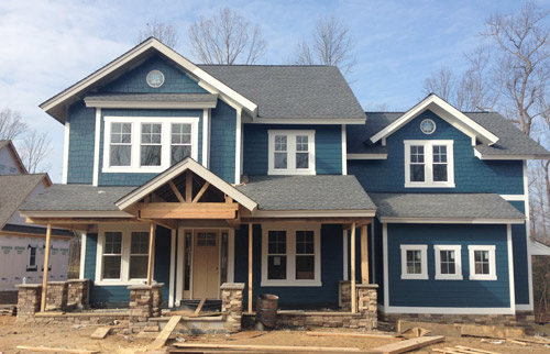
And we can’t forget how much of a difference a little landscaping will make. It’ll take the look from “The House That Sprung Up Out Of Nowhere” to “The House That’s Integrated With Its Surroundings.”
But let’s look at the front door for a moment. We’re currently debating a bunch of colors for it, so we thought it would be fun to have you guys weigh in too. It arrived in this tone (we didn’t paint it this color, but it isn’t able to be stained), so we messed around with a bunch of color options in Photoshop (over two dozen!) and these were the ones that seemed to work the best with the other elements that we had going on. Some of the nixed colors surprised me (I’ve always loved navy houses with yellow doors but it just looked too crazy on this house) and the ones that we ended up liking also surprised us (who knew we’d ever even consider a blue-gray-green door on a navy house?). So without further ado, here are our six finalists:
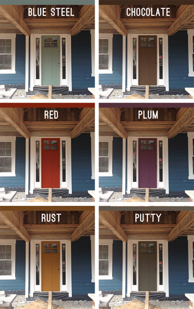
Note: Photoshop is not real life – so the door will most likely look a lot more dimensional (and generally better) than these fake renderings when it’s actually painted.
But let’s zoom out and break things down for a hot second (although the colors are generally a lot easier to see in the up-close grid above). First we have a paint color we’re affectionately calling Blue Steel, which is a greeny blue-gray. None of these are real colors from a paint deck (we picked all of them in photoshop), but we’d choose a swatch that has the same undertones if we opted for any of these choices.
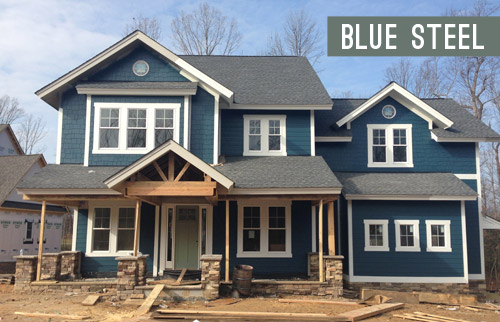
Next we have something in the chocolate range. Sort of like this:
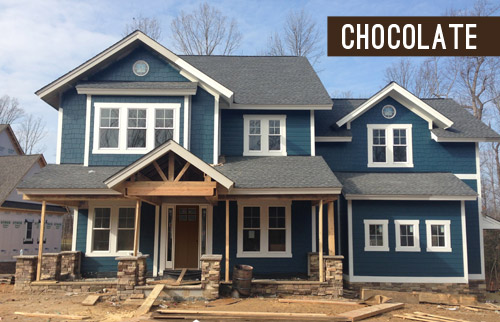
Another color we considered was red, for that nautical, all-American look.
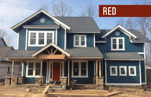
We also played around with the idea of a rich plum door, although this one’s a lot easier to see in the zoomed-in grid above.
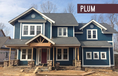
We thought something in the rust family could be a nice nod to the natural tones in the stone and the porch beams (which will end up a bit richer/darker than they are now, but should still feel warm as opposed to cool).
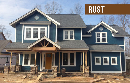
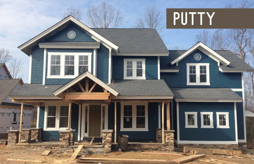
Lastly we have putty, which ties into the tones in the roof and some of the colors in the stone around the porch.
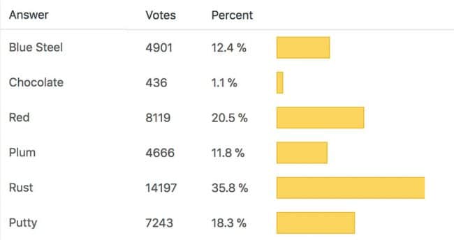
So don’t be shy, we’d love to see which way you guys lean! We can’t finalize the door color until the porch beams are all installed and sealed, but we’re hoping that’ll be pretty soon.
VOTING ON THIS POLL HAS CLOSED
As for the inside, exciting stuff like tile and hardwoods are going in and we’re beginning our furniture/rug hunt along with trying to pin down a bunch of interior paint colors, so we can’t wait to share that progress. Hopefully in the next week or two!
Psst – Wanna see the finished showhouse? Click here for Our Full Showhouse Tour, which includes final pictures of every room, the floor plan, budget info, a video walk-through, and shoppable showhouse furniture & accessories.

Sarah says
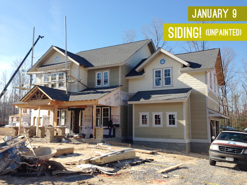
The unpainted siding color was actually not bad, but I do like the dark color to make it stand out. I had a hard time voting, I loved the red, plum and rust. In the end I voted rust!I love that you are letting us vote, even in instance where you wont go with the winning vote, it’s fun to see everyones favorites.
I have no design or decorating talent but I’m jealous you get to build a house from scratch. I’m sure things like paint color and floor options are more fun than others but what I great opportunity!
YoungHouseLove says
Yes, we are so thankful to get this opportunity! There are some aspects of it that we still find completely overwhelming (picking out every plumbing fixture and knob and pull, making sure the recessed lights are put in the right place, etc) but it’s really fun to see it come together!
xo
s
Jenna says
The blue is such a strong color that I like the blue steel to compliment.
Or the red as a contrast.
The rust is a color I just don’t like, no matter how it coordinates!
Good luck picking!
JoAnne says
Love the Newburg green! You guys are making fabulous selections here. You should let Clara pick the front door colour. After all, she’s had success in the past :) And pink (hot or not) would look great on that door. Just sayin’. Excited to see what ends up on the door.
http://www.houzz.com/photos/334750/Colonial-House-Northport-new-york-traditional-exterior-new-york
YoungHouseLove says
That’s so funny because I woke up this morning thinking “coral and navy are fun together…” – although I don’t know if I could convince John and the builder to vote that way with me :)
xo
s
Ang says
Love the blue you picked with the white trim!
Looks like rust is a front runner – but on my pc it looks like…um…baby poop. Anything but rust please!!
Louise says
I voted Blue Steel … but really wanted to vote Other. I would love to see a pop of yellow with the dark blue and white trim. Of course, red doors are supposed to bring good luck and fortune. :)
Rebecca says
Hi, I also vote for a white door – same as the trim.
That Navy is so beautiful and the porch has such great architecture. The colored doors just seem to take away from that. The white door with trim will also make that entry feel/look even more grand.
I currently have a white door – and its great. I really think white takes less maintenance than a colored door – which I’ve also had. I think of it as kind of the same concept as cars – dust/dirt and scratches are less noticeable on white than any other color (except maybe gray)
YoungHouseLove says
Love that info Rebecca! We worried that white would be much too hard to keep white, so that’s great to hear!
xo
s
Mary S. says
Have you guys considered simply painting the door to match the trim? With how bold the house color is (which I LOVE! by the way!), I really feel like a colored door distracts from the pretty blue of the house and makes it just too much going on. I’d love to see a photoshop rendering of the color winner against the door in the trim color and see which gets the most votes!
YoungHouseLove says
We have been chatting a lot about white here in the comments (it’s certainly the write-in color of the morning) and I actually wanted to toss one in there but John worried that a white front door would just get scuffed/dirty and be impractical. Now that we have heard from a bunch of people on the subject, we’re definitely considering it as an option though!
xo
s
Rebecca says
My vote, although not an option, would be for a natrual wood door or a natural wood looking door (they make fiberglass versions now that are very realistic). They are my favorite for this style of house and with the covered porch it should not be an issue regarding weather. I assume replacing the door is not an option at this point?
YoungHouseLove says
Yes, this is the door we’re working with, and it’s not stain grade, so it has to be painted :)
xo
s
Rebecca says
On that note, I voted for plum!
nic says
Looking good! I too wanted the Hale Navy bu the house looks good in the brighter blue.
On another topic – if you are taking votes – please bring back your blogroll!
YoungHouseLove says
Thanks Nic!
xo
s
Kristin says
Is a wood door an option? That’s a strong colour and then with the stone and wood adding another colour might make it crazy. I vote wood door same color as the beams and other woodwork. Wood doors look richer than a painted door any day.
YoungHouseLove says
We mentioned that in the post, but it’s a little hard to pick out with all the words and images that we have going on. This door isn’t stainable, and we have to work with it as-is (making paint the only choice). We did try to select some paint color options that pick up on the wood beams and stonework like rust & chocolate though!
xo
s
Jill says
Call me crazy, but I’d love to see a black door. :)
Heather says
I would have loved to see a pale buttery yellow as a choice :)
Sara W says
I voted for blue steel but my first pick would be ORANGE. Oh I how I love a nice true creamy orange with navy and white for a beautiful welcoming contrast. So that’s what gets my real vote, but out of all choices presented I like the lightness and serenity of blue steel. This home is gorgeous! You guys are doing a great job.
Michelle says
OMGoodness!!!! I have found the front door I have been longing for (for 3 years to be exact)…..now if only you can tell me where it was purchased?! I love that door! I must have it….
Can you email me all the details, pretty please? My husband will be sooooo very impressed with my finding. Bwahahaha.
YoungHouseLove says
Aw thanks Michelle! I hope Justin can drop in here with that info for you (not sure if there’s a direct link or just a name/model #).
xo
s
Jennie says
Michelle, you could check out Thermatru doors. We have a very similar door looks-wise, but ours is fiberglass, and I have found that it is great to maintain. We are really happy with it! They also have a customizer on their website, which is fun to play with … (Also, I should mention that I am not affiliated, just a satisfied customer!)
Michelle says
Thanks Sherry! I will hope like made he makes his “appearance” with the info. The house is looking AHHMAZING by the way! You two should be proud!
Michelle says
Thanks so much Jennie! I will certainly look into it. This girl loves a good customizer site! ;)
Jen @ The Decor Scene says
OMG I love this house color!!! When we have the money to reside our home, this is the navy color I have always wanted. Plus I would finally get the white trim around our windows that I have always wanted. Right now, no trim, just siding right up to the windows. BORING!!! Can’t wait to see what color door you pick. Loved them all but I loved the Blue Steel & Putty the most. This house is going to be gorgeous! I can not wait for it to be finished! :)
YoungHouseLove says
Aw, thanks Jen!
xo
s
Annie says
Photoshop black in there and see what that would look like. It would coordinate with the roof and make it a little more formal. I LOVE the blue you chose, but combined with a bright door it may seem a little preppy. Just a thought. I voted rust, no too bright and still fun.
YoungHouseLove says
We tried black but ended up liking putty better since it tied into the roof a bit more and wasn’t as harsh with the navy. Could have just been photoshop though, so we’ll have to try black swatches in person to be sure!
xo
s
Melissa@TheChicDream says
It’s really coming along! It looks great. Whenever I see a navy clapboard house on The Outer Banks, NC I get excited. It’s always been one of my favorite looks. Now when I see one, I’ll think of you guys! I can’t wait to see it in person.
Trudy says
Chocolate! Looks like a beautiful natural wood door, which would be gorgeous on this house (but pricey). I can’t believe there’s so little love for chocolate! Red is my second choice. I think the blue steel clashes, but all the others are nice – just personal preference.
Trudy says
P.S. I also LOVE the siding color and would love to have the door details. It’s what my cottage needs! Can’t wait to see the finished house! You make everything lovely. A thought on the plum: I can personally appreciate it, but not all neighbors will, most likely. If no other houses are going bold, it will stand out and bother some people. Purple in any form has been uber-controversial around here. To me, exterior colors are both for yourselves and your neighbors. Anyone can choose to pick what they love and neighbors-be-darned, of course! But I like to try to balance that out.
Aimee says
I adore (adoor? ha) a nice red door on a blue house with white trim! I think blue steel would be my second choice but the red just does it for me! Of course red is my favorite color so I am always drawn to it if it is an option.
Sina says
Sherry- the house is turning out SO beautiful!!!!! You guys are doing such a great job (not that I didn’t have faith in you)!!!
YoungHouseLove says
Thanks so much Sina!
xo
s
Heather says
Or even a soft green. Don’t you just love unsolicited advice! Lol you asked us to pick one simple color hehe
http://concordgreen.blogspot.com/2010/02/front-entry-door-what-color-do-you-like.html
YoungHouseLove says
Haha! I loved the idea of green but couldn’t make any shades of it work in photoshop. I’m totally going to try some swatches when the beams are up/sealed to be sure though!
xo
s
Andrea says
Forgive me if someone else already brought this up, if that’s a wood door then why not just stain the door to match the wood on the porch beams???
YoungHouseLove says
Sorry, that’s in the post but it’s easy to miss (I blame all my words, haha). The door isn’t stain grade, so it has to be painted :)
xo
s
Joe says
What is the siding material? I was looking back in past posts but not finding anything. Is it wood? Wood composite? Looks like what i was looking to put on my house this Spring/Summer – I hate the cheap vinyl they put on my little house.
I always look forward to the posts. Thanks.
YoungHouseLove says
I’m completely unsure about the siding material other than knowing that it’s not real wood and it’s some sort of HardiePlank-like material (it could be another type/brand though). Hope Justin drops in with that info for ya!
xo
s
Joseph says
One look?! One look?! *everyone gasps* Magnum! It’s beautiful!
Ahem, aside from the Zoolander reference I still think Blue Steel is the best choice. I think Rust might be a little too close to the same affect a yellow door would have. The Plum and Red seem a little “oh of course they put a purple/red door with the blue siding, and I think the Chocolate seems to slink into the shadows of the porch roof. If not Blue Steel I’d say Putty, but Blue Steel is at least a little bit more of a statement color.
Those are my thoughts anyway. I suppose it could be totally different non-photoshoppy.
Sara Richins says
Red and Blue Steel were my favorite door colors by far, though the rust is tolerable, though considering the door gets a lot less sunlight than the house, the lighter color adds better contrast. Something about the plum actually made me chuckle. not sure why a paint color would come across as comedic, but I’d avoid that one if I had a choice in the matter. The rest of the house looks great!
Patricia says
Love that color, its the same one I would have picked. Lovely house!
Katrina says
This is my DREAM house. Every single thing about this house (so far) I am absolutely in love with. I never would have chosen the dark blue-green paint color, but now I’m obsessed.
YoungHouseLove says
Aw thanks so much Katrina!
xo
s
Alexandra says
I just love a red front door!
maripi says
I can’t believe you guys picked that color for the show home…considering is notyour house. (at least I would play it safe)because to me it looks weird. is one of those colors you say oh I like that color but, I wouldn’t dare to do it my house…hopefully you go with a white door like everyone else is advising you. white is so clean and bright looking and yes u have a white door and is not high maintenance.
YoungHouseLove says
We heard from someone in Texas who said most homes there were stone/tan, so maybe common house colors are regional? In Richmond there are many homes of this color (they’re not on every corner, but they’re certainly not crazy unusual). In fact our builder’s realtor told him if he had painted his last house this color she thought it would have sold faster since it’s such a grab-me color! Isn’t that funny?! The showhouse event staff heavily encourages each of the seven houses to showcase a nice wide range of options/choices/ideas – just to keep the show interesting. So every choice in every home won’t be everyone’s cup of tea, but attendees can pick out certain ideas they love as they walk through. Thankfully each house only needs one buyer, and these houses usually go fast :)
xo
s
Jennie says
Well, our house is a nice bold color almost like this one, so I think you will have no trouble finding someone who loves it :)
Jenn says
This looks just like the homes around us! Shake, Stone, and Stained wood are super popular in eastern KS right now (also popular is heavy metal rivets and panels that look like they’re supporting all the wood beams; very lodge-ish…if that’s a word).
I love the exterior color; it reminds me of the Dragonfly you painted the bookshelf interior in your last dining room. I really think a desaturated yellow-green might look really pretty on the door; kind of analogous/same color family? I still like the plum too!
YoungHouseLove says
Aw thanks Jenn! Love that too!
xo
s
Gaidig says
In general, I prefer front doors to stand out and call attention themselves because it is more welcoming. The three options on the left seem to do that better than the three on the right, though the plum is a maybe.
Elizabeth says
The rust is really calling out to me! When I saw the color choice for your house, I immediately thought, yellow door! The rust still gives it that yellowish/gold element without being too, “Hey, I’m a bright yellow door!”, vying for all the attention. :)
Suzanne says
I really like the Plum. But the putty is doing a great job of picking up the colors in the stone – bringing it forward, which I like, and is smart. But Plum with some plum colored flowers in the beds to bring it forward could be really interesting too.
Candice says
Hands down – RED
Molly says
I love the color that was chosen for the siding. What about not painting the door at all, but replacing the door with a beautiful wooden one that is stained a warm color. I think that would only enhance the beauty of the blue/green color chosen for the house and is less expected.
YoungHouseLove says
We have to work with this door, so it means we need to paint it, but a lot of folks have written in to vote for white (which I do agree would make the door look bigger since the sidelights would be the same color) so we’re considering that too! It might help the gorgeous wood beams on the porch be the star too :)
xo
s
Molly says
I agree that crisp white would play up the beautiful wood beams and trim. My first inclination would be that white would be difficult to keep clean, but given that it’s protected under the over-hang, this would be less of an issue.
Megan V. says
Wow guys! The house is seriously coming together nicely. I was a little worried at the beginning with those colors but you guys are SO good at this. Can you pick colors for my house? ;)
YoungHouseLove says
Thanks so much Megan! We’ll be right over ;)
xo
s
Melissa @ HOUSEography says
I expect the rust is a little more orange in person than it looks on my screen (mustard as some other commenters said) but either way I think the contrast is needed to highlight the door. I love the putty color but maybe for the other exterior doors.
Haley says
I love the house color you picked! I also loved your ‘photoshop is not real life’ disclaimer.
Looking forward to see what your readers pick. I’m all for the blue-steel… and not just because the name makes me think of Zoolander.
Mamaw says
Ok, this shows why after 25 years I still have a white front door. I preferred the red or chocolate door. Didn’t like the rust at all and that’s the one that ahead. I need help with my door!
Che says
Love the paint color….looks great!
I was wondering who you used to order the front door from or if you have recommendations from past projects? We are in the processing of picking exterior paint colors and updating the exterior of our 1920 home and are looking for a new front door.
YoungHouseLove says
I hope Justin drops by with the door info for you! We were given a booklet to look at to select it from a few options but can’t recall the brand/model number. Our builder uses that company all the time tough, and really likes them!
xo
s
Kimberly | Turning It Home says
I’m torn between rust and putty. I ended up voting for putty because I love how it flirts with the tones in the stone beams but I also love the pop of color rust adds without being too overwhelming. Ah, the decisions!
Bethany says
Aww, chocolate’s getting no love! I like the chocolate. Rust looks good too. :)
Chase says
Oh this house just sings to me! Love the paint choice
YoungHouseLove says
Thanks so much Chase!
xo
s
justynn @ Creative Life Antics says
AHHHH Newburg green is the color of my bedroom and I LOVE IT. I’m obsessed with the color :)
Aoife says
Love the colour combo. Can’t wait to see the inside!!
YoungHouseLove says
Thanks so much Aoife!
xo
s
Jen Rayder says
What color are the posts on the porch going to be? I don’t think I could chose a color until the posts are painted. But I would be leaning towards rust.
YoungHouseLove says
They’re going to be sealed which will make them a bit richer/darker, but they’ll still be rustic and tie into the stone around the base of the porch. We’re definitely waiting for those to be in/sealed before we finalize the door color (we mentioned that in the post, but there are a lot of words/pics going on – sorry to bury that!).
xo
s
Michelle says
Love the colors! Have you thought about painting the inside of the front door the same color, as you’ve done with your house?
YoungHouseLove says
Yes, we have really liked doing that in our house! I think it’ll depend what we choose for the outside (the blue-steel color or even red or plum could be fun inside, but we could also go with white inside if we don’t think the exterior color would work as well in the foyer).
xo
s
Cher says
I’m so excited to see that Rust is currently in the lead! It’s just that extra bit of unexpected that I’ve come to expect (does that even make sense?) from you guys. It’ll make that whole porch area look rustic and casual. BTW what brand is the exterior paint?
YoungHouseLove says
It’s Benjamin Moore, although I’m not sure which type of their exterior paint they used (I think BM has a few).
xo
s
Traci says
I DEFINITELY vote plum! It isn’t doing so well in the poll, but I hope you choose it anyway. :]
Hillary says
I LOVE this house! Makes me want to go build one right now–especially with those rustic beams and the circular windows. Round windows are actually one of the items on my list if we ever build.
I voted for the rust colored front door but love the idea of a little lighter mustardy yellow. I know you said you tried yellow (I’m thinking sunny yellow?) but did you try mustard? I wish I had photoshop so I could do it myself and see what it looked like. I absolutely love navy and yellow together. I do still love the rust though!
YoungHouseLove says
Aw thanks Hillary! We tried all sorts of orange yellows, and mustard yellows, and even a soft pale yellows and they all looked weird in photoshop – but it totally could have just been the program (or user error, haha!). We want to hold up swatches after the beams are done/sealed to see how it really looks in person!
xo
s