When we last updated you on the progress of the showhouse that we’re working on for Habitat For Humanity (you can read more about it here, here, and here), its exterior was largely complete and it was awaiting some paint. Well, then it snowed for three weeks in a row, which is a complete rarity in Richmond, so while we continued to scurry around finalizing materials like light fixtures, tile, and cabinetry (more on that here), we weren’t able to update you on our color choice. UNTIL NOW! Can you tell I’m EXCITED?! Get those jazz hands up, y’all.
We knew from the get-go that we wanted it to be in the navy family with crisp light trim and some rustic touches (like chunky wood porch beams and some stone around the foundation). The builder was completely on board when we pitched him our navy concept, so we were tasked with choosing the shade so his guys could get painting. Our first step was to bring a ton of swatches that we thought could work down to the job site and hold them up against various planes of the house (the front, the side, etc) just to see how they looked in different lighting situations. Here are the nine swatches that we brought:
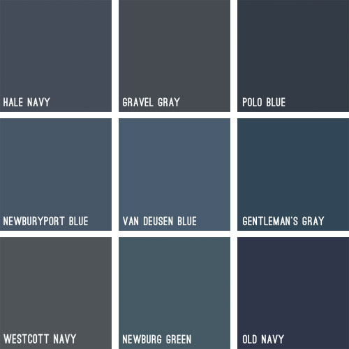
Some immediately eliminated themselves (Gravel Gray and Polo Blue looked almost like black when we held them up, Westcott Navy looked a smidge too gray, and Van Deusen Blue oddly read much lighter – like a medium blue). After a little more debating, we whittled our collection of swatches down to just three contenders:
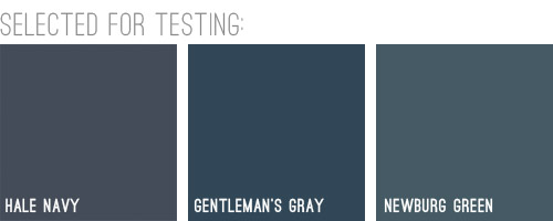
We liked that Hale Navy had some charcoal-ish undertones, Genteman’s Gray was pretty pure in that “it’s just navy” scheme, and Newburg Green was a smidge lighter with a hint of a green undertone (you can learn more about paint undertones here). Between the three of them, there was a nice range (unlike getting test pots of three identical navy colors) and we honestly thought all three of them could work, which was comforting. So off to the paint store we went…
We came back with three test pots to apply right to the house’s siding. Clara helped with the mixing:

We just brushed them right on, being sure to remember which one was which. After each one dried we applied a second coat and waited for that to dry so we could get a true read on each color.
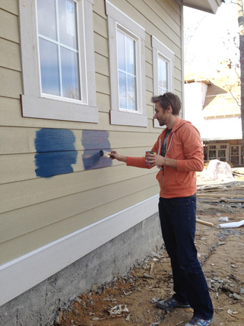
Clara even got in on the action at the end. Start ’em young.
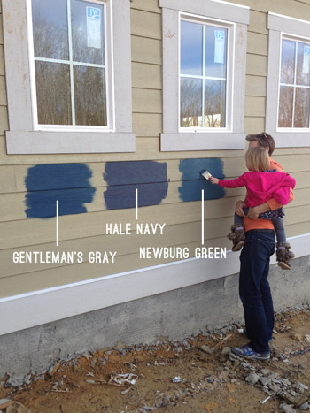
These are just iPhone pictures on a cloudy day, so they don’t really capture all the nuances that we could see in person, but after two coats of each color had dried, it was clear to us that Hale Navy and Gentleman’s Gray were slightly darker and more intense, while Newburg Green was a bit less “midnight-ish” and a little less serious and formal, if that makes any sense at all.
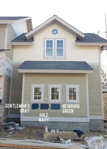
It’s weird to describe colors as being more or less formal, but something about Newburg Green felt more casual and friendly in person. Gentleman’s Gray and Hale Navy certainly would have been handsome, but Newburg Green was just calling our names a little louder. We also thought it would have a bit more contrast with the roof (we worried the other two might blend in with it too much since they were darker/grayer).
And so it was decided. Newburg Green was IT. And after holding up a bunch of trim swatches, we ended up with Steam as our trim color of choice. It would still read as a nice clean white on the house, but it wasn’t too stark or blinding, which we liked.
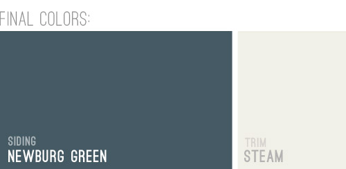
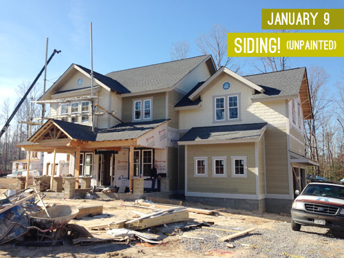
And here she is all painted and lovely! We’re really happy with how it looks with the tone of the roof and the Steam colored trim. And aren’t those two round windows in those peaks adorable?! The paint color really seems to emphasize the pretty architecture, thick trim, and sweet details like those windows. Of course there are still a bunch of unfinished elements going on (we have awesome chunky columns that will be going in above each of those stone pillars around the porch, and then all of that wood will be sealed, which will give it a slightly deeper but still warm & rustic tone).
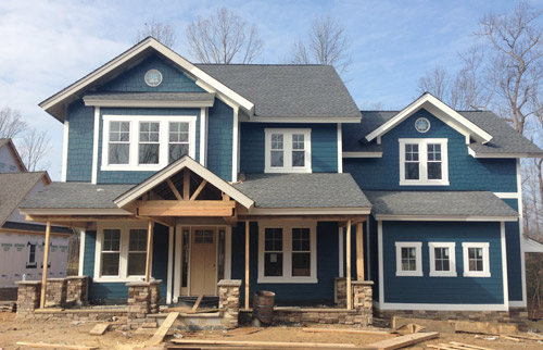
And we can’t forget how much of a difference a little landscaping will make. It’ll take the look from “The House That Sprung Up Out Of Nowhere” to “The House That’s Integrated With Its Surroundings.”
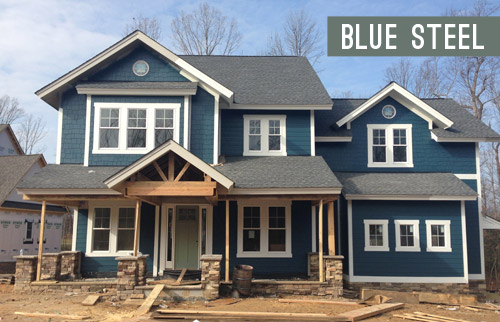
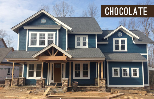
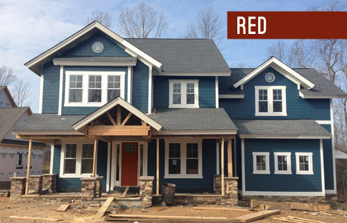
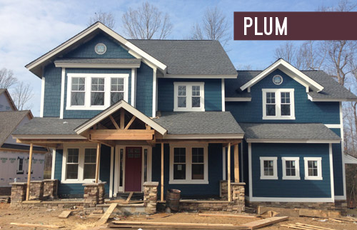
But let’s look at the front door for a moment. We’re currently debating a bunch of colors for it, so we thought it would be fun to have you guys weigh in too. It arrived in this tone (we didn’t paint it this color, but it isn’t able to be stained), so we messed around with a bunch of color options in Photoshop (over two dozen!) and these were the ones that seemed to work the best with the other elements that we had going on. Some of the nixed colors surprised me (I’ve always loved navy houses with yellow doors but it just looked too crazy on this house) and the ones that we ended up liking also surprised us (who knew we’d ever even consider a blue-gray-green door on a navy house?). So without further ado, here are our six finalists:
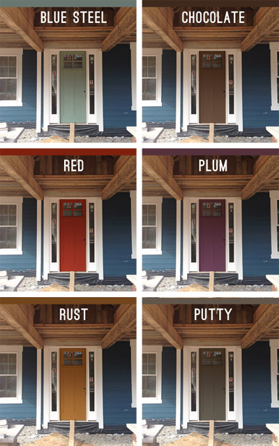
Note: Photoshop is not real life – so the door will most likely look a lot more dimensional (and generally better) than these fake renderings when it’s actually painted.
But let’s zoom out and break things down for a hot second (although the colors are generally a lot easier to see in the up-close grid above). First we have a paint color we’re affectionately calling Blue Steel, which is a greeny blue-gray. None of these are real colors from a paint deck (we picked all of them in photoshop), but we’d choose a swatch that has the same undertones if we opted for any of these choices.
Next we have something in the chocolate range. Sort of like this:
Another color we considered was red, for that nautical, all-American look.
We also played around with the idea of a rich plum door, although this one’s a lot easier to see in the zoomed-in grid above.
We thought something in the rust family could be a nice nod to the natural tones in the stone and the porch beams (which will end up a bit richer/darker than they are now, but should still feel warm as opposed to cool).
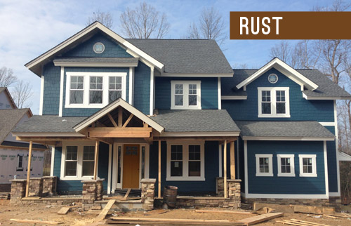
Lastly we have putty, which ties into the tones in the roof and some of the colors in the stone around the porch.
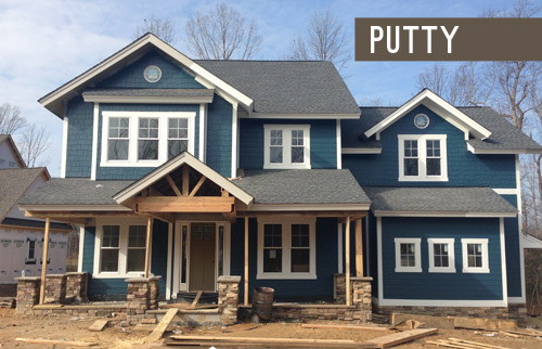
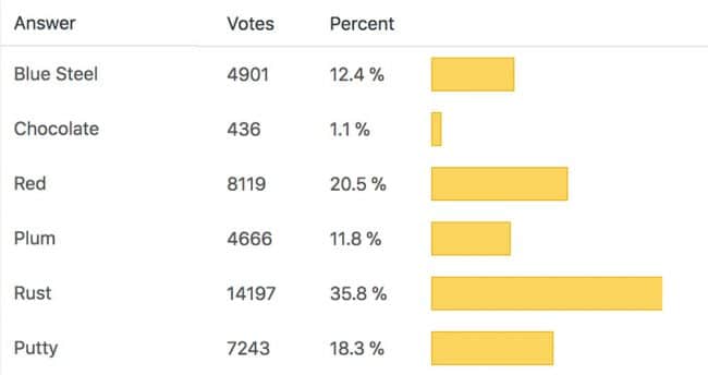
So don’t be shy, we’d love to see which way you guys lean! We can’t finalize the door color until the porch beams are all installed and sealed, but we’re hoping that’ll be pretty soon.
VOTING ON THIS POLL HAS CLOSED
As for the inside, exciting stuff like tile and hardwoods are going in and we’re beginning our furniture/rug hunt along with trying to pin down a bunch of interior paint colors, so we can’t wait to share that progress. Hopefully in the next week or two!
Psst – Wanna see the finished showhouse? Click here for Our Full Showhouse Tour, which includes final pictures of every room, the floor plan, budget info, a video walk-through, and shoppable showhouse furniture & accessories.

Amy says
Can you share what brands the house color paint samples were? We are doing a blue on our house and would like to consider some of these.
YoungHouseLove says
Sure, they’re all Ben Moore.
xo
s
Amy says
Thank you!!
jessi says
We are in the process of picking out exterior colors for our home, and your showhouse picks have been our inspiration! I have a question regarding brand. Is there a particular reason you chose Benjamin Moore? We are considering Behr Solid Stain and we have the choice of premium or mid-grade. Do you have any experience with Behr as an exterior paint? I can’t seem to find much online, so thought I would ask here!
YoungHouseLove says
We’ve never used Behr exterior paint, but their porch and floor paint is great! We’ve only really used Ben Moore for exterior doors and Valspar (both were great) but when we got this house’s exterior painted they used Sherwin Williams and that was awesome too. Anyone else have Behr exterior paint info for Jessi?
xo,
s
Toni Ivanov says
Thanks Jen B. for finding our website with the pics of the home we painted with Hale Navy! I absolutely love the Newberg Green, but think the door colors fall a little flat compared to the house color. Since turquiose is all he rage right now, how about trying something like Teal Ocean 2049-30. Try Advance Gloss by Benjamin Moore. Great durability for a front door! Good luck! Need some more door inspiration, look here…http://northbrook.certapro.com/frontdoorcolors.aspx
Cin McMullen says
Beautiful colors, I’d this Sherman Williams paint?
YoungHouseLove says
Yes, it’s Sherwin Williams :)
xo
s
Justine says
I am an avid blog reader and totally read this post back in February when you published it, however, when googling “how to pick exterior paint color” I came back to this post – and lo and behold, you guys were considering the EXACT same colors that I am. I don’t know if I was subconsciously remembering this post or if we post have the same great taste – I’m going with the latter :) So, do you want to send me your test pots?? (kidding). We’ll see if the decision will be the same…
YoungHouseLove says
So funny! What are the odds? Happy paint picking!
xo
s
julie says
I was wondering if you guys know what kind of siding is on the showhouse? Thank you so much!
YoungHouseLove says
I think it’s HardyPlank. Hope it helps!
xo
s