The following images make me wish I could carry a professional photographer around in my pocket at all times. But since I can’t, at least we had the pleasure of having one over for the afternoon. Local-ish photographer Andrea Hubbell (she’s from nearby Charlottesville, VA) is doing a series of “living spaces” photo shoots and asked if we wanted to participate for fun. Since we’re (a) not too camera shy – at least when it comes to our house and (b) always excited to see our home through someone else’s eyes (especially someone a lot better with a camera), we gave an enthusiastic yes.
And boy are we glad we did. Not only was Andrea super nice (and very stealthy too – we almost forgot she was here a couple of times) but her photos are beautiful:
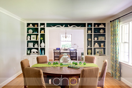
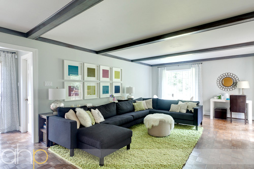
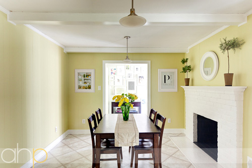
Of course we loved seeing the wider-angled full room shots, but what was most amusing for us was seeing all the little details that Andrea picked up along the way. You know, the things we hardly notice and never think to shoot and share. So we thought you guys might get a kick out of that too. What’s a trip to the Petersiks without a shot of Sherry’s pile o’ paint chips after all?
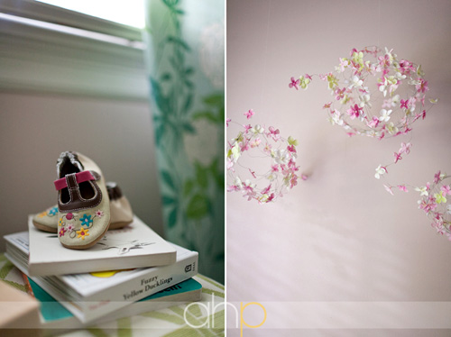
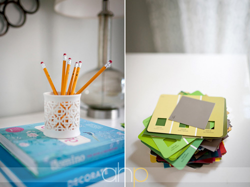
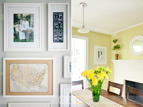
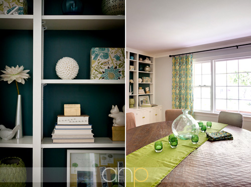
Be sure to hit up Andrea’s blog to see the rest of her photos of our house (barely half of them are shown here). They were taken about three weeks ago, which is why some rooms (ahem, bedroom and living room) are already looking semi-out-of-date and others (this means you laundry room) aren’t shown (since our little built-in shelves were just getting started when she arrived). Oh and here we are with Andrea. Most surprising thing ever? Sherry’s not wearing a black shirt. Crazy, right? I hardly recognized her.

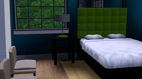
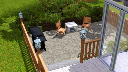
But wait – there’s more. Andrea wasn’t the only person to capture our house recently. We got a very sweet email the other day from a 16-year-old reader from the Netherlands named Karlijn. She’s an avid fan of the video game The Sims, and thought it would be funny to use her Sims-ing skills to virtually recreate our house. And considering the limitations of the game (she said she would have added a Burger if she could have), we’re pretty darn impressed by how close she got!
First we have our guest room with the teal walls, green headboard, and two slipper chairs that look almost exactly like the ones we have:
We chuckled at the accuracy of the “alley” on the left side of this screen capture of our living room (complete with a big gray sectional, a green rug, the bedroom door, and a giant paned window just like our house):
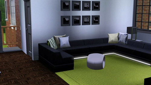
And how true-to-life it is that our windowless kitchen is pretty dark with the lights off? Maybe you don’t know that so I’ll answer for you: very true.
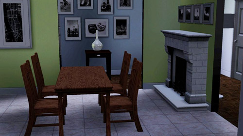
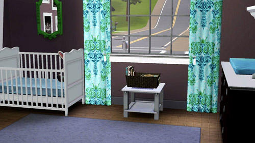
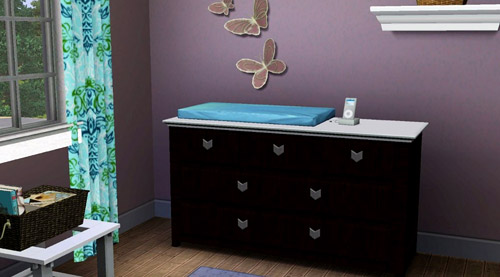
Our favorite is probably the Sims-ified space that is Clara’s room (although the highway that leads into her window kind of cracked us up, since the view is a little different in real life- but we’re sure Karlijn didn’t have much control over that):
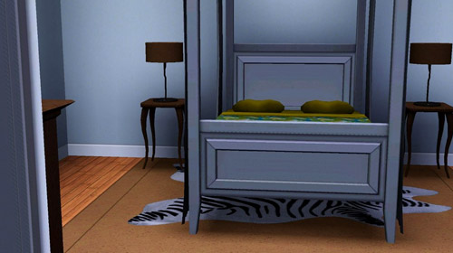
And perhaps Karlijn was dropping us some decorating “hints” along the way too. Like maybe we should add a zebra rug in the bedroom? Ooh la la.
Or some outdoor lighting to the patio? (Totally agree with her on this one, btw – we’re thinking about big bulb string lights).
Maybe some Sims players out there can find Karlijn’s place in that giant Sims universe to virtually drop in on on our house. Is that how it works? I’m so video game dumb it’s not even funny. Last time I played The Sims it was called Sim City and I think I gave up after a tornado and a monster attack simultaneously took out all of my skyscrapers. Anyway, we’re sending out a big thanks to both Andrea and Karlijn for taking the time to capture our home using their respective talents. It’s always fun to see a familiar place through someone else’s eyes. Have you guys ever tried to recreate your house in a video game or with online room-planning software or anything? Or seen photos that someone else took of your house that make you take notice of little things that you’d never really “see” on your own?
Psst- We announced this week’s giveaway winners. Click here to see if you’re one of them.

Cecilia says
Andrea’s (gorgeous) photos really show how much more colorful your new house/decorating style is compared to your old one. I love the evolution! The colors really bring your house to life and make it seem like such a happy place. :)
YoungHouseLove says
That’s actually really true huh? We’re definitely embracing color! I credit Clara, our sunshine-y gal!
xo,
s
Ann says
Those photos are fantastic! Strange thing is I never noticed the kitchen lights before now. I love them!
Laura says
so how do you safely secure that leaning mirror to the wall in your bedroom??
YoungHouseLove says
We posted about that over on BabyCenter. Here ya go: http://blogs.babycenter.com/life_and_home/mirror-mirror-strapped-to-the-wall/
xo,
s
Kelly says
Oh wow, I was stunned when I went to her photo blog and came upon the up front view of Carl. He’s so beautiful straight on!! I’ve only ever seen his profile.
Her photos are GORGEOUS!!!
Also, I love the close up of the built-ins because I’m trying to decorate my bookshelves and to see a close up like that is motivating beyond belief!!
Love you guys :)
Sara says
Hold the boat – did you sneak a new light fixture in on us? I’m referring to the 14th picture on the page, from the perspective of looking at Karl the sectional, in the hallway (near alley way door), the cieling light in that hallway.
YoungHouseLove says
That was actually always there! Isn’t that pretty! Came with the house. You can see it in the original “before” pics of our hallway on the house tour page: https://www.younghouselove.com/photo-gallery-2/our-current-house/
xo,
s
Blair says
Until I saw these pictures I had no idea I needed a ceramic squirrel or a cardboard rhino but, now I do. Amazing photography! Makes me want a really, really good camera.
Eve says
Those are fantastic shots (though yours always look great too). But wide angle lenses make a huuuuuge difference – I’m coveting the Tokina 12-24 f/4 for my Nikon. Next lens investment.
And I was happy to see a shot of Karl! I just scored awhite vintage sectional and I’m having a heck of a time figuring out the pillows, even searching Flickr. Then I remembered Sherry’s pillow obsession (which I share) and I’m thinking I’m on the right track with three points of pillow-dom.
Amy D. says
What did you use behind the framed map or did you buy it that way? I am trying to make my own map to track the places that i have been but I am not sure how to configure the frame.
Thanks,
Amy
YoungHouseLove says
I used an Ikea frame without the glass and used cork squares from Target that I just glued to the back of the glass-less Ikea frame.
xo,
s
Kath says
Can we have a Bella Eats, Kath Eats + YHL pow-wow sometime!? I’d love to host you guys in Charlottesville!
YoungHouseLove says
That would be so much fun!
xo,
s
Kath says
Late reply – ha! We’re actually buying a house (shhh don’t tell KERF!) and would love to have you guys up for a “what would YHL do” dinner after we move in September. I have no vision for potential!
Kiran @ KiranTarun.com says
Beautiful photo-shoot. I love how Andrea included different elements as “focus”.
Nicole says
Where did you get the tray for all your jewelry? I love it and would love something like that? The photos of your home look amazing!
YoungHouseLove says
That’s a ceramic egg crate from Crate & Barrel about 5 years ago- but I’ve seen them sold at Anthropologie and Hobby Lobby recently!
xo,
s
Chari says
Heeeeeey, how long did it take Andrea to shoot your house? Was she there all day? Did she bring tons of equipment like when they’re shooting for a magazine, or was it simpler?
Sooo curious!
wuv u guys!
YoungHouseLove says
She was probably at our house 2.5-3 hours and just brought one big bag (with two cameras and a few lenses plus a tripod). It was really simple (no reflectors or big lights) and she just worked her way around the house while we worked in other rooms with our laptops slash watched Clara (who even partially napped while she was over!). It was really nice and low maintenance.
xo,
s
Chloe says
Your Sims house is brilliant! I often take inspiration for the houses I make in-game from houses that I see on design blogs, but looks like Karlijn beat me to it! The professional photos are beautiful.
Erica M. says
Beautiful photos!
I actually recreated your old house on Sims some time ago!
Ashley says
That’s too funny! I actually play an unhealthy amount of The Sims 3, and yes, I’ve tried re-creating my apartment in-game. It didn’t work so well, since our layout’s kinda funky, but it was still fun to try.
Anna See says
What a wonderful post! Your house looks great, and I love the SIMS too!
Carla says
Sherry…. I totally have that shirt from Old Navy! Haha! Grad pix!
YoungHouseLove says
Haha, I love how many of us all have the same one!
xo,
s
Mollie says
love the built-in pic!
On an unrelated note…came across these dining chairs today and thought of you guys back when you were thinking green!
http://www.pier1.com/Catalog/Dining/tabid/977/CategoryId/113/ProductId/33364/ProductName/Mason-Bonded-Leather-Dining-Chair–Avocado/Default.aspx
YoungHouseLove says
Cute!
xo,
s
Sharin says
Howdy, I just wanted to say that I spied those large bulbed string lights in the clearance section at Home Depot this week! 50% off!!!
YoungHouseLove says
Thanks for the tip!
xo,
s
orchidlanedecor.com says
Just gorgeous. Your home is coming along so nicely. I’m off to check her site – what a talented photographer.
Suzy xxx
Ange says
Wow! Just checked out Andrea’s post. It’s so beautiful. What really struck me, was how she captured the textures. Particularly the round dining table & Clara’s curtains. I know you’ve described the texture on the table a few times, but even though I understood I never really appreciated what it was like until I saw Andrea’s photo. How exciting for you, this really does give you a different perspective on your own spaces.
Erika says
Those shots are AMAZING! The dining room looks so serene. I am loving those wide angle lens shots. Nicole at Making It Lovely showed how they change the look of a photo over at her site and I have been wanting one ever since! BTW- you guys are too cute in the portrait at the end!
Tina says
I love your map idea and would like to do something similar for our family. Any ideas where to find a smaller U.S. Map. I’ve googled everything I can think of but they are all rather large. I LOVE the size if yours!
YoungHouseLove says
I got that on ebay! Hope it helps.
xo,
s
Kim@ Flora Design says
Those pictures are fantastic! I know it feels good to step back and see all the improvements you have made around the house. Alot of sweat, blood and tears (ok..maybe only tears when you had to paint a million coats of paint in the dining area) but… it really has paid off!
Emily says
I LOVE those built-in shelves in the dining room! Exquisite! :)
Kimberly says
Hi S&J,
After seeing Karlijn’s depiction of your house in The Sims I thought I would get online to see if I could find it.
I checked Sims 3 but no luck! :(
-Kimberly
YoungHouseLove says
She stopped in to comment and said that if she could somehow share a link she’d be back with that (she just sent us screen shots) – so here’s hoping!
xo,
s
Laura says
Oooooh I love love love! I adore the details that she focussed on, but in general little details are my favourite things about houses, weddings, parties….anything! I just need to be a good photographer to capture them!
Martha says
The photos are incredible! I totally have camera (and skill envy). Now my house feels even more inadequate.
The Sims thing is … endearing.
I am sure you have done this before, but I’d love to see a post on how you style table tops and other small spaces. This is something I’m working on, but not all that good at yet.
Page says
What a lovely bunch of home photos!
Samantha says
So, do you guys only publish comments that praise your decorating??? It seems rather deceitful to only publish the positive…..maybe you should learn to accept constructive criticism.
YoungHouseLove says
Oh no way- we definitely publish comments that don’t agree with our decorating – check out this post for example (lots of peeps don’t like our horse art). So we actually did publish and respond to your previous comment on that other post if that’s what you mean (maybe you couldn’t find it?). Here ya go: https://www.younghouselove.com/2011/08/potato-potahto/comment-page-5/#comment-589278
xo,
s
Leah B says
Hi friends! (I know, I know, we’ve never met, but I feel like we would be bffs…) Just wanted you to know that I made no-sew curtains for my classroom’s open shelving today using your lovely instructional video you made to show the bed skirt for Wendy’s baby (see, told you we were bffs…I’m even friends with your family members) and my curtains turned out perfectly! Y’all are like the gift that keeps on giving! Happy Saturday to all my Petersiks out there! xoxoxo
Leah B says
HA! I am, in fact, SUCH good friends with your family members that I call them by the wrong names. EMILY, not Wendy! (who is Wendy?)
YoungHouseLove says
Haha, I knew what you meant!
xo,
s
YoungHouseLove says
Wahoo! That’s awesome. So glad. Congrats!
xo,
s
Elizabeth says
This is sort of off topic from this post … My husband and I just started renovating our first home and are about to move on to the painting stages. I’m very intrigued by the paint and primer in one but am wondering if there are specific cases that you recommend going with full blown primer first and then paint. We plan to go with primer first on wood paneling but what about regular kitchen/bathroom walls? Also, I’m sure you mentioned it somewhere, but have you found a low/No VOC paint and primer combo? We’ve been referencing your blog non-stop, looking at everything from fireplace painting to tackling wood paneling, Thanks for all the great tips and tricks!
YoungHouseLove says
We actually don’t use primer when we repaint regular old walls unless they’re really dark and we’re going light (or they’re light and we’re going dark) but we’ve heard great things about the Behr primer + paint stuff (which is low-VOC). Hope it helps!
xo,
s
Amanda says
I know you plan to knock out the wall across from the fireplace, but it looks so out of place without any artwork on it. just a huge yellow wall! I wonder if you considered adding any temporary art or maybe a a few floating shelves like you had in the office at the old house? I never noticed how blank it was until you got this wide angle shot in there!
YoungHouseLove says
We’re still hoping to knock that out soon (just waiting on some permits and a pro to make sure the house doesn’t collapse on us) so I think we’re just happy to wait instead of doing interim stuff with it. Just because we have so many other projects on our to-do list in the meantime! Haha.
xo,
s
Jessica F. says
Random, but where are those cute brown and patterned Clara shoes from? Adorbs!
YoungHouseLove says
Those are from Buy Buy Baby (by Ryobee I think).
xo,
s
Leah says
Where’d you get the beautifully bulbous glass bottle in the middle of your table? If you don’t mind me asking :)
YoungHouseLove says
That was from zgallerie.com a while ago, but I’ve seen dead ringers at HomeGoods and TJ Maxx. Hope it helps!
xo,
s
Alison says
Love your style. Wondering if you happen to recall the manufacturer of the fabric you used to cover the boxes you’ve displayed on your dining room shelves?
YoungHouseLove says
Hmm, this is the post about that project: https://www.younghouselove.com/2010/08/put-a-cork-in-it-2/
I think a few people in the comment section identified the fabric (even though we didn’t know the official name/maker)! Hope it helps.
xo,
s
EvY says
Hmm, that first picture made me wonder how the new home office situation is working. I tried searching for a post about it but the only one was about the dry erase mirror. Do you guys actually work in there? What’s the plan for that room?
YoungHouseLove says
Oh yeah – I probably spend 70 hours a week in there. Haha. Although sometimes at night (like right now) I just have the laptop on my lap on the sofa. John and I don’t usually work in there at the same time during the day since someone is always on baby duty while the other person writes posts/does comments/takes pics, etc. We definitely have plans to tackle the office to make it more efficient and add storage (the printer’s on the floor and Clara loves to push the buttons, etc). We hope to tackle that really soon actually!
xo,
s
Sarah says
Oooh wow. Looking at these photos–specifically where the kitchen picture is on top of the dining room picture– I can totally see how beautiful everything will look together once that kitchen wall is knocked out! Those colors are going to look so happy and bright.
Julie M. says
Sweet William fabric in your dining room shelves! Why didn’t I ever notice these before? I recently purchased some pillows and love that you used the fabric this way. I need to figure out how to incorporate this fabric more into my house.
YoungHouseLove says
Aw thanks Julie! Here’s a link to that post for ya: https://www.younghouselove.com/2010/08/put-a-cork-in-it-2/
xo,
s
Emily B says
Hi John & Sherry! I’ve been quietly reading for a while now. This is my first comment! I’m sure someone has already mentioned this, but there’s no way I’m sifting through all of these comments to find out. I went to the Photographer’s website to see more pictures..I am in l o v e with the little shadowbox you made with your keys from previous homes. Such a cute idea! Anyways, I enjoy you both so much..and Clara and Burger. We have our own little diy chihuahua. Maybe they could date? :P Looking forward to tomorrow’s post.
YoungHouseLove says
Aw thanks so much Emily! We blogged about that key project here if you’d like more deets: https://www.younghouselove.com/2008/02/the-frame-game/
As for your chihuahua, Burger sends his love!
xoxo,
s
Kaitlyn says
I love these photos! I’ll just echo the rest of the commenters and say I love the wide shots of your house.
With regards to the window-less kitchen, have you ever considered putting in a skylight? It’s a bigger job of course, but when we put one in our bathroom a while ago it added so much light. It was a great change!
YoungHouseLove says
We have actually seen a few neighborhood homes that have them and the kitchen is so bright! We’d love to tackle something like that someday!
xo,
s
Louise says
Beautiful images. And a differnt take on what you post – love seeing the details. On that, (are you still taking questions…) The white with blue spot curtains at the end of Andrea’s post. Could you share where they are from. Have searched a bit through your site, but can’t find a reference. Thanks. Although I doubt they are available in Sydney!!
Louise says
Aaaahh, found it – Ikea – that we do have in Sydney! Yay! Will have a look!
YoungHouseLove says
You got it, Louise – glad you were able to hunt down the info while we were sleeping here in the US. :)
-John
[email protected] says
the rooms all look absolutely amazing! It’s wonderful to see all the rooms in one post- what a huge transformation you guys have already accomplished! Definitely heading over to check out her blog! And how nuts is your house via sims!!! Totally crazy and she did an amazing job paying attention to the details- like the parquet floors!
The only time we’ve had other “pictures” of our house was when we were on DIY Network’s House Crashers (http://designbuildlove.co/?p=135)! It was crazy to see everything on TV. It totally makes you look at your home from a totally different perspective!
Karen says
Hooo mah goodness. I fuhlippin love your blog. Today I love it because I had an exposed beam epiphany. Do sudden realizations about exposed beams count as epiphanies? I’ve never been a fan of exposed beams, and when I say not a fan, I mean we totally sat on opposite sides of the classroom for a reason. After seeing these wider angle pics, I realized I think a ceiling with exposed beams is very… not boring. Maybe I wouldn’t jump so far as to pair a dark beam/light ceiling combination with a large chandy but… I’m definitely digging how the beams seem to make the kitchen ceiling more interesting. Is that just me? And I could totally be off base here but, being all about balance, exposed beams seem to break up longer spaces and make them feel more cozy. At least, that’s how it works in my head anyway. (Btw, I’m also really into the white on white ceiling/beams.)
Off the top of my head, your blog has caused me to fall in love with white faux fur rugs, large glass vases, photo walls, english ivy topiaries, stencils, Pinterest, and I’m sure there’s plenty more. Now, exposed beams.
You give out great decorating advice which I now actually remind myself of while I’m shopping: Pace yourself. Sometimes having less “look-at-me” objects is okay so that the whole room is not so overwhelming.
Thanks!
YoungHouseLove says
Aw you’re sweet Karen! And I totally agree with you about beams. I think they can add balance and make a room feel cozy and even make it feel more special and architectural (especially since we tend to have such basic boxy rooms in the ranches that we fall in love with!).
xo,
s
HollyG says
These pictures are really great – those built-in shelves are screaming to be in a magazine. And can I tell you how jealous I am of those built-ins and that you can display “stuff” without your little one touching any of it??!! I’m in such a quandary because I want to display some pretty, breakable items and won’t be able to to (at least in this house) until we get shelves that are high. And Sherry, you look great in color – you need to wear more color girlfriend! Jewel tones, jewel tones!
YoungHouseLove says
Haha- thanks HollyG! You’re sweet! I definitely relegated every last breakable item to those shelves. Haha. There’s not much else Clara can’t get into these days!
xo,
s
E @ Act Fast Chef says
Hi! I love the map that you have in your gallery wall and want to steal that idea for my house. Where did you get the map, and did you mount it to a bulletin board?
Thanks!
E @ Act Fast Chef says
Nevermind! I found the post where you described it! Thanks :)
Melissa Mitchell says
Sherry- absolutely had to tell you that the fabric from your beloved dining room curtains is all over the set of the ABC Family show “Switched at Birth”… it’s in the Kennish’s kitchen as upholstery covers for barstools and sprinkled a few other places throughout their set. The Kennish family is supposed to be portrayed as uber rich- so that must mean your fabric selection shows uber style!! :) PS- it’s a great show, too! -Melissa
YoungHouseLove says
Haha, no way! I’ll have to DVR that just to see it!
xo,
s
Emma says
Great pictures! What a small world–Andrea is one of my co-workers neighbors! I live in Staunton, VA!
YoungHouseLove says
That’s so funny! Love it.
xo,
s
Melissa Mitchell says
here’s a link to a photo of said fabric on said barstools: (you’ll be surprised how country the kitchen is) http://randomrecaps.files.wordpress.com/2011/06/sab.jpg Thanks, Melissa!
YoungHouseLove says
So cute! I love it. Now I want bar stools. Haha.
xo,
s
Allison says
OMG Sim City, I LOOOOOOVED that game. I wish I could go back to 1998 on my big old white desktop computer with dial up internet and play again!!! I wonder if they make a 2011 version of Sim City for the computer – I must research :)