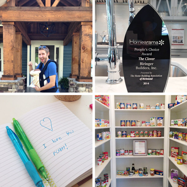
Before the Homearama show concluded this weekend, we slipped through on Friday with Teddy strapped into our baby carrier (Clara was with the grandparents) so we could check out the homes with visitors in them. It was fun to chat with show-goers, see our pantry getting filled up with food donations, and we even spotted a note someone left us on a notepad in the girl’s room of our house. But perhaps the most exciting thing we got to see in person was the People’s Choice Award that our house won! The votes were very close, and all of the other homes were so well done. It’s hard to put into words how much we’ve learned from this year-long experience. It has been such an honor to be involved.
Even though the show is over, we’ve still got more of our virtual tour to complete. Today we’re tackling the most playful spaces in the home: the kids’ bedrooms, their shared bathroom, and the playroom/reading room.
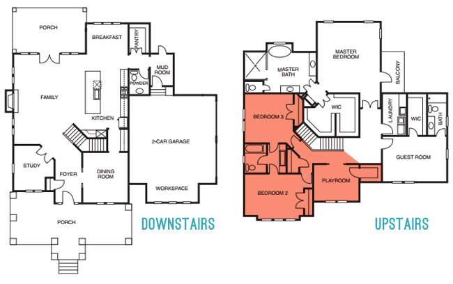
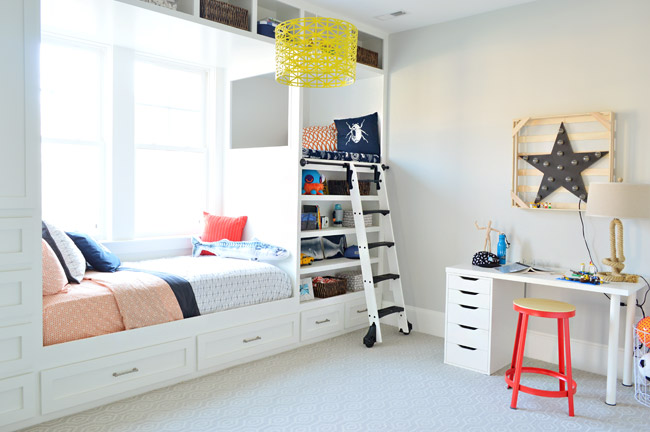
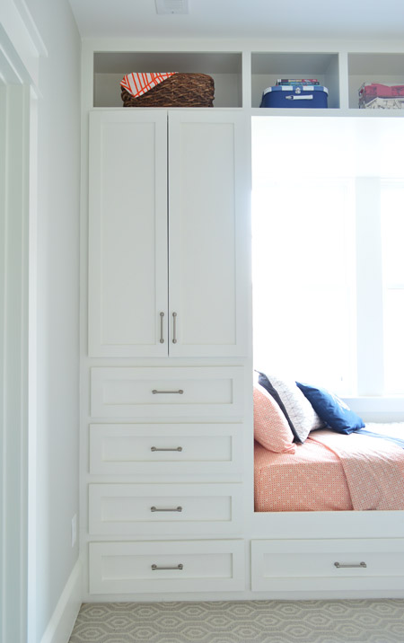
Let’s kick things off in the boys room (i.e. “Bedroom 3” on the floor plan). The walls are Moonshine by Benjamin Moore and the major focal point of the room is the built-in bed area. As a reminder, the show was really all about showing what the builder and his team could do (so specific carpentry updates were encouraged, just to keep the show interesting and showcase the possibilities to customize each home – even though they’re hardly one-size-fits-all modifications). This built-in fits a twin bed, which we covered with Target bedding, plus a couple of pillows from Ikea. If the future homeowner eventually wants a larger bed, a full or a queen could stick out into the room with the addition of a simple platform – and some rolling under-bed drawer storage could be added to offset those two drawers under the twin mattress that would no longer be accessible.
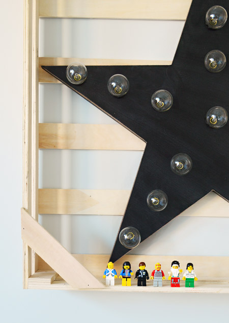
This desk is from Ikea but we scored it second-hand thanks to craigslist. The orange stool and wire basket are from Target (we wish the stool were a little shorter, but since it’s for an imaginary kid and we loved the bright color we let it be). The rope lamp and the star light are both HomeGoods finds – and the Legos throughout the room are from my own childhood collection (thanks for saving them all these years mom!).
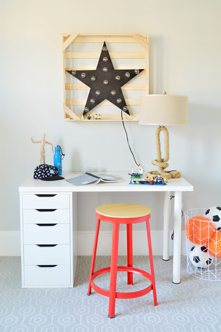
The wood crate around the star was actually just its packaging from HomeGoods, but when we held it up we liked it there so we kept it. It filled out the space more and created a little ledge for a Lego meeting.
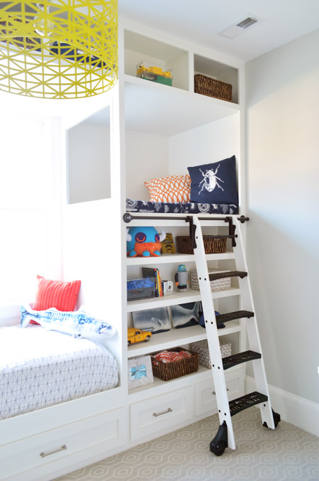
Our favorite part of the built-in bed was this raised nook area, which we all started calling the “Crow’s Nest” for some reason. We brainstormed these built-ins with John the Builder and John the Carpenter (not to be confused with me, John the Lego Hoarder) and they were instrumental in making it happen. Seriously, John the Carpenter and his crew are amazing. In fact, he found the rolling library ladder online somewhere and even used some old pipe fittings when we learned that top rail was going to put us over budget. The bug pillow and blue fabric up in the nook are both from Ikea. We didn’t have a chance to get something custom upholstered for that space, but a dog bed at HomeGoods miraculously fit the area nearly perfectly (which we wrapped in that Ikea bug fabric). The overhead light is from our Shades of Light collection.
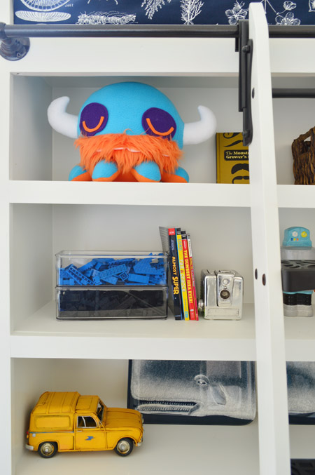
We stocked the bookshelves with random stuff, but my favorite was the “Viking Octopus” plush toy that was loaned to us by our friend Phil Barbato. Because why wouldn’t an octopus also be a bearded viking?
You can see our fun patterned carpet pretty nicely in this shot. It’s from a local place called ProSource, but the style is Stanton’s Revere in Silver. We thought it’d be fun to do something interesting with the carpet in at least one of the rooms since most of the spaces had hardwoods except for a few of the bedrooms (John the Builder said his average buyer seems to prefer that mix).
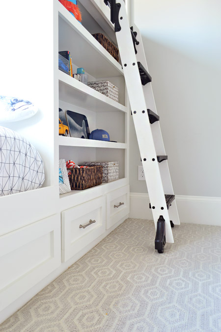
On the other end of the bed there’s more drawer storage, plus a big wardrobe. We left it empty so the future owners could decide if they wanted more shelving in there or an extra clothing bar. There’s a closet on the other wall, so it’s bonus storage space either way.
The two kids bedrooms are connected by a shared Jack-and-Jill bathroom, which is pretty light/neutral itself (so that it flows between the two distinct bedrooms without feeling too disjointed). The walls are Simply White, the floors are a white lantern tile (found locally at a Mosaic tile) with gray grout so they hold up to kids a little better, and our colorful “moment” in here was the big vanity cabinet which was painted Courtyard Green by Benjamin Moore.
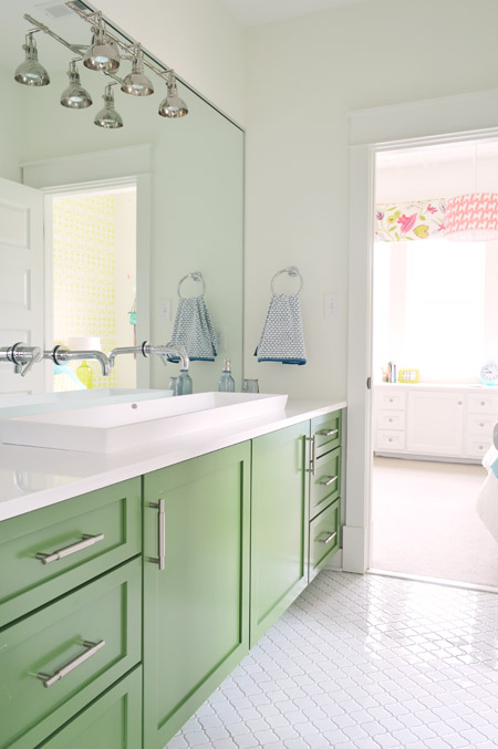
There’s also a wall-to-wall mirror with the light fixture and faucets coming through it. The faucets sit above a double trough sink that’s recessed into the white corian counter top (which makes it look shallow in this photo, but it’s plenty deep). It was awesome to hear from a bunch of show-goers that the big sink and those mirror-mounted faucets were their favorite things since they were definitely one of the more specific choices we made. Oh and the towels and bath accessories are from Target.
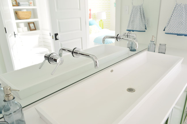
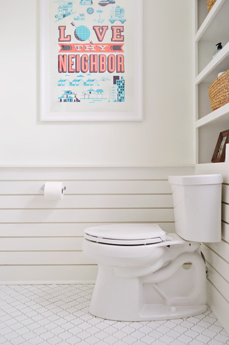
As you can see reflected in the picture above, behind the sink area is the bath/shower/toilet part of the bathroom, and we added some bonus storage via this shelf above the toilet. Once again, it was built by John the Carpenter (way back when the house was being roughed in last fall we had to plan for this shelving and have them set the toilet plumbing further from the wall to make room for it). The framed poster is from Help Ink.
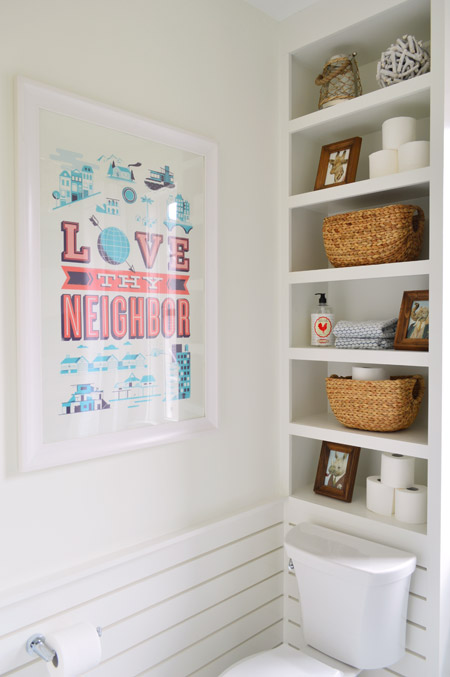
John also added this slatted wainscoting for us, which we thought contrasted nicely with the more ornate tile floor.
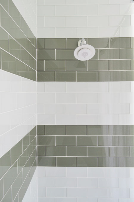
You saw a sneak peek of the shower back when it was half done, but we use two colors of glass tile (Snow Glass and Glass Winter from The Tile Shop) to create chunky stripes. The showerhead is one of these bluetooth connected speakers from Kohler since we figured kids would get a kick out of that. Heck, now we want one.
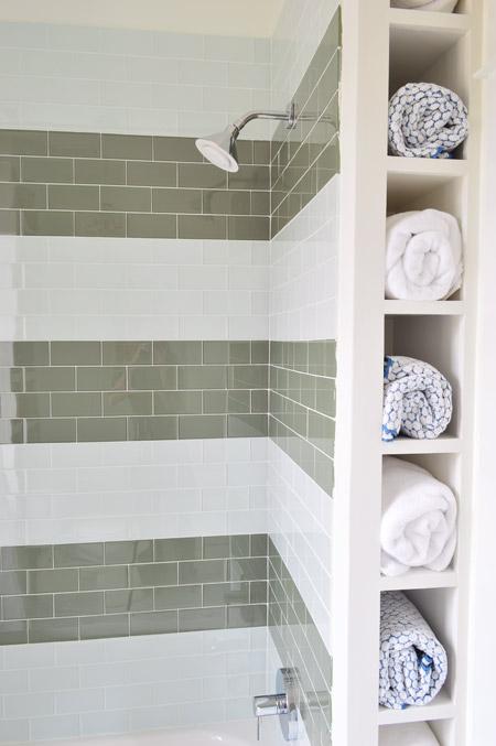
Here’s the other added sliver of storage that we worked into the room: a little towel nook behind the shower that we filled out with some rolled Target towels.
Let’s move on to our girls room. Fun fact: one of the most interested buyers for this house has two sons, so they’d adjust this room to work for a son instead of a pretend daughter (and you know Sherry will beg them to let us house crash them down the line). Anyway, we got our big window cornice installed, which was built by U-Fab in this fabric. We also mixed up the beside table situation (going for a blue Target side table and a yellow garden stool from HomeGoods), scooted the bed further into the middle of the room, added more pillows and a blue throw to the bed, hung some casual art, and even added some surprise string lights (more on those in a second).
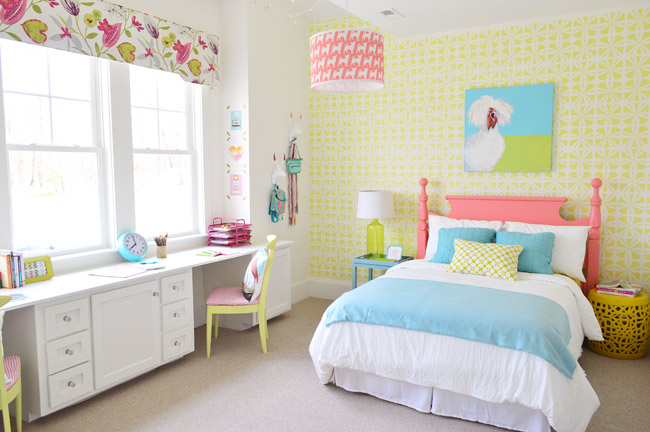
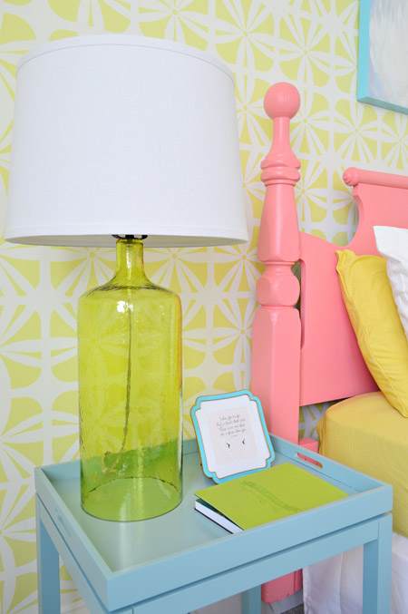
We can’t forget “Princess Truthful” (the chicken painting loaned by our friend Lesli Devito) who is perched above the thrift store headboard (painted Hydrangea Flowers by Benjamin Moore), which is all against the Royal Design Studio stenciled wall (it’s Hibiscus over Simply White walls). Here’s a closer shot of the wall pattern, plus a glass based lamp from Target.
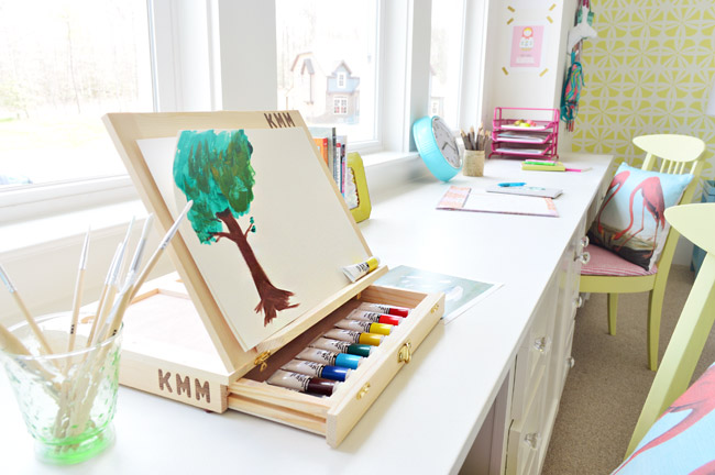
Now let’s shift over to our double desk. Not only does it add some nice concealed cabinet storage to the room (along with a big double closet that’s on the wall across from the bed) but it’s a nice big work surface. A lot of you weighed in on which two stations we should style it with (people tossed out things like a makeup area, a spot for art, a sewing zone, a homework area, etc) and we settled on an art station on one side (complete with a terrible tree painting by yours truly) and a homework side with notebooks and room for a laptop or desktop monitor but it’s really flexible so we’re interested to hear how the future owners use it down the line. You might remember that the chairs were rescued from a thrift store (we painted and upholstered them) and the pillows were from HomeGoods.
Now let’s get into the string lights. We wanted to do something with the small vaulted area of the ceiling above the desk, so we ordered a 50-foot strand of white cafe lights and strung them up on white cup hooks.
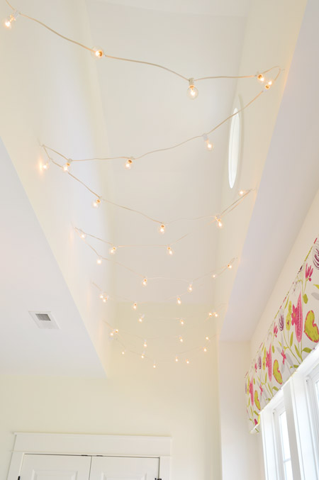
We had the electrician add an outlet up there for them to plug into, which connects to a switch by the door. They’re barely noticeable when they’re off, but are a fun surprise when they’re turned on. It was awesome to hear people’s reactions when they stepped into the room and noticed them during the show.
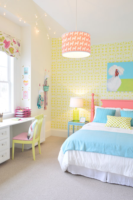
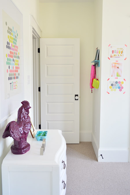
Speaking of the door, here’s a quick shot of that side of the room. It has some casual art taped up with washi tape, a framed poster from Ikea over the dresser, and one of our rail hooks from Target that we customized by the door.
When you head out that door, you end up back in the hallway near the playroom / reading room which sits behind two sliding french pocket doors. That way it can be an open family space when needed, or it can be closed off for quiet reading.
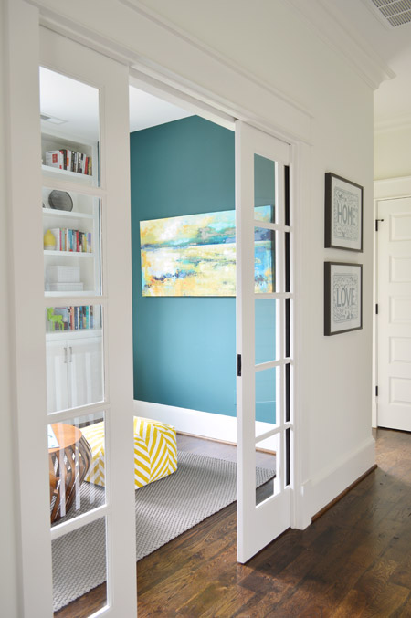
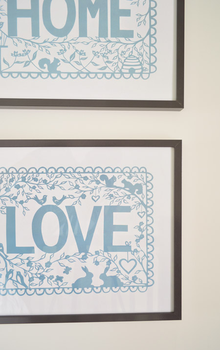
The prints in the hallway next to the door are from Ikea (they came in a pair).
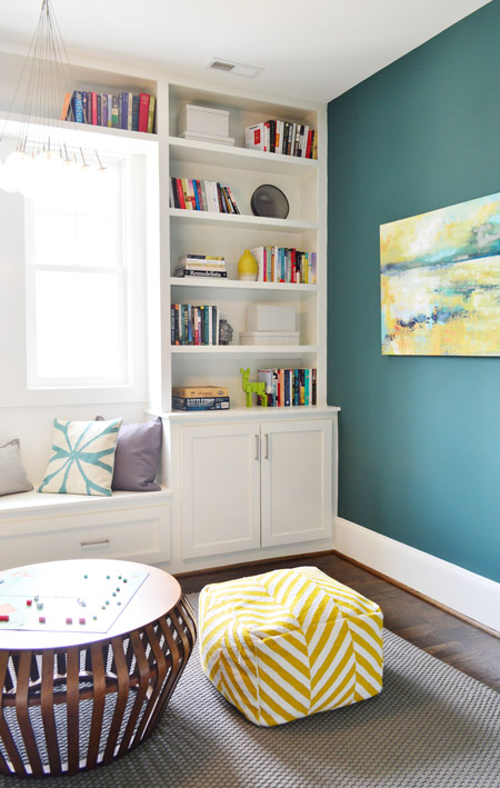
The playroom walls are painted Dragonfly (by Ben Moore) and we originally planned to have the built-ins that were made by John the Carpenter painted that color too, but the painters missed that memo and they ended up white. When we walked though we decided the room felt good that way, so in the end it was a happy accident. The art on the wall to the right is from World Market and the wood plaque on the left is a thrift store find.
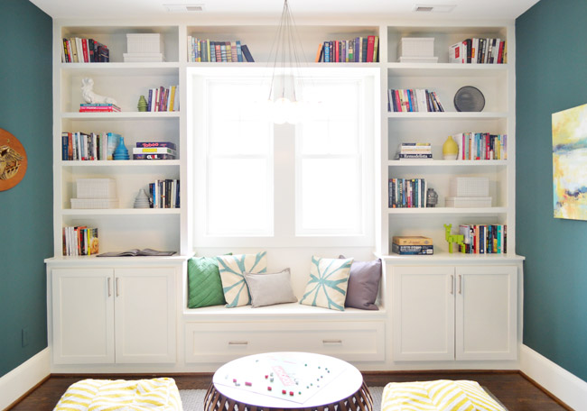
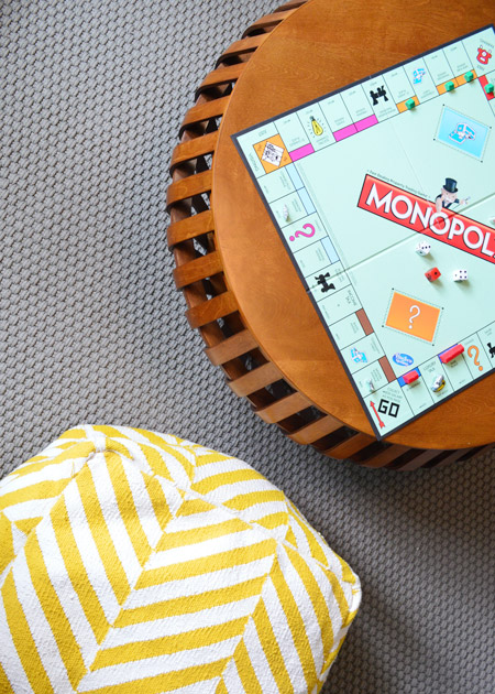
We also contemplated staging this space with a media console to look like a video game room, but decided to keep the layout a little simpler – just a low table (this one donated by West Elm) and two poufs that we bought from Target for playing games of the non-video variety. The rug in here is from Dash & Albert.
Fun fact #2: we actually crazy glued the Monopoly pieces down after worrying that small kids might end up swallowing them (a prospective buyer with four kids came through before the show and her youngest daughter “taught” us that lesson – thank goodness she didn’t actually succeed in her mission to digest a few houses).
This room also has a big shelved closet off to the left-hand side for game storage and what-not. Clearly we went light on the styling, but we clutter up enough closets in our own house that I didn’t feel the need to demonstrate that “skill” here.
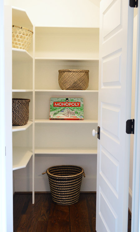
And with that dramatic game closet conclusion (I kid) we’ll end this 30-picture post. We hoped to include the other six remaining spaces, but we’re 2,000 words in and it’s clear that we need one more post to wrap this thing up – so that’s coming up for you next week, along with a video walk-thru that we shot.
Thanks to everyone who came to check out the showhouse in person, donated money to Habitat, left canned goods in our pantry, and cheered us on during this decorating marathon of sorts. Couldn’t have done it without you. Oh and as for what Teddy thought of the showhouse when we took him to check it out for the first time outside of the womb… the kid slept the whole time.
Psst – Wanna see more showhouse info & photos? Click here for Our Full Showhouse Tour, which includes final pictures of every room, the floor plan, budget info, a video walk-through, and shoppable showhouse furniture & accessories.

Kathy says
I had to send this to you knowing how much you love bees. :)
http://www.decorsteals.com/?utm_source=Decor+Steals&utm_campaign=956ce2a029-angel+wings&utm_medium=email&utm_term=0_136dc96a1d-956ce2a029-200111289&mc_cid=956ce2a029&mc_eid=cd2eb8ba95
YoungHouseLove says
So cute!
xo
s
PixieRonn says
Those are so cute!!
http://pixieronn.blogspot.co.uk/
Deb says
I totally saw these and thought of John and Sherry too!!
caroline [the diy nurse] says
That note is too sweet! I should’ve left one with my move in date on it ;) So sad I missed out on some Teddy!!
Sarah says
In the boy’s bedroom, does that bed sit right up against the window? Is there any fear that when that window is open that the kid would just roll right out of the screen?
YoungHouseLove says
In order for it to be to code there needed to be a ledge/lip above the bed’s height and a middle divider (it’s actually two smaller windows next to each other with a slice of wall between them, and there’s a lip/ledge so the mattress doesn’t line up with the window bases).
-John
Amy Wolff says
LOOKS AWESOME!!
Where did you get the piece of art in the playroom?
YoungHouseLove says
That was from World Market.
xo
s
Rosie says
Thanks for asking. I wondered too. Its beautiful. I think I’ll have to find a way to justify needing it, even though I have too much wall stuff and not enough space right now. :)
Mary Beth says
Love the pocket doors and the green bathroom cabs… great job guys!
MB
http://www.hystericallyeverafter.com
Dana says
Got to check out the houses this weekend and your house was amazing! All that hard work paid off! One of the best there!
Leslie C says
I have to say, as much as I loved reading about this house on your blog, when I went to visit, it felt like a totally different experience in person! It was definitely my favorite home on the tour, mainly because of the brightness of everything. One thing I will say though, the flat paint on the walls left a lot of marks and scuffs. Any reason why you guys didn’t go with an eggshell or satin finish? Also, some of the floor tiles were a little slippery to walk on depending on your shoes. Probably because they were glossly. I would be very nervous if the floor was wet. Just something to think about for the future since i know ya’ll are planning on redoing a bathroom or two for yourselves. Thanks for everything you put into this house!
YoungHouseLove says
Thanks Leslie! I believe the walls were eggshell (except for bathrooms which were satin I think) but just from the sheer volume of people passing through there are always marks they have to touch up after the show (they get around 2,500+ people going through each weekend for three weeks in a row, so the houses really take a beating!). The bathrooms would also have bath mats in real life, so I hope they wouldn’t be too slick, but if they are John the Builder could hone/etch the tile (we’ve learned so much about making a house work for the specific buyer, so they literally can have a list of things they’d like to address and John can make it happen).
xo
s
Andrea says
where is the blue and green abstract art print from in the playroom? thanks!
YoungHouseLove says
That was from World Market.
xo
s
Andrea says
where is the blue and green abstract art from that is in the playroom? Thanks.
YoungHouseLove says
That’s from World Market. Sorry to leave that out of the post – just added that info :)
xo
s
Amanda says
More great spaces! This place would be my dream home. The video was very nice, did they do similar videos for the other Homerama houses? Is there somewhere to view those as well?
YoungHouseLove says
I wish they did! This one was paid for by the builder, so I don’t believe other builders had one made. If I hear/see any I’ll definitely share the links!
xo
s
Jenny B. says
I had the same question. :) We are thinking about building a house in the next few years, and it would be awesome to have a library of video home tours like this one to go through as we think about our floor plan.
Laura says
Loved seeing the showhouse in person on Friday too! Overheard a Homearama staff member explaining who YHL was to some older ladies along the lines of “They write a blog that thousands of people across the country follow…” The puzzled looks on their faces were pretty priceless. Blog?
Mindy says
I LOVE this floorplan! What is it called/where can I get it??
YoungHouseLove says
It’s called The Clover, and you can purchase it on biringerbuilders.com (with some money going to Habitat!).
xo
s
Nikki H says
Everything looks great! I really like how you have so many accessories that are affordable. I love shopping at Target and Home Goods and it’s satisfying to see how you’ve used them to have such an elegant look. Your personal touches in these rooms just make them so special.
Nikki H says
And Congratulations for the People’s Choice Award!
Scott says
Can I tell you that my favorite thing in this whole post was your legos, John? We’re major lego fans in our house, so that was AWESOME.
Jill says
Congratulations! The house is both elegant and comfortable and you can see all the attention to the beautiful details. You knocked it out of the park!
Tami says
Where is the artwork from in the playroom?
YoungHouseLove says
Sorry, just added that to the post – it’s from World Market.
xo
s
Tami says
Nevermind.
Found it.
Cara Barbieri says
I was so excited to run into you two when I was waiting for the shuttle on Friday!I know you didn’t cover it in this post, but I have to ask where you got the curtains for the guest bedroom? They are so dreamy! Great work on the house! It was by far my favorite!
YoungHouseLove says
Thanks Cara! So great to bump into you too! Those curtains were from U-Fab – they did an amazing job and I am obsessed with that fabric.
xo
s
mare says
Where are the tiles in the kids bathroom from? Do they have a name? love the wavy lines!
YoungHouseLove says
They’re called “lantern tiles” and we bought them through Mosaic (a local tile company).
xo
s
Kathleen says
Unreal! Every detail is so beautiful! It’s no wonder you guys won the people’s choice award. Thanks for the awesomely detailed post. Also, I just want to hang out with Clara. She is hilarious! What a riot!
Melissa @ Loving Here says
What a fun project this must have been for you! I can’t wait to see how the new homeowners make it their own…fingers crossed for a future house crash!
YoungHouseLove says
Amen!
xo
s
Liz says
It’s cool to see a video of the space – gives a whole different perspective!
Is there any recessed lighting in the boys room or is it just the funky yellow light? I feel like that would cast crazy shadows at nighttime and, while that might be cool for a kiddo at first, I’d think it would be hard to read/do homework/etc. We have a lamp in my son’s room that casts a fun light that almost looks like stars around the room – but we have to turn on the plain overhead light whenever we want to get anything done in there. Ha!
YoungHouseLove says
Good question! If you used a frosted bulb there wouldn’t be any funky shadows – we just like them so we used a clear bulb. There’s also a desk lamp for homework and the star on the wall that lights up, but no recessed lights in there.
xo
s
Bethany says
The Crow’s Nest in the boy’s room is hands down the coolest thing I’ve ever seen. I’m so glad you included a video of Clara, because I thought it looked kind of small until I saw her in there lounging. I would have absolutely loved that as a kid (and as an adult)!
Julie says
We went to visit on Sunday, and yours was definitely our favorite house. It was absolutely fantastic, and I really loved all the lighting choices! (and am really hoping for a source on the hall lighting upstairs–those were my favorite–or I could just look at the flyer we picked up that had all the sources :). Fantastic job!!
YoungHouseLove says
Aw thanks Julie! Those were from Shades of Light here in Richmond. We fell in love with them at that Greek restaurant Stella’s here in RVA (so good!) and found out they were Shades of Light so we did those in the hall.
xo
s
karen says
looks fantastic!! congrats on people’s choice!
if you are curious…i played Magic by Coldplay while watching the video. I think it suited it nicely!
YoungHouseLove says
Love it!
xo
s
Sayward says
Holy Crow’s Nest! Congratulations on winning people’s choice!!!! Boyfriend and I both voted for you (he made his own decision – I didn’t influence him one bit). Your house was gorgeous – it was so fun, welcoming, and full of personality. All of the designers put a lot of amazing work into their homes, but your house truly stood out as a place where I could realistically see myself living with the people I love. You guys went above and beyond with thoughtful, creative personal touches. I could have stayed in there for hours and I wish I could go back – just seeing this update I feel like I missed so many little things when I was there in person. Picture me running up to you like Will Ferrell in Elf and shouting “Congratulations! You did it! World’s best show home!” (and then for good measure, “John and Sherry?! I KNOW THEM!”)
Personal Bonus: your show gave us an excuse to take a mini vacation, see a new city, and visit some relatives. Greatest show house/trip ever!!!
YoungHouseLove says
Thanks so much Sayward, you’re so sweet!
xo
s
Megan says
This entire house turned out so cool! We have a similar event in my area called Chefs on Parade where local chefs will actually cook in the showhouse kitchens so patrons get to munch on delicious food while perusing the homes. Just can’t beat food and fancy houses.
YoungHouseLove says
Oh man, that sounds awesome!
xo
s
Meredith says
Totally a weird question, but the art set in the girls’ room has “KMM” on the side—it looks like a monogram? Was that borrowed from a friend with those initials? Why do I feel the need to know the answer to this? :)
YoungHouseLove says
That’s just the brand of the kit I think (we got it from Target and it had those marks sort of burned into the wood out of the box :)
xo
s
Kim says
As my initials are KMR, I was totally going to ask that question! :)
YoungHouseLove says
Yeah, that’s just the brand. It’s “Kid Made Modern.”
-John
Michelle says
I love all the fun touches in this part. That reading room is so lovely. And the video really knocked my socks off — the home looks so warm & inviting, especially when filled with sunshine.
Congrats on the People’s Choice award!
Stefanie says
We drove down from DC this weekend to go to the show. There was a lot of travelers from far and wide there and all of the locals were surprised we heard of Homearama, it was all thanks to your blog of course. They had to have broken a record of visitors. I had to guess by the very detailed conversations I overheard in your house, that a lot of the people were your blog readers. I know like I feel I was along for the whole process, so seeing it come to life was amazing. My favorite was all of the bathrooms, especially the downstairs bathroom. It was like a little jewelry box. I never thought I would love a toilet design, but I just appreciate the amount of work that you put into every design choice.
I heard they are already working on 2015 Homearama. Do you think you would go through this again? You have a full plate already, but I can only imagine that they want your pull that your name brings them. Also, wondering if it would be hard to do something different (so that it wasn’t the same as this year’s) but weighing the pressure of winning the People’s Choice Award. How would you keep it fresh and different, but still appeal to the majority of the visitors? Thanks so much for sharing this journey with us. It has been awesome.
YoungHouseLove says
You’re so sweet Stephanie! We would love to work with John the Builder again, but we’re not quite ready to sign on for Homearama 2015 since it’s already starting and life with a newborn is a little too much to envision adding that to our plates right now. But down the line we’d love to do something! Not sure if it’s another Homearama or a spec house with John the Builder or some other project for charity or something. We shall see!
xo
s
Lynne says
I’ve been wondering this since you started posting photos of the finished spaces. Does a cleaning crew have to come in after every weekend? I imagine with so many people walking through the floors at least need to be cleaned. If the counters and other surfaces get cleaned, do the cleaning crews re-set all the staged items? I can just imagine a map for them showing where all the Legos belong…
YoungHouseLove says
Yes, I think everything is cleaned each week between the three weeks of the show, but they’re amazing at lifting something up, cleaning under, and putting it back down. When we passed through this weekend, other than a few switched around pillows, pretty much everything was exactly where we left it!
xo
s
Emily says
Congratulations! The house is amazing – I can see why it won the People’s Choice award!!! I really enjoyed the video. I saw the master bath and I am seriously drooling. So much fun inspiration. Great job!
Tammy says
LOVED walking through this house last weekend! You may have covered in another post but I can’t find it- where did the gray dresser by the front door come from? My husband has promised it to me if we can find it! :) yay!
YoungHouseLove says
Thanks Tammy! It’s from Green Front Furniture here in Virginia.
xo
s
Shannon @ River City Reading says
That desk looks much better than it ever did in my house, though I imagine it’s being used about the same amount!
YoungHouseLove says
Haha, it’s true! We love it Shannon, thanks so much for setting it free!
xo
s
Michelle | Birds of Berwick says
Ok… NOW I get to ask since I didn’t read it in the post… Where is that playroom art from and how can I buy it???
Such a great job on this house, guys…the thought in all the details in staging are so great!
YoungHouseLove says
That’s from World Market.
xo
s
Katie says
I am tickled pink that you found the little love note in the girls room. My daughter wrote it before I could catch her, and then when I read it, I thought it was great. I tried to convince her to sign her name, but I think my initial crazy “LOOK WITH YOUR EYES AND NOT YOUR HANDS!!!!” immediately made her shy. We loved the house, and felt so inspired to go home and get to work, especially on Grace’s little girl room!
YoungHouseLove says
You’re so sweet Katie! We LOVED her note. Please tell her it made our day.
xo
s
Kerri Hillis says
Love it!!! Where are the playroom pillows from? (Esp. interested in the white with teal star.) Thanks!
YoungHouseLove says
Those are pillows we stole from our own house (they used to live on our sofa in the last house) that are originally from HomeGoods.
xo
s
heyruthie says
You defintely need to watch the video with One Republic “Love Runs Out” as the soundtrack. Seemed appropriate since y’all are YHLove, and it works :-)
YoungHouseLove says
Haha, I like that idea!
xo
s
Reenie says
Absolutely beautiful…. love it ~ and congrats!!
Kati says
I just let Pandora choose my music for me – The Weight of Lies by the Avett Brothers came on… and it was actually so nice- made an awesome video haha! I love the house. The video makes it feel like such a different space and really helps me understand the layout. Gah so gorg.
Danielle says
So awesome! Congrats again to you guys for an amazing job – that house is absolutely gorgeous!!
Emily says
Where is the bedding from in the girl’s room?
YoungHouseLove says
The blue pillows and throw are HomeGoods, the bolster was made by U-Fab and the duvet is Ikea.
xo
s
Kerry says
I’m continuing to be wowed by every single space – and I could live in that boys’ room for the entire rest of my life. That crow’s nest! Omg.
Also, I’m loving the idea of you guys putting together the Lego sets to decorate. John, you would have loved my high school job – I used to work at a toy store called Zany Brainy and sometimes I’d come in and my role for the day would be to assemble a big Lego or K’nex or Playmobil set for display. And I got PAID to do it! Amazing.
YoungHouseLove says
Best job ever.
-John
Amy says
I would love to see what’s on the opposite side of the boys room – do you have a dresser there?
Also in the boys room- I’m questioning the functionality of the desk – maybe it’s the photo but looks so small compared to the girls room desk and also the stool looks too tall?
YoungHouseLove says
The closet is on the wall across from the bed (you can see that better by checking out the highlighted floor plan). We didn’t think a dresser was necessary with a big closet and all that storage around the bed, so that’s why we went for a desk on the wall to the right of the bed. I shouted out the too-tall stool in the post (since it’s for an imaginary boy and we liked the color we let it be) but of course when a real family moves in they can put a bigger desk or a dresser there if they’d like.
-John
Kristie says
Quite simply gorgeous in every way. I’m such a huge fan. Thank you so very much for the inspiration (I’ve copied your map frames and many other YHL-inspired projects). Can you please tell me where you got the blue/white pillows in the game room?
YoungHouseLove says
We stole those from our own house (they used to be on our sofa, but originally came from HomeGoods).
xo
s
Kate says
Thanks for including that video of Clara–I was having a hard time visualizing the scale of the crow’s nest so at first it didn’t look like a child could fit in there comfortably. But once I saw the video, it made sense. What a cool feature!
Any idea if any of the Home-a-rama houses have sold yet?
YoungHouseLove says
I don’t know that any of them have, but we hear there’s a lot of interest in them so it’ll be fun to see who ends up living in them!
xo
s
Heather says
Ah, I really love how it turned out. Has me house dreaming! Can I ask sort of a nosy question (and feel free to not answer), but how much do the Homearama homes get sold for?
YoungHouseLove says
They’re in a few different ranges, but ours is in the 600’s and the one with the pool at the end of the cul-de-sac is in the 800-900 range.
xo
s
Elizabeth T says
What frames did you put the “Home” and “Love” prints inside? We were so close to buying those but the white background looked a little funky with the white in the Ikea frames. I was worried we wouldn’t be able to find a frame that fit since Ikea’s sizes can be wonky!
YoungHouseLove says
Those are just regular old Ikea frames!
xo
s
Rachel K says
Congrats on the award!!! I love seeing pictures of the house, you guys did an amazing job. So beautiful and creative in every room.
Kate says
Congrats on the People’s Choice Award!
I absolutely love the painting in the playroom / reading room and was wondering where it came from? I don’t recall you saying/linking it any previous posts. If you did and I missed it somehow, I apologize.
I just have to say that you guys did a fantastic job with the house. You did so many things that I would normally not do or think of and I love how everything turned out. I’ll be using so many of the ideas for my own home. =)
YoungHouseLove says
Thanks Kate! That’s from World Market.
xo
s