Remember when we got into it over a refrigerator back in Episode #74? Well, the location of an appliance recently had us battling over two different kitchen layouts – this time for the duplex. So this week we’re sharing our competing perspectives on form versus function, and how we finally came to a compromise that checks both boxes (but not until I spent a few days cooling off). We’re also sharing why this stage of the duplex renovation is especially brain-bending, and what we’ve come to realize about hitting a wall… and then getting yourself over it. Plus, a solution to an age-old problem in our home office, an update on Sherry’s weighted blanket, and an easy upgrade to a money-saving tool that we use at home. Oh yeah, and we solved our weird locked-out-of-Instagram problem!
You can download this episode from Apple Podcasts, Google Podcasts, Stitcher, TuneIn Radio, and Spotify – or listen to it below! Note: If you’re reading in a feed reader, you may have to click through to the post to see the player.
What’s New
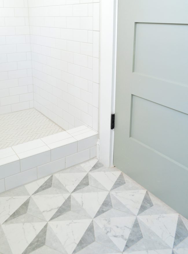
- I was able to snap a few photos over the weekend in Cape Charles of the tile finished, but things were a little messy in some of the rooms in preparation for floor refinishing, so we’ll share some other shots a little later – most likely in that big tiling blog post Sherry promised.
- In the meantime, you can check out all of our tile selections here.
Updates
- If you missed the original discussion of Instagram hacking and the issue we were having, check out Episode #118.
- And if you want to hear more about Sherry’s weighted blanket, it was originally discussed in Episode #79.
- This is the weighted blanket we have – and here’s that more affordable option without the removable cover (both are 12 pounds and about 4′ x 6′).
Duplex Kitchen
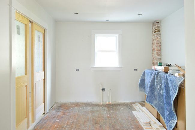
- I know some of what we described in this episode will make more sense with these photos, so let’s start with this picture of the kitchen we took last month. This is actually of the RIGHT side, but I flipped it since all of my renderings show the LEFT side. I figured it would be easier to follow that way. I’m standing in the living room and the wood doors on the left open to the mudroom / laundry room, and you can see the exposed brick chimney there in the back right.
- Before I show you all of the bland renderings, remember that thiswe are planning to add in lots of fun color. The left side, which we’re showing in these plans, will have the blue-green cabinets with pink patterned tile. So yeah – pattern and color are on the agenda for the duplex since it’s going to be used entirely as a weekly rental. Felt like a good place to have some fun.
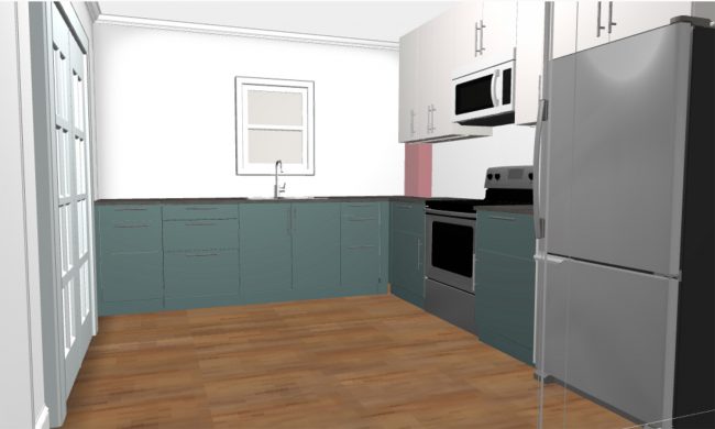
- Below is the ORIGINAL layout Sherry and I had been working off of, which included the over-the-range microwave. This was made using Ikea’s Home Planner, which is free. It’s not perfect (you can only import Ikea products) but if you’re ordering their cabinetry, it’s a great way to organize your order and see it all in 3D from a bunch of different angles. We discussed a few other 3D home planning tools in this post.
- You can see how the upper cabinets conceal a lot of the exposed brick (shown in red – although in real life they’re pretty whitewashed – see the kitchen photo). NOTE: We’re only ordering cabinets from Ikea, so the appliances, hardware, and countertops are just placeholders. This also doesn’t show things like our patterned tile and open shelves, so you’ll have to use your imagination.
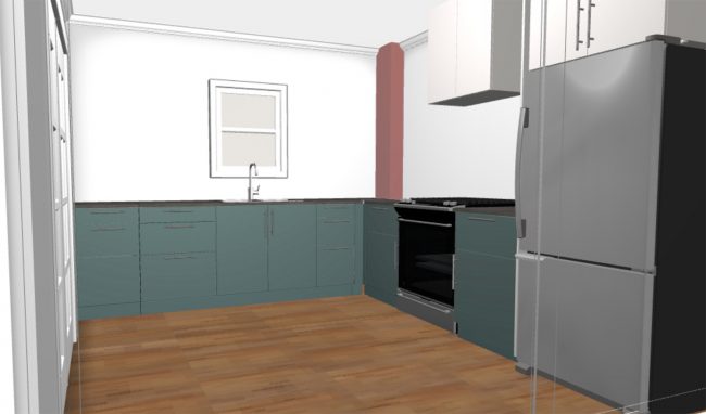
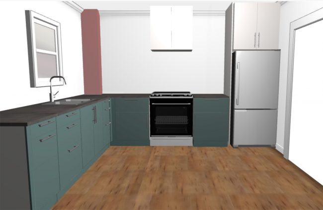
- When we eliminated the upper cabinets and tried a hood like this one instead, suddenly more of the brick are exposed from this vantage point (which is the main view of this room from the living & dining room). So it’ll no longer look like “a box of bricks sitting on the counter.”
- Here’s the difference shown from another angle. This is the view from the mudroom / laundry room with all of the upper cabinets we originally thought we should add. More of the chimney would’ve been visible from here, and we envisioned putting some floating shelves or small ledges on it.
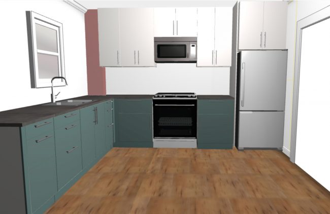
- And this is how that vantage point looks with the new plan. Again, there will be colorful patterned tile and floating shelves so it won’t look as stark (and we may even try a shiplap treatment along the stove wall). But either way, it’s definitely a more open feeling and that brick chimney is less covered up than it would have been in the original plan.
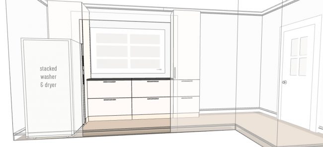
- The rendering below illustrates some of the cabinetry we’ll be gaining in the adjacent mudroom to create a nice pantry-ish extension from the kitchen. That wide doorway is where those wood pocket doors were in the original photo – so these cabinets would only be about 5 steps from the sink. Ikea isn’t great for rendering laundry spaces (which is why my washer & dryer is actually a refrigerator) but you get the idea. And above the washer & dryer will be a cabinet to the ceiling.
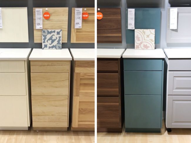
- As a reminder, these are the cabinet colors and tiles that are going on either side of the duplex. All of our upper cabinets and mudroom cabinets will be white. You can see this post for more info & mood boards of our duplex selections.
We’re Digging
- Below is a photo of our new printer that still fits nicely within the IKEA storage cabinet we got over 7 years ago to house our old one. This piece is no longer sold (the bottom is a file drawer!) but it has held up really well for us, even though our kids added some artwork to the inside of the door.
- We used to have to fold out and fill the paper tray every time we wanted to print something, but this printer stores paper in a hidden drawer on the bottom. Plus, I just learned it prints two-sided sheets!
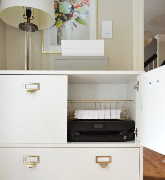
- I picked up the printer at Target, and here’s where you can learn more about the HP Instant Ink service we’re trying out.
- And this is the new hair-clipper/trimmer that Sherry is loving. And you can check out that original post where she shares her DIY haircutting techniques. It’s very embarrassing, but here’s the video:
And if you’re looking for something we’ve dug in a past episode, but don’t remember which show notes to click into, here’s a master list of everything we’ve been digging from all of our past episodes. You can also see all the books we’ve recommended on our Book Club page.
And lastly, a big thank you to Universal Furniture for sponsoring this episode. They’ve teamed up with Coastal Living Magazine for a whole new home collection called “Escape,” which captures that relaxed beachy feel. You can check it out at UniversalFurniture.com/YHL.
Thanks for listening!
*This post contains affiliate links*

