This week we’re sounding off on an article that says open floor plans should be a thing of the past. We’ve been known to knock down walls and widen doorways to add a more expansive feeling and better flow in all three of our homes, but there are undeniable reasons why it may NOT always be the right call. So we’re breaking down all the pros and cons of open concept living and pointing out when to avoid the urge to open up a floor plan – plus what to do if you’re struggling with the one you’ve already got. We also share a big curb appeal improvement that we tackled in just one afternoon and Sherry spills her favorite sources for extra long curtains and explains why she loves them so much. One last gripe: what’s the deal with all of those storage units popping up everywhere!?
You can download this episode from iTunes, Google Play, Stitcher, and TuneIn Radio – or listen to it below! Then use this page to check out any links, notes, or photos that we referenced. Note: If you’re reading in a feed reader, you might have to click through to the post to see the player.
What’s New
- Here’s the link to the metal mailbox post we purchased (it also comes in black), as well as the black mailbox that we got for our neighbor. And below is a quick photo-recap of the project.
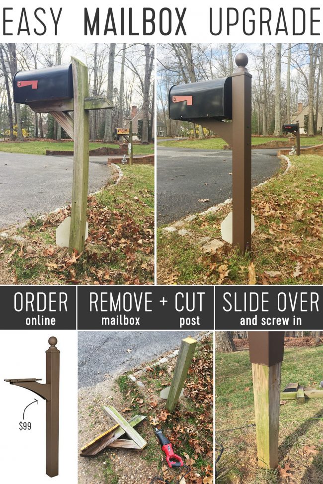
- Home Depot’s website only seems to have the gold version of the adhesive metal house numbers we bought, but the dark bronze versions we purchased are on Amazon. They’re the perfect size for the front of the post, which is where we stuck ours and our neighbor’s.
What’s Not
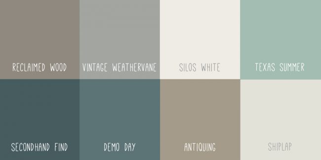
- Here’s a link to the entire line of Magnolia Home by Joanna Gaines Paints.
- And, as promised, here’s a link to that old Reader Redesign she submitted back in 2013, in her pre-Fixer Upper days.
Open Floor Plans
- Here’s the House Beautiful article about “Why We Need To Just Stop With Open Floor Plans“
- And here’s a recap of a few times we dealt with open floor plans:
- Widening doorways (and actually closing one!) in our first home
- Adding a large opening in a closed wall in our second home
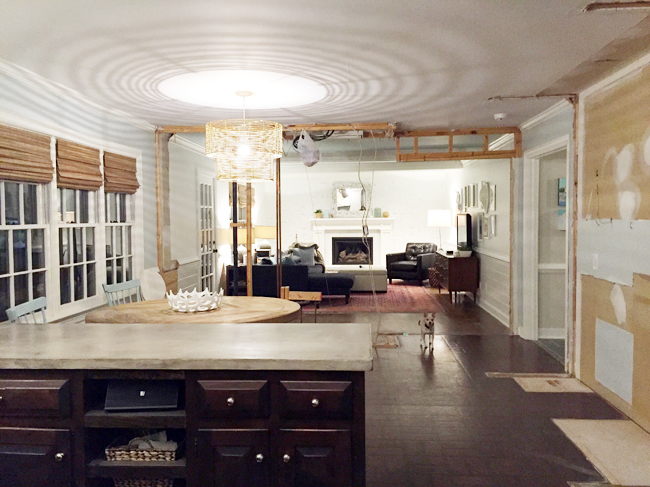
- Opening up our living room & kitchen (below) in our current home
- Decorating a very open living room + kitchen floor plan in our showhouse
- For reference, below is the closest photo we’ve got of how open we could’ve left our current house, had we not decided to add some visual separation with the built-in bookcases in the living room.
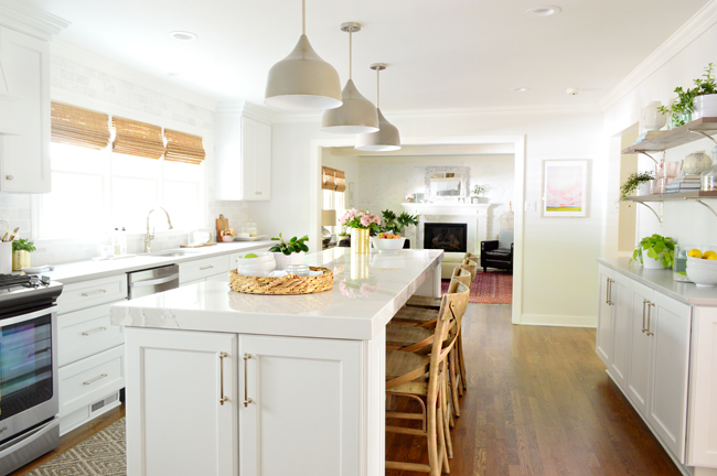
- Here’s how it turned out after deliberately leaving a wide doorway, but not going whole-hog and eliminating the wall entirely.
- And here’s all the storage we gained on the other side of that wall, thanks to leaving room for the bookcases.
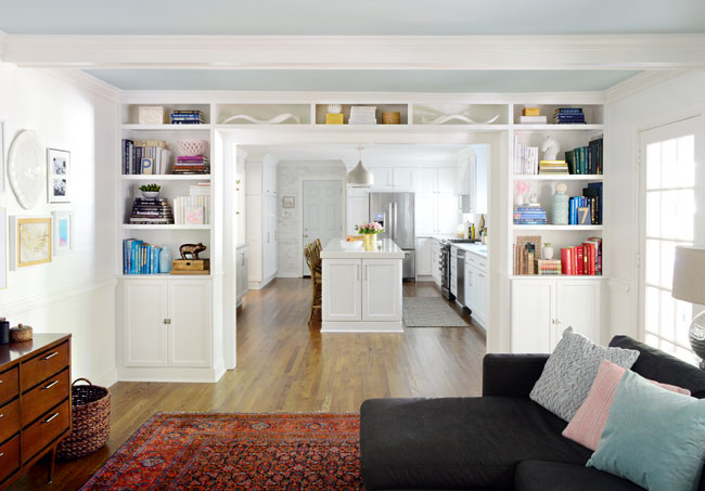
- Also, here’s our friend’s living room makeover that we recently shared in case you missed it. Again, the wall she considered taking down is the one with the big leaning mirror on it (the TV for the informal living room is on the other side of that wall).
We’re Digging

- Above are some of Sherry’s favorite 96″ (or longer!) curtains that work great, even for standard height 8′ ceilings like ours. 1 /2 / 3 / 4 / 5 / 6 / 7 / 8 / 9
- As you’ll notice, many are from our favorite sources for long curtains: West Elm, Pottery Barn, Wayfair (you can even search by length!), and Ikea (remember to wash the cotton ones first to avoid capri curtains!).
- Here’s the book John’s digging: So, You’ve Been Publicly Shamed.
- And below is the podcast where he first heard about it, which tells the Lindsay Stone story we mentioned in our episode:
Psst- Looking for something we’ve dug in a past episode, but don’t remember which show notes to click into? Well, here’s a master list of everything we’ve been digging from all past episodes.

Check out the all of Delta Faucet’s products and innovations, including that cool split finish, at DeltaFaucet.com/YHL.
*This post contains affiliate links
