Here’s where we explain the second half of Farah’s home makeover (click here to read our first post on the subject). Basically HomeGoods offered us some free merch for our house and we asked if we could pay it forward and transform someone else’s casa instead. Unbelievably they agreed. And we decided that we couldn’t stop at just sprucing up Farah’s mom cave after we laid eyes on her family room. So we have another before and after for all you transformation loving fiends. Here’s her cute family again, just to refresh your memory.

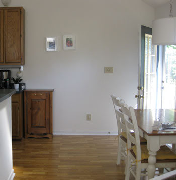
And here’s their family room before:
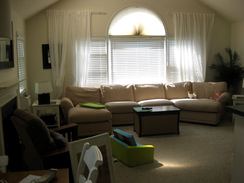
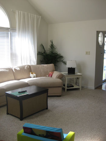
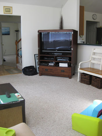
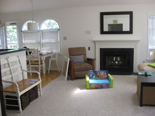
Here’s the same room after we got our mitts on it:
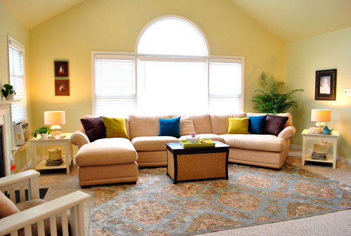
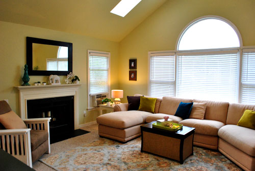
It was pretty much a blank slate, and we were lucky enough to be able to work with a lot of Farah’s existing things (the sectional, the recliner, the side tables, the wood frames, the coffee table, etc). So it just came down to adding some room-making accessories and bringing in a ton of kid-friendly function for Laila without cramping the grown up’s style.
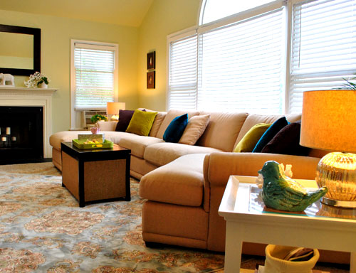
One of the biggest changes came from suggesting some warm artichoke green for the walls (Benjamin Moore’s Nantucket Breeze color matched to satin Behr paint). The room glows like candlelight with a soft green tint. And thanks to everything from the new table lamps to the soft texture-adding rug, the space really feels warmer and more inviting.
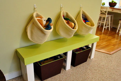
Farah even primed and painted the existing recliner (see how here) and we brought in a cute green bench (which used to sit unused in a corner of Laila’s room) to create an entire area that could be devoted solely to her toys and games. Because it’s always nice to work in some kid-space within a public living area. You know so they don’t feel banished (like those old formal living rooms where children weren’t allowed and the sofas were covered in plastic).
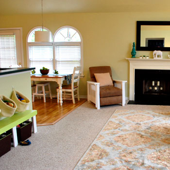
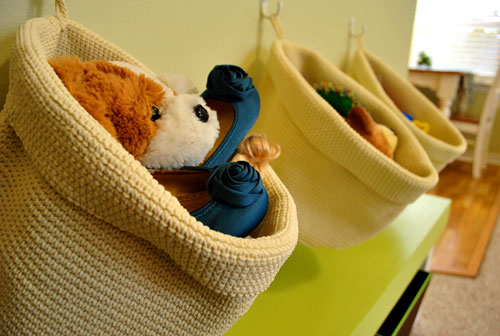
We thought hanging three white hooks with inexpensive Ikea baskets on the wall above the green bench would add even more stash space for Laila and her gear (while keeping things looking organized and simple). Plus we’re not gonna lie, it was a whole lot cheaper than buying a big cabinet or console table to fill up that wall.
And over in the kitchen, we moved the white bench (which used to live where we put the green bench) over into the kitchen near the table. See, whenever Farah entertains she pulls the table out into the room and adds the bench. This way she doesn’t have a blank wall in the family room anymore when she has guests over. And Laila now has a little zone to enjoy every day. Win-win.
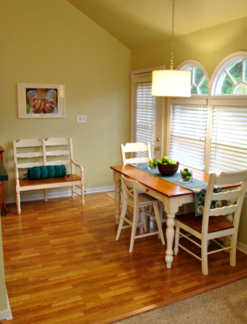
And see that print above the bench? We’ll explain more about that in a bit.
But first, here’s another POV of the seating area:
And another one:

And another one:
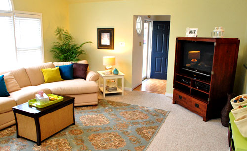
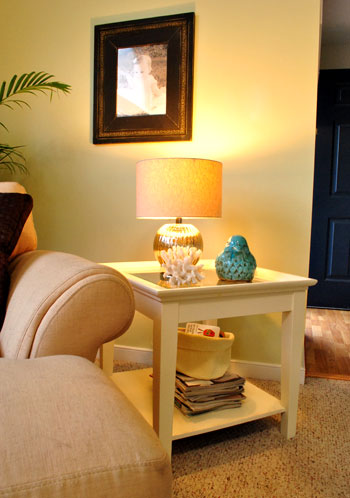
And see that basket under the side table atop that stack of mags? It’s just one of two leftover woven Ikea baskets that we got for the wall above the green bench. We thought they would add even more function if we used each of them to corral Laila’s board books. Now adult reads and kid reads can peacefully coexist without looking like a doctor’s waiting room.
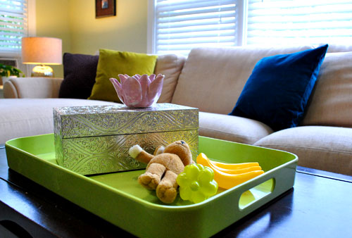
And not only did we make a little Laila zone with the green bench and those hanging baskets, we also tossed a few of her toys on a plastic (read: unbreakable) tray on the coffee table. Since kid stuff tends to inexplicably migrate around a room, I figured that embracing that fact by using some pint sized play things for the reveal would depict how the room would really look after Laila works her decorating magic. Let’s just say I was channeling my inner two year old. Plus how cute are those tiny plastic bananas? Maybe plastic fruit will be my new obsession akin only to ceramic animals.
Here’s that photo that we said we’d get back to. It’s actually a portrait that we shot of Laila in the backyard holding mini grapes.
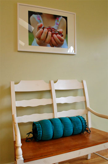
When Farah said she was looking for a berry-related print for a frame that she already had to hang above her bench in the kitchen, she asked if we could shoot photos of her own daughter’s hands holding berries for a one-of-a-kind customized result. One DIY photoshoot with Johnny P the photog and twenty bucks later (we had it printed at a local shop downtown) we had our one of a kind print for the wall. Now Farah can enjoy something a bit more custom than anything that she’d ever find online or in a big box store.
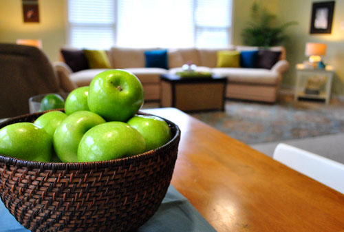
Oh, forgive me for being captain obvious here, but here’s a cheap (and edible) centerpiece idea for you. Nothing beats a bowl full of fresh green apples:
This is just a gratuitous basket detail shot because I can’t get over those cute blue shoes that match our color scheme. I’m shallow like that.
And now for another budget breakdown:
- Paint: $100 (five whole gallons- we suggested Farah paint the ceiling & adjoined kitchen to avoid breaking up the room)
- Rug: $299 (8 x 10 from HomeGoods)
- Kitchen blinds: $60 (faux wood blinds from Home Depot to unify the kitchen windows)
- Side table lamps: $29 each (from HomeGoods)
- Blue bird: $9.99 (from HomeGoods)
- Blue finial on mantel: $12.50 (from HomeGoods)
- Pillows: $55 (brown ones from HomeGoods, rest from World Market)
- Custom Laila hand photo in kitchen: $20 (printed locally at Uptown Color)
- Decorative remote box: $15 (from HomeGoods)
- Kitchen table runner: $12 (from HomeGoods)
- Kitchen bench pillow: $20 (from HomeGoods)
- Baskets under green bench: $22 (from Target)
- Hanging toy baskets above bench & under side tables: $30 total (from Ikea)
- TOTAL: $713.49 ($296 spent by Farah thanks to HomeGoods!)
We went into this family room (and semi-kitchen) makeover with the Trading Spaces spirit- we definitely gave Farah her fair share of homework, from painting the walls to hanging the blinds and even priming and painting her recliner. So we assumed the total would come to around a thousand dollars a la Vern Yip or Genevieve Gorder from their glory days on TS. Needless to say, we were pretty darn psyched when we crunched the numbers and realized we were about $300 short of that, especially since we squeezed in some big ticket items (like a giant 8 x 10 rug, tons of paint, and matching side table lamps) as well as a slew of accessories (from pillows and a table runner to baskets and hooks, a ceramic bird, and even a large custom photograph of little Laila herself). We had so much fun with Farah and family! Thanks for letting us barge in and order you around like Doug Wilson. What about you guys at home? Do you have a corner in your family room for kid-paraphernalia? Or small plastic bananas as coffee table decor? Somebody please say yes to that.

Carmen says
Love the transformation, it really does look amazing. Quick question, is this the printing store that you used to print the prints in your yhl store? When you printed the print above the bench, did you print it on card stock or special paper? Thanks a lot!
YoungHouseLove says
Hey Carmen,
Yes, Uptown Color (the shop that we used to print the photo) is the same place that used to print the art that we sold in our online shop. We had them put it on heavy weight paper and it came out looking glossier than something matte would (but not super glossy like a photo- something in between with some nice heft). Hope it helps!
xo,
s
Stef says
Love this room. How did you pick the colors for the throw pillows? I have a sky blue rug (http://www.westelm.com/products/circles-rug-r371/?pkey=cpattern-rugs-flooring) that seems to be a similar color to the one in this room, a neutral beige-ish couch, and a lot of chocolate brown wood. Now I’m shopping for throw pillows, and I assumed at least some of my throw pillows would need to be sky blue to make it look cohesive, but here I see you’ve pulled off much brighter colors. For someone missing the “I-just-knew-they’d-look-good-together” gene, can you explain how you chose the throw pillows and made them work with the rug? Many thanks.
YoungHouseLove says
Hey Stef,
Our recommendation with pillows is always to grab a ton, toss them on the couch, and see which ones look best. Then just bring back the rest. As for us, we discussed some of Farah’s favorite colors with her and picked up some rich blue and greeny-yellow pillows since we assumed they would add some bright color and interest against that neutral sectional. So that was our train of thought!
xo,
s
Cindy says
Wowza! That doesn’t even look like the same room! Great Job!!
pam says
awesome job guys!!! it afters on both room are amazing!
Patti says
Great simple affordable ideas. Absolutely love this. Reminds me to use what I have. Thanks!
Lauren says
Love this! The room looks so inviting and I love all the pops of color. I’m not sure if you have this in the works, but how cool would it be if HomeGoods (or other stores) offered up money on a regular basis so you could transform even more spaces??
YoungHouseLove says
Um, very cool! We’re definitely open to that! We definitely couldn’t churn them out on a weekly or even a monthly basis but we’d love to do five a year or so. Here’s hoping!
xo,
s
Lindsay says
I love what you guys did with the living room and mom cave so awesome! It is such a bummer we don’t have cool stores like Homegoods and Ikea anywhere close to Montana!
Robin O says
I LOVE that little nook you made for the daughter in the living room. Great inspiration! I have an 11 month old that can make the living room go from pristine to trashed in 5 seconds flat. That’s a great way to corral all the toys in one stylish (but still realistic and functional) area. Great stuff YHL! :)
Kathy says
Y’all never cease to amaze! Great ideas here… forget “corner”– my whole house tends to get overrun by toys, books, and the like. I have two toddlers and stuff everywhere. Thank goodness they are learning to help mommy and daddy clean up. And thank Barney the dinosaur for the Cleanup Song (“clean up clean up everybody everywhere…”)!
Anna says
This is spectacular! I love EVERYTHING that y’all did and that is was so so budget friendly! I’m heading to Homegoods this afternoon to finally get some lamps, pillows and wall art that compliment eachother.. it’s just time! :) Thanks for sharing this with us.. and for sharing your Homegoods bucks with your friends.. how generous!
Paula/adhocmom says
I am so pro-yellow!
Jennifer says
Wow…what a great job you guys! LOVE the colouful pillows on the sofa!! I may just have to nip that paint colour in the living room as well…love it!
Andrea Melberg Thompson says
Hello there – Really enjoyed this post. I have another Ikea basket question, in follow up to the prior ?. Did you pay $30 for two baskets? (I thought you noted they came packaged in two’s). I think in the end you had 5 of them about the room (3 for the bench and one each under the coffee table). Were they $30 for two? Thanks for the clarification!
So enjoy you both!
Andrea
YoungHouseLove says
Hey Andrea,
We actually had Farah pick those up since she was going to be in DC (near where Ikea is, two hours away from us). She grabbed them and just gave us the total amount spent (which was $30). They definitely came in twos (we remember unwrapping them) so we can only assume that they were $10 for two (which would add up to 6 for $30, of which we used five in the room since we used two under the side tables to hold books on top of the magazine piles). Hope it helps!
xo,
s
Lonely Wife Project says
So sweet of you guys to pay it forward. Love what you did with the space!
margie says
I have to say you did an amazing job!! I am a long time fan, but I believe this makeover really showed just how talented you two really are! Great Job!! My house next??
Szig says
Wow! What a great makeover. I hope Farah didn’t realize her ceramic elephant was missing after this photo shoot!
YoungHouseLove says
Haha, that would have been awesome. Uh… we haven’t seen it…
xo,
s
Lauren says
Love this feature, and I’m really loving the new, looser blog format. So fun showing both makeovers back-to-back!
JenniG says
Hey! I have the same remote box! Excellent find. ;)
You guys should have your own tv show!
Kim S says
I love everything about this room!
I’m apparently area-rug-challenged and I have a question that I’m hoping you guys can help me out with…would a patterned rug like the one in Farah’s living room (love it btw!) work in a bedroom with a neutral color but striped comforter (http://www1.macys.com/catalog/product/index.ognc?ID=357150&CategoryID=39342)? Or do you think it would look too busy?
YoungHouseLove says
Hey Kim,
You might have to see it in person but we’re thinking it could totally work. Fingers crossed for you!
xo,
s
Alicia says
I Love, Love, Love this room! I doesn’t even look like the same place…I keep scrolling up and down because there were so many things I didn’t even notice in the before pictures. I don’t know how anyone wouldn’t change their white walls after seeing this transformation!!
Holly H says
I really enjoyed reading these two posts, such a great idea!
Stephanie Phillips says
I LOVE it! Come do my house! I have two rooms that could really use your help! I’d even pony up the cash and I am right down the road…
Erica says
Beautiful! I love the kids area! I also adore that fabulous blue bird. I wonder if he is available at my local Homegoods.
Renee says
Oh my I love that lounge room!
If anyone offers you a trip to Australia to do a room – pick me and bring that rug with you!! I just love it! I have a lounge the same shape but it’s black, I’m having trouble finding a rug to use with it but I think something like that would really work!
Farrah says
another (2 r’s) Farrah here… I love the way you used what this family had! that’s part of why your blog is a favorite – I agree that it’s much more realistic and rational than the gut-the-room approach.
We’ve definitely carved out a kid-friendly niche in our LR/DR area – the girls have a playroom downstairs, but our bookshelf sofa table holds baskets of toys and a bright assortment of children’s books. We used Skip Hop’s pretty floor tiles to add more playspace to the hardwood (http://www.skiphop.com/product/242000.html)… and my daughter has one of the Plan Toys dollhouses – which, frankly, is too pretty to hide away. I love the way the room looks with kid stuff included – there is storage for everything to hide in, but it’s a fun place to play – no plastic sofa covers here, but it doesn’t look like a ToysRUs either. It’s all about storage…
kita says
wow, I absolutely love the bench with the storage baskets underneath. That’s my favorite. It kinda sucks that I rent and can’t do much with my area. boo!!!
Tracy Lee says
Love that bench and the hanging baskets of toys above it! I have 3 kids under the age of 5 (and a 4th on the way, YIKES! LOL) so I love seeing new ideas on how to reign in the chaos of toy clutter! I’m sure that when Clara gets older, I can look forward to more tips on keeping a house from looking like a daycare center! =)
Lily says
Thanks for sharing these makeovers Sherry and John! I have found some fabulous ideas for my mezzanine makeover to be undertaken over Christmas. I adore that fact that you made these rooms over with such a small budget, that is a true inspiration. You guys show us that with some creativity and keeping an open mind to the possibilities of switching things up, giving things a different role, you can achieve great results with little expenditure!
Credit to you!
Now, to plan the 3 hour each way trip to Ikea!! :)
Lx.
KNatGU says
You both are awesome, not much more needs to be said.
Rachel says
WOW!! That is truly inspired. You guys are so good! And doing it all with a baby is even more impressive. Loved the before and afters. It looks so beautiful now. This site just keeps getting better. I have been looking for a warm greenish color for our master bedroom and thanks to you, I think I’ve finally found it. Loving YHL!
Briel K. says
Wow, it looks so nice! I love what you guys did. You really do such a great job at makeovers! I love the photo that you blew up. Nicely done!
Leslie says
Love this! Do you know where the coffee table is from? It looks like it has a great big basket in it. Can’t tell for sure though.
Leslie says
Oh whoops! Just saw your response to someone else’s question. Thanks!
Ro says
Ummm.. I need friends like you all! lol Love it! Looks amazing!
Jenn L @ peas and crayons says
Aww yay!!! That room is so perfectly gorgeous AND functional! Kudos, guys!
xoxo
jenn
mike says
LOVE the apples.
Polina says
Love it! So when are you coming over to my house? :-)
kelly says
beautiful! how lucky they are! when my kids were little there were not so many cute options for toys, we had them on shelves in the basement where they wandered up to the family room often. at one point we even had a play kitchen in our living room! that’s life, you want your kids to feel at home!
Kristi says
This is AWESOME! Please do more posts like these!
K (Barking BabyMama) says
That rug is amazing!
Kate! says
Please tell me more about Nantucket Breeze — I LOVED it in the pb catalog but when I got a sample can from BM it was easter egg pastel green! Awful! Didn’t look anything like the catalog.
BUT when I painted our bathroom BMs Constellation, I started with a sample can, got a quart, and a second quart (first didn’t quite finish the job). All THREE cans of Constellation were different shades. Visibly different.
Has anyone had this problem with BM paint? I was truly in love with Nantucket Breeze for our family room, but after the sample can (plus the Constellation weirdness) I’d given up on BM paint.
YoungHouseLove says
We got the swatch color matched to Behr paint so it wasn’t BM paint, but the color was definitely not pastel or easter-egg-ish. It’s very artichoke-y (with lots of muddy yellow undertones). Love it!
xo,
s
Crystal says
My biggest dilemma at the moment, is we our living room furniture is too big for the small space (measure before purchasing – lesson learned!). My husband doesn’t want to purchase new furniture because we plan to sell our house soon and is worried the new furniture may not fit the new home. Any suggestions how to create the illusion of more space?
YoungHouseLove says
Stagers would recommend storing your too big furniture, or at least some of it to free up more space and keep things from looking cramped. Nobody wants a house that feels like they can’t fit into it, so even if it’s small, try to remove an armchair or a loveseat to make it feel more proportionate. Oh and you might even be able to rent furniture or have it staged for a few hundred bucks which could actually make all the difference in bagging a buyer!
xo,
s
Shelley @ Green Eggs & Hamlet says
This post is dream – it’s like a custom mood board and the awesome after pics all rolled into one! Any way you guys could do this kind of thing again in the future? It’s so awesome to see a space before and after – in real life – with your positive influence.
p.s. the Ikea is finally being built in Denver, CO and I am so excited!
YoungHouseLove says
Hey Shelley,
We’d love to do five or so a year if we could- especially if other companies (like Target, Pier1, Ikea, etc) would like to donate some loot for a few lucky homeowners! We had so much fun!
xo,
s
Heather @ Side of Sneakers says
I can’t believe such simple changes made that room so much more inviting and “designer”. You guys definitely have the eye!
molly says
Wow! Love the changes! You guys work magic!
Question about the windows – I noticed you removed the curtains and went with the wooden blinds. If money was not an object, would you have done anything differently with them? just curious! thanks!
YoungHouseLove says
We like keeping windows in a space cohesive, and because the side window next to the fireplace and the two windows in the kitchen also had those great faux wood blinds we liked keeping them as the only things on that big picture window too (even if money was no object) because it makes everything feel balanced instead of heavy on one side (while the other windows feel like they’re missing something). Hope it helps!
xo,
s
Ashley says
I just wanted to say that this is a great makeover! I love that you were able to use all the existing furniture and make it look cozy and classy. Seriously, great job guys!
Holly says
You really did a beautiful job, they must be thrilled with the end result. Any interest in coming to San Diego to decorate my new house? Trying to figure out what to do with it brings me to tears, I don’t know how you guys do it (and do it so well!!).
Good luck on your house hunt we only looked at about 40 before finding the 1 we liked, and even that was exhausting!
Kate Burdick says
You guys are stinkin amazing. Wow!
Jen K says
Love the hanging baskets on simple hooks!!! Great idea! I’m going to steal this one too! It seems like I’m always stealing your ideas : ) Thank you!
Nichole@40daysof says
Really amazing, I love it! I need you guys to come Home Goods shopping with me – you always find great stuff. :)
http://40daysof.wordpress.com/2010/10/06/heres-a-riddle-for-ya/