This bathroom came together so quickly, we almost can’t believe it ourselves (and we witnessed it with our own four eyeballs). If we hadn’t watched it fly along ourselves, while everything just seemed to line up perfectly, we probably wouldn’t have thought it was possible – especially after the longest-bathroom-reno-of-our-lives that we started way back in October. (Yes it’s still going, but next week we’ll have a full reveal & budget breakdown! FINALLY!).
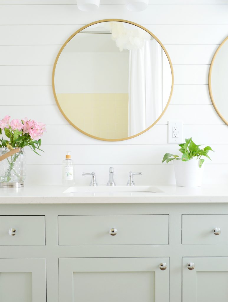
Meanwhile, in less than a week, this upstairs hall bathroom went from looking the way that it has looked for years (old painted double vanity, two yellow-beige sea-shell shaped sinks, bare white walls, old seams in need of some fresh caulk around the tub, etc) to a totally fresh & updated room! We are THRILLED!
And we did it with basically zero dust/reno! We reused a ton of what we had, and although we brought home a bunch of other floor tile options (at this point we’re pros at tiling a bathroom floor in an afternoon or two, so we assumed we’d do that to freshen up this space too) we realized we liked the cute vintage yellow tile better than anything else we brought home! So we returned all the tile and worked with what we had. And we’re so glad we did!
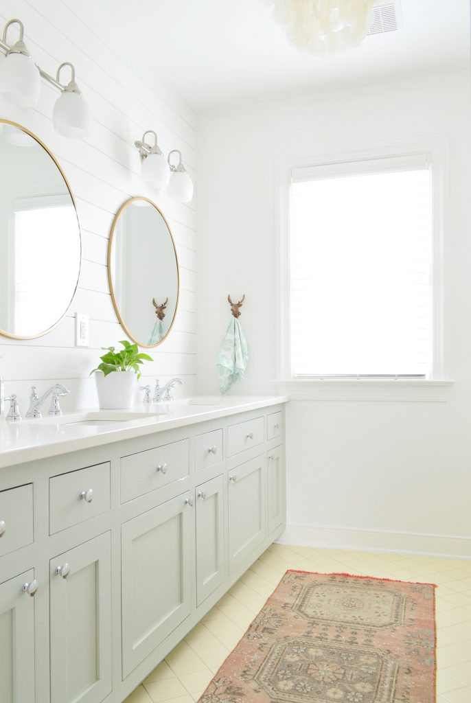
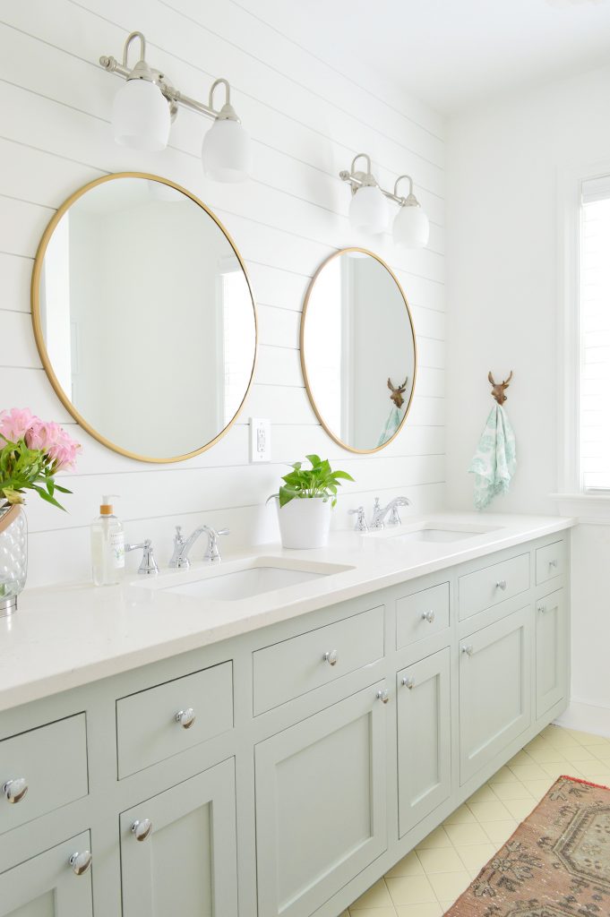
This bathroom truly is a combo move of adding a few fresh new things to make it feel crisp & updated (new counters, new cabinet doors and drawers, a quick wall treatment, and some new mirrors & accessories) while many of the old elements got to stay thanks to the other updates elevating them so much. The vintage yellow tile adds so much sweetness to this kids bathroom – and what can we say, we have a soft spot for yellow tile (remember we kept the old yellow tile in our second house’s bathroom and updated that room for a mere $51?!).
Let’s rewind to the before of this room, as it looked when we bought the house seven years ago:
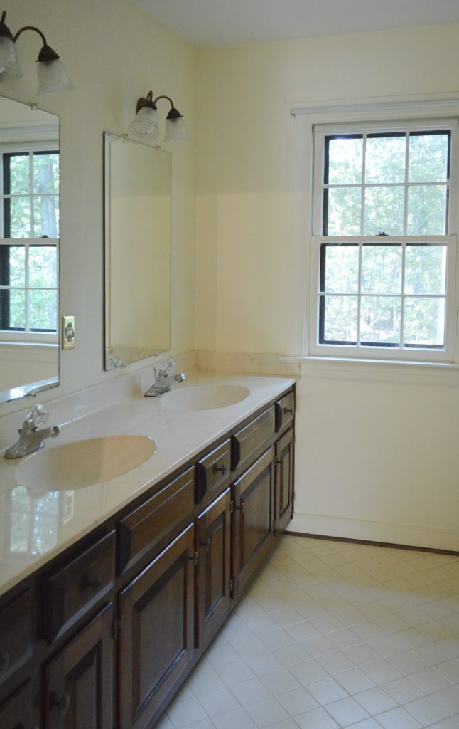
We gave it a quick paint makeover a few years back, which basically just involved painting the walls this crisp white color along with the double vanity, and doing our best to ignore the seashell shaped sinks. Have I mentioned this house came with five of them and these were the last remaining two?!
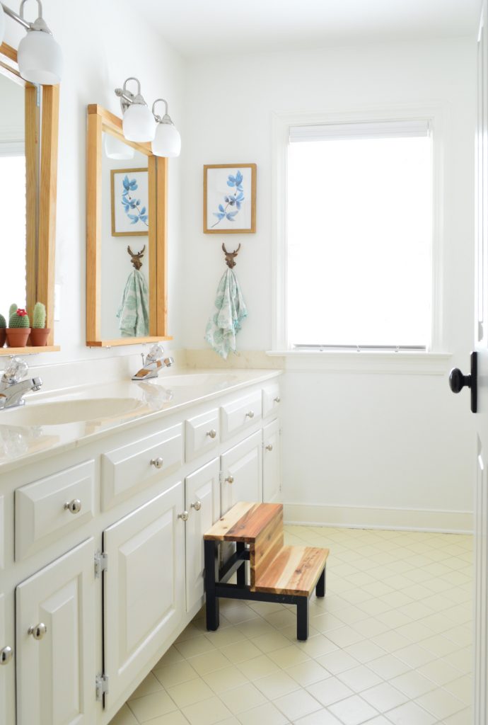
That quick and extremely cheap room update worked wonders on making the space feel less dark & dated, even with those seashell shaped sinks still in the mix! We even made those wood frames to go around the stock cheap mirrors that were screwed into the walls (scroll up to the before to see what we mean) and a cute stool and some new hardware on the cabinets helped too. So truly, if $100 is more your budget for a work-with-what-you-have bathroom makeover, this phase hopefully demonstrates just how far you can take a room with some paint and elbow grease and a few accessories alone!
Could we have just left the bathroom that way and still sold our house?! SURE!! We totally could have! The reason we wanted to do more of an update was that the entire house is more updated, and that bathroom would have been the glaring exception to that statement. Plus we had some ideas that gave us the confidence that we’d be able to do it quickly and well – which we knew would elevate it to the rest of the house’s level of finish, which not only makes us happy but it’s great for resale. Plus we like closure and we leave two seashell shaped sinks here they win. WE CAN’T LET THEM WIN.

So let’s go through what changed, how the heck it changed so fast, and we’ll even share a full budget breakdown for this room update at the end of this post.
New Counters
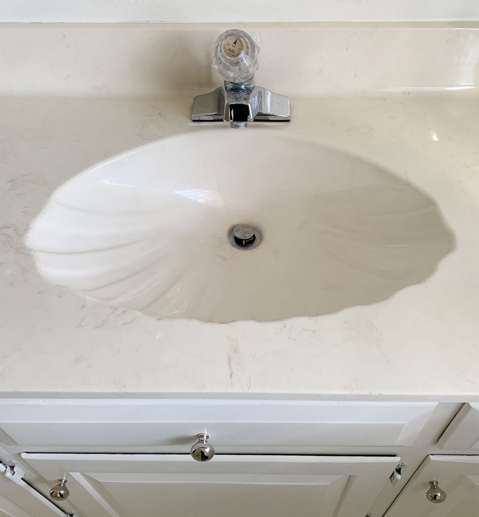
These were the old yellow-beige seashell shaped sinks. May they rest in peace. Also those crystal knob faucets (they leaked all over the counter when you turned them on). May they also rest in peace.
About a week before this bathroom’s miraculous glow-up, we went to our local stoneyard (we like Capitol Granite for any locals here in Richmond) and asked to see their remnant pieces. We measured the width and length of our existing counters before we went there (they’re almost eight feet long!) to ensure that we could find a remnant that was big enough – but there were at least five options that we could have happily used!
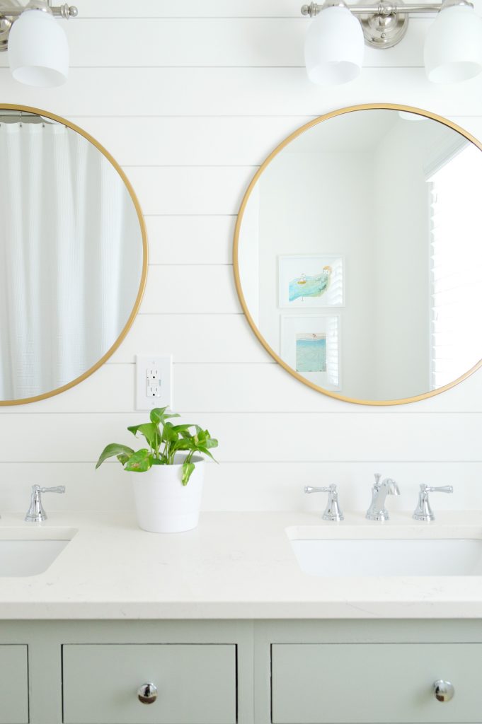
The good news about remnant pieces at our local stone yard is that they’re all the same discounted price per square foot, whether you choose corian, granite, marble, or quartz. We love polished quartz for how durable it is, and it’s a really great choice for resale (marble in a kids bath can stain from toothpaste and soap, etc) so it was an easy decision for us. The only other choice we had to make was whether we wanted round or square sinks, which the stone yard adds and installs right along with the counter. We went with square solely because it felt the least reminiscent of the old seashells. Yeah, we’re petty like that.
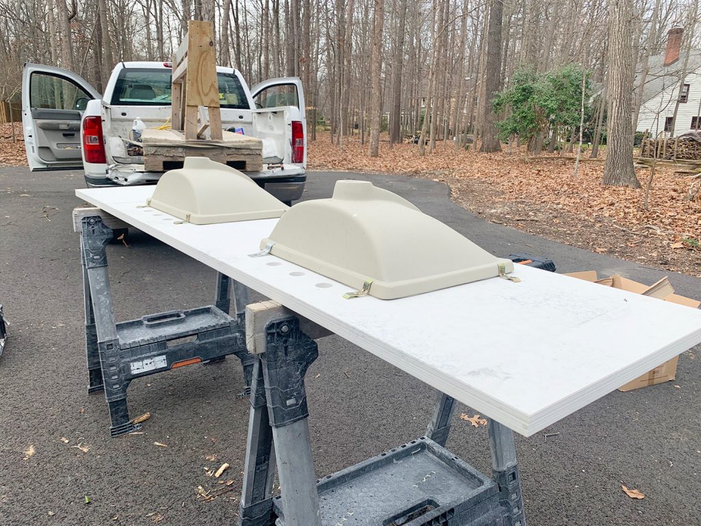
The process probably differs from store to store and the timeline definitely varies, but although we were told it might take a few weeks between picking our remnant piece, getting them to come to the house to template it (they measure it themselves using special equipment to be sure the piece they cut is the right size), and then getting them to install it – it only ended up being about a week from slab selection day to install day! They were out templating super fast and it all just happened in the blink of an eye. Lucky for us, it was a slow week for other orders, which definitely worked in our favor! The name of the quartz is Journey and the maker is HausPro.
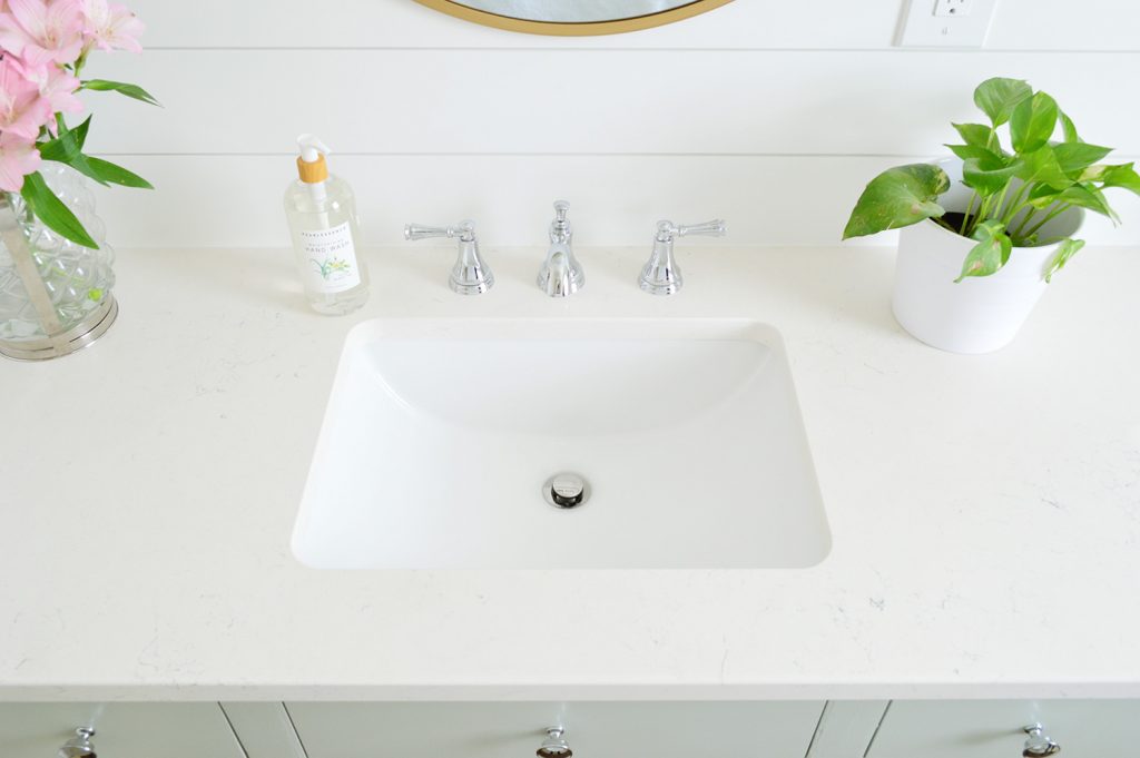
Oh and you can see that we chose a widespread faucet for each sink. It’s our favorite of all the bathroom faucet options because it looks so crisp and is super easy to clean when it doesn’t have the components clumped closer or sitting on a backplate that collects mineral deposits from the water. The faucets are $140 each, which isn’t nothing, but $280 for a totally elevated sink hardware situation to complement our new quartz counters felt like a good call – and we love the result.
New Cabinets
If you listened to last week’s podcast you heard me gush about this local carpenter named Billy who creates gorgeous new doors and drawers that he adds to existing cabinet frames (remember when he redid our friend Teresa’s kitchen as well as our friend Carey’s kitchen and her rental kitchen?! He’s a MASTER!). For anyone local to the Richmond, Virginia area – here is his contact info: Harper & Taylor Custom Woodworks, LLC (804-467-7014). Billy is the best thing that could have ever happened for the timeline of this room is that we somehow had the foresight to hire him in November to come measure the doors and drawers so he could start building them as we worked away on our bathroom. We just had bathrooms on the mind, and it felt like a smart thing to get rolling in the background since we figured we’d tackle this room next. Little did we know how much that would help our “ahh-we’re-actually-moving!” timeline a few months later!
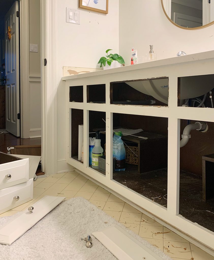
I’m sure if you listened to me say “new doors but old frames” on the podcast it sounded like some sort of cheap cop out or something, but the results are SO CUSTOM and SO ELEVATED!
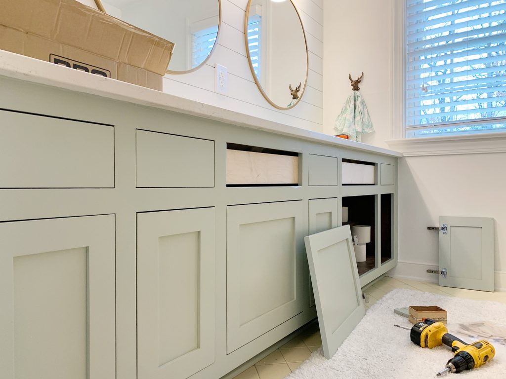
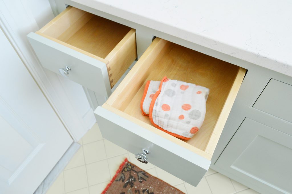
He spares no detail, makes new solid wood drawer boxes with dovetailed joints, adds new slides and hidden hinges as well as soft close doors and drawers, and creates a perfect and polished inset fit. They look like a million bucks! Plus you get to save yourself the demo and waste that ripping something out just to replace it with something else.
So last November Billy came over to measure all the openings and quote us for the 12 doors/drawers that we needed (yes, this double vanity is 8′ long! It’s HUGE!) and said it would be $750 for him to build all of those custom drawer boxes and doors. We screamed SOLD because it would be three times that much for a new 8′ custom fitted double vanity with inset doors like the ones he makes, and then we learned the rest of the process, which is pretty simple.
We were in charge of removing the old doors and sanding the frames smooth and priming and painting them the color we wanted (we just used a small foam roller – they’re super easy to paint because they’re flat). And we just had to email Billy the final paint color we chose (the exact brand and finish) so he could spray the doors and drawers that he was creating to make it a perfect match. And boy was it a perfect match. You’d never guess the frames are old and the doors are new!
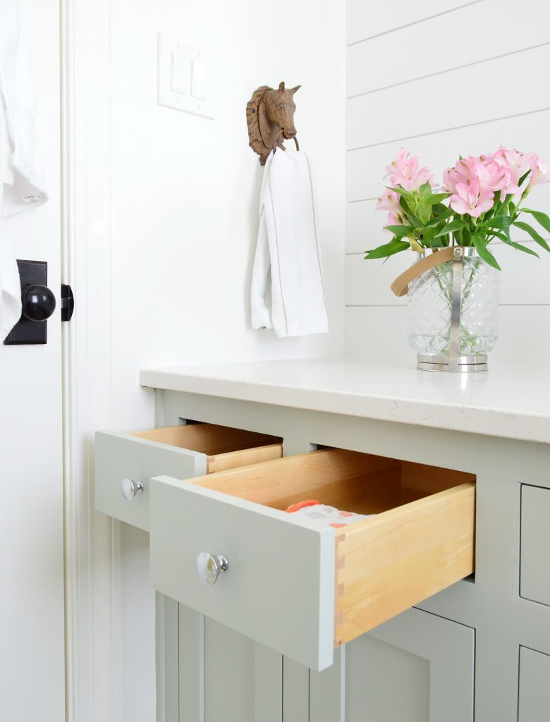
Especially because the drawer boxes are so so lovely. Solid wood, and look at those dovetailed joints on the side. We love that they’re all soft close too (so helpful in a kids bathroom to keep anything from getting slammed). We just couldn’t be happier with the way they turned out. We joked on the podcast that I’m already plotting ways to convince Billy to come to Florida with all of his tools for a vacation but also to help us redo the new kitchen or bathrooms – ha! He really is amazing.
Oh and as for the timeline of all this, although we ordered them in November, they take a while to craft, and Billy contacted us right around the time that we had been out to the stone yard to pick our quartz to ask what color we wanted him to spray them! So we literally picked this color about a week ago and then he called and said he could install them the day after our counters went in! Talk about a photo finish!
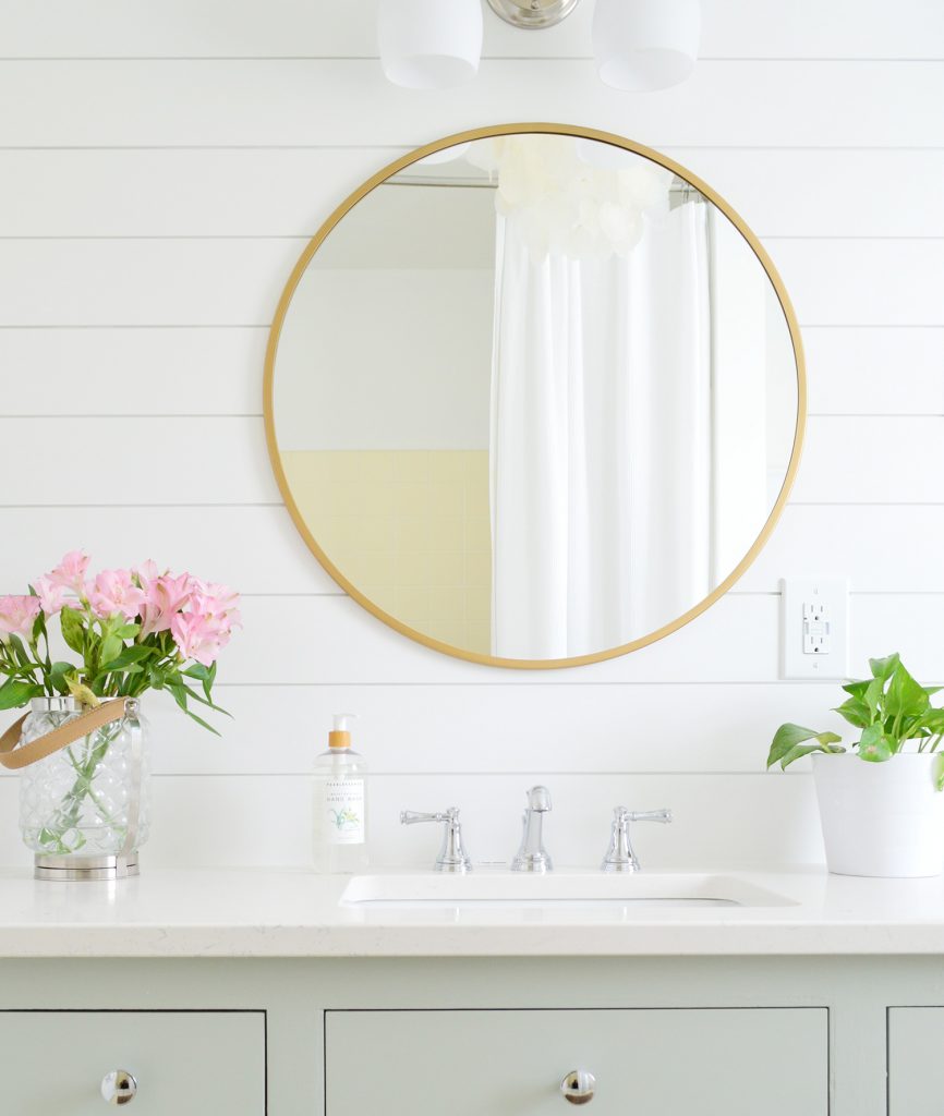
And speaking of the paint color, the one that we chose for the cabinets was Contented by Sherwin Williams (in a satin finish). It’s a very soft greeny-gray color with a tiny hint of blue. It’s soft and subtle and although we debated doing basic white in here (I mean for resale that’s always a super safe choice), since it’s a kids room and it has that soft yellow floor tile, we just wanted something a little more fun. It was a little nervewracking not to just panic and scream “SIMPLY WHITE BY BENJAMIN MOORE AGAIN!” we’re so glad because this feels like such a charming space now – and hopefully feels extra special to whoever buys our house too.
New Backsplash
Here’s where we changed our original plan for this bathroom after realizing that we were going to sell our house. For the last few years I thought a tiled backsplash on this wall would be lovely behind the vanity mirrors – like maybe white fish scale tile? But when we realized we wanted to fast-track this makeover and put the house on the market we made like Ross Gellar and screamed “PIVOT!”
The answer? A simple wood wall treatment that we’ve done before (for the duplex kitchen backsplashes). It’s SUPER AFFORDABLE but looks so crisp and clean, and it’s nice and wipeable, just like a beadboard backsplash. This time we actually just bought interlocking shiplap planks from the store instead of cutting our own, because the entire wall only cost us $90 and time was of the essence.
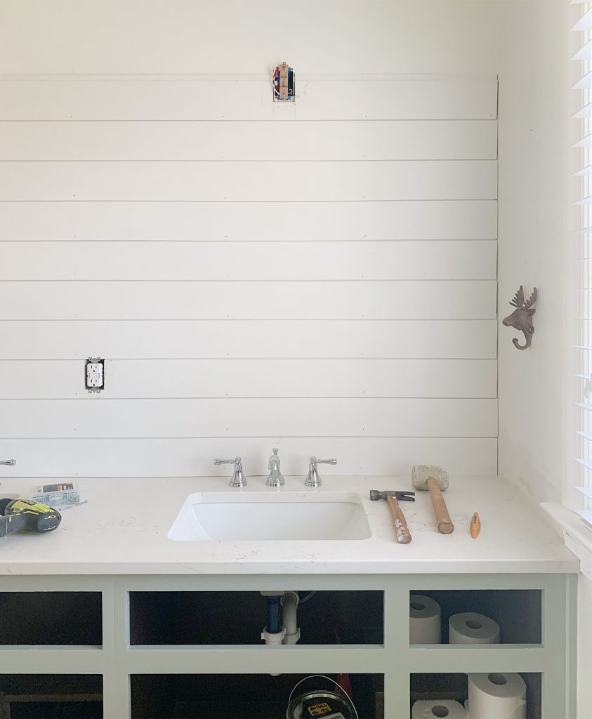
It’s super straightforward – just cut each shiplap piece to length in the store (Home Depot can do it!) or at home using a miter saw. If you have any obstacles like outlets or lighting boxes, carefully measure and mark those obstacles onto the shiplap board and cut them out using a jigsaw. Then use a nail gun to secure each plank to to the wall (find your studs ahead of time so you can nail into them for the best hold). When all the interlocking boards have been nailed in place, all you have to do is run a thin line of caulk vertically up the wall in each corner and along the ceiling crack and the bottom line where it meets the sink (we used silicone bath caulk for that spot to make it extra water-sealed down by the faucet). And voila!
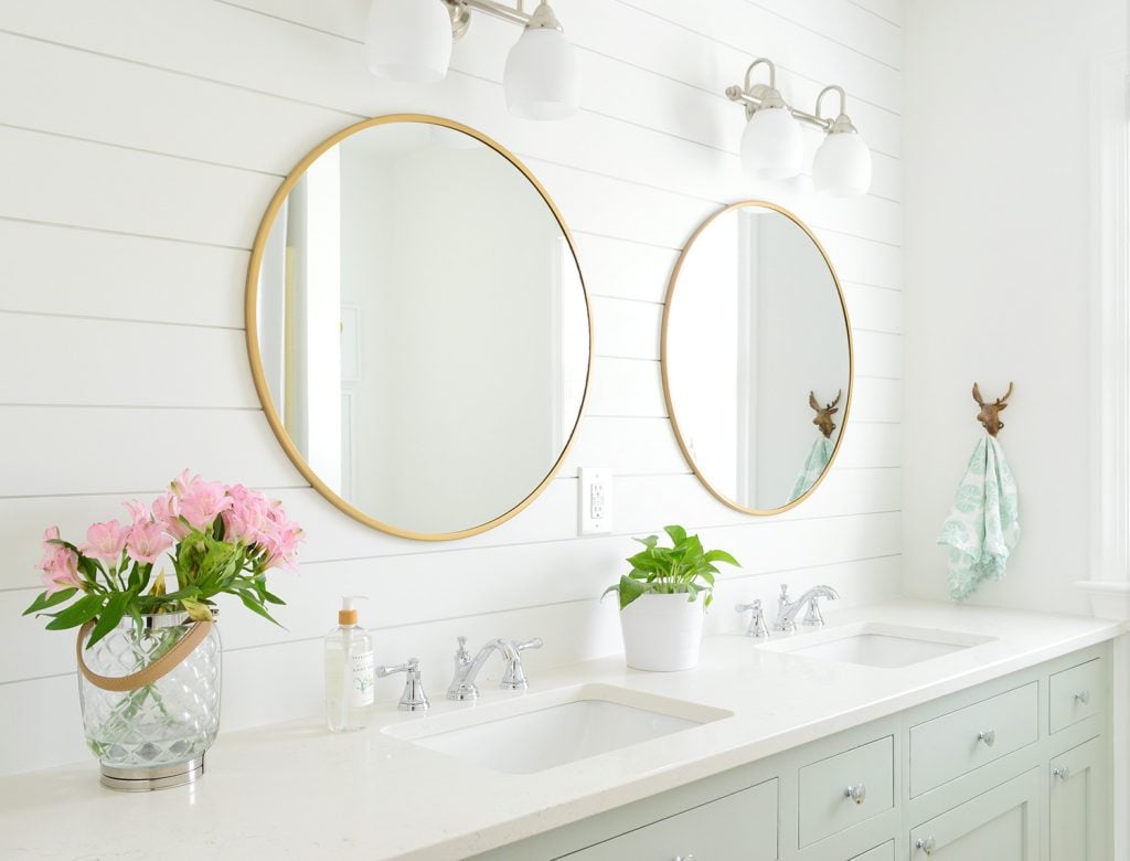
The nice thing about using this exact shiplap product that actually interlocks is that you don’t need to use any sort of spacers, and you don’t need to caulk the cracks between each board. This was a much faster route even though it was more expensive than our previous technique.
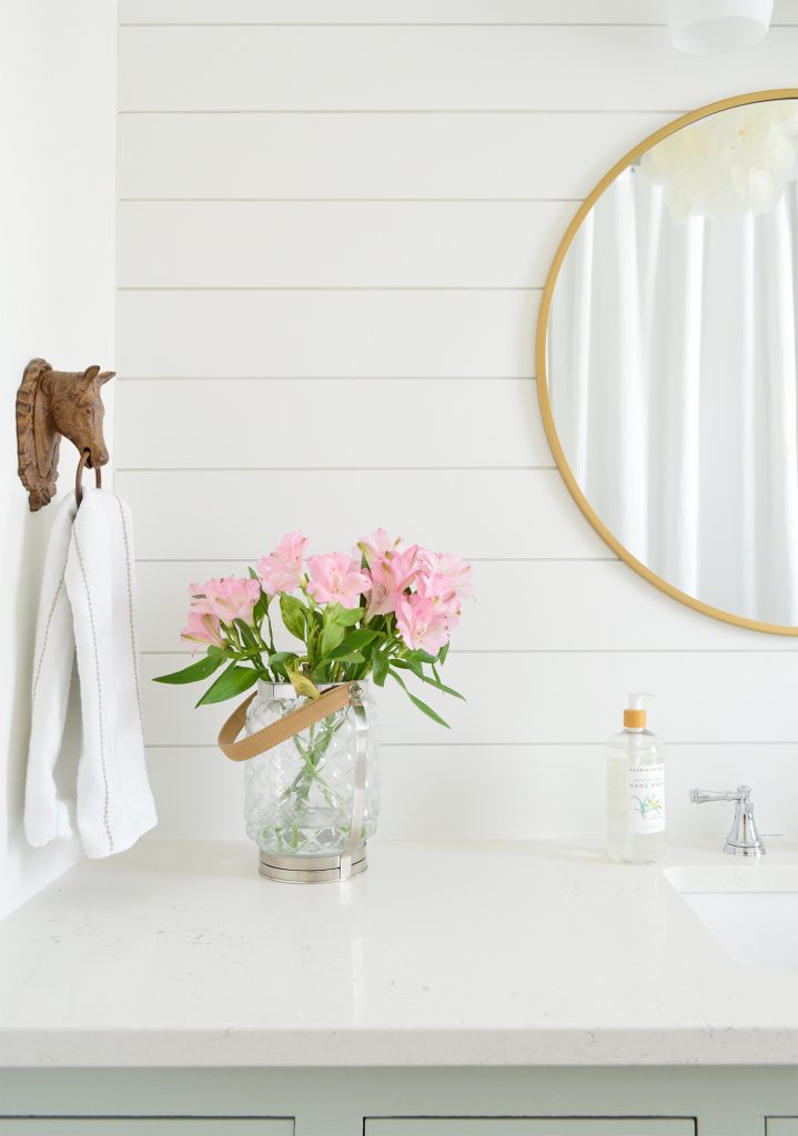
Oh and at this point in the project we decided to repaint the entire room a bit of a less warm white (we went from Simply White by Benjamin Moore to Extra White by Sherwin Williams). It looks so fresh and really brightened the whole room. We reused the existing lights and towel holding hooks on each side – but some new mirrors ($50 Target ones – we already had one so we just needed to buy one more) and new hardware on the cabinet doors added up to a completely new looking space.
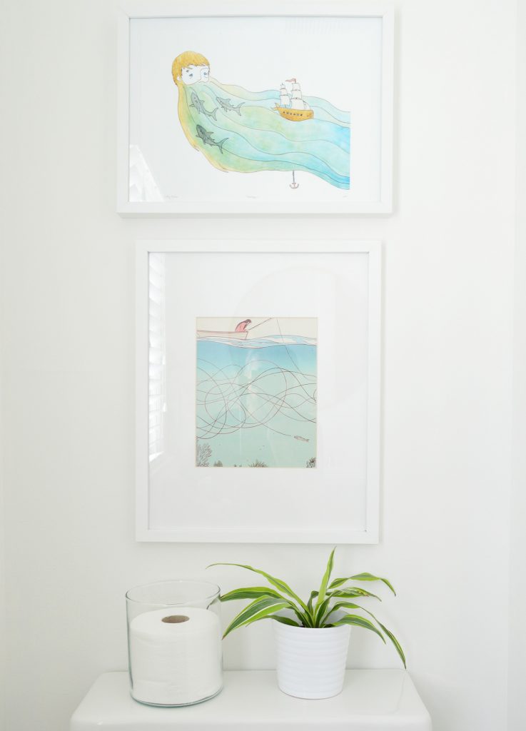
Oh and the art above the toilet! That has been in this bathroom pretty much since we moved in. They’re some cute ocean-themed prints we’ve had forever! I love that the one on top is a little wider than the one below it (feels a little less expected than putting the wider one on the bottom) and that bottom piece of art is actually a page from a magazine (Real Simple I think!) that I framed like 8 years ago!
We also updated the shower/tub handle since that used to be one of those crystal ball things and we just needed to ask them kindly to leave. That along with some fresh white silicone caulk around the tub and top/side of the tile helped revive that whole side of the room – along with the new white paint on those walls and ceiling.
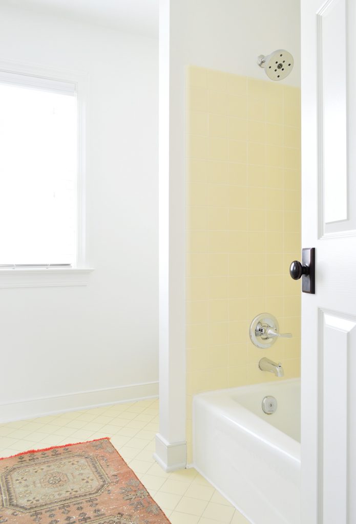
Oh and the rug in here is just stolen from our new closet since I wanted to give you an idea of what kind of rug I’d add if we were staying here longer. It felt weird to buy a cute little decorative rug for a bathroom a few months before we leave, especially since we have a white bath mat that we put down when the kids use the tub/shower. As a side note, I always put those bath mats away for showings whenever I stage a house so people aren’t stomping all over a white bath mat, which 100% of the time ends up looking so grody and bad. So this room feels ready for showings! Which is pretty dang amazing considering that about a week ago it had seashell shaped sinks!
The Budget
- 8′ Quartz Counter with 2 Sinks: $1120 (including install)
- New Cabinet Fronts/Drawers: $750 (including install)
- Cabinet Paint: $22 (Contented by Sherwin Williams)
- Cabinet Hardware: $42
- New Faucets: $280
- New Tub & Shower Handle: $79
- Shiplap: $90
- Wall Paint & Shiplap Paint: $42
- Mirror (already owned one): $52
- TOTAL: $2,477
Definitely not dirt cheap, but the entire room feels SO NEW! And we didn’t have to jackhammer anything or move any walls – and it came together so so fast! So under $2500 for a bathroom makeover with a huge quartz countertop & custom inset cabinet doors?! I’ll take it!

I hope this post not only shows how you can work with things you have instead of ripping everything out every time, but also demonstrates how a quick phase one update with just a gallon of paint and some new hardware and accessories can yield a MUCH MORE refreshed space for years until you can afford a deeper reno! Heck, it took us seven years to get around to this update thanks to the cheap tide-us-over step working so well for so long. And maybe you’ll like your phase one updates so much that if you don’t have two seashell shaped sinks taunting you, you’ll might just do that and love it forever!
P.S. To see some really low budget updates, here’s one that covers our $51 bathroom refresh with more vintage yellow tile, and here’s how we added board & batten to a hallway for $57.
*This post contains affiliate links, so we may earn a small commission when you make a purchase through links on our site at no additional cost to you.
