We were so happy to stumble upon Beth’s email in our inbox. Her retelling of her kitchen redo had all the elements that we love in a good renovation story: an ugly before (a brown fridge!), lots of DIY details (yesss!), a bit of drama (the counters arrived the day before Christmas, yowza!) and – best of all – a beautiful after. Here’s her note:
Hello, Sherry & John! We bought our current home a little over a year ago, and to say it was outdated is the understatement of the century. Like you, we wanted something to fix up and make our own. Our kitchen was dark, ugly, and closed in. No matter how often/well I scrubbed the fridge, it smelled like garlic, and the OLD electric stove/oven burned everything.
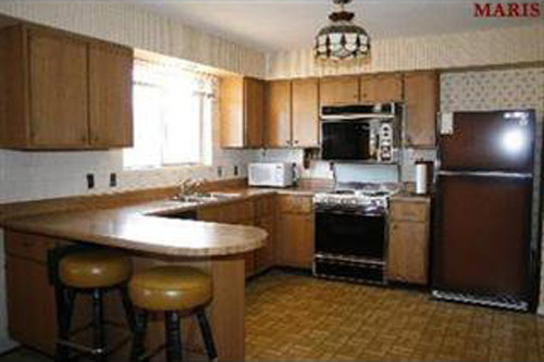
The first thing we did was remove the existing linoleum and carpet in the adjacent family room. We lived on sub floor for almost a month because while the floor was up we tore down a wall between the formal dining room and the kitchen. With 4 kids under the age of 10, and a dog, it was a challenge to say the least.
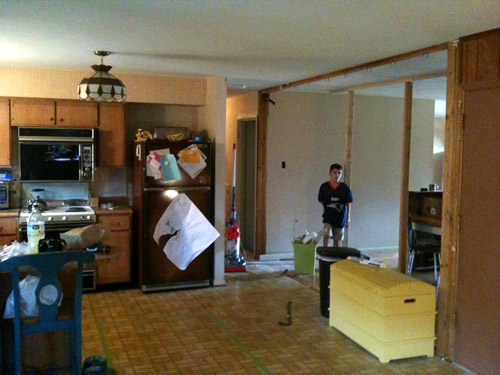
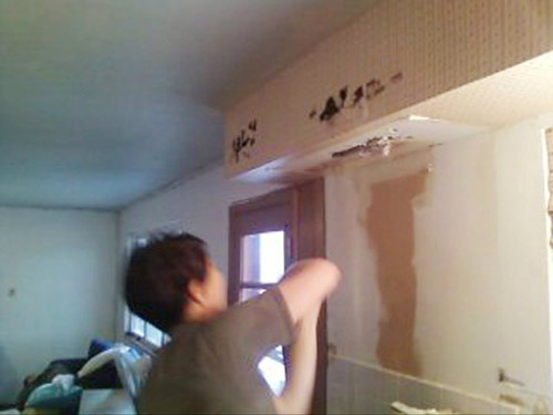
Finally, we were prepped to install prefinished hardwood flooring that matched the hardwood throughout the rest of the house. So, we ripped out all of the rest of the cabinets, demo’d the soffit, and installed the floor in a little over a weekend. Once the floors were in, we started installing cabinets that we had ordered from Home Depot. They’re technically ‘in-stock’ cabinets, but we had to order ours since we wanted 36 inch upper cabinets, and a few drawer configurations that they didn’t offer in the store for some of our lower cabinets.
Originally, I wanted to have my brother-in-law help my husband make concrete counters (he is a concrete finisher by trade) but we worried about the weight being supported enough, particularly because our island is pretty big. So, we went with Silestone counters in the color “cement.” The counters were installed the day before Christmas Eve (you can imagine my stress level!). My husband Jake installed a marble subway tile backsplash that goes all the way to the ceiling.
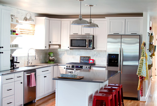
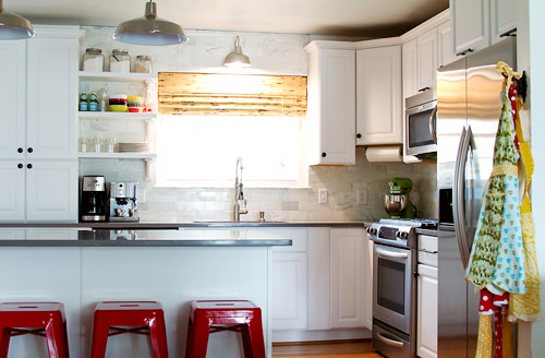
Obviously, we got all new appliances (Kitchen Aid). The lighting is warehouse lighting and an outdoor light. The red counter stools are from Overstock. The open shelving was made with bits and pieces that Jake found at Home Depot. The corbels were actually ordered from the same company that we got our cabinets from.
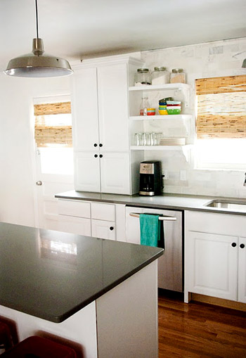
The whole project took more time than I had hoped for, but with four littles and Jake and I doing all the work ourselves, that is to be expected. I still can’t believe that this is my kitchen! Hope you enjoy! -Beth
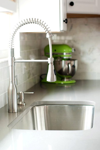
Thanks so much to Beth and Jake for sharing their beautiful kitchen! You can read and see more about the project on Beth’s blog. Didn’t they do an amazing job? It doesn’t even look like the same room. Let’s play the favorite part game (Sherry and I both picked those killer stools). I have to admit they’re giving me some ideas for ours…

Lauren says
Gasp! Beth! I thought the “after” picture was an inspiration photo you pulled from a magazine. It looks AMAZING! Love love love it.
Monique says
It’s hard to believe that it is the same space!
I don’t think I could play the favorite part game… I think the whole kitchen is beautiful!
Amy says
Wow! I’m willing to bet she lives in a raised ranch/split entry home. I have the EXACT same kitchen layout in my house, and seeing her “after” shots is giving me some ideas about potential transformations for my own kitchen. I never would have thought to get rid of the wall or switch out the breakfast bar for an island. It would really open up the space in our dark, 1973 home. Awesome job, Beth!
Michelle Wilcox says
Anyone have experience demoing a soffit? I have one like in their original kitchen and I would LOVE to get rid of it but I’m afraid of messing up the house structure, electrical, etc. I see them being demoed a lot in kitchen makeovers. What is their purpose? Are they usually hiding something structural or are they just for design? I really love their makeover and it makes me want to redo my kitchen even more!
YoungHouseLove says
Sometimes they’re for hiding ductwork or electrical and other times they seem to just be there for no reason! Anyone have more info for Michelle?
xo,
s
Randa says
In my parents’ basement we always thought one held ductwork, but a little exploratory test hole showed that it was empty. Perhaps the ductwork was moved at some point by the previous owner, in their case. Or a soffit was installed for no reason, though I can’t imagine why.
One possible idea is to slowly make a small test hole in a place that’s not overly visible. You would hear the metal when you first poke into the drywall, if there is ductwork.
Then of course, you could chat with some experts at a home improvement store, for more input. Hope it helps!
Beth says
We did have to move the vent pipe for the plumbing and some wiring. Luckily, we have friends who are licensed professionals in both areas. They helped Jake get the job done properly. It wasn’t a tough job, but they were things we didn’t want to have problems with down the line, or have safety issues with. Yikes! I have also been told it was a trend back in the day. Anyone know if that is true?
Alina says
I heart that kitchen!
Sarah B says
I seriously thought the “after” pic was going to be a pinterest inspiration – had to keep reading to realize what a great job they did! Totally going to add this to a pinterest board right now.
Kristi @ Addicted 2 Decorating says
Lovely! What a day and night difference. I love how light and sun-filled the room is now without all of those dark elements soaking up the light. I also really like the light over the sink (I have the same one outside by my front door, but I really like the look inside) as well as the inexpensive warehouse lights over the island (I used that same light in a client’s kitchen remodel…they’re super inexpensive but look fantastic). The red bar stools are the icing on the cake!
jeannette says
uhm, backless stools are a big problem for children, old people and the handicapped. they also kill the backs of the young and healthy.
YoungHouseLove says
Just one of those personal preference things! If they work for her family and they only sit there for quick snacks they could be perfect for them!
xo,
s
Beth says
My daughter, who is 7, is physically & mentally disabled, and it is actually much easier for her to navigate a backless stool. We were actually going to get the ones John & Sherry just purchased, but ultimately went with what would be better for Betsy. Her physical & occupational therapists weighed in, too. :) Maybe down the line we will consider a stool with a back, but for now this works the best and is most functional for her needs. We mostly eat at the dining room table anyway.
Amy @ A New Old House says
Wow- beautiful job! And thanks for mentioning the countertop make & color- I’ve been looking for a “slate-like” countertop, and this might fit the bill. Will be checking it out!
candace says
Such a beautiful transformation!! The entire kitchen is amazing but my fav is the green apple kitchen aid mixer on the counter – too cute!
LauraElle says
Where’d they put their kids so they could demo cabinets, a sofit and the old flooring AND install new hardwood?! Their DIY mojo is mighty!
Beth says
Haha! They were here the WHOLE time. Let’s just say we consumed lots of coffee & red bull, and worked into the wee hours! Luckily, they’re pretty good kids, and didn’t make it too tough.
Jennifer says
One of the best kitchen reno’s I’ve ever seen!
Meg says
I also love concrete counter tops – so the counters are my favorite – but seriously? this was DIY – it’s incredible!
Alexis Peck says
OMG!! im dreaming :)
Alyssa says
What a hideous before picture! But the end result is beyond beautiful. I love love love the pops of color. Great job Beth.
Sheena says
Amazing!!!! But you know what’s even more amazing? The post she shared on her homepage (Thoughts) & then Betsy’s story!!!
Definitely brought on the tears! Thanks for sharing her fabulous kitchen.. that led me to such a touching story. Everyone should read it. :)
YoungHouseLove says
She’s amazing, right? Inspiring in more ways than one for sure!
xo,
s
Beth says
Awww, shucks….thanks!
Michele says
What a transformation! It turned out so smart and looks highly functional. I know I’d have fun in there!
Beth says
Hi, all! First of all, wow! Thanks, YHL for the feature. I had no idea until I opened my flooded inbox! Ha!
The floors are pre-finished hardwood. Red oak to match the existing newly refinished hardwood (by the previous owners). We just happened to find a brand/dye lot that matched seamlessly. We borrowed a friends hardwood nail gun, and agent to town.
The counter tops are all the same color. They are silestone, and I believe the color is cement. I can double check, and let you know for sure.
Thanks, again John & Sherry! And thanks for all the comments. Can’t wait to see the ‘after’ of someone else’s kitchen. Wink, wink!
YoungHouseLove says
Haha, of course we had to feature your amazing kitchen! Consider it a hiday surprise!
xo,
s
Ali says
I want it. All of it. Amazing transformation!!!!
Reenie says
WOWZA!!! Beautiful. Love the lime green mixer and red stools. =)
emma says
I thought the first after picture was the ‘what we want it to look like’ picture. amazing!! i’m digging the marble tiles and open shelving!
julianne says
I was on the phone while looking at this post and I literally thought the after photos were pictures they had used for inspiration. That kitchen was completely transformed. Amazing job, Beth & Jake. Thanks for sharing and YHL–I LOVE THESE POSTS! So glad the Reader Redesign feature has now become a constant fixture on the blog!
YoungHouseLove says
Aw thanks Julianne! So glad you’re enjoying them. We’re happy to have them back too. Inspiration is a powerful thing!
xo,
s
Jenna at Homeslice says
beautiful redo! I love her counters, floors, lighting, and sink faucet (so pretty much everything..) Great job Beth!
Amanda McCann says
Absolutely Gorgeous!!!!! The renovated kitchen looks like it’s from a magazine! Beautiful job! I especially love teh red pops and the cabinets are to die for!
Devon @ Green House, Good Life says
What an amazing transformation! The only thing that’s the same is that skinny wall next to the refrigerator! Great job, Beth!
Hailey says
Totally awesome and inspiring!
My favorite is the marble subway tile back splash. I’m kind of obsessed with marble timle. :/
Jasmine says
Beautiful-gotta love those white kitchens!
Paula M. says
WOWeeeeee!!!!!!!
The re-do looks WONDERFUL. What an amazing change, from dark, dreary and depressing to light, bright and stylish.
Fabulous job!! Kudos!
One QUESTION: if they got a good deal on the subway tile and the counter, I’d love to know from where. I’m pricing similar materials for a bathroom remodel. (Can’t go wrong with subway tile, is my thought.)
Thanks!
YoungHouseLove says
Here’s hoping Beth can stop in with that info for ya!
xo,
s
Beth says
The marble subway tile was by far the cheapest at Home Depot. We priced quartz counters (silestone) many places, and found the most affordable price at a locally owned kitchen store. It was almost $2 a square foot cheaper.
Wrenaria says
Lovely. It’s pretty much what I want – white cabinets, dark countertops, wood floors, and an island. Perfect.
Love the splashes of bright color too.
Amy in PA says
WOW! Their before floor was the same one my parents had in the house I grew up in. What memories!!
mp says
Did Beth and Jake choose thermofoil cabinets? I’d like to hear their experience with how they wear, as kitchen designers have told me bad stories. No indication on their blog.
I also have the light they use over the sink — I put it outside, over the basement door. Great idea to use it inside. And I’ve seen those wide pendants at Lowe’s — was seriously considering them until I saw a new and different one that looks a lot like pricey House Beautiful-types kitchen lights (for less than $50).
YoungHouseLove says
Here’s hoping they stop in with that info!
xo,
s
Beth says
They ARE thermafoil. I can tell you that in our old house we had painted existing oak cabinets, and they were great, but my mom an dad have had KraftMaid (?) thermafoil cabinetry for years with no problems. I am told modern day thermafoil doesn’t yellow like they may have in the past. I’m not sure we would have gone that direction if it weren’t my parents’ and some friends’ positive experiences. Good luck with your choice!
heyruthie says
i’m so glad to see you featuring Beth’s kitchen. i’ve followed her blog for a long time. not only is her house tres cool, but she’s an awesome Mom too. thanks for brining one of my favorite bloggers (along with y’all!) to your site.
Tia says
LOVE this kitchen. I have always wanted a white kitchen and this is perfect! Did I metion I love it? Yes? Well I do =)
The counter tops are so nice and sleek, but still feels so inviting. Such a bright space and the red stools are a great additon.
Rebecca of Beck's Chic Life says
I love a white kitchen, but the pops of color and the natural shades really have me rethinking my “All white dream kitchen”.
Jo says
The counters are my favorite part. Cement colored silestone. Genius!
Trina says
I love all the litte pops of color in the kitchen! Also, you can barely see but I love the baskets & organization on the wall next to her hanging aprons! Would actually like to see a close up of that part of the space…. Those RED stools are pretty awesome too!
Alyssa says
There’s NO way that’s the same kitchen. Period! ;)
Violeta S. says
This is beautiful! Very good job! I love the faucet and the marble tiling :)
Shanna says
Wowowoowow. Wow. I love, adore, covet this kitchen. What a beautiful space!
Stephany says
I just had to laugh- I totally just pinned that kitchen recently- because of the stools!!
Now that I have seen the before and after- WOW I love it even more.
Jeanne says
Gorgeous kitchen! I also love the pops of color and especially the lime green KitchenAid! I have that same brown fridge, but I like it – as it fits in with my retro kitchen and walnut cabinets. I would love a more user-friend bottom freezer stainless model but will use mine until it dies. :-)
Amelia says
AH! I totally saw that ‘C’ on Clara’s door at Anthropologie yesterday and thought, “I bet John and Sherry would love that for Clara’s room.” I guess you beat me to that thought! Haha.
rachael says
You had me at marble subway tile. Beautiful kitchen!
Melissa says
OMG, no way! This looks beyond amazing!! I can’t even believe it is the same house. Wow.
Sami says
I too thought the first “after” was an inspiration photo… it looks amazing!! I’m getting ready to makeover my kitchen and had a question – how did you decide when/where to use the long handles versus the knobs? I see the pull handles over the appliances, but knobs on the rest of the uppers, and both mixed on the bottoms as well?
Beth says
The knobs are on all cabinet doors except over the microwave and fridge. Those doors, and all the drawers have the long handles. No rhyme or reason. My mom hates that. ;)
Jessica says
I LOVE LOVE LOVE this kitchen! Her kitchen is roughly the same layout as mine and I love the remodel! I think I may just have to hijack her ideas- complete with the red stools! :)
Jenna says
Wow, wow, wow! I can hardly believe that’s the same room! Beth and her hubby did a fantastic job! I love that little bit of open shelving {I’ve been contemplating that idea for my kitchen}.
Aron says
Love the marble subway tile, the stools and the apron hook. I bought a light from Schoolhouse Electric to match an existing milk glass fixture during my kitchen reno. Their fixtures are great quality. Highly recommend.
Louise says
HOLY CANNOLI!! WOW WOW WOW!! It doesn’t even seem like it’s the same kitchen!! Totally worthy of being in a magazine! Even better, knowing that one couple did this by themselves…let alone with their 4 KIDS to watch over!! INSPIRATIONAL!!
Erin M says
What a fantastic redesign! Thanks for featuring it. Our kitchen is slated for an upgrade (hopefully soon) and has the same soffits making it cave-like, the same linoleum in the house, and pretty similar wallpaper. I’ll be pinning this for inspiration when the time comes!