When Kathy sent us her kitchen makeover pictures we had to wipe the drool from our chins. Here’s her letter:
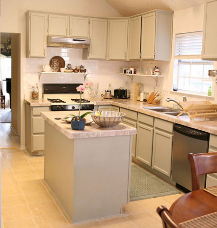
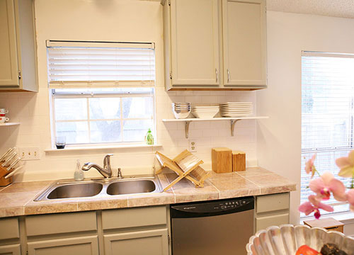
I just wanted to send you some before and after pictures of our recent kitchen redo. I love reading your blog and all of the updates keep me inspired. In fact, we were inspired by your “how to” section’s tutorial on painting cabinets. Instead of replacing our kitchen cabinets (we considered going the Ikea route), we decided to paint the pickled whitewashed facade a chic and solid gray tone (Fieldstone by Benjamin Moore- the wall color is Winter White also by BM). We then hired someone to do the following: raise the cabinets to the lowest part of the ceiling, install a new sink and faucet and exhaust fan, tile the backsplash in a white subway tile, tile the counters in a gray marble, and install a white shelf where the bottom of the original cabinets used to be. We saved gobs of money by using tile marble instead of a big slab. We also took the original brass hinges and spray painted them silver instead of spending $150+ on new hinges. The entire cost of the redo wasn’t cheap, but it wasn’t budget breaking either–materials and labor ran us around $1600 (the sink, exhaust fan, backsplash tile, counter tile and white shelves were all from Lowe’s). You can check out some extra details on our blog. Thanks for looking! – Kathy
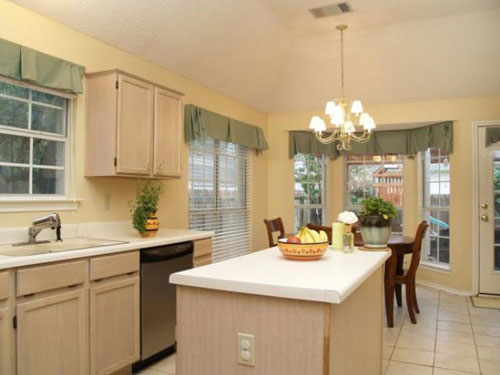
Here’s the kitchen before the makeover:

And here’s the same space after the cabinet painting/rehanging, the new sink, the new backsplash and tile counters and the shelf installation under the newly raised cabinets:


Isn’t the difference just miraculous. At first glance it seems similar in tone, but the feeling of the newly transformed space is so fresh and crisp and charming as opposed to the builder before. And the raised cabinets and new stone counters really make the entire space feel a lot more luxe and lovely. And last but not least, the price! New counters, backsplashes, fixtures, faucets and rehung cabinets can usually run in the $5000+ range, so Kathy’s budget-friendly makeover is that much more impressive. What do you guys think? Isn’t this kitch the bee’s knees?

Dinah Y. says
this is beautiful! i love the idea of raising the cabinets higher and adding shelves underneath. it makes the space seem so much bigger and expensive! <3 this.
Stephanie says
I LOVE it!!
I think it looks fabulous and as a shorty with cabinets to the ceiling anyway…there are always gonna be cabinets you can’t reach! So you just work with it and this looks way better than mine for sure!! I think it looks so fab!
I think some cute bamboo shades hung high to cover the wall over the window even with the cabinets would be a great finishing touch! No curtains by the sink to worry about.
Great job and thanks for sharing with us!
Mike and McGee says
We literally shrieked when we saw this makeover – Kathy and her hubby are friends of ours!! :) We love, love, love their kitchen!
Kathy says
Thanks for all of the comments! Just wanted to try to answer some questions about our update.
First, we’re totally fine with the fact that not everyone likes it! We don’t expect everyone to have the same taste as we do, nor do we expect in return to like things that others (or builders!) do to their houses. We’re not too concerned about resell value, because if the buyer doesn’t like it, they can just turn around and find 100 houses nearby in a similar price range with builder style cabinets. As a seller–being different may have some perks, and of course some drawbacks. We of course hope that when we do decide to sell, there will be someone else out there that likes our taste.
As for raising the cabinets. I fretted over this for a long time and lost a lot of sleep when they were first raised. But once it was finished, I immediately loved it. I’m 5’8 and my husband is 5’11, so we’re taller. But, I find that the things I use on a daily basis–plates, glasses, etc., are well within reach. I keep a step stool in the kitchen, but I definitely don’t use it daily. I have most of my kitchen supplies below the counter, and the upper cabinets have things like extra serving platters, fondue pot, etc. However, the best part about the cabinet raise was giving space underneath for big items like my mixer and opening up the space. The room feels so much bigger!
As for the color of the cabinets, the original photo doesn’t do it justice. The cabinets were pinkish, and the varnish was peeling off. It was pretty nasty. The new color (in my opinion) is much more calming. And yes, we will deal with the underside of the cabinets showing, we just ran into some unexpected financial business startup costs that ate into our money that we had set aside for that. Someday soon though!
Nicole says
It looks great—the finishing touch would be to replace the light fixture over the sink—the gold kind of sticks out like a sore thumb now—KUDOS to you!
Anna See says
This is lovely. My faves are the backsplash and the paint color on the cabinets. Great job!
Renee says
While the color palette is not my taste, I LOVE the change! I’m a shorty, too, and I regularly use a step stool or a chair from the kitchen to reach the top shelf in our low cabinets, but I only keep entertaining pieces up there anyway. The change definitely makes the space feel huge, which is really important in an often crowded space like a kitchen!
Amanda says
I have those same ugly pink-ish builder cabinets in my house and I can’t wait to do something like this in my kitchen. I think it looks fabulous and it’s even better that you did it on the cheap. So many people gut their kitchens and spend thousands re-doing everything, it’s refreshing to see a beautiful job done on a realistic budget.
Elizabeth says
I do really like the cabinet colors and LOVE the backsplash. I cannot believe they did all they did with that budget. Great job choosing what to update to stay within a budget yet get a very different feel in the kitchen.
I do not want for this to come across as being critical of the redesign but to answer a question posed by another commenter. We bought a home with a tiled countertop, and, after 18 months in our house, I would never ever tile a countertop. Ours is 4 inch tiles with more grout than this one. It is absolutely impossible to keep clean. You cannot just wipe down the counters. We always have crumbs in between tiles, and the it seems like everything stains the grout. I imagine if you don’t cook much it would be fine, and it can be a cheaper countertop option. I have a friend that also purchased a home with a tile countertop, and we both agree it is impossible to keep clean.
Chrissy says
Wow, that Cottage Living kitchen was like out of a storybook! How did she get herself a COPPER STAND MIXER?!? to match her copper stuff? *Awesome* !
I love the new kitchen here too- I’ve always felt that gray is a very calming color, and looks very sophisticated with silver and white.
Katie says
Hi, I randomly discovered your blog last week…….lucky me!! I’m quite smitten! I’m just wondering about the paint color on the cabinets, or something similar to it? My husband and I are hoping to buy a 50’s fixer upper, (we made an offer so cross your fingers for us!)and I’d love to do something similar in the kitchen.
In love with all you guys do!
Thanks so much!!!!!!!
Katie
YoungHouseLove says
Our best guess (which still could look quite different depending on your lighting situation) is Polar Frost or Olivetint by Benjamin Moore. In the end, bringing home a bunch of swatches and just seeing what looks best in your home’s light is the best way to pick a winner. Good luck!
xo,
s