When Anna sent us pictures of her family room redo, we couldn’t wait to share the major makeover with you before-and-after-lovin’ people. Here’s her letter:
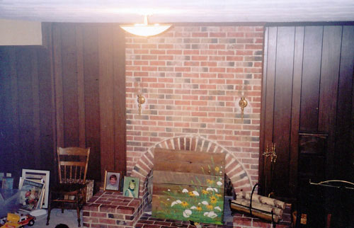
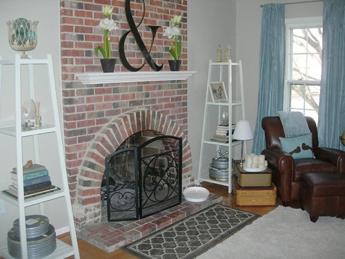
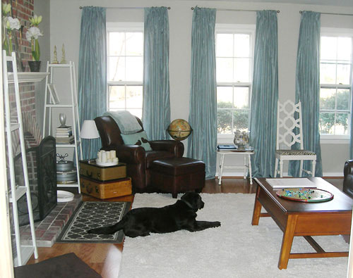
I thought you might like pictures of my 1960’s step-down family room re-do. The best part was getting rid of the textured ceiling and replacing the carpeting with wide plank wood flooring. Because the flooring is engineered wood, it could be applied directly to a concrete slab. We couldn’t commit to painting the fireplace, but we hoped that getting rid of the paneling and making a few other changes would lighten the room up enough to make it livable. The etageres next to the fireplace were found on your website and we bought them on clearance from JC Penney! Thanks! The pillows and rugs are from Target, and the white chair is a thrift store find that I spray painted and made a new chair pad for. I don’t really like the coffee table, and hope to find a new one soon. Have a great day! – Anna
Here’s the dark and dated before:
And the amazing after pics:
It’s unbelievable that a chair that once looked like this…
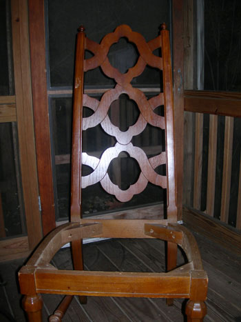
…was transformed into this showstopper with some spray paint and a new fabric cushion.
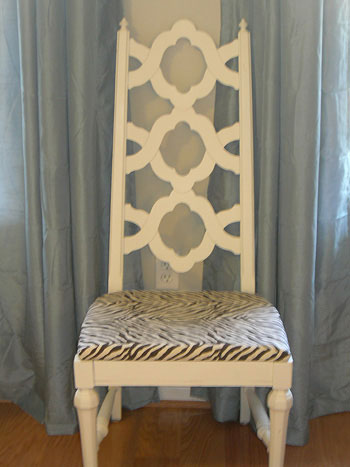
Deeeelicious. Thanks so much for the gorgeous pictures, Anna. Now everyone’s gonna be on Craigslist trying to hunt down a quatrefoil chair like yours. Including me!

Laura at Emmy Lu says
Oh oh oh! I just LOVE the big ampersand letter above the fireplace!
I am just amazed at the transformation! The room went from dark and cramped looking, to bright, airy and open. It is a complete breathe of fresh air!
Jenna says
Wowza, where did you get the Ampersand? I would love that.
Wendy says
Wow – great transformation! I gave you guys props on my blog today! Happy Tuesday! http://southernstuf.blogspot.com/2009/03/new-fave-blog-young-house.html
sarah says
WOW! Gorgeous transformation. Hopefully she can chime in with where she got that ampersand for the mantel–it’s awesome!
Samantha says
Wow, that looks great! I love the shelves by the fire place. This room looks really fresh now. Great make over.
Tam says
Wow..well done..
Allison says
Good before and after photos of transformations are so inspiring
heather s. says
I love the ‘after.’ I think the fireplace looks great as-is and wouldn’t touch it. The chair is amazing!
Katie says
Gosh, I can only imagine what the inbetween pictures must have been like. Did you and your husband do it all or hire some contractors to help? Either way, wow!
I bet you don’t miss that old ceiling one bit.
Katie
Sam & Jacci says
I love you guys. Anna, I love you, too.
We have the SAME dark wood paneling and a *hugemongous*, dark brick fireplace all on a concrete slab covered with… John and Sherry know what’s coming next…yup, pee carpet. (I’ll forever be remembered as the reader who kept talking about her stinkin’ pee carpet, won’t I?). BUT, you lovely, wonderful people give me all kinds of swanky hope with before and after pics like these!!! Look at that room!!! You would never know it had been so funky before!! Anna did such a fabulous job. My inner designer is very, very much encouraged by this post. Thank you! :)
Jacci
Anne says
Must have ampersand! Where did you get that?
ellis says
Wow, this is one of my favorite transformations! I think the brick on that fireplace is gorgeously incorporated into the final room. I definitely can see how John & Sherry painted their brick since it was sooooo dark and overpowering, but I think you made the perfect decision on this room. Thank you for sharing!
Kim says
Great job! I actually think the brick fireplace looks nice with the new colors.
JM says
I love seeing dogs in reader photos :)
Erin M.G. says
Lovely transformation! I love the colors and the mix of textures. I’m so glad they didn’t paint the fireplace. I believe people will regret that trend down the road.
Liz @ itsgreattobehome says
Love the chair!! I want to steal it for my very own. :)
DANIELLE FORTE says
IT’S BEAUTIFUL!!!!I LOVE ALL THE WARMTH.
WE HAVE THE SAME COFFEE TABLE AND ARE IN THE PROCESS OF SANDING IT DOWN AND PAINTING IT BLACK. WE GOT IT FROM POTTERY BARN, ITS THE PARKER COLECTION, 10 YEARS AGO!!!
Stephanie says
I love it! And don’t you dare paint that fireplace! I think it’s beautiful exactly how it is. The colors pop more against the white wall!
Denise T. says
Amazing transformation. The arched soldier course on your fireplace is a beautiful architectural feature in your room. You’ve played it up in all the right ways – well done.
Anna See says
Thanks for all of the encouragement! I needed it today since that disobedient dog in the picture just peed all over the new white shag carpeting. Oh well.
The ampersand was from a furniture store called Haverty’s– $100 marked down to $9.99.
The chair was part of a set I got for the dining room. 8 pieces for under $50 at a thrift shop. It was pretty gross trying to get the smoke smell out of them, but it was worth it. You can see the whole set on my blog. http://aninchofgray.blogspot.com/2008/11/give-me-staple-gun-ill-give-you-chair.html
Thanks for including me, Sherry and John!
Anna
aninchofgray.blogspot.com
stephanie says
PAINT PAINT PAINT the fireplace!! You will LOVE LOVE LOVE it!! I love mine everyday!!! painted every brick on my 50’s ranch, inside and out, and LOVE it!!
LOVE the chair re-do!! beautiful!!!
Tamara says
Love the ampersand, funny, I was just mentioning the other day how it’s one of my favourite symbols and I’ve been trying to think of a way of incorporating it into a corner of our home. Looks like I’m not alone in the ampersand love.
Missy says
Wow… love the big black lab too! We have one of those! :)
christy says
Love the transformation! Gorgeous. And I love your blog – I’ve never been here before – you have a new fan!
Kristin Campbell says
Looks lovely! Great Web site, guys…and such beautiful design! Love how down-to-earth you are…it’s refreshing to read your posts. Keep up the great work!
Kate says
Beautiful color choices. Love the chair, wow !
Ami Rae says
Leave the fireplace alone. It’s a fabulous character piece in the room. The room looks fantastic. Great job!
Heather says
Wow this redo looks fantastic!! I love the fireplace as is…. don’t paint it! I love what you did with the chair! It looks like something right out of a West Elm catalog.
Blayne says
Wow gorgeous! That chair is amazing. I never come across anything that cool at thrift stores. Great job and I think the fireplace looks 1000% better with all the other improvements whether or not you paint it.
SarahS says
This redo is amazing. Totally made my morning! Thanks for sharing!!
SoBella Creations says
What a fantastic transformation! I love it!
Ann-Marie says
Beautiful! These pics make me wish we’d taken before and after shots of our apartment (Before: plain, nearly empty bachelor pad. After: colorful, homey newlywed nest). I’d love to see before pics of the rest of this room, too.
Meredith says
Anna–I’m not sold on painting the fireplace, but I DO think you should paint your coffee table white. I think the sturdy structure looks great in your space, but I’d love to see it lightened up!
bungalow_bliss says
Wow, so fresh and airy! I love that you didn’t paint the brick but still achieved this look. So, so nice!
Melissa E. says
where did the curtains come from? I’m looking for a similar color…your new room is beautiful!!
Jill says
I love the way the mantel looks now and that chair… speechless. I love the whole look of the room. Amazing and so inviting!
Katie says
Do we know where she got the curtains? Did she have them made? I love the color!
Kellie says
Beeeeeeeea-U-tiful!
I am PRO painting the fireplace, myself. However, it still looks great with all your other changes. Either way you decide, the room will look amazing.
Great job!!
YoungHouseLove says
Hey guys,
We’ve dropped Anna a line to let her know that there are a few questions about her space over here. Hopefully she’ll pop in with the answers asap!
xo,
Sherry
Julia @ Hooked on Houses says
That makeover is amazing. Great job, Anna! Hard to believe the “after” is the same room as “before.” :-)
melissa says
Wow, I love, love, love the details that come out in the chair now that it has been painted white. I’m not always a fan of covering natural wood with paint but this is one of those times it makes the piece look much better. Congrats on a great room.
Brooke says
I hope I’m not repeating a question here! Where did you get those amazing shelves?
The room looks great! I love how the fireplace stands out now!
YoungHouseLove says
Hey Brooke,
The shelves on either side of the fireplace, also known as etageres, were actually from JC Penney a while back. We posted about them when they went on clearance and Anna snatched them up for her space! Here’s the old post with the link, although they might not still be available:
https://www.younghouselove.com/2008/05/penney-pinchin/
If not it might help to google “white etagere” or search Target or JC Penney for an “etagere.” Hope it helps!
xoxo,
Sherry
Anna See says
Anna here!
The paint is Benjamin Moore HC-82 (Bennington Gray). The curtains are from Target– Color: Rocky River. Super Cheap. Both rugs and the bird pillow are from Target, too. The coffee table was from a thrift shop. I love Meredith’s suggestion to paint it white. BTW, my favorite spray paint color (as seen on the chair and its 6 buddies I painted) is Heirloom White “Painter’s Touch” by Rust-oleum. That’s a whole lot of fun in a $3 can. I love Young House Love and I can’t wait to see more transformations here.
P.S. The worst part of redoing this room was getting rid of the textured ceiling. I got it tested for asbestos and found that there were trace elements of asbestos(less than 1%), but that still counted as asbestos. It looked like a scene out of ET here– men in space suits, etc. to get rid of it. While most of this room was done on the cheap, that part was pricey.
Marissa says
So great! One more question… did yo uend up replacing the light fixture as well?
Anna See says
Yes, we just got a plain burshed nickel fixture from Home Depot.
Anna See says
Oops! I meant brushed nickel, not burshed nickel.