When Jen and Erik sent their toddler-friendly entryway makeover our way we had to share their genius transformation. Here’s their letter:
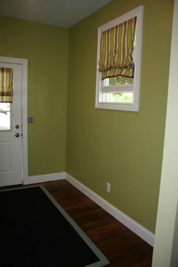
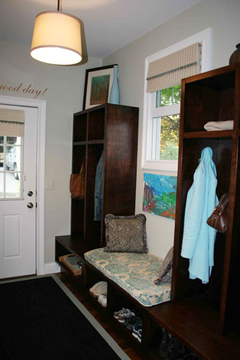
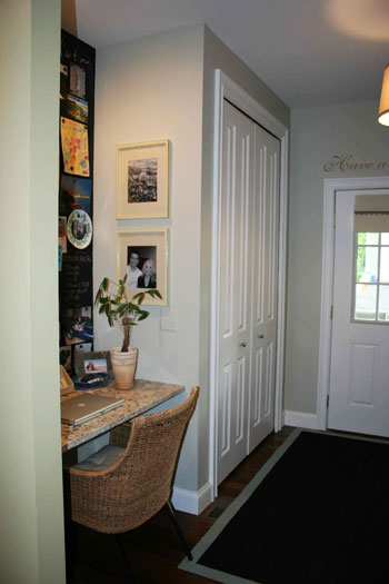
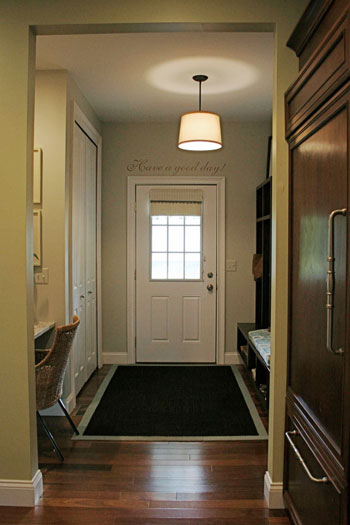
I just wanted to let you guys know how much we love your site. It’s funny because in a lot of ways you remind us of ourselves. People think we’re nuts doing all we do around the house. We thought once we had a baby we’d be done- but nope, our son just inspires us more, as is the case with our new mudroom. The space was once green, which wasn’t bad but looked crazy with all the colorful art we were trying to bring in. So we decided to lighten it up with Glidden’s Quiet Light. The saying above the door was inspired by our two year-old again (he says “have a good day!” to anyone leaving the house). Just seeing it makes us smile! Then there’s the case of the lockers I loved from Pottery Barn and begged Erik to make for us because I didn’t want to spend all that money. Boy, did he- and for a steal too – $250 total. The bench on the lockers doubles as a pet bed and a place to sit down when taking off shoes. The rug is from Flor.com. It was our one splurge at about $150, but the tiles come up and can be washed in the sink if there are spills. We used magnetic primer above the desk, covered with 2 coats of chalkboard paint to create the magnetic chalkboard to display Jack’s art. The bench cushion was made for $30 with fabric from JoAnn Fabrics and two coupons for 40% off from each of our parents’ Sunday papers. The canvas is recycled from the basement. I helped our son Jack paint it with tempra paint using his feet, the palms of his hands and even his nose at one point! The blinds are el cheapo Target blinds. We paid $41 for the pair and then hot glued fringe on them make them look more custom. Lastly lighting is a recycled pendant light with a $15 Walmart shade. Our son, Jack seems to really enjoy the room and so do we. Keep up the great job on the site! -Jen and Erik
Here’s the room before its two-year-old-inspired makeover:

And here’s the I-can’t-believe-that’s-the-same-space after:


Isn’t that a stunning little entryway makeover? We love how Jen and Erik were so inspired by little Jack (the quote above the door is so sweet, and we love the personal meaning behind it). What do you guys think? Isn’t this a great use for an old hallway that needs to step it up in the function department? And the fact that they made those lockers is beyond amazing. Thanks so much for sending your fab before and afters our way Jen and Erik! And be sure to give your little guy a high five for his awesome art work.
Psst- Don’t forget to check out Jen and Erik’s brand new blog right here for more amazing eye candy…

Jennifer says
They did a fabulous job re-creating the Pottery Barn locker look! And the desk area is great! Thanks for sharing!
Have a great week!
Rebekah says
That is super stylish and cute! I’d love to see an overall shot of the desk area, though — love the magnetic paint, chalkboard paint combo.
Sue says
I couldn’t agree more. The quote above the door is my favourite part I think – something so simple that will send you (and loved ones) on your way with a smile
Jessie (Vegan-minded) says
What a great makeover! I love the built-in features, especially the little computer desk :)
Lesley says
Love this makeover. I just finished painting my living room that green color, now I may want to change it. I wish I had a gerat area like this for a mudroom.
Kate says
Great transformation! I love the entire look – the PB inspired locker turned out very well and I love the new light fixture.
Molly says
I think AWESOME sums it up very nicely! The lockers are amazing!
Anna See says
I absolutely LOVE this. I would love a space like this in my home. It is so warm and inviting. Love the light fixture, too.
Jenny @ DIY Newlyweds says
Wow, I’m jealous! That is a beautiful entryway. The lockers are amazing, but I’m in love with all the personal touches like the magnetic wall for Jack’s artwork.
In the last photo, is that a gorgeous kitchen cabinet sneaking into the picture? If it is, I’d love to see pictures of that kitchen too!
Amy says
Love the lockers and the color stain! Hope Jen drops by to let us know what color she used…need to stain an entryway table my father in law made me that color to match our living room furniture! Everything at the store to me is either too red or too brown or too light!
Barbara says
This is fabulous! I’d love to know how to paint a phrase on the wall like this.
Amanda in Boston says
This looks just great! It turned an unused space into something functional! I’d love to see the rest of the house if this is just the mud room! :)
Kasey at Thrifty Little Blog says
What a great space! I love all of the diy elements like the lockers and paint detail.
Lauren says
Love this! The quote is the best part!
YoungHouseLove says
Hey guys,
So glad you’re loving our latest Reader Redesign. Here’s hoping Jen and Erik stop in to answer all of your questions asap! Stay tuned…
xo,
s
Janell Beals says
They did an outstanding job, looks like every bit of space is taken advantage of.
Janell
Nicole B. says
NICE! I am now seriously considering getting rid of our tiny dining area and doing this. Although the “where would we sit to eat” keeps breaking into my dreams :)
LauraC says
WOW!!!!!
kelly@TearingUpHouses says
those “lockers” turned out beautifully! and the meaning behind the quote is very, very sweet. also, the fact that they managed to squeeze a desk in there is fantastic!
kelly
Jessica says
Would love for them to post the materials used to make the locker!
Heather says
Any idea what the wood floors are by chance?
Amanda says
It’s beautiful!!
cshteynberg says
Yes! Is there any more DIY information on the lockers–how they put them together or a cost breakdown?
Sonja says
Awesome result! The fact that her husband made the lockers makes the finale even more brillant. consider me inspired!
Kinga says
WOW! This is awesome, I love every detail of it! I was just looking at the same lockers on PB this weekend and they are pricey. Could you post instructions how you build the lockers by yourself? Thank you. Kinga
CarMaj says
Absolutely beautiful and functional – better then Pottery Barn if you ask me! Love the FLOR carpet too! Awesome job!
Rachel says
My entry way needs a little pick me up! Thanks for the inspiration…
Danielle@ Newlyweds Paradise says
Aww….so cute!! Perfect for growing kids!
Tasha Schifo says
I too would love a tour of the rest of this adorable home.
Chelsea says
I am in love – what a great transformation. I wish our backdoor or even entry was arranged differently so we could have a built in this lovely! Thanks for sharing.
Chelsea
Jennifer says
This is a GREAT redesign!!!!
Jocelyn Stott says
Wow – that looks amazing and so cozy!
Lindsay says
My jealousy is seeping through my pores! My house doesn’t have a “mud room”. You walk right into the kitchen from the garage. Needless to say, that when I see a gorgous/useful one I am green with envy! What a beautiful room. Love everything about it!
Meghan says
I love this redesign! The color is delicious!
Sarah @ Dream In Domestic says
Wow, I would love walking into a home with that entry way every day! I absolutely adore the magnetic chalkboard paint treatment above the desk. It looks so great and is very functional too!
Amy @ Rennovation Innovation says
What a fantastic use of the space. Irs amazing how they turned the long non-functional entryway into some beautiful. I especially love the little desk area – any more pics of that?
Jen says
Thanks guys! That is so nice! I will ask Erik to stop by and answer the question about the stain.
The words were so easy! They are vinyl. Check out http://www.wallwords.com/ .
They allow you to personalize your space easily and the best part is the words easily come off with tweezers. :) Jen
YoungHouseLove says
Hey Jen,
Thanks so much for that info! Looking forward to Erik dropping in with the stain info too!
xo,
s
Jenny @ Making the Most of Money says
Gorgeous! I love it! I’ve always wanted an entry way so that I can install those cute little locker/cubby things for coats. And the tiny desk in that nook is brilliant! I love the way it seems so much richer and more welcoming now!
Briel K. says
What a great makeover! I love the new paint and dark wood. Looks great!
Candied Fabrics says
Yup, love it! NEED it! If they feel like sharing info on how they built the lockers, I’m sure I’m not the only one to be interested!
Tegan and Tage says
Nicely done! I like the “toddler friendly” aspect too, since we now have a little one who is crawling…
:::Lyzz::: says
What a stunner. Love it!
Carmen says
What a great space! I’d love to know how they did the lighting fixture too.
karen@strictlysimplestyle says
An excellent use of space.
Natalie says
Gorgeous! Do Jen and Erik have a blog? I’d love to find out where they purchased their rug! :)
Katherine V says
It’s like a designer showhouse – I love it. One thing I would love to know is – Is the color I see peeking from your kitchen the same color as the mud room? If not, would you post the name of that one?
Thank you!
Jennifer S. says
I love the lockers. This is a great transformation. I have a mud room area that I’ve been wanting to build lockers for, but don’t know where to begin. I need a place to stash my kids’ stuff and this is perfect.
Jen, please share with us how your husband built them!
Esther says
Touch me!
My favorite app is the urbanspoon app. You shake your itouch or ipod and it shuffles through restaurants in your area! Great way to find new places!
Annie says
This is so chic. I love how elegant it came out. I’m also wondering if it’d be possible to duplicate the look of the lockers/bench using the Ikea Expedit? (For those of us who suck majorly / lack the tools of a carpenter).
Great work! Love Reader Redesigns and YHL (of course!)
YoungHouseLove says
Annie- Great idea! Using Expedit bookcases, shelves and benches from Ikea can definitely create this built-in locker look for those who don’t have the carpentry skills or tools to DIY them like Erik and Jen!
Natalie- Nope, sadly they don’t have a blog (we always include links to any and all blogs that we know of in Reader Redesign posts so when there’s no link, alas, there’s no blog). Maybe after Jen and Erik hear how much everyone loves their space they’ll be inspired to start one!
Sandy- We love your idea to add a shade outside of your chandelier for a more modern ZGallerie take. Just hit up any lighting store in your area with the diameter of the shade that you’ll need and they should be able to help you out (we saw giant shades that would work perfectly on sale for $39 here at a lighting outlet in Richmond). Hope it helps!
xo,
s
Sandy says
Love the look of this entryway. This is a semi-related question. I love the look of the large drum shades around chandeliers — like this: http://www.zgallerie.com/pc-5666-38-erto-chandelier.aspx
Does anybody know of a source for a shade to retrofit and approximate that look? I have a chandelier in my dining room that I paid heaps of money for a few years ago, which now sort of clashes with the decor in there. It’s silver plate, with small individual shades, and I want to update the look to something more contemporary. I saw something somewhere once on a site, but now I’ve lost the link (and besides, I recall that it cost around $200 (!).
Magchunk says
Definitely passing this post along to my parents. My mom has been in love with those Pottery Barn lockers for years but balks at the price. They are VERY handy (ie built their home all on their own), so I bet seeing that someone else did it will inspire them to go for it!
The stain really is beautiful too.