Back when Anneliese sent over her first bathroom makeover we couldn’t wait to share the goods with you guys. Now she’s gone and sent us her second… and it’s just as lovely as the first! Here’s her letter:
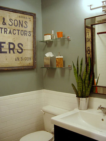
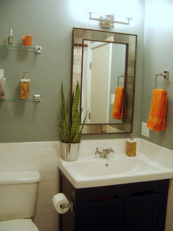
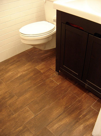
Many elements of this redo are similar to our previous master bath renovation: the wall color, the espresso elements, the love of IKEA, the orange accents. However, for this tiny, tiny room (5′ by 7′), we managed to squeeze in a full-sized Jacuzzi tub, some cool porcelain floor tiles that look like wood planks, and a mongo vintage storefront sign- because I love a good antique. Hope you enjoy the before and afters! – Anneliese
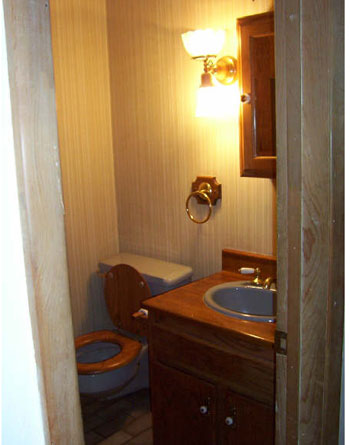
Here’s the dated before:

And the oh so chic afters:


Everything from the soothing wall color and the complementary hits of orange to the vintage sign and those amazing faux-wood ceramic floor tiles totally floats our boat. Serious swooning going on over here. Thanks so much for the pics Anneliese! You have two gorgeous bathrooms and I’m sure more than a few people (us included) are green with envy…

Cacey says
Those floor tiles are gorgeous! Could Anneliese tell us where she found the tiles and the pretty wall art?
Ann says
I’m LOVING this bathroom! Please give us the information on where everything is from…the art, the sink/vanity, the mirror.
Great job!
Chelsy says
I’m dying to know where the vintage sign is from…please, do tell!
Meghan says
Please tell us where you got those floor tiles!!
Amanda says
Wow I love it all! I love how the orange accessories really ‘pop’ with the rest of the colour scheme and those tiles…!!!
Colleen in MA says
Usually bathroom makeovers are not my thing, but WOW. I love this!
Sue says
Where can I find this fabulous faux wood tile?
Sarah says
What paint color did you use? This bathroom looks great!
Ally says
I LOVE everything about this bathroom – great job! Along with everyone else’s reqeusts, could you tell us what paint color you used?
CH says
I love it! Could Anneliese share the name of the wall color?
bungalow_bliss says
Oh my garsh! I can’t get over this make-over. It’s just perfect! What is the paint color?
SSM says
I also suffer from small master bathroom-ness, do you have any photos of the tub part? I would love to see how they fit it in.
Seraph says
My bf’s parents put tiles like that in their bathroom renovation, too. I think they just got them at Lowes or Home Depot, nowhere special. They came across them totally by accident while looking for ordinary tiles. They also feel really silky underfoot, which is nice for the bathroom.
Allison says
This is such a soothing bathroom. The color of the walls is exactly what I want for our living room/most of the main floor.
Barbara says
Gorgeous re-do! But I was hoping to see a view of the Jacuzzi tub. Is that still possible?
YoungHouseLove says
Hey everyone,
We dropped Anneliese a line to request all of those answers for you, so stay tuned! You can also check out Anneliese’s blog for more info on her entire home’s renovation:
http://annelieses.blogspot.com/
As for the paint color, she revealed it in the last makeover (she used the same paint this time around) and it’s Alexander Julian’s Lichen, although the line has unfortunately been discontinued. However, if you sweet-talk the paint guy at Lowe’s and give him this info, I’ll bet he’ll mix you a trial size of the paint in their Valspar house brand (this info is for a full gallon… they used the satin version): 113-9Y24 101-42 111-26 102-40.
xo,
Sherry
Tonya says
Wow! Gorgeous re-do. It is so soothing and fresh. Love it. Thanks for sharing.
Nikki's Nacs says
This is great before and after. I love this bathroom.
Amara says
Anneliese, if you are reading the comments, I am interested in knowing what type of flooring you have right outside of the bathroom and how it looks against these tiles. I would love to do this in my bathroom but I plan to have wood floors in my master bedroom and I am on the fence as to whether to continue the wood floors into the master bathroom due to potential moisture issues (although I love the look of wood floors in the bathroom). These tiles would solve that problem. However, I do not think actual wood floors against these tiles would look right. Just curious as to what you guys did and what it looks like. Hope my question makes sens. Thanks!
Katie says
That girl is on a roll!
Thanks for linking to her blog, Sherry and John. I love reading about the work everyone is doing.
Katie
Jessica says
WoW! What a gorgeous bathroom! Now I know what I want my master bath to look like! I love the color combo and that antique sign! It’s perfect!
anneliese says
Thanks, guys, for the props. Can you believe when we bought our house, all the bathrooms and kitchens (and the backyard and the frontyard and the….) all looked like the before? Nothing had been done in what looked like 30 years.
OK, the vintage sign came from eBay (and was more than the vanity, sink, and fixture put together… I personally love one big splash in a room, and since the rest of the room was massively cheap, I could rationalize the $350 for the sign).
The vanity, sinktop and faucet are from IKEA, the mirror/lighting/hardware is all from West Elm, and the floor tile is Interceramic Timberlands (http://www.fastfloors.com/catalog/productline.asp?productlineid=19284&productid=135605&REF=CZT1272515 for a pic, although your local tile place should be able to order it for about $5-6 a square foot) in Country Suede.
The Jacuzzi tub pic is on my blog (scrrrrrroooollll on down) and the subway tile was bought at a seconds place for a $1 a foot. The towels are Kohl’s (with a 30% off coupon, natch), and the bath accessories are from Target’s last home accent event (forget what they call it), for 50% off, of course.
Amara, our house has vintage red brick throughout, which is why we could get away with the wood-look porcelain flooring (in 6 x 24″ tiles). We actually started with a more modern, one-color ebony wood tile, but against our vintage floors, it was too much of a contrast. That’s why we ended up with this more rustic tile.
Thanks, Sherry and John! Air kisses from NM.
Ros says
Hi,
I have a similar question to Amara. I would love to see the floor outside this room next to the tile of this room. I would love to have dark bamboo floors throughout my house, but the placement of my bathrooms and kitchens are such that any tile I use in there needs to match. Not being a fan of very dark tile I would LOVE to see how this woodgrain tile might look next to a hardwood floor.
This is a gorgeous bathroom Anneliese! Well done!
Meredith says
It looks wonderful! I wouldn’t have ever thought to pair sage green and orange, but they go quite well!
Lauren says
LOVE IT!!!! I just finished my own mini-bathroom make-over and I’m looking for glass shelves just like the ones in this re-do for over my toilet. Are they from Ikea or somewhere else? I’d love to know!!!
jbhat says
Um, I am “pee” green with envy. It’s such a cool loo.
I must check out the blog in hopes to see the rest of the place.
Jill says
Gorgeous! Love the space……..thanks so much for sharing.
It’s great that the toilet base doesn’t go to the floor…………oh, how I would love that.
Anneliese– I popped on your blog (can’t do much while I am at work) and I must say I love your humor and you have great style!
kristin jo says
ick — wooden toilet seats gross me out. The after is lovely lovely! so clean and fresh
Emmy says
Oh I love it! I have been completely stumped on starting a renovation on our internal bathroom. It is so hard to find inspiration – most renos seem to include a window so don’t address issues such as maximising light, or making a small space feel bigger when the room is internal. This is perfect.
Sammy Jenkins says
Benjamin Moore’s “Soft Green” is very close to this color.
Ann-Marie says
Stunning, truly! So sophisticated. I love it.
SoBella Creations says
Love it!
Melissa says
I absolutely love the floor tiles!
jessimarie33 says
Oh wow! I just love this bathroom! Nicely done! (and I’m a little jealous!)
Magchunk says
Can’t go wrong with subway tile. So pretty.
Sandy says
Fantastic! Would love to know exactly what the antique sign says?
melissa @ den-designstudio says
Congratulations on such a wonderful job. You really brightened quite a small dark space up. It always makes me happy when people take the chance and mix IKEA products with others (I was a store designer for them) because I think it really classes them up.
heather s. says
Love it! (Though it may be time to move the snake plant into a larger planter so the roots can spread out!)
Jen says
Wow, it looks so chic! Refreshing but with personality, too (not that there is any personality-free decorating HERE, of course). Wonderful work!
lyn says
i need toliets like that! with a husband, three sons and 4 full bathrooms in my home, i’m always cleaning the “ring”. it is a NASTY jobs. where did you find that floating toliet? it would make my life so much easier!