This latest before & after comes from one of our neighbors to the north, Kahley from Ontario, Canada. She and her husband Steve revamped their home’s only bathroom. And in the process proved that going dark and sophisticated can still be bright and airy. Here’s her letter:
We are a young family of four – me, my husband, and our kids Noah (4) and Lexie (2). The only bathroom in our house dated back the 1950’s, so it was HIGH TIME to reno!
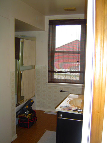
Since it was our only bathroom, we wanted it to be insanely multi-purpose. We needed a tub AND shower, some closet space, a dirty laundry area, lots of concealed storage, etc etc etc!
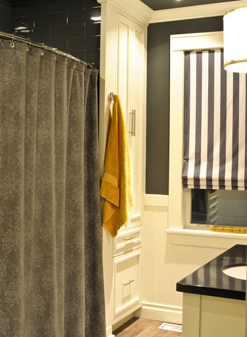
I had the color (BJ Moore “Gray”) picked from the beginning. These built-ins were created according to plans that I developed. Above you can see the shower curtain that I made myself from some discount fabric in the women’s “suiting” area at Fabricland. The fun striped roman blinds were made by Tonic Living in Toronto. The accent color that I chose in the end was a golden mustard yellow. The towels are from Sears!
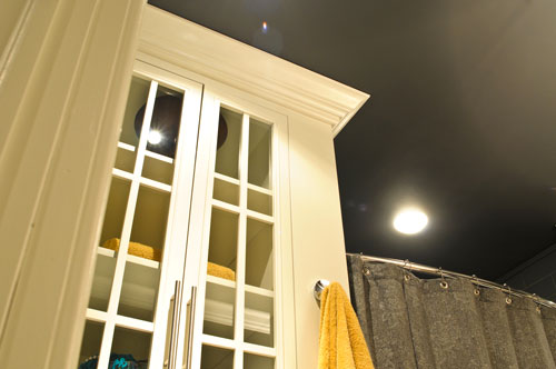
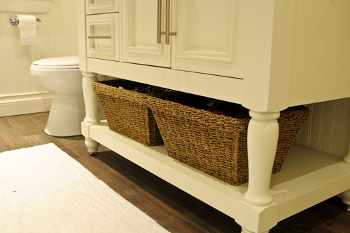
Here’s the bttom view of our vanity. I fell in LOVE with an oh so unaffordable vanity at Pottery Barn (they used to have a larger double version that was amazing) – so I had it built for THOUSANDS less.
Here’s what I like to call sexy tile!! I believe it’s a Centura tile (it’s an enlarged subway tile – 4″x12″ – in a high gloss gray finish). It feels oh so chic. Now if only I could have done a walk in shower (oh the joys of only having one bathroom, and children to bathe!). Anyway, thanks for checking out our bathroom makeover. I hope you love it! – xo, Kahl
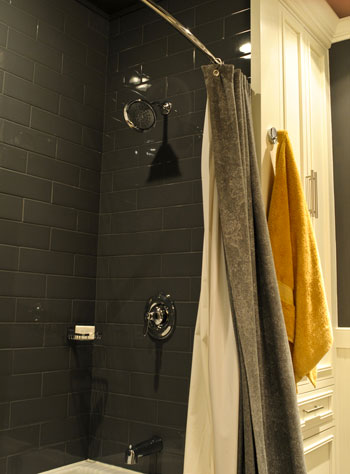
We’re not sure what we like more – all of the function they added (a set of built-ins on either side of the shower) or the brave color choices (dark gray tile and a gray ceiling). So we’ll just choose to love them both equally. How about you? What’s your favorite part? Oh and you can read more about the project over on Kahley’s blog.
Psst – Got your own awesome before & after project? Send your story, pics, and related links to [email protected] to be considered for a possible Reader Redesign feature. You know we love a makeover.

sandra ann says
LOVE IT! somehow, grey has become my favorite “color”… love the pops of mustard yellow and all the white, too… perfect!
Brandan WH says
That gray tile is to DIE FOR! So beautiful. Great job!
Jennifer says
I am printing her pics and bringing home to hubby….hello inspiration!!
Kristen says
What a gorgeous bathroom! That is one amazing makeover! The colors they chose are just beautiful.
Felicity @ Our Little Beehive says
I did not expect her to say that she had the vanity made for thousands less, I was ready for a “great sale” but handmade? That’s amazing!
I love the colors – and that the accent yellow would match a kid’s rubber ducky fabulously ;)
Blaine Stewart says
Would have never, in a million years, be that brave to pick those colors in my home. Yet, the final product looks AMAZING. Job well done!!!
Randa says
WOW WOW WOW!!! Gorgeous!
Amy in Pittsburgh says
I LOVE THIS because this layout is like our bathroom (also our one and only). Currently our toilet is where their new linen closet is, providing about four inches of access to the shower pipes. If we ever remodel, we want to move the toilet next to the sink, and now I see how awesome a linen closet would look in its place! Thanks!!
bridget b. says
wow! beautiful job Kahl!
tosha says
holy crap I love everything about that bathroom!! I think it’s the gray tile plus the bright yellow towels..? LOVE.
Christin says
Holy gorgeous bathroom Batman! Seriously – WOW! I love it. I think my favorite parts are the builtins and the vanity. It really looks like something out of Pottery Barn and she got it for thousands less – inspirational. :)
Beth says
That tile…I die!
Marye V says
Love this bathroom!! We are in the beginning stages of redoing our own, but wondered how tall the cielings are in this bath. This seemed to work well because of the verticality in the room, however we are stuck with low ceilings…Kahley do you mind sharing the height??
Annetta says
Since imitation is the ultimate compliment. I will try to compliment you and imitate. I painted a few walls in white kitchen with the Cinder grey from Benjamin Moore, so I could tie in the bathroom, too. Our home is also a 50’s home, so it’s difficult to find inspiration. But you have inspired me ;) thank you, love it!
Ashley L. says
I love this!!!!!! Great work!
Barbara says
Wow! This is so much like what I am planning for my bathroom makeover! Wish I could get her plans for the vanity as I had the same ‘sticker shock’ over a PB vanity! We are planning on white subway tiles..but with light gray walls. Maybe I will get brave and go a shade or two darker!
Heidi P. says
New love – GRAY high gloss subway tiles!
*camp1899* says
j&s..
love the yard/”fence” make-over, shows how pretty your house is!! tiffany
michaela says
I adore this makeover! What a change. The contrast between the dark tiles and white built ins is awesome!
Eva says
Your bathroom turned out SOOOO Beautifully!!! The tile is the “Arkitekt” series in Dark Grey Glossy #VIT794245. I love the large subway tile too, it has all the classic appeal of a regular subway but the oversize does make it super sexy!
Tehmina - Interior Decor DIY says
I like the smart use of spaces in this bathroom – they’re usually so cluttered with important-looking bottles :)
Kahley @ Ambiance says
Just wanted to let everyone know, I’ve posted a follow up blog answering all of the questions asked here by YHL readers, and on my blog as well – all regarding the my bathroom Reno! Check it out! http://ambiancedecorlive.blogspot.com/2011/10/q-follow-up-to-yhls-feature-and-freebie.html
YoungHouseLove says
Thanks so much Kahley! And thanks again for sharing the awesome and inspiring pics!
xo,
s