This email from Laurel-Dawn sounded like a common situation. You find yourself in a cookie cutter home, dying to put your own personal spin on the house so it doesn’t look exactly the same way that the builder left it. Well Laurel-Dawn and her husband definitely turned a common kitchen into something spectacular. Here’s her letter:
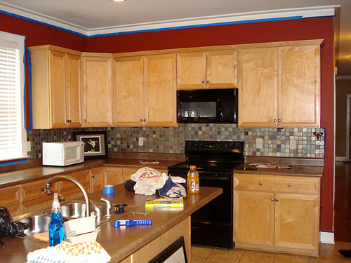
“I live in a super simple home. It’s what my mom calls a “tract home” which I personally hate, but I guess it’s true. I live in one of those neighborhoods where all of the houses look the same and it’s hard to put a personal stamp on things. I dream of someday updating a home with a lot of style from the get-go. Until then, I’m changing every surface of my abode, room by room, until it feels like me (and my husband too, I guess!?) Anyway, my dad helped me redo the kitchen and it’s my favorite space in our house. Here’s the before…
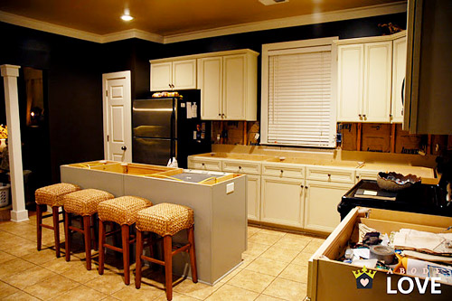
… and the during…
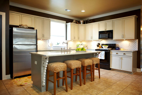
… and the after…
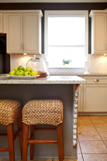
Thanks so much for the opportunity to be featured!” – Laurel-Dawn
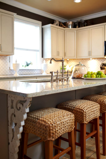
Isn’t that amazing and borderline mind-blowing? Our favorite parts are the decorative corbels on the island and the rich wall color with the crisp white cabinets (and of course we love that she worked with what she had and just painted the original cabinets). You can peruse more pics and details over on her blog too. And if you’re in the mood for more of their home’s transformation, you should check out their dining room makeover. We’re obviously on a kitchen kick lately (go figure) but it’s a really cool update too!

Karen L. says
Oooh, thanks for the inspiration! Wonderful as well as do-able. Great job.
Michelle says
Oh my god that is amazing!
katie o. says
Loves it. Fantastically creative and completely her own.
Lindsey says
I actually love the kitchen before, but I think it’s great that since they didn’t, they had the courage to make it their own!
Robin @ Our Semi Organic Life says
Wow looks great! My favorite part is perhaps the ceiling! Looks so grand!
Allen says
LOVE that new faucet!
Julie McKinley says
This is BEAUTIFUL!!!!
Karin K says
Nice job! The white color on the cabinets really brings out the trimwork – which is almost unnoticeable in the “before” pics.
kara says
I had to laugh at “track home”. It’s actually “tract” …
http://en.wikipedia.org/wiki/Tract_housing
Tract housing is a style of housing development in which multiple similar homes are built on a tract of land which is subdivided into individual small lots. Tract housing developments are typically found in North American suburbs that were modeled on the “Levittown” concept and sometimes encompass large areas of dozens of square miles.
YoungHouseLove says
Thanks for the tip Kara! I didn’t know that either. Haha. Just fixed it!
xo,
s
Trisha says
Love it! Don’t think I would ever leave.
Allison @ Quite Simply Home says
Whoa, my mind is blown. Is that even the same kitchen? Just goes to show that you really can make the space your own. Whooa. Can’t wait to check out her blog (when I’m not at work….)
Julia @ Chris loves Julia says
I LOVE the stools. Source??
YoungHouseLove says
Maybe check her blog for that info? Or Laurel-Dawn can hopefully stop in with that info soon!
xo,
s
Michelle says
I love them too and I think they are Pottery Barn!
kari says
beautiful! now i need someone to show me how they fixed up a 70s kitchen on a budget :) i’m sure mine was a track home in the 70s…..
Marlo says
Wow, this is absolutely beautiful!
Melanie @ MailboxJourney.Com says
Wow, just amazing!
Allison says
Those backsplash tiles are magical!! Beautiful.
Craky Zebra says
Ooh! Love that shade of gray on the walls. It goes so good with the white cabinets. Very nice :)
Bree C. says
I love this. I live in Central Florida, which is famous for it’s multitudes of tract home sub divisions. It’s hard to find any other option around here, honestly. This is a great remodel – shows that you can take something that seems impossible to make your own into something great.
And just because you move into a home that is new, doesn’t mean you shouldn’t change things up just because they don’t have to be replaced or updated.
Kate says
I love reader redesign! Lotsa new blogs for my reader!
Lydia Pudel says
That looks beautiful!
Thank you for sharing;)
Lovely greetings…
http://pudel-design.blogspot.com/
kathy says
THIS is what I would luuuuuurve my kitchen to look like. We don’t have a tract house but we have a tract kitchen. I think our neighbor around the corner re-did everyone’s kitchen about five years ago bc they aall look the same. I used to like it but now I’m starting to hate it. Thanks for the inspiration!!
Lisa in Seattle says
Who knew a tract home kitchen could turn out so beautifully custom looking? My favorite part is that backsplash. I checked out her blog and the tiles are wonderful! She also has a super-cut Anthropologie bread bin that doesn’t show up here.
Kim says
WOW! So beautiful.
Lindsay says
i love the backsplash! the little square tiles are cute, but hanging them on the diagonal makes all the difference!
karen says
what a good job!!! love the corbels, faucet, colours, stools…love it all.
Kristen says
Beautiful kitchen!! Great job! :)
Erika says
I never cease to be amazed at the wonders a can of paint can do!!! What a fantastic job!
kat says
Wow! That’s the same tile we just ordered to put into our own kitchen! I love it! Now back to painting cabinets…
shannon says
just recently found laurel dawn’s blog and i am obsessed! she has great style (and that kitchen is amazing!)
Krysta @ Domestic for Dummies says
I had this pinned on Pinterest before you even posted this! Love this kitchen and those stools!
Jenny says
Whoa, this is GORGEOUS!
Also, totally completely unrelated, but I am doing a giveaway on my blog (so exciting!! Anyone reading this is welcome to come enter, including you Petersiks although I’m guessing you don’t do that haha) and one of the throw pillows made me think of John haha. Here is a link to it in the shop that the giveaway is from —
http://www.etsy.com/listing/84656253/new-18×18-inch-designer-handmade-pillow?ga_search_query=bike&ga_search_type=user_shop_ttt_id_5327907
Jenny
simcoestreet. blogspot . com
YoungHouseLove says
Such a cute pillow! Love it.
xo,
s
Laurel says
I never thought a color so dark could look so bright! Stunning!!!
Amanda @ Our Humble A{Bowe}d says
Wow, such a difference with a little paint, tile and counters. I love how different it looks. Great work!
Teresa says
What a great job.. it scares me to change anything in a newer home since its already so new, but this really shows how you shouldn’t be afraid to make changes. Love all the little personal touches.
Patti says
The colors and those kitchen stools! Love!
abode love says
Look ma! I’m on Young House Love!!! My coworker yelled at me across the office to tell me that my kitchen was on my favorite blog- she knew I would totally lose my cool and she was so right! I did a nerdy dance and screamed, best. day. ever. Thanks so much Sherry & John for featuring my kitchen, I’m SO looking forward to seeing your kitchen come together!
YoungHouseLove says
Aw so glad! Your house (and your blog) are awesomesauce!
xo,
s
Emma says
I love the work-with-what-ya-got-ness of it all. Well done! I also now know what a corbel is.
Andie says
I would love to know what color they used on their cabinets as my husband and I are about to redo our cabinets in the kitchen to a white shade (from a medium brown wood finish as well)
I love how their kitchen came out! gorgeous! Do you have details on their paint colors, etc?
YoungHouseLove says
You can click over to their blog to hopefully find that out, or maybe Laurel-Dawn will drop in with that info!
xo,
s
Paige says
Ohmygosh, that’s so impressive! It took me a while to realize those were the same cabinets. And that’s one awesome backsplash.
Ashley Bird says
The tots are so so so cute together!!
Laurel-Dawn says
Thank you all for the compliments on my kitchen! The paint colors on the cabinets are Ralph Lauren’s Architectural Cream with a Ralph Lauren Boulder Gray glaze that I made. The gray cabinets are Ralph Lauren Boulder Gray. Here is the link to the process:
http://abodelove.blogspot.com/2010/05/kitchen-cabinet-redo.html
YoungHouseLove says
Thanks so much for stopping in with that info Laurel-Dawn!
xo,
s
Laurel-Dawn says
Also, the barstools are from Pottery Barn. They’re surprisingly “squishy” and comfortable to sit on! Here’s the link:
http://www.potterybarn.com/products/seagrass-barstool/?pkey=cbarstool
YoungHouseLove says
So pretty! Love them.
xo,
s
mp says
I’m not a fan of dark wall paint, but she pulls it off.
Emiles says
so…this reminds me a bit of our kitchen. It was remodeled in the late 90s/early 2000s…oak laminate floors, oak railing on the stairs, oak countertops, white appliances, black granite. I’m DYING to paint the cabints white (or gray or cream or ANYTHING to get rid of the oak explosion) BUT they’re solid oak, somewhat new, and very high quality. Plus, we’re not going to be in the home for more than the next 5 years (I’ve only been there one year, my husband’s owned it for 3). What would you do? Is it legit to paint nice cabinets just because you can’t stand the oak explosion, even if for a little while? Or, should one tough it out? please help!
YoungHouseLove says
Hmm, I’d paint them if they really bother me. But maybe I’d try to live with them by making other tweaks (painting the walls to compliment them as they are, bringing in pops of color to detract from them, etc). But I’m just a white cabinet girl (and I don’t believe white cabinets are any worse for resale than wood ones actually) so in the end I’d probably end up painting them! Our first house had white cabinets and we sold it within a few weeks for over asking price! Hope it helps.
xo,
s
[email protected] says
I was in the same spot–oak everywhere in a 90s spec house. Mine weren’t close to new, but they were high-quality cabinets. While I know that white cabinets are really popular right now, I also know (given how things are), that oak will probably come back in style and then everyone will be moaning and groaning about previous owners who painted them.
Which doesn’t mean you shouldn’t live for today–but I decided not to paint mine, especially once I knew I was going to move within a few years. Instead, I put in new flooring and painted the walls, and I couldn’t believe the difference it made. I chose a bright (red!) floor color, and it got me to almost liking the cabinets. You can see it here: http://mountainmodern.wordpress.com/house-tour/ (I created the site to help sell the house, which did sell last June. Didn’t get asking price but did sell conventionally, which was quite a feat in my area given all the foreclosures and our remote location.
YoungHouseLove says
Very interesting points! I’m in the school of thought that both wood and white cabs are pretty classic. I believe certain buyers will always be attracted to one or the other, but don’t think white cabinets will look dated since they’re so clean and classic (mags like House Beautiful have been featuring kitchens with both wood and white cabinets for the past four decades or so). Such an interesting subject!
xo,
s
Emiles says
thanks for all the comments! I’m definitely in favor of painting them. I love me a white kitchen as well, and I agree they don’t hurt resale one bit. BUT the husband is not. he’s scared of the effort and the possibility it won’t look good w/ our dark colored living room (it’s open concept). I’m definitely planning to paint the walls – a light limey green color. We’ve debated replacing the floor too but it’s also not too old. Did I mention this is a 1950s ranch? Your fav. :) They just gutted the living room and kitchen, made it one big room. Oh and to add to the rambling, I think I convinced the hubs we need out in the next year (rather than his preference of the next 3-5 years). So! I suppose I’ll paint, beg to do a backsplash and live with it for a year more, despite my desperate desire to have a gorgeous white cabineted kitchen!
YoungHouseLove says
I bet if you paint the walls and add some happy accessories you’ll be amazed how much it cheers things up! Good luck!
xo,
s
Jessica@fourgenerationsoneroof says
This is a dramatic change! Love it & the island is beautiful! Jessica (aka nucheysmommy)
Ariel says
Really starting to come together. Great stuff!
Suzanne Supplee says
Cookie cutter no more! It’s absolutely gorgeous!
Elizabeth@themustardceiling says
Laurel-Dawn’s house is amazing! She has done a beautiful job with the entire house and her kitchen is no exception. Love the corbel detailing on her island.
Regan @ RenovatingRothenbergers says
The corbels & new faucet are amazing! What a transformation!!
Hilary says
Ahhh..mazing! Love cabinet transformations – we went dark on ours but I lurv the classic white.