It’s no surprise that we’re in the mood for a good kitchen makeover these days. Okay, who are we kidding, we’re always in the mood for one. But Erin & Zach’s do-it-yourself remodel of their 1950’s kitchen is especially familiar (and inspiring since we’re just at the beginning of our current kitchen’s transformation). Here’s their letter:
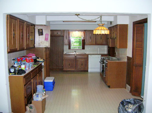
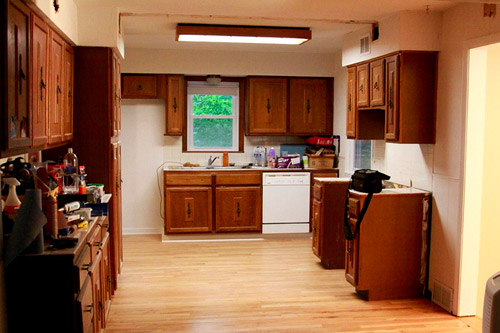
We wanted to share the redo of our 1951 kitchen (take note of the sweet before lamp and the heavy-duty ceiling beam disappearing act).

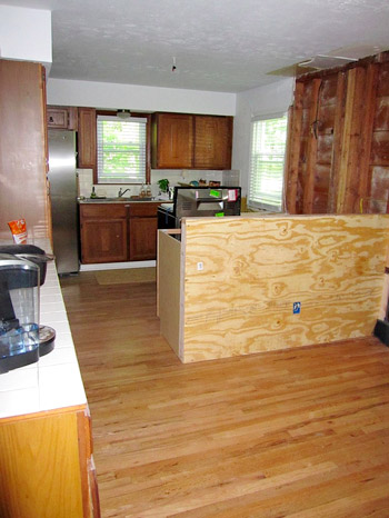
We were so lucky to peel up the old laminate floor and the plywood to find original (albeit quite damaged) wood floors that extended into the middle of the kitchen. We found matching red oak floor pieces and filled in the missing & damaged spots.

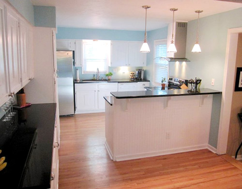
One of the cool things we did was to buy two pre-made cabinets from Home Depot to create the breakfast bar. We put them side-by-side and filled one of the openings with wood pieces to make it seamless.

We also re-used all the cabinets but updated the hardware. Painting that many cabinets and doors definitely took patience … and three coats of paint. The new blue color in kitchen is Behr Primer + Paint in Clear Pond, Eggshell.

Thanks so much for checking out our kitchen. We love it!! ~ Erin & Zach
We love it too, guys. Congrats on a job very well done! It’s a reminder of not only how much work is ahead of us, but also what a big payoff there can be at the end! Seriously, it doesn’t even look like the same room.
PS: We’ve announced the winners to this week’s giveaway. Click here to see if you’re one of them.

Sabrina says
So inspiring since we are starting our own kitchen reno. Love the white.
bridget b. says
WOW!!! great job!
Erin & Zach says
Thank you so much for the wonderful comments! We are so excited about it being done. We ordered the range hood on overstock.com and bought all the hardware from homedepot.com. We found the granite countertops at Nebraska Furniture Mart at about half the price of local home improvement stores. You can check out many more pics here:
http://flickr.com/gp/firesnaps/6C48JT
Abby says
I looked at some of your other pics and I have to say that I’m kind of in love with your sink! I love the curvy lines of it! =)
Johanna says
Clicked through your Flickr album – amazed at how much work it must have taken to get from your “Before” to your “After” photos! Did you know what you wanted the final product to look like from the beginning, or was it more of a deciding step-by-step process? (Sorry if the answer is obvious – I’m new to this DIY stuff!)
Carley @ On One Hand says
It looks so much more functional now! Before it was just kinda loose and all over the place. Love the colors!!
tina says
wow… that’s beautiful !!
Anna says
It looks like a totally different kitchen! I love it! Especially the breakfast bar and the floors.
Sarah G. says
Uhhh-mazing! Erin and Zach are friends of mine and I couldn’t be more impressed! They really did a fantastic job!
dm says
I don’t comment often, other than giveaways, but I have to say, this is lovely, and I am SO glad reader re-designs are back.
Craig says
This is an amazing transformation. What a wonderful achievement for your family. Great job!
I am now following.
Please check my blog out.
http://www.saintenterprises.blogspot.com
Thanks, Craig
Tina I. says
One of the best remodels I’ve seen. Like it when the before/after pics are from the same angle! It seems like a completely reasonable remodel too. Not one of those high budget, House Beautiful, hundred thousand dollar jobs, that while lovely, just aren’t within the realm of possibility for “regular folk”. Thanks for sharing!
Janelle D says
What an amazing transformation! From dingy and dated to bright & ‘breakfast-ready’?I can’t believe it was all DIY. I’m seriously impressed. Great job!
Lyn says
This makeover is wonderful! But what I don’t get is where does everyone hide their mircowave?! I know every kitchen has one….
Same thing with alarm clocks. I’m starting to think these items are removed for pictures!
Jill says
I don’t like having things on my countertops (except the cat, of course), so I’ve had my electrician put an outlet for the microwave and other small appliances inside one of our lower cabinets that will have a pull-out shelf. So we’ll put the microwave on the shelf, pull it out when we need it, shove it back in and close the cabinet when we don’t.
The nice thing about this plan (as opposed to having a built-in microwave) is that (it doesn’t matter in terms of the overall beauty of the kitchen) what our microwave looks like (we’ve got an unimpressive-looking white one) or if it breaks or anything. Much easier to switch out or buy based on function/price.
Robin @ our semi organic life says
I love (all of it but especially) the tiny lights on the underside of the hood. So fancy!
Marci says
Gorgeous and inspiring!
Maureen @ This (Kinda) Old House says
Wow! This looks great!!! I am itching to do my kitchen!!! I have to wait, boo.
Once again, I am inspired by my fellow DIY’ers.
Catherine says
Very inspiring! I hope this helps me to talk to husband into doing a similar project!
Stefanie says
Love it! Do you guys have any thoughts on painted cabinets? I would love to paint ours, but am afraid the paint wouldn’t hold up for the long run. I know some of HGTVs designers send cabinet doors out to be sprayed – do you know if this helps durability? Any other tips?
YoungHouseLove says
We painted the cabinets in our first home and really loved the durability… until we redid the whole room. But John’s sister painted hers and they lasted over a decade until she sold the house- they looked great and she rolled on oil-based primer followed by two coats of latex paint. The key is thin and even coats, so it’s not too thick and therefore doesn’t crack and peel. Spraying them can be great if you’re an expert, but if you’re a newbie you can apply thin and even coats the most easily with a small foam roller and a brush to get into the crannies. Good luck!
xo,
s
Natalie says
This comment has nothing to do with this post but Sherry, has anyone ever told you you look like Margot Robbie (from the show Pan Am)? I was reading this article today and thought she reminded me of someone and then realized she looks like you! Especially in the 3rd picture. Anyone agree??
http://www.dailymail.co.uk/tvshowbiz/article-2050968/Pan-Am-star-Margot-Robbie-gets-powder-pink-set-makeover.html?ito=feeds-newsxml
YoungHouseLove says
That’s too funny! Never heard that before. She’s hot though, so I’m flattered. Haha.
xo,
s
Robin @ our semi organic life says
Off topic but I saw you guys here today! http://www.apartmenttherapy.com/sf/fireplaces-stoves/step-by-step-painting-a-fireplace-young-house-love-158845?utm_source=feedburner&utm_medium=feed&utm_campaign=Feed%3A+apartmenttherapy%2Fmain+%28Main%29&utm_content=Google+Reader
YoungHouseLove says
Too funny! Love it! Thanks for the heads up.
xo,
s
Mary@The Good Life says
Wow- Erin and Zach- bravo! Its incredible. Your sense of vision with the layout is really impressive. Good for you guys!
heyruthie says
my parents have those same cabinets and hardware–believe it or not, Erin and Zach’s kitchen must have been “updated” in the 1970’s! LOL!
Angela L says
Fantastic re-design! I’m in the midst of my own, and I also painted the cabinets white and the walls light blue. Since mine’s only 1/2 done, I wasn’t so sure about my color choices, so seeing how great yours looks finished makes me feel so much better!
Erma says
I like it!! The blue color is perfect.
Drew @EpicFinances.com says
Amazing job!
I myself have done a complete rehab on my house and I know what it takes — You did a fantastic job! Hope you did check out my blog and take advantage of saving at home Depot!
Rachel Gross says
Love the re-do! However, one question…and I’m stumped when thinking about our own kitchen what to do… the microwave/fan combo above the stove. Looks like they took theirs out, and you are planning to do the same. I’d love to put in a hood (because ours, just like yours, is waaaay too low and I can barely fit a soup pot on the stove), but where to put the microwave w/o having to have an ugly space-consuming countertop version (or modifying the base cabinets to install it below)?? Where will you put yours, and do you know what they did with theirs?
YoungHouseLove says
We’re going to do what we did in our last kitchen, which is use a hanging one and build it in- not over the stove. So it’s tucked in and easy to use at a comfy height without taking up counter space. See it here: https://www.younghouselove.com/2008/01/113-days-later/
xo,
s
Rhonda says
I love a blue and white kitchen, I’m quite envious as I sit in my 1938/58/68/78/98/08 kitchen…one of these days! Nice job.
Marcie says
Look great! I can’t believe that you got the cabinet covered in 3 coats. We ended up having to do 2 coats of primer and 4 coats of white. Around coat 5 we were wishing we had invested in a sprayer.
BrookeJ says
Fantistic! Love it, glad you shared.
Rebecca @This Nest is Best says
Oh my word! This remodel was absolutely beautiful!!!
Polly says
We have the exact same cabinets and I have been planning on painting them white. This has totally convinced me – they look great!! I had wondered if the middle panel where the original hardware was would look strange, but it doesn’t. Now I just need to decide between regular painting or trying Cabinet Transformations…any thoughts?
YoungHouseLove says
Anyone have thoughts for Polly on that? We’ve seen them done both ways and they look gorgeous, so you probably can’t lose!
xo,
s
www.orchidlanedecor.com says
Shut the front door! Magnificent. I love the pics of Parker too, so adorable :) I said it yesterday, and I’ll say it today too – boo for my laminate cabinets. Dumb, dumb, dumb laminate :(
Suzy xxx
Tania says
Wow! It doesn’t even look like the same room! Great job and enjoy your new space! I did a similar re-do except we did not create a peninsula but built up a previously non-functional island. We cut it in half, but now we can sit at the island, just like your peninsula! Nice work!
http://carnoustielane.blogspot.com/2011_02_01_archive.html
YoungHouseLove says
Gorgeous!!!! So awesome.
xo,
s
Lou says
Nicely done. Also, youngsters, you got two Apartment Therapy pics in today. The one mentioned before, and this one too! http://www.apartmenttherapy.com/dc/interior-design/colorful-patterned-curtains-158786
YoungHouseLove says
No way- love it! Thanks so much for the tip. I love the other rooms mentioned!
xo,
s
Laura Jane says
Wow, looks amazing! I’m super impressed. It’s so peaceful and inviting. And it totally doesn’t even look like the same room.
Dana Mainetti says
Amazing! Would love to know where they got their pendant lights from?
Sarah says
What a beautiful transformation! I have my dream kitchen all designed, but haven’t the slightest clue where to start without blowing up the house. I wish I was as handy as you two! The blue is so light and airy, perfect for the kitchen. Great job!
sarahbclark! says
whoa, that’s amazing! i can’t believe how transformed it looks without a total overhaul.
Amy says
This looks so fantastic! Great job, guys! I bet the kitchen is the new favorite room of the house.
Jenn says
I can hardly believe this is even the same house. They did an AMAZING job.
Cathy Gorga says
wondering if Erin can tell me what she did with the insides of her cabinets, or if you have any advice, Sherry? ours are ’60s-era maple cabinets with years of sticky contact paper on the insides. we want to paint the exteriors, but…how to make the insides nice and happy, too? the shelves aren’t removable, so it would be totally annoying to paint the interiors. hmm…in the meantime, love love loving the kitchen updates (yours & others’)!
YoungHouseLove says
Our new kraftmaid drawers were wood inside (and white outside) so that look is pretty standard (and super durable since they won’t chip or show dark marks or smudges) so we’re planning to leave our insides unpainted and maybe use pretty liners. But if we had glass shelves we’d paint the inside with a fun pop of color.
xo,
s
Sarah says
Forgive me for not contributing anything intelligent to the conversation but HOLY FREAKING CRAP!
Kari says
Was John in Phi Sigma Kappa?
YoungHouseLove says
Phi Sigma Pi. Holla.
-John
Pamela says
Ohhhhhh, that is so lovely!
Izabela says
Wow…what a transformation and inspiration!
Johanna says
Wow, I love the finished product! It’s so light and airy – makes me think of a home in the countryside. Can’t believe they’re the same room!
Virginia@ Scentsy says
Wow this looks amazing! I am in the process of painting my kitchen cabinets white and this inspires me to get on the ball and get it finished. I have been a bit lazy in the painting department lately.
Then it is on to countertops and backsplash!
esther says
Oh my gosh that’s like a completely new room!! Love the new kitchen!! Hard work definitely does pay off :)
Megan says
That looks awesome! I wish I had such a good layout and cabinets to redo but unfortunately we’re in the “do it from scratch” time once we get the money.
Ashley says
Wow the kitchen looks 10x better painted white! It’s really elegant and sleek looking with the black counter tops too. I like that! Thanks for sharing Erin and Zach!
Brooke says
That is a true transformation! The kitchen looks amazing now! I absolutely love it!