Lately lots of the submissions that we’ve been getting are kitchen related, and you know we’re in the kitchen mindset these days… so we’re happy to share. Jasmine & Sam’s remodel wooed us with their use of white on white with tons of texture and a sleek clean feeling. And when it comes to function, we’re really impressed by how the addition of more upper cabinets and details like molding and trim elevated (both literally and figuratively) the entire room. Here’s Jasmine and Sam’s email:
Hey guys! My family and I just had our one year anniversary in our new house and I thought to send you some pics of our new kitchen. We actually did almost all of the projects in our house makeover on our own. Luckily, we are a handy pair.
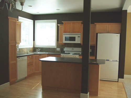
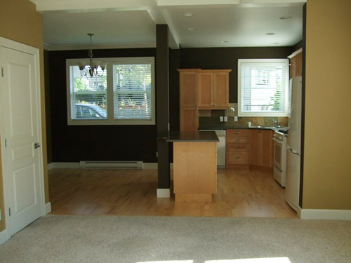
The kitchen cabinets were maple, in a shaker style. We ordered a second set of cabinets from a local company (Summerhill Kitchens) for the top row to match the bottom row and sent all the doors to an automotive painter friend of ours who sprayed them in Benjamin Moore’s Simply White. I painted the gables, and stretchers, and anything else that was nailed down with a foam roller. The big splurge was new appliances – all Vikings. Love them. A Lot. Not Sam’s favourite things to install, but totally worth it (we saved money by having him install them all).
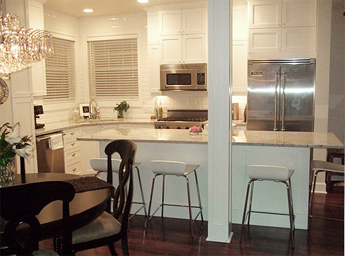
The backsplash is a white beveled subway tile. They were a great bargain (around 60 cents each) from here. The floor was a combination of birch hardwood and the ugliest shag you’ve ever seen. Not only was it ugly, it really broke the space up. After ripping it all out, we laid an engineered walnut floating floor on top throughout the whole main floor. We bought it from an auction that sells flooring a few times per year, so the flooring ended up being an unbelievable $1.50/sq ft (including underlay). Oh and the stools are from Crate & Barrel.
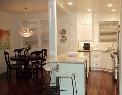
The wall colour is Antique White and the cabinets and trim are Simply White by Benjamin Moore matched to Home Depot’s Behr Paint & Primer in One paint. There’s a post in the middle of the kitchen that we really really wanted to remove, but apparently since it holds up the entire house, they told me it had to stay. So we tarted it up with moulding and called it a day. We’re used to it, but I still wish it was gone. Anyways, have fun with your kitchen renos, catch ya later! – Jasmine and Sam
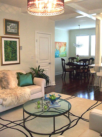
Anyone else think Jasmine and Sam need to start a blog so we can learn more about their renovations? They look like quite the stylish duo. And I for one, love that coffee table above. Here’s hoping they can drop in and answer any comment questions that you guys have here. And in the meantime, let’s play the what’s-your-favorite-part-game. I’m digging the extra cabinetry they added along with those cool stools. And Sherry’s drooling over those shiiiiny counters and that gleaming backsplash.
Psst- We (finally) shared our road-tripping Thanksgiving adventures with friends, family, and food over on Young House Life. Find those deets here.
Psssst – We just put our dining table and six chairs from our first house on Craigslist (it’s from Target, is in great condition, and is about four years old). More deets here.

CATHY says
awesome! love it!!
Becky says
I love the round glass/metal coffee table – we are looking for this exact thing for our own living room! Any chance Jasmine & Sam will tell us where they snagged it?
YoungHouseLove says
Here’s hoping they stop in with that info for ya!
xo
s
Sarah R says
IKEA’s Vittsjo: http://www.ikea.com/us/en/catalog/products/80213309/
Michelle says
So pretty! They definitely need to start a blog.
Amanda @ Our Humble A{Bowe}d says
I love the added height of the extra cabinets. We’re doing something similar with ours: http://ourhumbleabowed.wordpress.com/2011/11/30/on-the-up-and-up/
And the all white is stunning. Thanks so much for sharing!
Lena says
I love the added cabinets! Without them it looked so standard builder-style, now it looks very custom, plus the ceilings look higher and they have more storage space! Also, painting the cabinets always makes such a big impact.
Jess @ Little House. Big Heart. says
Oh my holy white kitchen. I love it! The subway tile is divine… and VIKING appliances? I’m swooning at the thought.
Maybe if I show this to the hubs he’d go for a white kitchen.
JennP says
Ha! I thought the same thing about showing it to my husband. I have a pretty convincing list of reasons why white cabinets are the best choice for our kitchen, and he just isn’t biting. Why are so many men opposed to white cabinets??
erika m says
I know my husband is the same, he hates white cabinets…I should show him this one too. In our old house the closest I got was vanilla bean glaze (loved that too!)
chelsey says
Beautiful!! Do you have any close up pictures of your granite? My husband and I are in the process of remodeling our kitchen and the big debate is countertops. We are doing white cabinets and are in love with subway tile backsplash. Thank you!
Laura says
Wow – this is great! We are doing a white on white kitchen in our new house too – we are probably going to use Cambria Torquay – looks like marble but has the upkeep of engineered stone…Have you guys heard anything about it?
YoungHouseLove says
We have heard amazing things about Cambria (actually looked at Torquay and loved it but it wasn’t in the budget). It’s supposed to be really durable and gorgeous!
xo,
s
Jessica says
I live right down the road from Cambria! Awesome stuff. Hope to have some in my house someday!!
Audrey says
I’m an interior designer and have Cambria countertops in my home, and specify them all the time. You don’t have to seal it like granite and it has a very similar look. Highly recommend it!
Ashley@AttemptsAtDomestication says
The white is gorgeous!! I love love love it with the grayish counter tops!
Hannah says
I L-O-V-E their rug in the living area, I would super grateful if they shared where they purchased it :)
Amy K says
Where is their crystal chandelier from? I love it!
YoungHouseLove says
I know, right? I thought the same thing! Can’t wait to find out!
xo,
s
danielle says
I want to know too! Love it!!!
Karla says
I want to know too!
Brandi @ His Shabby Her Chic says
I think I love clean white of everything best!
Beautiful kitchen!
Allen says
My favorite is definitely use of the phrase “tarted it up a bit”
YoungHouseLove says
Haha- me too! Hilarious!
xo,
s
Megan says
I agree! That phrase alone makes them perfect blog material. :)
Jen Migonis says
I am positively drooling over the extra cabinetry… It went from looking like builders grade to custom with that addition… And I’ve always fallen hard for white cabinets. Oh, and the backsplash… Yes please. :) this is completely and out of control gorgeous.
Lesley says
Are those serving platters on the walls as art work? Love! What are you using to hold them up?
YoungHouseLove says
Maybe plate holders (places like Michael’s sell them)? Here’s hoping they share that info soon!
xo,
s
Nicole says
I’ve seen other bloggers use these:
http://www.amazon.com/gp/product/B001GZKSC8/ref=oss_product
Andrea @ the yellow cottage says
All the white and the cabinets up to the ceiling make it look soooo much bigger when you compare the photos. Very posh!
Ali says
I love so much of this – the lighting, the light fixtures, the coffee table, the cabinets. Beautiful! Thanks for sharing. Then again, I really do have a thing for white kitchens of all kinds. :)
Lisa says
I don’t personally like all the white…I think the only thing white in my house is the trim and doors! ;)
However, I love to hear about people who love their own homes and design..who cares what I think if they love it!
I do like that they pushed the cabinets to the ceiling and put in the extra cabinet/counter to add more/better seating to the island. I am going to do both when I redo my kitchen in a few years.
Great job!
Sarah @ Redhead in Ruffled Flats says
Love, love, LOVE this kitchen! Reminds me of this kitchen (http://s771.photobucket.com/albums/xx360/dreamindomestic/Interior%20Decorating/Kitchens/?action=view¤t=ifIhadwhitecabinets.jpg) I had “pinned” on Photobucket long before the days of Pinterest. Adding the cabiinets was an amazing idea, and I think getting the cabinet doors sprayed makes them look custom and purchased already white and not painted later. So inspiring – they definitely need a blog!
Melissa Evans says
I-am-in-love with this KITCHEN!! What an amazing transformation!!
Kelly says
Love the kitchen! Wow!
SOOOO bummed that you are on the other side of the states. I have been trying to buy a table like yours but can’t find at Target. I would run with cash in hand right this second if I was closer.
Hilary says
I LOVE the counters! Is that marble? Any chance they shared that info?
YoungHouseLove says
We think it’s Cambria quartz, but hope they’ll drop in with more deets!
xo,
s
Mary says
I would also love to know what kind of counter it is & where they bought it!
CaitlinMelton says
Love it! My kitchen now looks like their before pictures so now I am inspired!
GreenInOC says
I would have never thought about adding more cabinets – brilliant! It’s a gorgeous kitchen.
I would love to know about the automotive paint – did you have your friend do that because he has the room or was it a special automotive paint (I’m guessing it wasn’t special paint since you listed a Benjamin Moore color)?
Does anyone know if most automotive places paint with regular paint if you pay them or is it generally more expensive?
YoungHouseLove says
Ooh great question. Anyone know? I know the pros at the Ben Moore near us will spray furniture and cabinet doors for a fee, but I’m not sure if it’s more or less than an auto body shop!
xo,
s
Courtney says
I love the chandelier over the table (along with everything else)! It would be awesome to hear where Sam and Jasmine found such a beautiful fixture!
Sophia says
On behalf of my creative little sister and her charming husband, thank you! (As I did very little more than try to help Jasmine make decisions from the other side of the country, basking in her glow is as good as it gets!)
Yes, the kitchen is even more beautiful in person. She definitely should start a blog – it’s impossible to walk through her house without noticing something really fab that she and Sam with made, bought and remodelled, or found in some funky little out-of-the way place.
And it’s funny that you were hooting about your dad and artwork made by family, Sherry. All of the artwork you see on the walls (with the exception of the little one in the living room, I think) was painted by Jasmine. I have several of her paintings and consider myself might lucky!!
I just sent her an e-mail telling her to drop in and tell you about that gorgeous round table. I could spoil the surprise and tell you that yes, it is a Jasmine and Sam creation – but I’ll let her give you the deets!
YoungHouseLove says
Oh man- can’t wait!
xo,
s
Katie O says
I love how they extended the island. It makes it, with its beautiful gray top, the focal point, rather than the fridge. Nicely done, team.
Michelle N says
Are you guys on fab.com? It’s a Joss and Main kinda site.
Right now they have a few sales I think you would really like. you must check out the Tiny Confessions Precocious Pet & Monster Prints collection. So cute!
Oh and they have several decor magazine subscription discounts!
YoungHouseLove says
Off to check it out! Thanks!
xo,
s
Janelle D says
What a stunning transformation. I really like how they kept the same layout but just upgraded everything. It’s amazing what white can do to freshen up an old run-of-the-mill kitchen! Oh, and my favorite part is how everything just *shines*. Great job Jasmine & Sam!
Kris says
I must say that I’m not a huge fan of white kitchens but that is gorgeous!! Love that table too. I wonder if they made it out of copper tubing? Hmmm, maybe I could do that for my living room.
Linda says
I’m having a hard time concentrating on the (stunning!) kitchen due to that gorgeous (faux?) fur throw on the couch! I’m loving that texture!
Penni McNamara says
Perfect timing for this post! Wish we could ask them questions! We have the exact same cabinets. Both color and style. We have contemplated having them professionally sprayed but worry they will no longer close properly (because they are Shaker inside set snd only have about a 1/16 of an inch aroind them) Would LOVE to know if they ran into this problem with any of their cupboards or drawers. How inspiring! Well- if they read all this….can’t wait to hear the answer! We have hesitated in doing this for that very reason.
YoungHouseLove says
Here’s hoping they’ll drop in with that info for ya!
xo,
s
Penni McNamara says
Oh….,.and which brand of Paint was the wall paint ?? I know they said Antique White….just curious which brand! Clearly I want to replicate this whole look!
YoungHouseLove says
I believe it’s a Benjamin Moore color. Hope it helps!
xo,
s
Jen says
I love the simplicity and glamourous-ness (sp?) of their home. It’s beautiful! Thanks for encouraging us all in our creativity at home.
<3Jen
Christy Bryan says
Looks so nice. Love the countertops and upper cabinet addition. Bummer about the post, can’t believe the builders made it run right in the middle of the island.
SingleMama says
I would love some details on the light fixture above the coffee table!!
Karla says
Would also love the details on that fixture. Stunning.
Hil says
Nice! I love the clean airy feel.
Haha… I’m totally a white appliance gal, though. When I saw the before picture, I thought ‘It was too dark, but I love the fridge’ :-)
Nikki says
Question for Jasmine if she stops by: How is the configuration of the appliances working for you? Obviously changing them was probably cost prohibitive but I’m considering a similar configuration in an upcoming reno and wanted to know how it’s working for you. This was a GORGEOUS makeover…it didn’t look that bad before but the after is AMAZING!
Molly says
That house went from builder basic to seriously upscale. Great work! I am super jealous.
thenestinggame.com
Lisa in Seattle says
Hot hot hot. I’m so impressed that they did much of the work themselves. I vote for a House Crash, assuming they live on the same tectonic plate you do. Favorite part of the kitchen: those ceiling-high cabinets! Jasmine, I beg you for a close-up of the living room art.
YoungHouseLove says
Would love that actually! Great idea!
xo,
s
Erika says
I LOVE white kitchens! That looks fantastic!
LeeAnn says
OMG so gorgeous! I am in love with it – your home looks like a million bucks!
Heidi says
Very pretty! It looks like that coffee table and rug were meant to go together they way it just fits in the middle of the print!
paula says
This is sooooo gorgeous! I love everything about it. What a beautiful home – well of what we can see, maybe they will share more??!!
Jen @ The Decor Scene says
OMG that kitchen is gorgeous!!! thank you for sharing and they should have a blog…they would have lots to share it seems. :)
Carrie says
How is the paint holding up? I really want to paint my cabinets white but am super nervous they will chip, scuff, etc. Did you use a high gloss? Or poly them afterwards? Or use oil paint (I’ve heard that holds up better). Young House Love, I know you are planning on painting your cupboards…how are you going to do it so they hold up to sweet Clara and any future kids/pets? Any insight would be much appreciated!
YoungHouseLove says
Any info for Carrie? John’s sister painted her cabinets and ten years later they were still going strong (she used oil-based primer and thin coats of latex semi-gloss paint) so we’re planning something similar! We’ll give you deets as we go!
xo,
s
Ivette says
I’m also looking forward to this answer and to your cabinet painting since we will probably be painting ours next summer. The problem with our cabinets is that they are already painted white but you can tell is a really cheap paint job. I’m starting to gather information on how to deal with tis particular challenge.
And this kitchen is beautiful! Love the high cabinets.
Kathy says
About 18 months ago I painted my oak kitchen cabinets white, using John and Sherry’s tutorial instructions: a light sanding, thin coat of oil-based primer, and 2-3 thin coats of latex paint. It worked like a charm! I’m so glad we finally went for it–even though it was lots of work! Thanks, J&S!
Whitney Dupuis says
Wow. What an amazing kitchen!!! Here’s hoping they will come down to Florida and “fix” my kitchen now! :)
Anu says
beautiful kitchen, lights up to make it a brighter space! how did they cover the load bearing column ? used lumber or something else..? please share if you can…!
Thank you.
YoungHouseLove says
Here’s hoping they drop in with that info!
xo,
s
Sam/LeavetheNestuptoMe says
Such a clever idea to add an extra row of cabinets! And oh, how I love white subway tile. Great job!
Jennifer says
Great transformation. But I HATE that post/column that was put at an awkward place next to the island. That would drive me crazy! Bad builder.
paula says
I don’t think the column is that bad. They’ve addressed it beautifully and it gives the space its own personality.