Lately lots of the submissions that we’ve been getting are kitchen related, and you know we’re in the kitchen mindset these days… so we’re happy to share. Jasmine & Sam’s remodel wooed us with their use of white on white with tons of texture and a sleek clean feeling. And when it comes to function, we’re really impressed by how the addition of more upper cabinets and details like molding and trim elevated (both literally and figuratively) the entire room. Here’s Jasmine and Sam’s email:
Hey guys! My family and I just had our one year anniversary in our new house and I thought to send you some pics of our new kitchen. We actually did almost all of the projects in our house makeover on our own. Luckily, we are a handy pair.
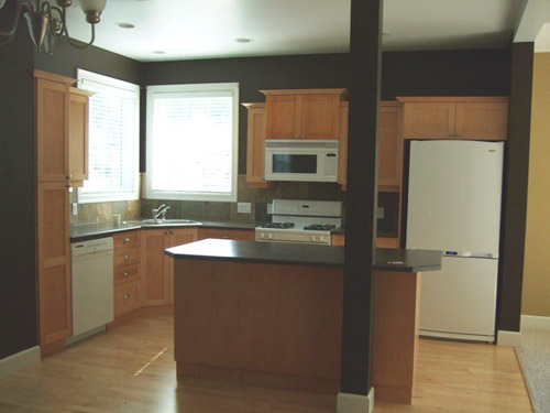
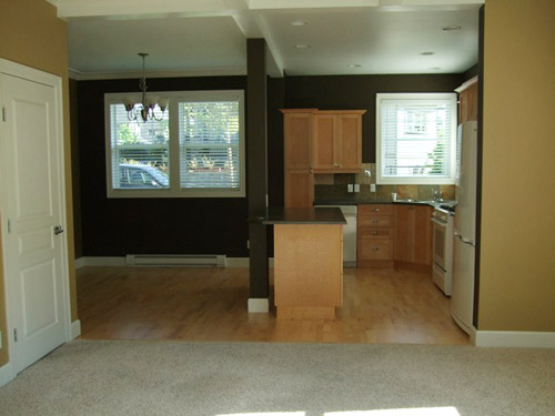
The kitchen cabinets were maple, in a shaker style. We ordered a second set of cabinets from a local company (Summerhill Kitchens) for the top row to match the bottom row and sent all the doors to an automotive painter friend of ours who sprayed them in Benjamin Moore’s Simply White. I painted the gables, and stretchers, and anything else that was nailed down with a foam roller. The big splurge was new appliances – all Vikings. Love them. A Lot. Not Sam’s favourite things to install, but totally worth it (we saved money by having him install them all).
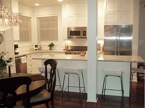
The backsplash is a white beveled subway tile. They were a great bargain (around 60 cents each) from here. The floor was a combination of birch hardwood and the ugliest shag you’ve ever seen. Not only was it ugly, it really broke the space up. After ripping it all out, we laid an engineered walnut floating floor on top throughout the whole main floor. We bought it from an auction that sells flooring a few times per year, so the flooring ended up being an unbelievable $1.50/sq ft (including underlay). Oh and the stools are from Crate & Barrel.
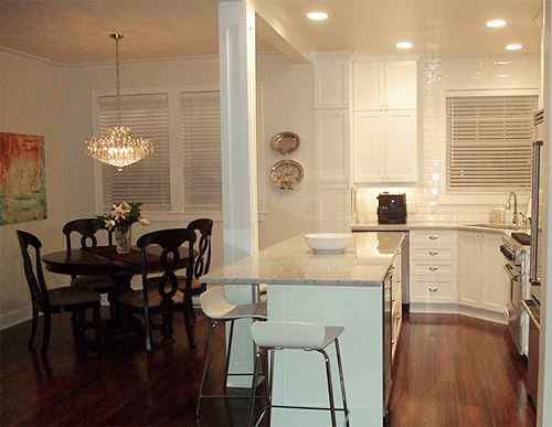
The wall colour is Antique White and the cabinets and trim are Simply White by Benjamin Moore matched to Home Depot’s Behr Paint & Primer in One paint. There’s a post in the middle of the kitchen that we really really wanted to remove, but apparently since it holds up the entire house, they told me it had to stay. So we tarted it up with moulding and called it a day. We’re used to it, but I still wish it was gone. Anyways, have fun with your kitchen renos, catch ya later! – Jasmine and Sam
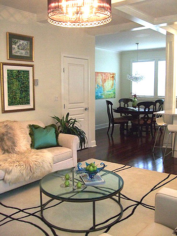
Anyone else think Jasmine and Sam need to start a blog so we can learn more about their renovations? They look like quite the stylish duo. And I for one, love that coffee table above. Here’s hoping they can drop in and answer any comment questions that you guys have here. And in the meantime, let’s play the what’s-your-favorite-part-game. I’m digging the extra cabinetry they added along with those cool stools. And Sherry’s drooling over those shiiiiny counters and that gleaming backsplash.
Psst- We (finally) shared our road-tripping Thanksgiving adventures with friends, family, and food over on Young House Life. Find those deets here.
Psssst – We just put our dining table and six chairs from our first house on Craigslist (it’s from Target, is in great condition, and is about four years old). More deets here.

Lelia says
I would love to know where that coffee table is from!
Stephanie says
Just curious about the extra cabinets up top. It appears from the 1st photo that the ceiling has a slope to it, but the extra row of cabinets in the “after” photos appear level (but the edges are somewhat obscured). Just wondering if Jasmine had to do any maneuvering to adjust for the slope OR if I’m just seeing things? Thanks. Awesome kitchen redo!!!
Gaidig says
I think you’re seeing things because of the shadows in the before picture.
Katy B says
Wow! When I first saw the title I wasn’t even excited to see the “after”. I was thinking, here we go with another kitchen makeover ala white paint. But, this blew me away. It looks so bright and sophisticated. I would love to have it as my kitchen!!
Lisa says
I am very interested in the fact that they got their flooring from an auction. We are looking to convert from carpet to hard wood floors (sadly there are none under the carpet). Anyone have any clue how to look into that?
Nichole@40daysof says
I love it! What an amazing update to a boring builder basic kitchen. And now they don’t have to figure out what to display on top of the cabinets and how often to dust it! :)
http://www.funnyordie.com/videos/b63f436ac2/katherine-heigl-hates-balls?rel=player
Dee Dee says
love it. the extra cabinetry really makes a big difference!
and i’m drooling over the floor.
Alla says
AMAZING transformation! I love everything about this. Hope they drop in to answer all the previous questions.
Leila Waddell says
Ohhh I wish I could buy your table. Dont ya ship to California? lol
I love it and fits the space I have. Also I cant find anything nice for that price.. so that would be great.
But I believe the shipping will be more expensive than the table set itlsef /sadpanda
YoungHouseLove says
Aw man, so sorry there aren’t teleportation services to use!
xo,
s
Audrey says
Wow, such personality! I can tell from the “before” pics that it was a very builder basic style home. They really have made it their own.
katie says
HOLY COW, what a dramatic change! A.MAZ.ING! If my husband had 1 ounce of handiness maybe I could have such a fabulous kitchen, but sadly he does not. I’m on my own!! ;)
Michelle Nguyen says
Love the floor to ceiling cabinets! Its so important when renovating older homes with low ceilings… And makes such a dramatic difference! I did the same with my home and always advise others who are remodeling their kitchens to do the same. Who doesn’t need extra storage?!
Love your blog! Been a follower for some time and compelled to post a comment with this beautiful kitchen make over.
Lindsay says
Is that Kashmir white granite? Love the kitchen!!
YoungHouseLove says
We’re not sure about the counter. Could be granite, Cambrian quartz, or marble. Here’s hoping she drops in with that info!
xo,
s
Katie V. says
Love the sparkly chandelier in the dining room! It works so well with the shiny kitchen.
Tracey says
Gorgeous! I really hope they do start a blog.
Laura @ My Pink Thumb says
Wow! They did such a fantastic job! My hubby and I are hoping to give our kitchen a face-lift in the next year and I’m pushing for all white to brighten up the space. I am now very inspired!! :)
Michele says
OMG. the lighting in the family room and over the dining area is amazing!
Ted says
Wow…they did an amazing job. I’m not a fan of all white so I would never have chosen that, but they did a nice job.
Someone asked why guys don’t like white kitchens. For me, white and stainless kitchens like this look institutional to me. Like a hospital or school or something. And it feels very cold and uninviting. I want a kitchen that feels warm and inviting, so I like warm color woods (we have cherry maple). I also don’t like all one color, I like contrast because it feels more interesting than the monochromatic palette. Last, white always feels like it will be work because EVERYTHING will show up on it and you have to clean it constantly. I remember when my best friend’s mother replaced her counters with white Corian; anything dropped on the counters showed up and she spent so much time cleaning and wiping down everytime you used the kitchen. Maybe some of these resonate with other guys.
Meghan says
I sent an email about the dining room set- I promise I’d heart it forever. :)
YoungHouseLove says
Haha, thanks Meghan! John is emailing everyone the same first-come-first-served thing to keep it fair. So glad you’ll love our table if ya get her. She’s a good little gal.
xo,
s
Lisa says
So pretty! I have Kashmir White granite counters that look exactly like these…that is my guess. We love them as they have specks of pretty much every color imaginable in them so they look clean even with crumbs;)
Sara says
I am absolutely, 100% in love with this kitchen. Amazing.
Gaidig says
Great job, Jasmine and Sam!
I think my favorite parts are the backsplash and counter. The upper cabinets worked out really well. I also think that the new lighting is a big upgrade.
Ana says
Love the coffered ceiling in the after photo (on top of the awesome kitchen remodel).
I’m in the middle of one myself. I’d planned to DIY a lot of things, but sadly, once the contractor opened up the floor, he discovered that the foundation was a mess and that meant a lot of things had to be done by professionals because of how unlevel and out of code things were. (I could smack my home inspector.)
Diana @ Boy + Girl says
Absolutely stunning! I can’t even believe this is the same kitchen. They did a fantastic job. And I agree with a few others – I don’t find the column that bad. It’s not ideal but they couldn’t have dealt with it any better!
-Diana
Jen M. says
Love it! They did a gorgeous job! I want to snoop on more pictures of their house because it looks amazing!
Kate @ Stripes and Polka Dots says
Ahh this is beautiful! I love the whole thing, especially the counter tops!
heathyr says
holy cray, my mouth just dropped. that is the SAME kitchen?!
Nora says
I love this blog! Wonderful renovation and who knew that there are auctions for flooring? I have about 800 sq ft I would love to redo. Is there a website online for the detail (when and where) for the auctions?
Christy says
I’m in love with the coffee table as well! If it’s a “Jasmine and Sam” creation, I’d love to know how the heck they made it!
Becca says
They don’t have a blog! Ah! I searched high and low for a link, cause I didn’t even want to read to the bottom, I just wanted to go straight to the real source. Maybe this will inspire them to start one!?
YoungHouseLove says
Here’s hoping!
xo,
s
Sarah Keller says
Beautiful! If they’re able to answer questions- What color is their granite, and what supplier/company/store does it come from?
Thanks!
Jasmine says
Wow! Thank-you so much everyone for your lovely comments! I can’t tell you how jazzed I am about being on YHL’s blog-so very cool!
I will try and answer some questions asked;
-The cabinets were painted with regular semi-gloss paint (Home Depot’s Paint and Primer in One)and then baked in the ‘oven’ at the autobody shop. I know it wasn’t as hot as baking a car because he didn’t want the wood to catch on fire! Otherwise, I don’t think he did anything else. The end gables, etc that were in place I painted with a foam roller, and obviously were not baked. So far, there are a couple of places where I was a bit too energetic with cleaning and some of the paint on the edges have worn off (could easily be addressed with a touch-up), but otherwise they are holding up very well.
-The post was wrapped in regular primed mdf (medium density fibreboard) that we gave a couple of coats of semi-gloss. Some walls and the fireplace were given the same treatment for some architectural interest.
-The coffee table is my own design. :o) I had the glass for years sitting on a piece of garden ornament concrete as a table, but when we moved I went to a steel fabricator http://www.driverswelding.com
and told him what I wanted. I was learning AutoCAD at the time and was able to ‘draw’ out my vision. It’s made of 3/4 inch steel square tubing. It turned out great I thought!
-The countertop and island top is Bianca Carrera marble (3cm/just over an inch thick). It is very sexy and beautiful, but stains almost as soon as you breathe on it! I still love it though-we will just have to have it polished once in a while if we want to keep it shiny. Some people like the patina of it over time, but I don’t think we’re those people! The island was aslo made bigger with the addition of a wine fridge. (I am doing a friend’s cabin reno and will be using Cambria Torquay in the bathroom. The look is pretty close and I think it will be more user friendly.)
-The light fixture and rug in the living room are both from Homesense (Canada’s version of Marshalls) and we got great deals on both of them. It was a happy accident that the table fits the lines of the rug so well!
-The crystal chndelier in the dining room is actually from Costco online. It is Swarovski crystal and is the most stunning thing in person. We spent more on that fixture than all the other lighting combined! But we think it was worth the splurge. We have a mini sconce in the same style in the powder room. Last month I spent 2 or 3 hours cleaning it, it has 649 separate crystals! No pain, no gain, right?
-The plates and platter that we hung as art on the wall are each hanging on their own wrought iron holder. I know I got one of them from Pier One. Then the holder is just hanging with regular picture hangers. The ceramic pieces are from Portugal (one we bought on a memorable trip, and my son brought the other one back for me) and apparently a very old design. The pewter plate is from Mexico.
I think I got all the questions-again, so pleased everyone likes it! I will show you pics of my paintings if Sherry and John are okay with that. I have dozens more just waiting for new homes. I have thought about a blog, but never really thought anyone would be interested. Maybe it’s time to re-think! Thanks again!
Stephany says
Blog– YES!!!! There will be definite interest :)
Jasmine says
Even though I did re-read my post before hitting ‘send’ I see a few spelling errors (now I get what you mean about how much time it takes before actually posting!)
One more question asked was about the flooring. We went to this place http://www.ableauctions.ca/ when it came to town.
YoungHouseLove says
Thanks so much for answering all those questions for everyone Jasmine! Love your place! And cheering for a blog for you if you have the time! Would love to read it!
xo,
s
Cortney says
Nice kitchen reno. LOVE the white.
Seriously bumming about the fact that I cannot purchase your table and chairs. It is exactly what I am looking for for our eat in kitchen and the price is perfect, buuut I am on Cape Cod and have been looking for one like it near that price for over a year! OH well. :( Good luck, I hope it sells quick for ya so you can use the cash for more awesomeness for the blog!
YoungHouseLove says
Aw so sorry Cortney! Here’s hoping the perfect set finds its way to you!
xo,
s
Laura says
I might be weird, but I kind of liked the before picture and the after picture. I have the maple colored cabinets in my kitchen and my house is only ten years old, am I out of style already?? I even like the before tile backsplash, the paint was a bit dark but the rest of the kitchen looked fairly recent. I do like how the new cabinets go to the ceiling. Oh well, maybe I am getting old (35) and enjoying the “older” styles.
Paula M. says
Great job! I actually envied them their nice maple cabinetry in the Before photos (I have really awful cabinets in my 1970s condo), but I do like white kitchens and I especially love the extra cabinetry up top now. The extra space that was looming above the old cabinetry would’ve driven me nuts.
To break up the white a bit, what about adding a few splashes of easily changed-out color here and there?
I’m thinking some acquas, teals, turquoises or greens to tie in with the pillows or artwork that I see in the nearby spaces.
I could see having the same style chairs in a color — but for a much less expensive change, it’d be a snap to change out the dish towel and/or have a couple colorful ceramics or glass pieces on the counters – or, on a totally practical note, have some kitchen tools that are always on view be colorful ones (again, some colors that tie in with the other visible rooms). Just a thought.
Molly says
Love, love, love those chandeliers. They add such warmth and charm. And, you certainly can’t deny the appeal of the shiny white tiles. Amazing transformation!
Erin says
What a wonderful transformation and the end result is very similar to my (still unfinished after 2 years!) kitchen reno. If Jasmine & Sam pop in, could they share about the hardware on the doors & drawers? Thanks!
Anna See says
oh my goodness! this is a stunny, classy space. i am so impressed by the transformation. love the shaker style cabinets and the subway tile going all the way up the wall!
Mary says
Have you seen this product by Rustoleum – http://cabinets.rustoleumtransformations.com/? I saw it on Pinterest. Not sure if I’m ready to brave it on my entire kitchen but might start with a bathroom and go from there. All of our cupboards are the straight from the box, circa 2001, light maple BORING kind. But if someone else wants to brave this method first and let me know how it goes, that’d be cool too.
YoungHouseLove says
We’ve heard from other bloggers who have used it like Kate @ Centsational Girl and she loves it! Hope it helps!
xo,
s
Amy says
I used the cabinet transformations product in July and I am in LOVE with my kitchen after the transformation. I will say this, if you use the paint without the glaze use a foam roller or you will have brush strokes. The only reason they tell you to use a brush is so the glaze will settle in the strokes! It is relatively easy!
deena says
Sherry look! It’s a white fake deer head with blue antlers. I’m looking around on Etsy for Christmas gifts and I thought of you immediately!
http://www.etsy.com/listing/77956616/cream-robins-egg-blue-deer-head-wall?ref=tre-1344501296-4
YoungHouseLove says
Fun!!
xo,
s
katherine says
It always makes me a little sad to see nice wood painted over.. paneling or plywood is one thing, but those cabinets are in good condition and they’re not too dark or overpowering. I suppose that’s the style nowadays, though.
karen says
very nice!! white is simply perfect for kitchens. good job!!
Lisha says
I have to say I love the dark floors. I’m a sucker for dark floors. We put dark floors in our house when we remodeled.
The whole thing looks great! Very clean looking, which I love!
Thanks for sharing Sam, Jasmine, John, and Sherry!
melinda H. says
Ohhhh la la… I am head over heels for this kitchen!
I’m another interested reader who would like to hear about where she found the light fixtures in both rooms and even the dinette round table? So elegant.
Hope they pop in with answers :)
Jo says
I particularly like the way they have taken the backsplash tile all the way to the ceiling around the windows.
It helped that they extended the cabinets because it created a natural end to the tiling.. but it has elivated a very simple and inexpensive treatment.. ie white subway tile.. to an entirely new level. What a great job.
Jo xx
zana says
that kitchen is awesom…very impressive….i also think they should start a blog of their own!!!
ummm i have a question not related to this post but i hope you guys can assist me in lookin up for that blog….a few days ago or maybe a month….some posted a picture of her bathroom…she painted the pebbles and placed them on the sides of her bath tub….she gave her bathroom a caostal n beachy look….arrgg i just cant seem to find that link she posted here on yhl and her blog…
if one of you have it please post it below my comment…i will really appreciate it….big thanks….
ps…iam also loving followin your kitchen updates john n sherry=) we are in the midst of our kitchen and bathroom reno too!!!
YoungHouseLove says
Aw man, anyone remember that link? I can’t seem to track it down (it was somewhere in the comment section of a post, but we don’t remember which one!).
xo,
s
MoHole says
WOW. I have to say WOW. I am so impressed. This is my favorite reader redo yet! It looks beautiful.
Emansfield says
Did anyone notice the awesome coffered ceiling? That is something I would love to do but have no idea how to get started. Plus with cathedral ceilings, it would definitely involve staging or scaffolding. It think it lends a formal feel and absolutely makes the space!
YoungHouseLove says
Yes, I love it! They were so lucky to have it!
xo,
s
Maria says
I am loving the light fixtures! Oh, and the kitchen :-)
Regan @ RenovatingRothenbergers says
Viking appliances!! My heart just skipped a beat!