Lately lots of the submissions that we’ve been getting are kitchen related, and you know we’re in the kitchen mindset these days… so we’re happy to share. Jasmine & Sam’s remodel wooed us with their use of white on white with tons of texture and a sleek clean feeling. And when it comes to function, we’re really impressed by how the addition of more upper cabinets and details like molding and trim elevated (both literally and figuratively) the entire room. Here’s Jasmine and Sam’s email:
Hey guys! My family and I just had our one year anniversary in our new house and I thought to send you some pics of our new kitchen. We actually did almost all of the projects in our house makeover on our own. Luckily, we are a handy pair.
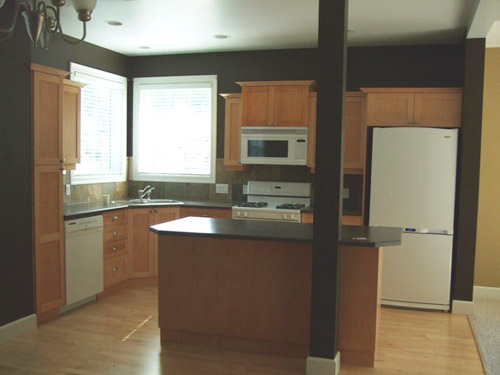
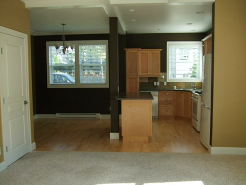
The kitchen cabinets were maple, in a shaker style. We ordered a second set of cabinets from a local company (Summerhill Kitchens) for the top row to match the bottom row and sent all the doors to an automotive painter friend of ours who sprayed them in Benjamin Moore’s Simply White. I painted the gables, and stretchers, and anything else that was nailed down with a foam roller. The big splurge was new appliances – all Vikings. Love them. A Lot. Not Sam’s favourite things to install, but totally worth it (we saved money by having him install them all).
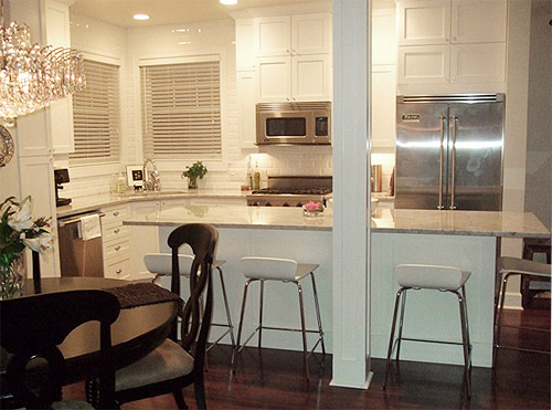
The backsplash is a white beveled subway tile. They were a great bargain (around 60 cents each) from here. The floor was a combination of birch hardwood and the ugliest shag you’ve ever seen. Not only was it ugly, it really broke the space up. After ripping it all out, we laid an engineered walnut floating floor on top throughout the whole main floor. We bought it from an auction that sells flooring a few times per year, so the flooring ended up being an unbelievable $1.50/sq ft (including underlay). Oh and the stools are from Crate & Barrel.
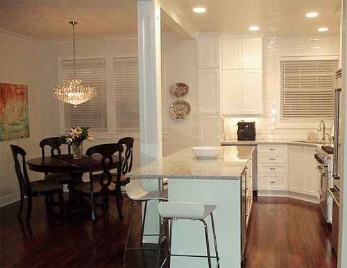
The wall colour is Antique White and the cabinets and trim are Simply White by Benjamin Moore matched to Home Depot’s Behr Paint & Primer in One paint. There’s a post in the middle of the kitchen that we really really wanted to remove, but apparently since it holds up the entire house, they told me it had to stay. So we tarted it up with moulding and called it a day. We’re used to it, but I still wish it was gone. Anyways, have fun with your kitchen renos, catch ya later! – Jasmine and Sam
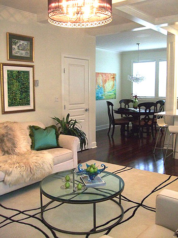
Anyone else think Jasmine and Sam need to start a blog so we can learn more about their renovations? They look like quite the stylish duo. And I for one, love that coffee table above. Here’s hoping they can drop in and answer any comment questions that you guys have here. And in the meantime, let’s play the what’s-your-favorite-part-game. I’m digging the extra cabinetry they added along with those cool stools. And Sherry’s drooling over those shiiiiny counters and that gleaming backsplash.
Psst- We (finally) shared our road-tripping Thanksgiving adventures with friends, family, and food over on Young House Life. Find those deets here.
Psssst – We just put our dining table and six chairs from our first house on Craigslist (it’s from Target, is in great condition, and is about four years old). More deets here.

syreena says
I LOVE the extra cabinets!!! I really love the look of a white kitchen but i love the richer stains as well. I would really like to do a mix of the two but have no idea how to do it the right way?!?
This re-design was goWageous!!!
YoungHouseLove says
I’ve seen lovely stained lower cabinets with white uppers! Hope it helps!
xo,
s
Laurie says
Gorgeous! Adding the extra cabinets on top is what made it so much better, in my opinion. That’s what transformed it from a builder’s kitchen to a high end custom kitchen. Well done!
Laura says
Love the kitchen – it looks gorgeous. I have white cabinets, which came with the house. Maybe they weren’t primed appropriately or something, but they are not holding up well to the heavy wear and tear in our family of 4 kids. Chipped, scuffed, etc – not shabby chic, just shabby. I actually dream of getting new pale, maple cabinets like your originals. Not in the budget, so I’m trying to gear myself up for painting them – considering using Annie Sloan’s chalk paint to reduce some of the prep work.
Aryn@LivingonADimeorLess says
I LOVE that kitchen redo!!! They did an amazing job!
Oh yeah, and I can’t tell you how weird it is to surf my local Craigslist postings (I’m always in the need for new furniture!) and see pictures for a table & chairs posting and yell out (yes, because I actually yelled it!) “HEY, I know that kitchen!” I found your post on C’list and recognized the picture of your table in your now grellow kitchen!
YoungHouseLove says
Haha- isn’t that funny! I love how the tables is in two different places (one for each pic).
xo,
s
Heathre says
I love, love, LOVE the floors and the subway tiles.
Maureen says
I’m a big fan of the cabinets all the way to the ceiling. Such a waste of good storage space to stop them mid-wall. The shorties can always have a handy step ladder to get stuff off the high shelves. I love that marble counter top and how they extended the island to a seating area. Nice job with the trim and amazing appliances. I realize white is the rage now but I find it a bit blinding and too monochromatic with white cabints and white backsplash. Something about white subway tiles to the ceiling says hospital aneseptic or a room that regularly gets hosed down. Looks like they put a lot of work and love into it and that’s a good thing. Everyone has their own idea of dream kitchen.
Leila says
Another of Jasmine’s proud sisters here, and all I can say is I am so excited to see both Jasmine and Sam getting the praise they both deserve! You should see what those two can do to a bathroom when you let them at it! Nice job guys! Xo
Donna says
Hi Sherry! You said that your local Ben Moore store has pros that will paint furniture or cabinets for a fee. My question is, we only have Ben Moore products in hardware stores here… is this where your pros are located or do you actually have a Ben Moore store with pros? Also trying to get my cabinets painted!! Thanks :)
YoungHouseLove says
Here we have specialty paint stores that carry Benjamin Moore (called Virginia Paint Company). Hope it helps!
xo,
s
Jasmine says
Thank-you again for the comments! We’re blushing. (Okay I am blushing, Sam is fine).
The house is only 5 years old, and no, the kitchen wasn’t awful, just not our taste. One of the cabinets had discoloured and had to be dealt with regardless. It didn’t help the space that the previous owners brought in a blind interior designer for colour choices for the walls. I have wanted a white kitchen my whole life-it took three other houses to talk Sam into it! These pics were taken a while back and we have added a few things here and there-mostly some fantastic Tiffany Blue accents (thank-you Z Gallerie!).
The knobs came from here http://www.leevalley.com/en/hardware/page.aspx?p=50451&cat=3,46742,44008&ap=1
and really do act as jewellry.
Thank you again Sherry and John!
YoungHouseLove says
Thanks again to you for letting us share your gorgeous kitchen!
xo,
s
threadbndr says
I think I would have backed up the island bank of cabnites to build around the column and had another step between the stove and island. It looks just a bit tight for getting things out of the oven and notching the granite around the column might have helped pull the column into the kitchen just a bit.
But over all, a great renovation. Is that a wine fridge I see there in the new part of the island? YUMMMM. I’m trying to figure out how to build a tiny one into my kitchen.
Kristi says
I totally picture those stools – or something similar in your kitchen John and Sherry!
YoungHouseLove says
I LOVE them!!!!! First question I asked was: where are those stools from?!
xo,
s
Tasha says
That is so funny because I just posted about painting my kitchen cabinets white! It’s not nearly as dramatic or stunning as this remodel, but this love for white must be something in the air. And in my tiny apartment, white just really opens up the space! It’s here: http://diyingtobedomestic.wordpress.com/2011/12/02/a-little-paint-goes-a-long-way/
YoungHouseLove says
So pretty!
xo,
s
Sally says
Too white. Blinding. Looks like a spaceship.
Andrea says
What a FABULOUS kitchen… I am sooooo envious!! Simply stunning with the white on white… so glam looking.
Beth C says
Wow! That is gorgeous! I’m drooling over here. I love shaker cabinets. And marble counters. And subway tile.
Randa says
Wow, I am seriously impressed. It’s funny because when I first looked at this post and saw the first photo, I thought, wow, that’s not bad, is that the before or after shot? Well, that question didn’t linger too long in my mind when I saw the actual “after” shots!!!! It’s so inspiring to look at other people’s work and see what can become of spaces.
Jordan@the2seasons says
Wow great reader re design. I am shocked that is the same kitchen. I am dreaming of a white kitchen. I have cabinets very similar so it is good to see it in white. I love all this kitchen stuff!
Kim says
That kitchen is gorgeous! I rarely see a kitchen I like as much as my own, but that one is just great. Love the additional cabinets at the top, too.
Melissa says
I really love this kitchen. If the creators happen to drop back in to answer some questions, I would love to know where they got the light fixture in the living room. It looks awesome.
Nichol Naranjo says
Absolutely beautiful! All of it. I am in LOVE with the fur throw on the sofa? Please share where you found it. :)
Lauren @ Around the World Food says
LOVE the updated look of a white kitchen. So timeless.
Victoria says
Gorgeous! I SO want a white kitchen:)
Please, please, please I hope that they can share where they got that throw and pillow adorning their couch:) Love them:))
Kristin ~ Bien Living Design says
What an amazing transformation!
lexi says
What an amazing redesign! I LOVE white kitchens!
xx Lexi
FASHION: Glitter & Pearls
WEDDINGS: Glitter Weddings
erica says
would love to hear which auction was the source of that great flooring deal!
nan says
I too was thinking I wish she told us where she got that coffee table from… LOVE IT. I love how they used white throughout.. I would be very scared.. two kids and all white.. very scared but I LOVE LOVE the look. great job! but please share..where is that coffee table from?
YoungHouseLove says
I believe that Jasmine dropped in with that info in the comment section a little while back, so feel free to scroll back for that info! Hope it helps.
xo,
s
Patti says
My jaw dropped at the after pic! It’s amazing what white paint does for a room. I love the rug too!
sarahbclark! says
wow, that layout is fantastic!
Marcie says
I LOVE the idea of putting extra cabinets on top! I want to spray my ugly-to-me cherry cabinets, but they are so short and squatty, I know I would hate it more than the cherry red. This is a great solution! I’d also LOVE to hear about the coffee table. Spill it already Jasmine! :)
Marcie says
I see now that she did tell us where the coffee table was. Somehow I thought I had seen all the comments!
YoungHouseLove says
No worries, so glad you found that info!
xo
s
Tracy says
Would love to know where they got their kitchen table and chairs, LOVE THEM!! Gorgeous reno!
Jenna at Homeslice says
OH MY GOODNESS. This is one of the best kitchen renos I’ve seen. Obviously it’s a tight space, but they added so much function and it’s beautiful. Did you guys have to move the cabinets at all or were you able to find the right size to squeeze on top. Love it! And bummer about the post- I think it looks beautiful now though!