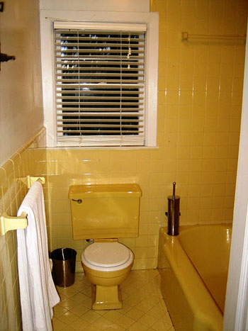
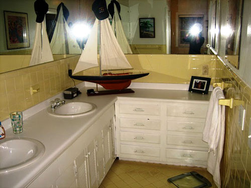
Just as we mentioned last week, Reader Redesigns are back y’all!! And we’re kicking things off with Michelle’s amazing bathroom renovation. She and her husband David gutted the crazy yellow bathroom, completely reconfigured the layout, and built it back up in beautiful greys and fresh sparkling whites. Here’s her letter:
Hi Sherry & John! Your bathroom at your first house sparked me and my hubs to renovate our 1952 en-suite bathroom. We followed soooo many of your tips (we ran into all of the same demolition problems, including the wire mesh). It was no bueno! But thank goodness all of the hard work is done. I shared the big final reveal of the bathroom here on my blog Ten June, and you can also look back at the entire renovation here. Anyways, I just wanted to say THANK YOU for your insight! So excited that Reader Redesigns have returned! -Michelle
Um, it’s insane. Seriously, it doesn’t even look like the same room. Just check out these before pics:
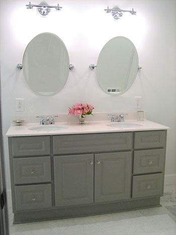
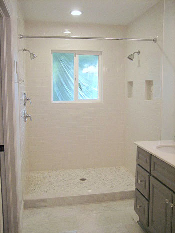
And now for the holy-cow-that’s-amazing afters:
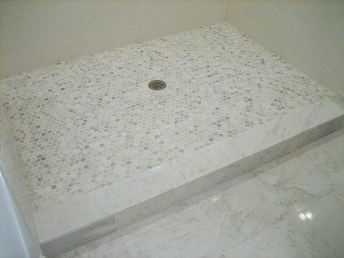
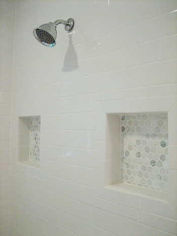
Not only is that shower – ahem – double shower awesome because it sits where the toilet and bathtub formerly were, but it also has these killer hex tiles….
…which Michelle and David smartly echoed as details elsewhere in the shower.
Sherry and I may or may not have gone nuts over that tile. And everything from the soft gray vanity to the glittering angled mirrors have us in a gorgeous-bathroom-induced haze. As Michelle said, there are more before, during, and after pics on her blog: Ten June (namely, here and here). Thanks for sharing your awesome project with us Michelle!
Got your own awesome before & after project? Send your story, pics, and related links to [email protected] to be considered for a possible Reader Redesign feature. You know we love any and all design eye candy!

Karen T. says
Holy smokes! Their bathroom looks AMAZING! I’m totally jealous! So glad y’all brought back Reader Redesigns!
Jill @ Mission Decorate says
Holy Makeoever Batman! This is amazing! Great job Michelle.
Jenna says
Oh wow! That is an amazing redo! And yeah, the tile totally rocks!
Andrea Ross says
Looks great! We recently redid our master bathroom but were lucky in being able to keep the major pieces and just do the floors, walls, counters (around the tub), etc. here’s a link if you want to take a look: http://byandrealeigh.blogspot.com/2011/08/our-new-master-bathroom.html
YoungHouseLove says
Wow- looks awesome!
xo,
s
Maureen @ This (Kinda) Old House says
This looks awesome! Gray is big on my mind lately also… Love that the redesigns are back!
Virginia says
I just Loved the bathroom! what a makeover!
and love that Reader Redesign is back!
I´d like to see what she did with shower curtain as well…
I´m brazilian and around here we are not used to shower curtain, most bathroons have glass doors!
Ilana says
So disappointing. Rather than trying update something unique, (like keeping the yellow tile but getting a new toilet and reglazing the bathtub), they made their bathroom look like a cookie cutter snooze. Also upping their carbon footprint…
Kim says
Maybe you should submit a redesign where you’ve done just that. Otherwise you’re just being judgmental.
Jaimie says
At first I was confused about the toilet being gone, but I checked out the blog. I love that they moved it away from the shower and gave it its own little space. The only bad thing I could say is it’s not a good idea to completely remove the bathtub from a master bathroom, even if just for resale value. Some people don’t care about resale value, but it does matter when you aren’t planning to stay in the same house forever, especially when investing money in a renovation.
Otherwise, fabulous!
Sarah-Nadine says
Can’t wait to share our before and after 1950’s bathroom when we are done. We have one in baby blue with matching wallpaper, shower curtain and curtains to remodel, along with the same thing in pink. The fun never ends in my house either.
Thanks for your amazing ideas
Jenny says
Oh wow, that IS amazing! Love the shower with the hex tiles, so pretty! What a great job; I’d never want to leave the bathroom again :D
Emily M says
I absolutely love this! I just started my own stenciling adventure in our half bathroom, and let me just say…you got a lot farther than me in 4.5 hours. My stencil is a quatrefoil cardboard cutout :P I really liked this design and couldn’t find something similar in an actual stencil. So I’m tracing with pencil and painting overtop (which will require two coats…ugh!!). I’m hoping this is the link to my progress thus far: https://fbcdn-sphotos-a.akamaihd.net/hphotos-ak-ash4/300445_10101489922550154_9305479_85505897_1907597_n.jpg
Hmm, yeah, I doubt that’s going to work, but hey, I tried.
Anyway, I ramble, sorry :( Good luck with the rest of the office!
YoungHouseLove says
Love it so much!
xo,
s
Brandi says
oh my goodness i love it! definitely gives me some ideas for our big master bathroom renovation scheduled to begin in January!
the people who lived in our house before us actually removed the toilet from the master bathroom in favor of a double shower so when i saw the pictures posted i was wondering if someone else in the world did that. knowing the inconvenience i’m glad they put it in it’s own little space.
Lindsey says
Ok… so it looks like they moved the window????? How the heck did they do that?! Btw.. I am going to have to send some before and afters of my laundry room makeover (small demo) :)
YoungHouseLove says
They’ve did! And they’ve got all of the details over their blog (see the link in Michelle’s letter about the look at the process).
-John
Shelley @ Green Eggs and Hamlet says
Wow, great job, Michelle and David. I am SO jealous of your big double shower. We moved into our first house a couple of months ago and have a small avocado green shower stall. I’m dying to rip it out and make it bigger and put in new white subway tile so I can actually get the darn thing clean!
Julie B. says
Do you think that having a shower only bathroom could be a hard selling oint for the house? It is beautiful but some people really want a tub.
YoungHouseLove says
I think it depends if there’s a tub in another part of the house. We’d happily buy a master bath with just a shower but would need a bath for Clara in the hall (somewhere near the kids bedrooms). Anyone else care to weigh in?
xo,
s
Christina says
I don’t think I’d mind a shower only if there were 2+ bathrooms and there was a tub somewhere in the house, like Sherry said. Now- the double shower thing- to each their own. I’m not a huge fan. I love what they did to the bathroom and it’s beautiful. Most importantly- if they love it, then that’s what matters! I don’t get the whole 2 shower thing in general. No offense- just a personal preference :)
Lyndsay @ Mr and Mrs says
I agree. totally fine with the shower only master as long as there is a bath somewhere else. we don’t have kids yet, but even i like to have the option of a bath somewhere in the house…although i hardly ever use one.
Anneliese says
We ripped out the big (nasty, ugly) bathtub from our master bath in our last house and replaced it with a walk-in shower(the redo was a reader redesign “back in the day”)… when we put it on the market, the second group of people to tour the home bought it for just a smidge under asking price.
And this was during a month the media claimed was the worst time for housing sales in 30 years. So, from my limited data pool, I’d say that as long as you have a tub somewhere in the house, you’re fine.
Kelsey says
BEAUTIFUL! I love the marble flooring. Great job, Michelle!
jessica says
where do you get the premade niches for the shower, i tried Lowe’s but no luck. I want them to be water tight so afraid to dyi. Any tips, thanks.
YoungHouseLove says
Hmm anyone know? I would think you might have to make them out of cutting hardiboard or hardibacker? Maybe use some sort of watertight caulk in the corner? Anyone have info on that?
xo,
s
Pamela says
Jessica – Floor & Decor carries the waterproof shower niches that are meant to be tiled over like in the remodeled shower. If a Floor & Decor location is not near you (they have nice stuff in the store in my area), you could order it on-line (type in the word “niche” in their website’s search bar). Hope that helps you!
http://stores.flooranddecoroutlets.com/locator/
Rebecca says
They have them at the Tile Shop. They are plastic squares that you tile over.
YoungHouseLove says
Thanks Rebecca! So good to know!
xo,
s
Ade@fortheloveofpainting says
Wow that is quite the transformation…looks great!
Py says
Lovely! The double shower is nice…. But where did they put the toilet?
YoungHouseLove says
Click on over to their blog for more pics!
xo,
s
michaela says
Love Michelle and her bathroom seriously turned out amazingly (:
Jessie says
I looooove the monogram towel holders! What a great transformation.
lifebeginsatthirtyright says
Awesome makeover – love the semi-DIY vanity!
Alicia Sherman says
This is simply a-mah-zing.
That grey is so hot right now! (a la Mugatu from Zoolander, of course)
YoungHouseLove says
Haha- any comment with mention of Mugatu gets me to pop in and say: hilarious.
xo,
s
Megan H says
it’s gorgeous! Thanks for bringing these RR’s back!
Kathryn Griffin says
Boy, they got guts and glory! That’s flippin’ fantastic! Thanks for sharing the renovation. Toodles, Kathryn @TheDedicatedHouse
Anne says
I am so jealous of this amazing bathroom! Ours needs to be remodeled too and we only have one bathroom in our whole house! Not looking forward to that…
Jordan G @ The Happy Homebodies says
Woohoo for the return of Reader Redesigns! This bathroom is beautiful and I love everything about it. Bravo!
Eliza says
yay! i’m glad reader redesigns are back! i didn’t even realize how much i missed them. i’m with you, that tile is gorgeous! fully bathroom guttings, especially when they involve moving fixtures, always hugely impress me. well done, them!
Lauren says
Oh wow, what a change! I love how zen the new bathroom is and I’m a sucker for those oval mirrors :)
Erica says
You guys should get a “share” button for the bottom of your posts, because I would totally share this on facebook. That bathroom is my dream bathroom!
YoungHouseLove says
We actually do have a Facebook “Like” button on the bottom of our posts (when you click into them to comment). Hope it helps!
xo,
s
kelley says
Yeah! Thanks for bringing back the Reader Redesigns! I missed them! Love to see all the creative juices out there.
Michelle @ Ten June says
For those who are concerned, we’ve got two other tubs in the house : )
Elizabeth says
Gorgeous!!
Btw, have y’all heard of the Australain show “The Renovators?” My roommate and I discovered it over the weekend and may or may not have watched the entire season up to the current episodes in three days… it is seriously amazing. Think Top Chef meets Iron Chef meets Chopped, but for renovating!!
YoungHouseLove says
Oh man, that sounds awesome! It needs to come to the US! Do you know of any way for us to watch it? Is it on Hulu or Netflix?
xo,
s
Emma says
Hi guys – fellow Aussie here, I have been watching Renovators on and off, if you want here is the website, I think you can watch ep’s online: http://therenovatorstv.com.au/home.htm
But my biggest addiction this year was The Block – LOVVVVEEEDDD it! My life revolved around The Block for awhile there :) Loved Josh and Jenna’s style and the sister’s industrial modern take on design. Get addicted!
http://homes.ninemsn.com.au/theblock/
YoungHouseLove says
Thanks so much Emma! Love it!
xo,
s
Angela B says
My favourite part of The Renovators is that they have ‘master class’ on Friday nights – they go through different renovating and design skills. I reckon between your blog and that show I would be reasonably confident to at least attempt some DIY.
YoungHouseLove says
Oh man it sounds so awesome! Would love to catch it!
xo,
s
Elizabeth says
Well, my roommate discovered it on the site she uses to watch tv shows (letmewatchthis.com) which I know sounds rather sketchy but we tried watching it on the Australian channel 10 website and the player wouldn’t work in the US.
YoungHouseLove says
Aw man, bummers.
xo,
s
Krystle @ ColorTransformedFamily says
I love the transfomrmation. I wish we could do something like that to our’s… but we only have one bathroom. I don’t know what we would do in the meantime.
Robyn G says
Great job on the bathroom re-do. I personally wouldn’t have changed a thing because I am a yellow fanatic! But of course, I know I’m not in the majority on that.
Erin H. says
I love reader re-designs! Where is the toilet???
YoungHouseLove says
Haha, click over to her blog for more pics & details!
xo,
s
Amanda Wells says
Wowza! Love how crisp and clean it is! So glad Reader Redesigns are back!
http://www.amandadovewells.com/?page_id=45
Courtney {a thoughtful place} says
I love Michelle and it’s been so fun watching the whole transformation. Such a job well done. I love every detail. Happy this series is back! Yahoo, Ten June! :)
Reenie says
haha….I was wondering the same thing….where’s the toilet now. I’ll have to click over to their blog.
The yellow in the photo of the sinks….looks ok. But, the yellow in the photo of the tub and toilet….looks like a deep wowza~yellow!! I do love the old bathrooms ~ but I guess I’d have to see it in person whether or not I wanted to work with it =)
Beautiful transformation.
joyjoy says
Holy wow, that’s an amazing transformation! That vanity is so, so pretty.
OurGrowingGarden says
I love the subway tile and the peaceful gray! So pretty!
kitchen sink make-over!
HeatherM says
Beautiful redesign!
For those who love the tile work- have you been to the Tile Shop yet? Please tell me you have. They are a national chain of stores, and a DIY’er’s paradise! (and the staff are insanely knowledgeable too!)
YoungHouseLove says
Yes, they’re awesome! Can’t sing their praises enough. When they came to us to be a sponsor we couldn’t believe it. Haha. They’re such an awesome company.
xo,
s
Diana says
I love that you are bring back before and after pictures. I love look at them.
Brittany says
I love the remodel and I love reading you guys’ blog! You two should really do a daily video blog of your life… I watch a couple of people on youtube that do daily vlogs and it’s so fun to watch and they seem to have so much fun doing it! Plus I am sure a ton of people would love to watch your vlogs, cause the videos you already have on here are so cute and fun! =) Hope you consider it!
-xx Britt
YoungHouseLove says
Aw thanks- that’s sweet! I think we’re happy to hide dorkily behind our computer screens and come out every few months or so in some video tutorial. Haha. We’re shy…
xo,
s
Shelley says
I’m swooning over that accent tile! I’d love a big open shower like that!
Mary@The Good Life says
Yay for reader redesigns! So much fun!
Jeff Platt says
This post reminds us all who live in houses, whether we are new to them or not, that you can make small changes in lesser emphasized rooms and make a big difference in the appeal of your home. I remember when I was a kid and my parent renovated our bathroom. If only they had the luxury of going back and reading this first I wouldn’t have had to deal with that eyesore everytime I went to shower.
eileen marie says
Am I alone when I say I prefer the before?
JUST KIDDING!! That makeover is amazeballs!! I love the grey & white -I am doing those same hex tiles in my next bathroom -such a copycat! Heidi P. is right -subway tiles are great, SO trendy, but more importantly, timeless. I HATE colored tubs, toilets, sinks, etc -they eventually (like 1 month later) go out of vogue. I will say I am a convert when it comes to “regular mirrors” vs. medicine cabinets. I used to think it wasn’t worth losing the storage for the aesthetic, but I live in a small apt. Well done, Michelle! SO inspirational. Your hard work was worth it!
Tamsyn says
Holy cow alright! This is one of the best bathroom re-do’s I have seen. I seriously need that tile somewhere in my house :)
Lindsay says
Yay for redesigns! I am so happy they are back!! I’ve been missing them. Thank you!!