When we opened this reader email, our first thought was that someone had stolen photos of our guest bathroom and just adjusted the color to turn our yellow tiles green. Seriously, how similar are they (our yellow guest bathroom is here on our house tour page)? But it turns out Susanne was just lucky enough to have a real-life green-tiled bathroom of her very own. Here’s her letter.
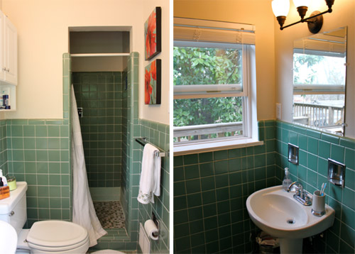
Hi John & Sherry! We just completed a total DIY renovation of our 1956 en-suite bath. Prior to the renovation, the bathroom looked a lot like your yellow bathroom…. lovely green tile up to your eyeballs (well, your eyeballs when you’re 5’2″). Three different patterns of green tile, a scary, small shower with little ventilation, cramped quarters… and so on. We did our best to update the look with accessories, but at the end of the day it just wasn’t our cup of tea.
Like you, we’ve tackled big renovations before (our kitchen in 2011), but this was a whole new beast. Trying to level concrete floors is something I’d rather never attempt again. However, we did it all ourselves, we did it on a dime, and we did it all together…. and the end result was so worth it!
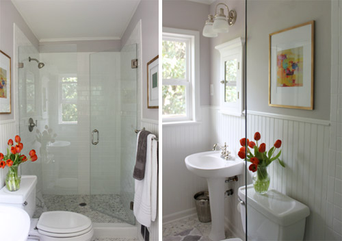
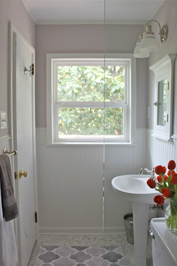
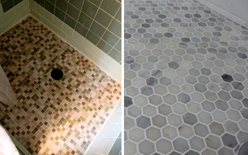
Going from old dated tile floors to new marble hex ones was definitely a welcome change…
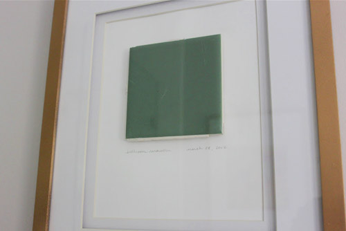
And we even framed one of the old tiles to remind us of how far we’ve come!!
Thanks for your time and for considering us! – Susanne
You can check out more jealousy-inducing pictures over on Susanne’s blog, including this post with a few more detail shots. What do you guys think? Are your mouths hanging open like ours were? What’s your favorite part? Mine is the awesome floating glass shower door (so much more open than the small tile stall that was there before) and Sherry’s obsessed with that marble hex tile.

Anne says
Looks great! Love the framed old tile. Great idea. :)
Claire says
I’m with Sherry…. that marble hex tile is awesome.
maribel says
The shower sits right next to the awesome tub from the other day…. Boo, i have the pleasure of showering in a ugly 80’s maybe even 70’s fiberglass tub/shower. I pray the day i can rip it out…..
Lindsay @ Me, Ed and Pea says
Gorgeous! We have three bathrooms like her “before” picture…a pink one, a gray one, and a yellow one! Isn’t that special ;)
Margaret says
Beautiful! I love the framed tile – it reminds me of the framed wallpaper rabbit in Uncle Jesse’s room. FH reference, that’s right.
Felicia @ lakehouseeffect says
Love it! We just redid our bath and have a totally similar vibe with the beadboard on the walls and color scheme. LOVE that shower!
Krysta says
I really love that old tile but I also really love how open and light the new shower is. I love that they kept one of the old tiles in homage.
Amy @ a new old house says
Beautiful!!! My fav is a tie between the tile and the frameless shower door- makes it look so much bigger!
Janet says
This looks like my bathrooms. This is what we had in mind to do to one of them. When I saw the after pic I was amazed. It turned out great!!!I have to get started this weekend on the main restroom.
Julie says
I love this take on the floors!
Paige @ Little Nostalgia says
Literally gasped out loud! That’s an amazing transformation! I’m especially in awe of that glass shower. Come to mama.
Anne with an e says
And I totally have that bathroom in the pink version! And wow, would I love to have their updated version replace the 50s one. Love that they framed a tile – what a fun touch.
Krystle @ Color Transformed Family says
Wow! That transformation is amazing. My favorite part is that they framed one of the old tiles. Ok… that isn’t my only favorite part… I love it all. Oh, to have a glass walk in shower like that. Their hard work payed off.
Bethany says
Such a huge transformation, they did such an amazing job! I never would have known it was the same bathroom. And like a lot of other people have said, I love that they framed one of the old tiles. It reminds me of Full House when Uncle Jesse framed one of the pink bunnies from Stephanie’s old wallpaper… anyone else? Hahaha
Lisa says
Oh. My. Godiva! What an incredible makeover!
Jen says
Ummm…. Are you sure that’s not the bathroom from my previous house? Awesome job! I could’ve never envisioned our ugly bathroom looking this good so we sold it AS IS!
Kristen @ LoveK says
What a beautiful transformation!!
danielle says
i love that they framed the old tile. genius!
Ally says
Beautiful work, Susanne! :)
(What did you inscribe under the saved tile? :)
xox
Bethany says
What a great idea to frame one of the old tiles! Bet it makes them feel proud every time they look at it!
Skeeter says
Ooh, I love it. The wainscotting, the tile, the shower door. Basically all of it. On an unrelated note. Do they have a parade of homes out there? I just saw a billboard for ours here and instantly thought ” John and Sherry would llove that!” it’s basically a whole weekend and citywide house crashing of our newest and nicest homes. Anyways, that was my random thought of the day lol
YoungHouseLove says
Yes, we love it! We’ve blogged about our adventures before. So much fun!
xo,
s
Christine Witt (Brush Dance) says
Amazing makeover – LOVE that floor and the clean open feeling in the room overall.
Katie says
Is there a source for that floor tile? I love it, and have been hemming and hawing about what to do in my bathroom for months.
YoungHouseLove says
I think if you click over to their site they have that info!
xo,
s
Azulao says
( .)(. ) Oh. My. Goodness. What a super-fantastic job. Their *persistence* blows me away!
kelly says
we are about to do a similar project this gives me great hope!! love the tile! this is simply beautiful!!
Amy says
It is undoubtedly beautiful but my practical side has a question and a comment. First my question is, where do you put your shampoo, soap washcloth or loofah and razor? I hate going to a hotel that doesn’t have a spot for these things so it would drive me berserk to live with that problem everyday. Certainly no one wants to stare at that stuff through those beautiful glass doors but it has to be used and has to go somewhere? Surely a couple shelves built in wouldn’t ruin the look too much and look better than some other options. Next is my comment – I also have a teeny tiny bath but I traded out my pedestal sink for a small cabinet sink which gives us space for an extra roll of tp, mouthwash and cleaning wipes so I can quickly sanitize after one of my boys’ aim went awry (the joys of little boys). Soooo glad we have the extra storage!
Samantha says
WOW, love love love this redo!!! I love everything about it!
Sofia - WinterStays says
I have to say I think it looked really nice before you changed it, but I understand what you meant with a cramped shower, I also prefer glass instead.
Natalie says
And now I’m more determined than ever to keep both my crazy tiled bathrooms -one is green (so like the one they ripped out), and the other is black and pink. I kid you not. These guys obviously did an amazing conversion job, but I actually really loved their before pictures. To each his own I reckon.
liz says
Absolutely gorgeous! I love how the glass shower doors make the room look so much bigger!! And I’m a sucker for carrara marble!
sally says
I hate this! It’s so “of the moment” there are a zillion re-dos like this online. The vintage tile was so unique. What a shame.
Gina says
That is a gorgeous bathroom!
Sarah@SBrandesDesigns says
I am in love with the hexagon tile. Seriously. And what a cute idea to frame an old tile!!! creative creative creative!
MoHole says
Wow! I am wildly impressed. That is a fantastic makeover. Good work, guys!
John@RemodelingBIBLE says
I think the flooring deserves top marks in my book!
Sammy says
LOVE the floor tiles!! And am so going to frame something from an old room before making it over!!
xx
Julia says
OMG! I actually have one of these pictures of their bathroom on my inspiration board for our bathroom (for when we get around to it)! Its so fresh looking, I love it.
I don’t remember where I found it though? google?
Megan says
I want the floor! It’s so beautiful.
Anna says
Ridiculously gorgeous! I would love to know the name of that paint color…
Kiki says
It looks great, but am I the only one that loves the color of the tile? My parents had the old tile from that same time period (but pink!) so I understand getting rid of it. However…I kind of love the before pictures and would have loved to see it stay. It’s not my bathroom and their redo was gorgeous! I think that kind of tile is weirdly coming back. Which is good news for all the people who can’t afford a full redo. :)
Melanie says
Absolutely gorgeous bathroom! Jelly over that one!
Karla@{TheClassyWoman} says
They did an awesome job. Their new bathroom is stunning!!
Margaret says
They knocked it outta the park. Excellent job.
T. Y. Lee says
I love that she framed that old green tile as a memento! What a great idea, that I will totally plagiarize in my own remodeling job, as I have some really boring beige travertine tile I want to rip out (I really don’t like beige, at all, AT ALL, I’d rather the tiles be neon orange than beige!)
Love the bathroom, but I really do prefer a tub in there, but that’s totally a personal preference! (I’m Asian, we NEED tubs, it’s very cultural LOL)
Great job though, the bathroom doesn’t look the same AT ALL! And the glass doors on the shower make it look so much larger!
how2home says
Wow, what a great transformation! I think making the bathroom white, totally gives the illusion that its much bigger and that full glass shower is to die for!!
Kristina Gulino says
Whew! So fresh and airy now! What a neat transformation.
Kristina
Nook & Sea
AmandaonMaui says
Wow! That’s a fantastic transformation. That shower was dark and unhappy before, but it’s so light and airy now!
Kara says
Framing the tile was the ultimate touch. Hilarious.
Natalia says
Wow!! Their bathroom looks amazing! I especially love how they framed their old tile. What a fun piece of artwork.
Jackie says
Yes, beautiful. And I also love that they framed the old tile. What a great idea…