Jaw dropping is not a term I like to just throw around, but I think this makeover earned it. Emily’s got lots of info about her makeover, so I’ll just let her dive right in and show it off to you guys. Here’s her letter:
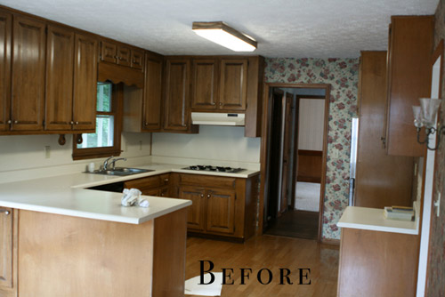
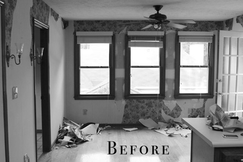
We bought this house as a foreclosure a little over two years ago. We got such a great deal on the house that it hasn’t been as difficult to save our money for the updates it needs. The house was built in 1987 and the interior had not been touched since, except for adding a layer or two of wallpaper over the original wallpaper. Floral explosion all up in the house! I really enjoy cooking and being in the kitchen, so that room was always on the top of my list to re-do as soon as possible. Our kitchen was so icky feeling – the formica countertops were stained, loose from the cabinets, and just plain old (but not in the cool vintage-y way).
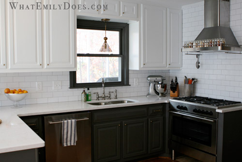
I browsed for hours and hours on different design sites and I eventually fell in love with the look of bi-color cabinetry. I felt like it would give me a little bit of a modern look without being too much, because I always have re-sale value in my head when making changes to the house. I didn’t want to do something too crazy that it would be difficult to sell later on if we ever need to move.
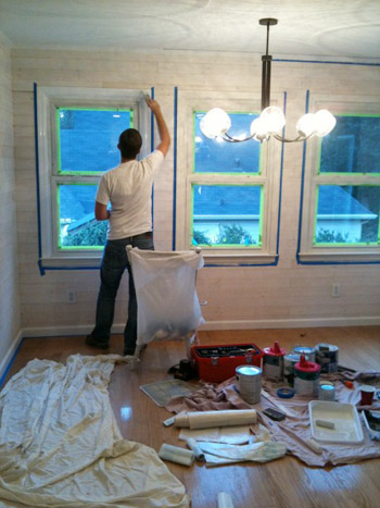
In order to save big bucks, and not be wasteful, we had the cabinets re-painted rather than ripped out to buy new ones. We hired a contractor to do a lot of the work (mostly to save time… and our marriage) but we DIYed the whitewashed plank walls to cover the terrible attempt at my first wallpaper removal.
Adding the plank walls took two Saturdays with my husband and I both working on it, and I would say that it’s a moderately easy project to take on.
Thankfully my wallpaper mistake turned in to a design success.
Another big savings was in purchasing all of our appliances at IKEA during their kitchen sale. We were able to get our dishwasher, a 5-burner oven range, an exhaust hood, a microwave, and a wall oven for less than $4,000. Having the cabinet built to surround the refrigerator is hands-down the best decision I think I made in the kitchen. The built-in look makes the room look so finished and luxurious. And another easy DIY was the chalkboard wall. I like to feel relaxed in a room and the silliness of writing on the walls did the trick for me.
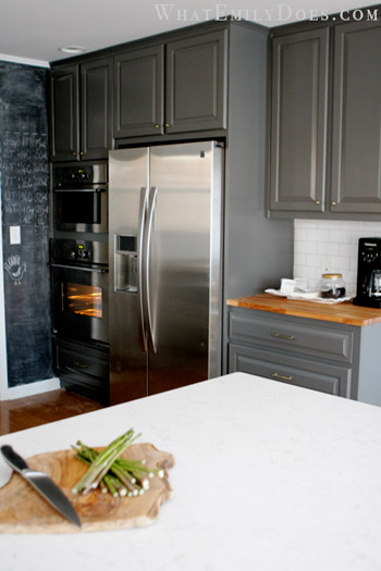
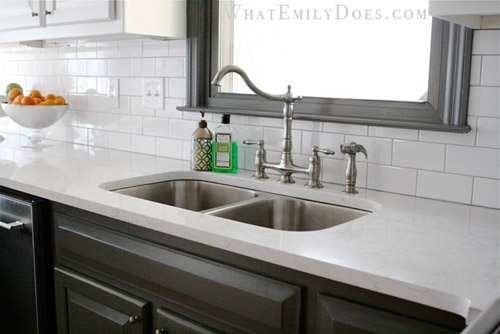
Another major cost saver was using subway tiles for the backsplash. We were able to get them for 21 cents each ($1.61 sq/ft). The countertops were a splurge though: a quartz product by Cambria (the color is called Torquay). It is such a low maintenance product which was the top reason for choosing it, but a close second was because it looks like Carrera marble!
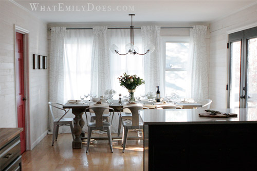
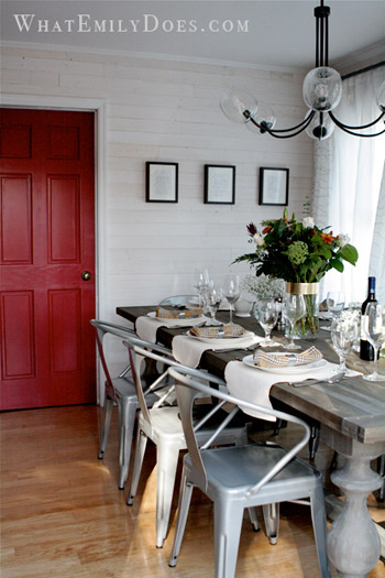
Our dining table is from a Restoration Hardware Outlet. The list price is $1395 for the 96 inch table, but we got it for $600! The curtains are all from Ikea. The dining area feels so cozy now and we’re able to close the sheer panels for privacy. The chandelier is from West Elm. It’s a bit funky, but I felt that the space needed a little funk! I hope you like it! – Emily :)
Killer, right? And I think it’s a great reminder that mixing splurges and affordable DIYs while looking at outlets and big box stores for sales can add up to a polished and expensive looking finished product. Oh, and if this wasn’t enough house hotness for you, Emily’s got lots more on her blog. Thanks so much for sharing your kitchen Emily! Now let’s play the ol’ what’s-your-favorite-part game. Mine’s the dining table and the counters and Sherry’s are that red door behind the table and the dark paint on those french doors and the window sash over the sink.

Gabriella @ Our Life In Action says
I absolutely love the colour. I am in love with the light over the table.
Maureen says
Wow, AMAZING Emily!
Sarah says
I looooooove that DIY plank wall. Such a great idea. And of course I’m a sucker for a subway tile backsplash. That red door is super fun too!!
Karen F says
beautiful!!
Megan @ Monroe Makeshift says
I love the plank wall! I may need to add one in my living room. Great job Katie!
Lauren says
Absolutely beautiful. One of my favorite reader redesigns for sure!
Sarah says
Why’d she end her email as Katie? Is her name emily or katie?
But yes, jaw dropping!
:)
YoungHouseLove says
Sorry, Emily!!
xo,
s
Kristi says
Wonderful – I love the plank walls! And we have the identical countertop, love to see it in such a great kitchen!
Erin says
That’s incredible!!!!! Love, love, love everything about it! I finally talked my hubs into doing subway tile for our kitchen backsplash, so I was thrilled to see it used in this beautiful kitchen!
Laura says
Love this!!! It’s absolutely beautiful!! What did you use for the wood on the wall??? I have thought about this for such a long time, but any advise would be great!!! Thanks
Emily says
Hi Laura! We used EverTrue v-groove paneling from Lowes (http://www.lowes.com/pd_304510-17587-PNVG0802_)
They are very light and easy to work with! :)
Caitlyn says
Emily just got a new reader. I am absolutely in love with this kitchen and her style! We also bought an old 1987 house that hasn’t been updated since it was built (the cabinets and Formica countertops, the peeling wallpaper…) and we are at the very beginning stages of updating it. Can’t wait to read about her process!
Emily says
Thanks Caitlyn! Good luck with your updates! I go through phases of burnout, but I always love it when I completely finish a room!
[email protected] says
Gorgeous! I love it! Loved the window treatments in the dining area. They added elegance without being heavy.
And I’m not normally a fan of mixed colored cabinets but you definitely pulled it off. Gorgeous!
Rachel says
WOW! It was really hard to pick a favorite, but I love the countertops and the black and white cupboards. She did such a good job!
Erica - From Millstones to Milestones says
Wow – love their kitchen story. It’s so similar to ours – I love the fact that they went with two different colors of cabinets – so sleek.
And the light over the dining room table is absolutely gorgeous!
Julia @ Chris Loves Julia says
Wowza!
Megan @ Rappsody in Rooms says
Ooo I am all over that dining room table/chair/light fixture mix. In love! Well done!
Elisa says
I just love the cabinet color! Not to mention the dining chairs! Bravo Emily! Is the cabinet hardware brass??
YoungHouseLove says
Hope she drops in with that info for ya!
xo
s
Emily says
Hi Elisa! You are absolutely correct–the hardware is an antiqued brass:-)
Diane @ Vintage Zest says
Wow, it looks sooo much more open! And the space seems just more fresh, not stuffy. It must be so nice to cook in there now. :)
Emily says
It is! It makes me feel like a chef:-)
Erin says
Just curious… did they do anything with the ceiling??? It looks like it was textured… and then looks a lot better in the after :) We have textured ceilings, too! Yuck!
YoungHouseLove says
Hope she drops in with info for ya!
xo,
s
Emily says
YES! Erin, we had the ceiling scraped and re-mudded and it makes a DRASTIC difference. I wish we could afford to do the rest of the house now!
-Emily
Andrea says
Great redo. John, Sherry, would you consider a post on what aspects of renovation you’d consider getting via the Internet and what you wouldn’t? I was noting that issue in your Clara-rug post below (that buying rugs on the Intertubes makes you nervous), and it’s something I’m grappling with now. We’re about 3/4 through a double-bathroom-redo, and our last purchase is the shower door. Our contractor’s local guy doesn’t offer frameless doors or glass-coatings or anything, so I’m looking at the Internet, but am reluctant to pull the trigger on such a big purchase without seeing it in real life — pretty much anything can be made to look pretty in a photograph! Do you have any renovation-via-Internet wisdom to share?
YoungHouseLove says
That would be a fun post! In general to answer your question in the meantime I’d say that if you can find reader reviews for things that really helps! And even check their standing with the Better Business Bureau. Generally people’s feedback is invaluable since they can say “it looks nice on the site but it’s super cheap” or “it came and I love it!”
xo
s
Andrea says
whoops, forgot: we got a ton for this redo from Lowe’s, Amazon, etc — I’m not Internet-shy — but wrt the shower doors I’m not finding any reader reviews or other helpful clues…
Sarah @ Tucker Up says
This is one of my favorite reader redesigns! She did an ah-mazing job!!
Emily says
Wow, what a great compliment. Thank you!
Wendy @ New Moms Talk says
I love the plank wall, red door, and table. I also love her thoughtfulness in redesigning the kitchen from thinking about a possible resale, to contracting out when best, etc.
Thanks for sharing!
Ethne @ Wom-Mom says
Loving the quartz countertops. Those look awesome. We did a corian countertop like yours (it was white with teensy black specks) for our kitchen island, so I love the white counter look. I’ve never seen the white and dark mix of cupboards. Very neat.
Debbie C says
I’m drooling. Gorgeous!
Rebecca @This Nest is Best says
Really love it! I’m crushing on the subway tile and those chairs!
Jordan G @ The Happy Homebodies says
Such a great job! Thank you for sharing with us!
meg @ pure&simple says
I love the white washed wall! That looks incredible!
Caitlin @ Desert Domicile says
Wow, her kitchen is gorgeous! I really love the look of the bi-color cabinetry and I’m crushing hard on her table’s centerpiece arrangement! Thanks for sharing her makeover with us :)
Emily says
secret: $14 bouquets from Costco. Put in vase. Done.
:)
Jill says
Wow!! Beautiful! Thanks for passing this along! I love the chairs at the kitchen table and the red door – they did a great job!
Elise says
That may be the most gorgeous kitchen I’ve ever seen. LOVE it!
Carrie, A Sweet Spot: Home says
I LOVE the idea of a plank wall but I’m such a chicken to actually give it a try…I’d be afraid I’d rip my entire wall down if I ever decided I was ready for a change!
Katie says
LOVE IT!
Stephanie Nelson says
Nice redo from what I can see so far! Her blog is having a hard time keeping up with YHL traffic! :)
Love Claras pink rug too. You guys do good finding on Joss and Main!
gemma@thesweetestdigs says
Amazing job, Emily! I especially love the two-toned cabinetry and the dining room furniture you chose. What a fabulous room!!
Brenda says
Wow, I really love the pop of color in the red door!
cheri s says
one of the best!
Heather says
I love how they re-used their cabinets. I feel like a lot of peoples first inclination is to dump cabinets all together when a nice coat of paint could freshen them up, or the cabinet boxes are good and they just need new doors. I really like their dual tone they went with and the counter tops are really pretty. My favorite piece is the dining room table though. I’m a sucker for rustic but elegant looking tables.
Casey says
IN LOOOOOVE!!!! Oh my gosh I love the entire thing. Dining space, planked walls, cabinet color, countertops… ALL.OF.IT.
Jayme @ Keeping Up With Myself says
I love that the range hood doubles as a spice rack! So genius!
keisha says
Wow! I just adore this redo and love that she 1) used gray in a kitchen, and 2) did quartz countertops. I also love that she used butcher block on some surfaces, the idea of which I am totally going to tuck back into my brain for future reference. Thanks to Emily for sharing her kitchen!
Allyn says
I just almost squealed out loud over the fact that there are Restoration Hardware outlets. Road trip is in our future!
Also, this kitchen is brilliant. Saving this one for our future home.
Sarah{Handbags*N*Pigtails} says
This is an amazing redesign-LOVE it! Hubby and I scored boxes of white subway tile at our local RESTORE for…sit down… $7! We’re holding onto it until we do a big change with the space but I almost squealed when the manager of the store told us the price!
WendyMI says
OMG… what a steal, Sarah!! WOOOOT!
Cassondra says
I’m always a lover of mixing thrifty/diy elements with a splurge here and there, and I love the mix of high-end countertops with the butcher block to warm it up!
Julie says
There are RH outlets????!!!!! Wildly jealous that you got my dining room table for half what I paid!!! May be planning a trip to Pennsyltuckey now.
Juliet says
Striking kitchen-love the funky light fixture over the table!
I am playing around with the idea of mixing in a different color sink base due to a practical issue. I’d love to hear from the YHL-ers and their esteemed commentariat if there are any dos and don’ts regarding bi-color cabinetry.
I just want to avoid doing it, hating it, and then re-doing it if possible-thanks!
YoungHouseLove says
Ooh this is a great question! Feel free to weigh in, everyone :)
xo
s
Megan @ Monroe Makeshift says
I would go for it! Maybe you could bump it out from the wall and add some moulding to make it stand out. It would make it a showpiece, it’ll look purposeful and draw attention to it’s uniqueness. Check out this gallery on Houzz:
http://www.houzz.com/photos/traditional/bump-out-sink-
None that I see are a different color, but I totally think it could work. You could start the trend!
Leah says
I totally had that _exact_ wallpaper growing up. Big ‘ol cabbagey-looking roses, right? Blegh.
The plank walls are awesome, and I really love the range hood with all the spices held on it. I really dislike having cupboards over my stove because I always hit my head on them.
Lawton says
Love, Love, Love the lighting in this space!
Becky says
Fantastic makeover. My favorite part is the hood with built-in spice rack. And I love how it’s the only thing on that part of the wall (i.e., no cabinetry).
Andrea + Kris + Our Chaos says
WOW!!! What a spectacular reno, and serious eye for design elements. I never would have thought to combine the things that she did. So, so, so AWESOME.
Kristin F says
So pretty, love the color scheme. I tried to talk the husband into white counters on white cabs, he won’t have it. Sigh. So it looks like we are going with black on white.
What a great way to fix a problem, the plank walls. Wonder where I could do that in my house, hmmm???