Jaw dropping is not a term I like to just throw around, but I think this makeover earned it. Emily’s got lots of info about her makeover, so I’ll just let her dive right in and show it off to you guys. Here’s her letter:
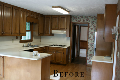
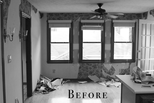
We bought this house as a foreclosure a little over two years ago. We got such a great deal on the house that it hasn’t been as difficult to save our money for the updates it needs. The house was built in 1987 and the interior had not been touched since, except for adding a layer or two of wallpaper over the original wallpaper. Floral explosion all up in the house! I really enjoy cooking and being in the kitchen, so that room was always on the top of my list to re-do as soon as possible. Our kitchen was so icky feeling – the formica countertops were stained, loose from the cabinets, and just plain old (but not in the cool vintage-y way).
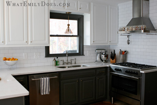
I browsed for hours and hours on different design sites and I eventually fell in love with the look of bi-color cabinetry. I felt like it would give me a little bit of a modern look without being too much, because I always have re-sale value in my head when making changes to the house. I didn’t want to do something too crazy that it would be difficult to sell later on if we ever need to move.
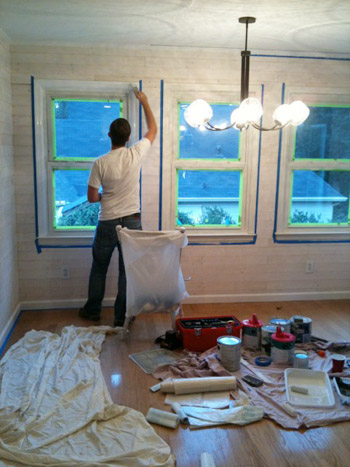
In order to save big bucks, and not be wasteful, we had the cabinets re-painted rather than ripped out to buy new ones. We hired a contractor to do a lot of the work (mostly to save time… and our marriage) but we DIYed the whitewashed plank walls to cover the terrible attempt at my first wallpaper removal.
Adding the plank walls took two Saturdays with my husband and I both working on it, and I would say that it’s a moderately easy project to take on.
Thankfully my wallpaper mistake turned in to a design success.
Another big savings was in purchasing all of our appliances at IKEA during their kitchen sale. We were able to get our dishwasher, a 5-burner oven range, an exhaust hood, a microwave, and a wall oven for less than $4,000. Having the cabinet built to surround the refrigerator is hands-down the best decision I think I made in the kitchen. The built-in look makes the room look so finished and luxurious. And another easy DIY was the chalkboard wall. I like to feel relaxed in a room and the silliness of writing on the walls did the trick for me.
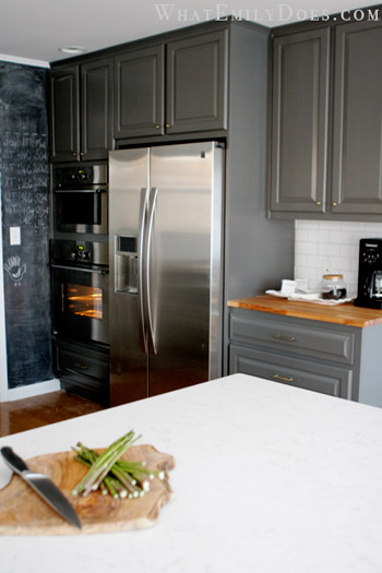
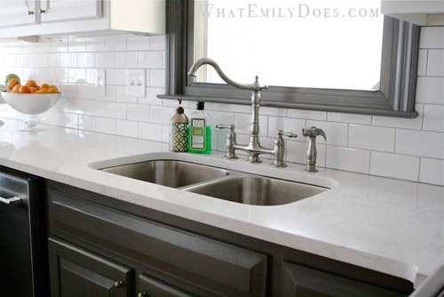
Another major cost saver was using subway tiles for the backsplash. We were able to get them for 21 cents each ($1.61 sq/ft). The countertops were a splurge though: a quartz product by Cambria (the color is called Torquay). It is such a low maintenance product which was the top reason for choosing it, but a close second was because it looks like Carrera marble!
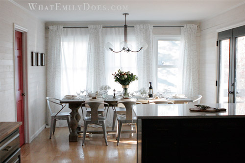
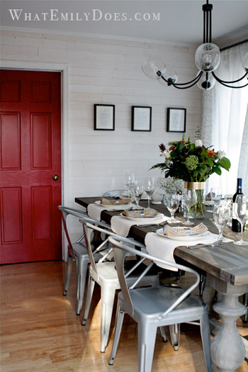
Our dining table is from a Restoration Hardware Outlet. The list price is $1395 for the 96 inch table, but we got it for $600! The curtains are all from Ikea. The dining area feels so cozy now and we’re able to close the sheer panels for privacy. The chandelier is from West Elm. It’s a bit funky, but I felt that the space needed a little funk! I hope you like it! – Emily :)
Killer, right? And I think it’s a great reminder that mixing splurges and affordable DIYs while looking at outlets and big box stores for sales can add up to a polished and expensive looking finished product. Oh, and if this wasn’t enough house hotness for you, Emily’s got lots more on her blog. Thanks so much for sharing your kitchen Emily! Now let’s play the ol’ what’s-your-favorite-part game. Mine’s the dining table and the counters and Sherry’s are that red door behind the table and the dark paint on those french doors and the window sash over the sink.

Lori H says
I love it all! Heading over to her blog now…
Amy B says
Love this kitchen and the different colored cabinets. You guys did a great job!
Beth A. says
The kitchen looks amazing — and I love the butcher block on the counter next to the refrigerator!
Elizabeth says
Um, wow! This kitchen reno is amazing!
Mary@TwoHappyLambs says
I love it! I’m thinking that building in the fridge may be something that we should do in the future, it looks so great. We just recently made over our kitchen, too (you can find it under House Tour on my blog if you wanna peek). Still not done, but every time I see a kitchen Reader Redesign it makes me itch to do more! Love these.
Wendy says
Gorgeous. Just, absolutley breathtaking!! Modern, warm, inviting, chic, and interesting all rolled into one. Great makeover. :-)
paintergal says
Curious to know if they reused the cabinets that were removed above the stove. I love that space opened up.
Great redo!
Emily Morrison says
We didn’t reuse them for anything. I wanted to keep them to see if I could use them later on, but my husband said that would be hoarding:( ;-)
Nicole @ Liberty Belles says
wow what a transformation..hard to believe those are the same cabinets painted. It’s funny, because I’ve had what seems like over a year to get on this dual-color cabinet bandwagon, and I’m not quite there yet. I always like the way it looks, but I just don’t think I could commit to doing it in my own kitchen.
Emily a la Blog says
Jaw-dropping is right. My favorite part is the plank walls in the dining room. WOW. Just, wow.
Katalina says
I was looking for paint colors info on the kitchen cabinets, walls and red door? she indicated she used oil paint on the cabinets but her blog does not indicate what colors.
YoungHouseLove says
Hope she stops by with that info for ya!
xo
s
Emily Morrison says
BM Kendall Charcoal on the bottom and SW brightest white:-)
Laura says
Wow! Just beautiful!
Laura says
Oh, I just noticed that fabulous cutting board. It looks like a slice of a tree. Source, please? :)
Emily says
It was a Home Goods find :)
Chaney says
I’m really digging this kitchen! This is the second kitchen I’ve come across today with different colored upper and lower cabinets. It’s subtle, but adds some serious interest to the space. Thanks for sharing this y’all!
Monika says
WHOA. I LOVE IT!
faves: the spice rack on the hood, the breezy curtains against the plank wall, the light upper and dark lower cabinets…I could go on forever! What a great inspiration kitchen! I already have plans in my head to make my fridge “built in” like this one.
Thank you for sharing!!!
WendyMI says
Gorgeous redo, indeed! I love the chandelier and the plank walls… and the fun metal chairs!
What is that that Emily has attached to the front of the range hood?
And count me in as a person that loves bi-colored cabinetry. I love the different colors from top to bottom, or one color cabinet for the main cupboards against the wall and then a different color for an island. Not sure what I’d think if only the sink base was a different color. Would have to see that, but I’d imagine that it could look nice if balanced out by a similar color somewhere to the left and right. So maybe all white cabinets, a blue sink base, and then the same blue in accessories on the far left and right (I’m all about symmetry.. lol) Does that make sense?
YoungHouseLove says
Hope she drops in with info on the range hood for ya!
xo
s
Emily says
I didn’t attach a thing! It’s just the way it’s made:)
http://www.ikea.com/us/en/catalog/products/80200651/
Rose Babic says
Love Love Love it……….
Do you know that in Australia Subway tiles are a “splurge” I had to pay $80 sq meter for them….
YoungHouseLove says
Wow, that’s such a different thing than here- they’re so cheap!
xo
s
Jenna Lou says
This is so amazing. I love when you guys share these makeovers!
Susie says
Wow–so nice! I love the counters, the cabinet colors, the plank wall, and of course, the beautiful appliances. Very inspiring. Thanks!
Megan says
Great plank wall. I really wish I had basic cabinets like that that just needed some paint and TLC. My whole kitchen will be knocked out and remodeled when we have the time and energy (and ok, the money too – they aren’t cheap!).
Adrienne says
Ohhh, my fav is the RED door and funky light! I also love the two different colors of cabinets. It is two, right? The picture of the fridge it looks grey. Could be my old eyes!
jbhat says
I am dying over how easily the mix of materials and colors and styles are working in there. It’s all so unexpected and perfect. I even am dying over how the placemats are laid out on the table.
jbhat
meganleiann says
Nuts. I had decided to leave my wood cabinets alone and now I’m reconsidering painting them black and white. My husband is going to forbid me from reading this blog!
Emily says
Haha! I tell my husband that it’s John & Sherry’s fault we bought a fixer upper ;-) He’s not as in to the reno’s as I am.
Charlotte says
Beautiful makeover! I like the color choices for the cabinets and countertop. I redid my kitchen two years ago and also chose to use Cambria quartz, in Canterbury. Love the quartz!!!
Terry says
Thanks for all that you do and share with us readers. Long time reader here. Just one favor to ask – can we all pledge to stop using the word “killer” as a positive adjective. We throw that word around so freely these days, and when I read today’s post title it just struck me as so wrong. Just a thought. :)
YoungHouseLove says
Never thought about it that way. Thanks for the reminder Terry.
xo
s
Maude says
I love the subway tile backsplash as well as the hood over the stove. Very mod looking:)
Maude
mp says
My favorite part is that they hired a contractor. I’ve ended up in the ER several times because of DIY, and I’m so glad to run across someone who cheerfully hired a pro to save time, their marriage, and their health.
Emily says
Oh no!! I used to work in the ER (I’m a RN) and I definitely saw a few DIY injuries myself. I think that scared me in to being extra careful anytime I’m using power tools:)
Mary T. says
I really like the red door and the color/texture combos. It seems rustic and cozy. I would spend all of my time is this space. great job!
Kym V. says
Love love love the plank walls!!! Ok really the whole kitchen but what a neat idea. I also like the mix of modern, fun and funky.
Kim says
Would love to know the color of the paint on the cabinets. The manufacturer might be handy to know too!!! and the finish?….looks like satin? Really wonderful makeover!
Emily says
BM Kendall Charcoal & SW Bright white (just their plan ol’ white)
I don’t really know the finish, to be honest. It’s not shiny at all.
Kim says
Three ovens?? Holy mackerel. I like the replacement of the kitchen hood and old cooktop with the new stove/oven combo unit.
Emily says
2 Ovens & a microwave! :-) We get that all the time though because the microwave above the wall oven definitely looks like another oven.
Lindsey says
I think this is my favorite redesign you’ve ever featured! Love the colors, love the chalkboard wall, love the subway tile… ok, I love everything. Well done!
Evelina says
Beauuuuutiful kitchen. So much to love. First, that red door made me drool. I also love the layout, love that the white cabinets are on top, love the counters + tap, and that SPICE RACK! so cute. Thanks for sharing!
John @ Our Home from Scratch says
I like what Emily Does or did (dot com). Beautiful!
Christa @ a*typicaljourney says
This is so inspiring. The before photo looks more like my kitchen now than I care to admit. It’s wonderful to see such a transformation on a budget to pull ideas from for my reno (someday)!
Thanks for sharing!
Emily says
Wow it’s amazing what some refinishing can do! My favourite part is the they used the same cupboards, seeing the pictures at first glance you wouldn’t suspect as much. Love the back splash and I’m a sucker for white washed planks! Come do mine please!
Melanie says
My taste usually isn’t very modern, but I absolutely love this. I love the gray cabinets, I love the plank walls, and that red door is the best! Great job, guys!
Sarah says
I absolutely LOVE this kitchen! Great Job!
Danielle says
Sooo pretty! And I love the tip about the Quartz countertop! I’ve been dreaming of marble forever, but knowing how we actually live day-to-day, I’ve been trying to accept that it doesn’t make sense for us. Patina I can handle, red wine ring stains all over the place, not so much.
Banclothing says
The two tone cabinets and the shot of the dining space, I almost cried it’s so beautiful!
Malissa says
Faithful reader, rare commenter (from Charlottesville, go hoos!) – the first “after” picture actually me made gasp out loud. BEAUTIFUL!!
Lux says
OMG the spice rack on the hood!!!!!!?? Thank you for that wonderful idea for when I redo my kitchen one day. Gorgeous job everywhere… God I love subway tile.
Rosemarie says
Do you know where she got the subway tile? My kitchen is very similar to her old one(only I have a country barn and people wallpaper) and I have been dreaming of using subway tile as a backsplash.
Emily says
Floor & Decor Outlet :-)
Rosemarie says
Thanks!
Samantha says
Any idea where the dining room chairs are from???
Emily says
Overstock.com :)
Silver Tabouret Stacking Chairs
Beth says
The red door is perfect, along with the chairs. What a great re-do!! Very inspiring.
Jessica Horton says
Such a great transformation! I loved reading her post and her use of the word “lantry” aka: laundry & pantry…. I have one of those!
Moudex Mouldings says
I love the plank walls! I never would have ever guessed it was to cover something up if you hadn’t said anything. This is truly an inspiring redesign!
Annabelle says
I love those chairs and am looking for a good source for them. So far I can only find them for more than $200 each and that’s too high for me. Where did you get yours? Are they comfortable enough for the long holiday meals?
Annabelle says
Ok, I just saw the chair source… sorry for the double post.
She Ran.She Worked.She Conquered. says
My favorite reader re-design yet!
Molly
Molly says
Can we talk about that window wall?! That makes the room for me. And that door! gah! LOVE!
monica says
In LOVE with this entire makeover! Bravo!