Jaw dropping is not a term I like to just throw around, but I think this makeover earned it. Emily’s got lots of info about her makeover, so I’ll just let her dive right in and show it off to you guys. Here’s her letter:
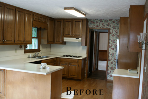
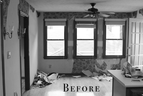
We bought this house as a foreclosure a little over two years ago. We got such a great deal on the house that it hasn’t been as difficult to save our money for the updates it needs. The house was built in 1987 and the interior had not been touched since, except for adding a layer or two of wallpaper over the original wallpaper. Floral explosion all up in the house! I really enjoy cooking and being in the kitchen, so that room was always on the top of my list to re-do as soon as possible. Our kitchen was so icky feeling – the formica countertops were stained, loose from the cabinets, and just plain old (but not in the cool vintage-y way).
I browsed for hours and hours on different design sites and I eventually fell in love with the look of bi-color cabinetry. I felt like it would give me a little bit of a modern look without being too much, because I always have re-sale value in my head when making changes to the house. I didn’t want to do something too crazy that it would be difficult to sell later on if we ever need to move.
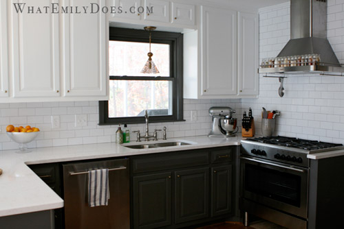
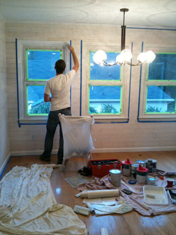
In order to save big bucks, and not be wasteful, we had the cabinets re-painted rather than ripped out to buy new ones. We hired a contractor to do a lot of the work (mostly to save time… and our marriage) but we DIYed the whitewashed plank walls to cover the terrible attempt at my first wallpaper removal.
Adding the plank walls took two Saturdays with my husband and I both working on it, and I would say that it’s a moderately easy project to take on.
Thankfully my wallpaper mistake turned in to a design success.
Another big savings was in purchasing all of our appliances at IKEA during their kitchen sale. We were able to get our dishwasher, a 5-burner oven range, an exhaust hood, a microwave, and a wall oven for less than $4,000. Having the cabinet built to surround the refrigerator is hands-down the best decision I think I made in the kitchen. The built-in look makes the room look so finished and luxurious. And another easy DIY was the chalkboard wall. I like to feel relaxed in a room and the silliness of writing on the walls did the trick for me.
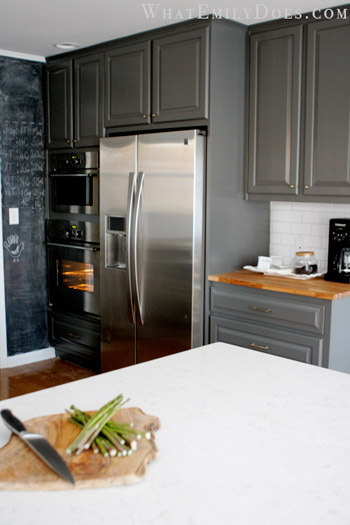
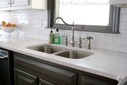
Another major cost saver was using subway tiles for the backsplash. We were able to get them for 21 cents each ($1.61 sq/ft). The countertops were a splurge though: a quartz product by Cambria (the color is called Torquay). It is such a low maintenance product which was the top reason for choosing it, but a close second was because it looks like Carrera marble!
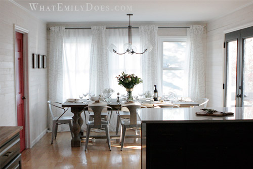
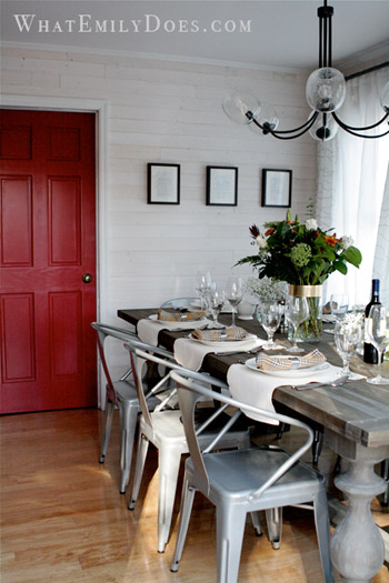
Our dining table is from a Restoration Hardware Outlet. The list price is $1395 for the 96 inch table, but we got it for $600! The curtains are all from Ikea. The dining area feels so cozy now and we’re able to close the sheer panels for privacy. The chandelier is from West Elm. It’s a bit funky, but I felt that the space needed a little funk! I hope you like it! – Emily :)
Killer, right? And I think it’s a great reminder that mixing splurges and affordable DIYs while looking at outlets and big box stores for sales can add up to a polished and expensive looking finished product. Oh, and if this wasn’t enough house hotness for you, Emily’s got lots more on her blog. Thanks so much for sharing your kitchen Emily! Now let’s play the ol’ what’s-your-favorite-part game. Mine’s the dining table and the counters and Sherry’s are that red door behind the table and the dark paint on those french doors and the window sash over the sink.

tina says
gor-geous! props to their vision and using affordable alternatives to create a kitchen that looks like it fell out of a magazine! it’s very inspiring!!
Tracy Godfrey says
Emily! great job! I think the red door is my favorite element!
Debbie says
I love the kitchen reno. I did something similar last spring and also used Cambria Torquay. I so wanted marble but was too scared to use it in the kitchen since i love to cook and bake and was afraid of etching and staining. Torquay was, by far, the best substitute that I could find…and believe me, I looked at everything, including visits to 40+ granite yards to look for a granite that looked something like marble.
Bonnie says
I too love the new kitchen. Cambria quartz and the white subway tiles – great combination. Grout color, if you remember, please!
Emily says
delorean gray :)