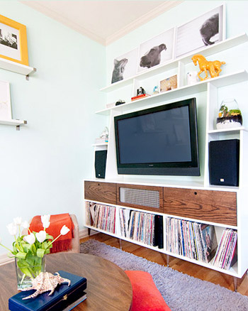
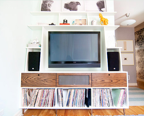
Is there anything better than a beautiful, functional, and DIY-ed piece of furniture? Arguably yes (a free car full of money?), but not much. So we loved getting Kim & Scott’s email about the built-in media wall that they constructed with a couple of friends. Not only was it custom built to perfectly fit the space, it saved them at least $450 (many similar units go for $750+ and theirs was $252 to build). Here’s Kim and Scott’s letter:
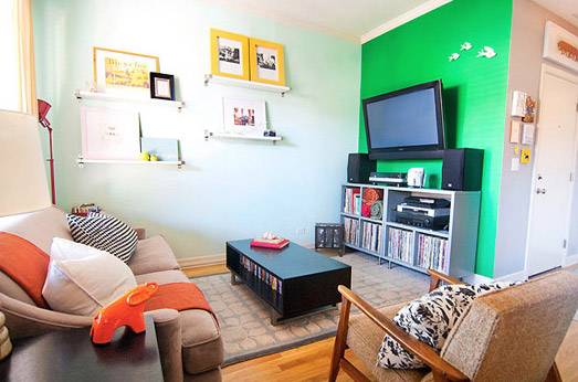
We started out with a very green accent wall, and over time we began to layer in a few new pieces to the living room (a shaggy rug, a Craigslist coffee table, etc). After said changes, we grew weary of the bold wall and figured that if we were going to change the wall color – what the heck! – we should just create a whole new media wall. Of course, right?
So with the help of some friends in another state, our road-tripping wall made it’s way back to Chicago where she was finished up, styled, and enjoyed. We have a tiny city condo, and the media center, although much larger than our last one, actually saves space, looks built in, and completes our room. Thank you for continuing to inspire with your many projects – large and small! -xx, Kim & Scott

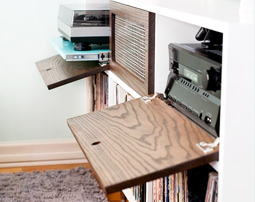
Isn’t that awesome? We love the flip-down wood drawers and the perfectly customized shelves (and you know Sherry’s sweating that yellow ceramic horse – that’s a jersey term that she taught me by the way). Thanks for sharing Kim and Scott! For more photos or to learn more about the process of creating their built-in, check out their blog. This is just the kick in the butt that we need to upgrade our own media cabinet situation. As soon as we get a bit more accomplished in our counter-less kitchen…


Regan @ RenovatingRothenbergers says
Awesome job! Love the orange throw – great pop of color!!
Ariel says
Great idea. I would love to create something like that!
Allison @ Quite Simply Home says
At first I loved the green wall, but then when I saw the after pics I loved it even more. Such cool detailing in the TV stand.
Shannon Rosan says
Love this idea!Plus,the color scheme of their whole place is just beautiful!
Vanessa says
I’m a Jersey girl too, and man that took me back. I haven’t heard the term ‘sweating’ anything since high school!!! LOL
Oh yeah, and that console is awesome too. :)
Caitlin @ Hardly Housewives says
I’m from NY and I guess “sweating” is a tri-state area issue. I found my journal from summer camp one year in which I “sweat” a certain boy. I couldn’t stop cracking up/cringing when I read that!
YoungHouseLove says
Haha- hilarious! Maybe we need to make “I Sweat Ceramic Animals” bumper stickers or something…
xo,
s
Caitlin @ Hardly Housewives says
Glad you gave that a “haha” – as soon as I posted I read the “our moms are reading” note with the comments and was like, “is this mom appropriate?”!
heyruthie says
forget the yellow horse. i’m sweating the orange ceramic elephant in the first pic. oh yeah, and the media center too ;-)
Tiffany Hall says
Way to be creative. Any of those would make me feel special if I was sitting down at your table to eat. I especially like #2 I think. The pink vase. I love when it is different and unexpected. You have an eye for beauty.
mp says
That new cabinet is awesome! So are the b&w photos on top.
Laura {The Embellished Nest} says
I love it! The whole wall is amazing!
maribel says
I posted a question but can’t remember where…it was basically asking how you decide which photos to keep of Clara. I have tons and tons of pictures of my son and want to get them in a photo book.
maribel says
it was killing me…I found my comment over on Life…thanks
YoungHouseLove says
Sure! Glad you found it!
xo,
s
Dylan says
being a woodworker myself, I love that they used one piece of lumber for all three drawer (pull down) fronts. Very cool.
Stefanie says
As a former Jersey girl (I live in Central VA now) you just brought back all kindsa laughs with “sweating”. lol. How about calling something/someone “salty”? Not sure if that was just a Jersey Shore thing or what but that was hot for a minute too.
Where in Jersey are you from Sherry? Cape May/Wildwood here.
YoungHouseLove says
Haha, oh yes. My chem teacher was salty! I’m from Par Hills (Parsippany, near Morristown).
xo,
s
Jenn @My Southwestern Life says
WOW! I LOVE the pops of the dark, grainy wood with the white shelves and all of the animal themed art. I want this console! lol
RLB says
My favorite part: the triptych above the T.V. The way it tells a story of acat being mean to a dog, so the dog slinks away.
Emma says
What a brilliant piece of DIY – everything is in one place and well hidden to keep it all neat and tidy… Well done!
kristine@New Homes Pittsburgh says
This is my dream house. The room is so child friendly. Can imagine my kids are running around while we are watching them. Thanks for sharing.
Jenna @ Homeslice says
What a great project! I love the shallow shelve and the wood flip down ones. It really ‘completes’ the space!
Rebecca says
I love the way the pictures are displayed on the shelves. We are undertaking a whole home renovation and I would love to borrow that idea. How do you keep the pictures from sliding off and falling to the floor though. Ideas?
YoungHouseLove says
Here’s hoping she drops in with that info! We’ve had luck using that blue sticky-tack stuff that kids use to hang posters on dorm room walls. Just a wad of it in front of any leaning frames usually keeps them in place!
xo,
s
Kim at Yellow Brick Home says
Hi Rebecca,
Thank you! Although the photos of the unit may not show this, that top shelf is actually 5″-6″ deep, and those photos have a good amount of lean going on. We don’t have any tape behind them, but even with a crazy dog that is constantly bumping into the media center, those shelves don’t budge and nothing wiggles. We also have small “L” brackets on the top 2 tiers of shelves to keep everything extra sturdy and prevent any sloping.
In other rooms, we’ve used velcro for more permanent art and like Sherry said, that sticky, tacky stuff that you use in dorms or classrooms.
Another idea is that a lot of stores have picture ledges, so there’s a lip in the front that prevents the art from falling. We have the IKEA Ribba ledge in our bedroom (last photo shows it best):
http://www.yellowbrickhome.com/2010/07/13/the-bedroom-blahs-resolved/