When Barbara sent us her almost-too-good-to-be-true before and after photos we couldn’t wait to share the eye candy. Here’s her letter:
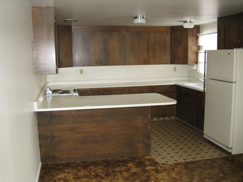
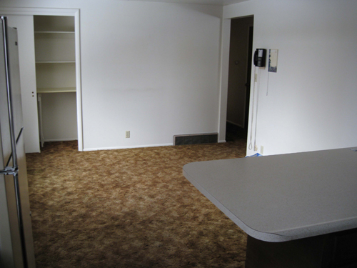
I have been enjoying your blog and thought I would send over my most recent remodeling project. My parents bought a home that was built in the 70’s and gave me and my husband the project of remodeling it. Here are the before and after pictures of the kitchen. As you can see this home stayed in the 70’s until about a few months ago. Dark seemed to play a theme in the entire house. And wanna know what was hiding beneath all that brown carpet? Beautiful wood floors. We were so excited! Here are a few things we did to get the room into this decade:
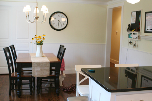
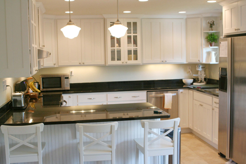
- Cabinetry was semi-custom. We had a budget to work within so we went with cabinets from a company that worked out of China they are called HQ cabinets
- Countertops are from Contempo and done in Premium Black Granite
- Paint color is Glidden’s Lemon Ice
- Barstools are Ingolf from Ikea
- Clock is from Ikea
Thanks so much for the great site! I hope you enjoy these before and after photos- it was a lot of work but well worth it! – Barbara
Here are the dark and dingy before photos:


And here’s the kitchen now, after some major updating:

Is that not an amazing makeover? Especially since Barbara and her husband had such a great DIY approach and fearlessly ripped up that terrible carpet to uncover amazing wood floors. And of course we love that affordable Glidden paint and inexpensive Ikea furnishings helped to transform the space. It looks like a million bucks in there! Thanks so much for sharing your photos Barbara! What do you guys think? Is it not amazing what a little updating can do? What’s your favorite part? I’m torn between the glass fronted doors and the amazing pendant lamps over the peninsula…


Sarah says
Amazing transformation! And knowing you did it yourself makes it all the more delicious to look at! WTG!
Barbara in CT says
If only remodeling Barbara was my daughter. I’d adopt her in a New York minute. What a beautiful job!
For those of you who weren’t even alive in the ’70’s or were perhaps, little children, dark cabinets and shag carpeting were just as popular as hardwood floors are today. Almost every house of that era and before were built with hardwood floors. Later, the hardwood became too pricey and they used cheap carpeting which lasted only a year or too. In New England, in the ’70’s, the raised ranch was very popular because you got the most square footage for the money. Small houses were the norm because you were only allowed to buy a house that cost 2.5 times the main breadwinner’s gross income. The wife’s income was not considered because women got pregnant and might not continue working. Banks weren’t interested in providing a mortgage if you couldn’t put at least 25% down. In the ’90’s, that all seemed to change but it also became much easier to lose your home to foreclosure.
I’m sure that most of you have noticed that accent walls, especially dark ones are less popular now. As georgeous as this kitchen is, in 30 years, it will probably be considered dated too.
Danielle says
Wow, that’s an amazing transformations. I seriously had to go back and look at the before picture several times to make myself believe it was the same space. That’s a great example what a little color will do!
Janet says
I think you did a really fantastic job… I have heard that it is difficult to get a room with different colors above and below a chair rail to look modern, but you definitely did it!
JM says
HOLY CRAP!!! That transformation is amazing! Great job Barbara!
Amy E. says
that is such an incredible “wow!” renovation! i’m still just geeking out about how different that is! great job! and thank you for sharing!
jess says
Question for Barbara – Did you paint the Ingolf stools from Ikea? Just stopped by the Ikea website and they don’t offer them in white…if so, they turned out great and I think I’ll be making a trip to Ikea over the weekend and copying your idea! Anyways, FANTASTIC job on the kitchen! It looks amazing!
YoungHouseLove says
Hey Jess,
Barbara already fielded that question above: Actually, the barstools come in white! I was worried about keeping them clean, but they are really easy to wipe down and take the beating of my two toddlers really well. And for only $60, we’ve been really happy so far.
Hope it helps! I don’t know why they’re not showing up in white online- maybe they’re only white in stores?
xo,
s
Jen Z. says
Gorgeous. Great job.
April says
I love it! It’s fabulous and the yellow is gorgeous. I want to paint my kitchen yellow and that looks like it would be perfect for me too! Thank goodness, my last attempt at yellow was a disaster!
Anna See says
Make. It. Stop. I can barely stand how gorgeous it is! I love that they had the vision to see beyond the dark and dingy. Awesome!
Ursula says
Barbara I love your comment! I was not around in the 70’s and always wondered the history behind the trends back then that created these homes. It makes a little more sense to me now. I also worry about everything I love now being outdated in 20 years, what happens if I still love it then? I’ll end be that “person who lives in the olden days”. Haha! Good post. :)
Oh and I LOVE the kitchen! It’s a beautiful update, I especially love the glass cabinetry.
jbhat says
Oh my, it’s too pretty! And look, they put a white ceramic cat under the table just for you, Sherry!
Live a Colorful life says
this is an amazing transformation. I remember when kitchen carpeting was all the rage. Just the thought of kitchen carpeting gives me the creeps now.
I love the whole kitchen. I can’t even pick out a single thing–I love it ALL.
Denise says
Stunning before & after redesign! The new doors on the pantry really dress up the dining area. I bet your parents are thrilled and your family gets to live in an updated home. Sounds like a win win for everyone. My Mother in law still has 40 year old carpet in her kitchen even though we’ve begged her to pull it up. She also has hardwood floors beneath her 70’s shag carpet in the rest of the house. She will not part with her shags either. I cannot explain the attachment.
Maybe if she reads my comment, she’ll rip it all up and reveal those gorgeous hardwoods.
Amanda says
Hello Barbara from a fellow Utahn! (Or Utahan) That is the most awesome kitchen makeover from the humblest beginnings. I’m in love- if my own kitchen re-do goes this well I will have died and gone to heaven.
Amanda says
PS- Am I the only one who can’t find the stove?
beabee says
Haha, I had that brown carpet from the before in my first apartment. Definitely horrible, but I could also go months without vacuuming!
David R. Hall says
If only she was my Daughter.. oops.. she is.. She is good isn’t she. She is re-modeling a rental home for my wife.. Bet it is an amazing transformation as well. Signed.. Lucky and proud Dad.
renee says
HOT DAMN! That is one sexy makeover – thanks for the pics!
Denise says
Amanda,
It looks like the new stove is in the same location as the old stove in the “before” pics. You can see a stainless steel handle for the oven and a range hood in that area. The stove top is probably ceramic black to match the counter tops. It does appear that Barbara left the appliances in their original location (huge cost savings) and maybe added a dishwasher along the back wall. Hiring a plumber is expensive.
Vanessa says
@beabee: I have that carpet now, it’s so ugly! I’m moving in a few weeks to a nicer apartment with tan carpets instead of brown and orange, thank goodness. Though I have to agree: they never look dirty! It was the perfect apartment to get my puppy in, because those few times he made a “mess,” it never stained the carpet, haha.
@Amanda: I can’t find it either- I can see the oven, so maybe the stove is right where that is, but you can’t see it because of the angle of the picture. And I think it’s an electric stove with the flat top, which also helps to look like the counter top.
Gail says
Beautiful! I love the wainscotting and island details.
Kim says
That is simply stunning!! Amazing job, Barbara!
28 says
It’s perfect!
Barbara says
Amanda- good comment! I didnt realize the stove was almost invisible in these pics. The black ceramic top range is practically seamless with the granite countertops, that is why you cant really see it. The appliances in the kitchen are Kenmore Elite range and dishwasher, and a Jenn Air fridge bought used but in awesome condition off of ksl classifieds in UT.
CherylR says
Really nice makeover! I too like those pendant lights over the island. Can you tell me where they came from? I’ve got just the place for some just like that. Congrats on a great job.
YoungHouseLove says
Hey CherylR,
We love those lights too! If you scroll back through the comments you’ll see that Barbara already popped in to answer that question. Hope it helps!
xo,
s
LauraC says
Ok, I’ll just be about the 100th commenter to say, “I LOVE THIS KITCHEN!!!!” Especially the pendant light and the paint. But I’ve known that my favorite kitchens are white with black counters, so it doen’t surprise me that I love it!!! Fantastic job Barbara!
Also, I loved reading what the other Barbara said about fads in home design. Everything “we” make fun of online was popular, and of coure everything “we” love now will be out-of-date in 2-3 decades. Probably a good thing to keep in mind when we are looking at “befores”. Oh, and I was alive in the 70s, but just barely! :=)
Holly says
AWESOME transformation!!!
Tracey says
Absolutely stunning. My dream kitchen. Great job!!
alltheprettythings says
Barbara, thank you so much for sharing your redo! My husband is a granite and stainless steel lover, and I love classic white kitchens… I can’t wait to show him how both styles can work together so beautifully!
Wonderful job!
Melo says
Barbara, this is such a lovely kitchen! You should be very proud of yourself.
Now, the questions: The closet doors near the table seem to have been sliding doors. Did you substitute them for bi-fold doors, or are those sliding doos as well? Any other info on the closet doors (cost, vendor, installation…)will be very much appreciated. Thanks! (And congratulations again!)
Lisa A says
How inspirational! Love this kitchen makeover…can’t wait to do my own, thanks for showing us it can be done!!
Barbara says
Melo- Yes those are new doors. We kept them sliding though. Mostly because it was cheaper just to just replace the doors than have to replace the doorframes as well. We purchased our doors through Burton Lumber (another UT vendor) and as for pricing, I’m not sure off the top of my head. We replaced all the doors in the home and added black oil rubbed bronze doorknobs and hinges to each door.
Barbara says
Barbara in CT- Thanks for your comment. I loved hearing about the coolness of shag rug in the 70’s. I agree, I am sure every “updated” kitchen out there will be out of date in about 30 yrs. I’m curious where the trends are going to turn next?! Here’s to another 30 yrs with this glorious kitchen, who know’s what you’ll look like come 2040.
Michelle says
OMG!! i absolutely love love love this kitchen!!! i cannot wait to have one of my very own!
Beth says
awesome!!!! i was skeptical about a yellow and black color scheme being too bubblebee-ish but it turned out beautifully!!
My favorite is the beadboard and shortening the bar countertop allowing more room to walk thru.
~Beth
http://southernfriedliving.blogspot.com/
Ruth B says
That is Ahhhmazing!!! I love it! I cannot wait to buy another home so we can remodel on our own and try to accomplish something just as beautiful.
raf says
Great job Barbara!
The ceilings look higher in the After pictures, but maybe it’s just an illusion? I’m afraid of hanging suspended light fixtures in low-ceiling rooms, but in your kitchen it looks beautiful. How did you do it?
Natalia Beley says
Wow, that kitchen looks amazing. I just recently started checking out your blog, a friend recommended it and now i have the decorating bug!!!! I want to redecorate our whole house now. I love the fact that you guys make things look great without spending a fortune, very appropriate in this day and age!
thanks
Ashley says
I always love when I scroll down and gasp out loud at the transformation. Absolutely incredible! I would love to see what you do with the rest of the house that’s still stuck in the 70s!
Steph says
That is SUCH a beautiful do-over! I’m celebrating my b’day today and this has given me a real buzz and ideas for my own aging kitchen. Thanks for the b’day gift of inspiration, YHL & Barbara!
Bromeliad says
Very fresh and inviting.
Lisa K says
I’ve been in Barbara’s kitchen and it’s even more gorgeous in person! She’s decorated her whole house amazingly.
wedding says
Wow, that is GORGEOUS!
Jackie Toye says
Love it!!! The pale yellow is perfect to highlight the room. You got me “thanking about painting” ;)
Abby says
wow. i just found this after stalking reader redesigns for new bloggers to follow…hamburger’s house as a blog? it pre-dates my reading but is HILARIOUS. can those be a regular on younghouselife?! :)
YoungHouseLove says
We’d love for him to start blogging again! Lazy dog usually just sleeps.
xo
s