When Holly Mathis (of the amazing Holly Mathis Interiors) sent over her latest nursery makeover we couldn’t wait to share the gorgeous transformation. Here’s her letter:
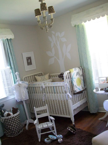
This time around I wanted my second little boy nursery to be a little less cottagey but I worked with the room’s existing light, awnings and basic furniture (but I did get a better rocker- I learned that lesson!). I chose some more modern fabrics but stuck with some Southern baby staples like monograms and smocked outfits… it is just enough of a Domino look to make mommy happy but it doesn’t look nuts with the rest of the house which is still pretty cottagey. Now I’m just twiddling my thumbs waiting for this baby to come (I am due on Monday) and wanted to share. Good luck with all of your projects. Love what y’all do! -Holly
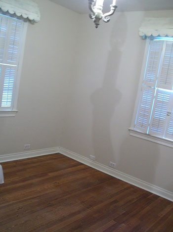
Here’s the blank slate before:

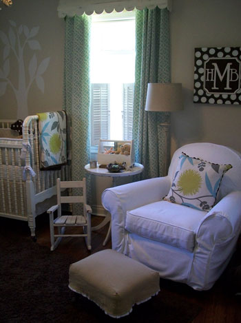
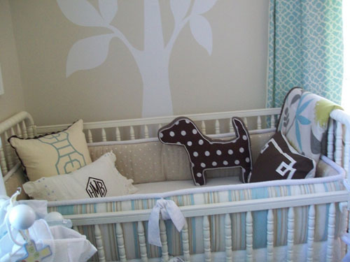
And the brilliant after:


Isn’t this nursery makeover amazing? We love the modern fabrics combined with the charming cottage-y touches. What do you guys think? What’s your favorite part? Thanks so much for sending over the yummy before and after photos Holly! And good luck with your little one on the way…

Katie says
So sweet! Love all the fabric designs, especially the brown and white polka dots. And that armchair looks super comfy.
Tracie says
That looks great!
Shaorn says
I love how Holly used the existing elements and added to them .. e.g. the shades on the chandelier, the drapes under the awnings. The fabrics are modern, but soft enough to blend with a cottagey feels. Lucky baby. Hope everything goes well Holly.
Laura@JourneyChic says
So cute! I looove the curtain fabric. Where’s it from?
Laura says
Very nice. I wish I could have a nursery like this! My kids always share a room so I never do a full blown nursery. Maybe someday you could give tips on sharing a baby room with another sibling?
My fav is the tree and that doggy pillow…
Terry G says
This is gorgeous. She has some great ideas. Thanks for sharing.
Lynn says
Beautiful! I love the pillow and quilt. Where is that fabric from? Thanks for sharing.
Miki says
Ooooooooh, Ahhhhhhhhhhhhhhh! This nursery is so beautiful. The fabrics used in the room are amazing.
ESBlondie says
Too cute! It looks great!
Catherine says
I love the chair in the corner! Is it a glider? Where’s it from? Congrats and good luck this week, Holly!
Wendy says
Is that monogram paiting by Kim at SmallWords? It looks like her work – she is fabulous!
Kelly Clawson says
love it! very cute! we are working on our nursery right now. first timers. due in january. keep the baby posts coming! your blog has been helping me with picking out colors. thanks!
Jeannine @ Small & Chic says
That baby has nicer pillows than many of us, I think! :)
Lauren says
Love it!
foobella says
Those awnings are fantastic. Did she make them? Buy them? I love them.
And that room? Forget the kid. I want to live in there!
Stacy says
Love that tree! The contrast is just perfect… I would love to know the paint colors!?
Beth Peele says
Love that look!
Rachel Ridd says
This is beautiful! I love the color choice and I love how it’s not incredibly girly or boyish! My favorite part are the pillows, especially the dog one. Do you know where they found it?
Ms. Bright says
LURVE IT!!!
Diane says
Oh WOW! That is gorgeous. I love it all. Love love love the tree decal (or painted on?) It’s all so soft and cozy.
Sarah says
Wow, it’s so cute!! I love the brown with the white polka dots, but it looks extremely adorable on that puppy pillow! It just looks so soothing, but still really fun and kid-friendly, in there!
Melissa says
This room is so cute! I’ve been looking for some trellis patterned curtains. Where did you find the fabric or curtains?
LG says
I love that nursery! Some of those fabrics can be found at
http://www.calicocorners.com because I just bought one of those myself for bedroom curtains.
Ana says
Beautiful room! I would love to know the name of the fabric used for the curtains, if possible. Thanks!
Megan says
I love the fabrics that she used. And, I like that even though she is expecting a little boy, the room looks very gender neutral.
Lynsey says
I am in love with this room! The tree is my favorite. I love that it is modern yet cottage at the same time.
Court @ Beauty Fully Used says
Love the tree mural. Simple and sweet.
YoungHouseLove says
We dropped Holly a line to let her know that her awesome nursery was featured this morning. Here’s hoping she stops in to answer your questions soon!
xo,
s
Amanda says
Wow! I LOVE this room! I think it is so great because it is so modern, and not to “baby.” Of course it looks like a baby’s room, but it has elements that can be used when the child gets older. I love the tree (was this a stencil?) and the chair which will be needed for those nightly feedings! Great job!
Kylee says
too cute….love it!!
Amanda says
love the lamp shades on the ceiling lights. If you look at the before pic there is a big dark shadow on the wall. The shades should help cast the light more evenly.
christy says
As soon as I saw the first pic I knew it was Holly! :) The nursery is so cute. Love her style & her blog.
Babs says
I love the tree silhouette on the wall!
veronica says
Is that tree painted or is it some kind of decal? If it’s painted…I’m so jealous! If it’s a decal…how do i get one?! Amazing work.
Heather says
Beautiful nursery! She did a fantastic job combining her looks – I can only hope mine would look close to that. She has a great site as well, thanks for sharing.
Audrey Gonzalez says
I LOVE this nursery!! So soothing, elegant and comfy! Very inspiring!
Kim says
My favorite is the painted canvas – that joker is FABULOUS!! tee hee! Seriously, one of my blog readers sent me over here because she recognized one of my paintings! And she did! Holly is fabulous. That girl has some mad decorating skills and is a peach to work with! Thanks for showcasing her work!
kim! at small words
YoungHouseLove says
Hey Kim,
It’s such a small world! So great to hear from you. We’re so glad you stopped in!
xo,
s
Charis says
Gorgeous! I love the tree behind the crib!
Donita says
FABULOUS!!! I love everything about that room….the tree is to die for. ;-)
Holly Mathis says
Yall are making me blush..THANK YOU for your sweet words…litte Mr Henry Brooks Mathis arrived July 13th and he loves his room..the little darlin are hanging out in Starbucks right now..I will try to answer all of your questions but if you visit my blog and scroll back through past posts you can find even more details..
~the paint is Stone 2 laura ashley from lowes
~the organic fabric on the pillows and quilt is DAHLIA from Calico Corners.
~the trellis and stripe fabrics are from fabric.com..so cheap
~the linen polka dot on the linen is fro Calico corners.
~the awnings were made by my cabinet guy..he copied them from some vintage ones i bought at round top antiques fair tthat did not fit the window..he did a great job!`
~the rocker is fro Pottery Barn..the Dream rocker i think.big splurge courtesy of Grandma..thanks Nana!u
~the tree IS a decal..i thought decals were so cheesy so i was just going to order this one and then trace it and paint it..never happened..i put this up and it looked so good i decided not to paint it..it is from uwww.dalidecals.com in beautiful Asheville, NC..they are awesome.
~the cutey dog pillow is from Babies r us..i am serious..it looks like DWELL pillow but much cheaper..
~and yes the fab Kim at Small Words did the canvas…she is the best!
please visit by blog to meet Henry..he really appreciates yalls kind words about his pad!;;
Rachael says
I think i might be the only one, but i dont care for this n ursery.. I wasnt sure if i should express my opinon or not :( I Do think the nursery is put together well and looks good, but it does not look like a little baby BOYS should be sleeping in there. There are feminine touches and im all about boys/men being manly (dont mean to sound sarcastic) for example, the curtains are sophsticated and looks like john and sherrys bed comforter (i think) the scalloped curtain header…and the baby comforter and pillow, look girly along with the chandelier. AH dont hate me!
Meredith Clark says
I love the mix of fabrics, and I’m sure you know I love the tree behind the crib, mostly because that’s exactly what I plan to do in mine!
anna see says
I adore this room. It is so soothing and classy. I loved being able to dress my little boy in smocked clothing when he was a baby, so there’s no such thing as “too girly” for me, althoguh I do respect the opinion of the writer of the previous comment. I guess I just felt that there would be time enough for trucks and trains and superheroes and such later. We can’t choose what a little boy will like when he gets older, but when he’s a baby, MOM rules!
p.s. My 10 yr old son’s room is now decked out surfer style and is buried in Legos.
John Anderson says
The tree in itself made the room for me. The browns are marvelous: the brown-polka-dot ceiling-lamp shades are too cute and the carpet added a homey aura. That dog pillow is uber cute.
And those white shades on top of the windows somewhat add an outdoor feel. I would prefer not to have them but they do soften up the room and make it look more childish.
Lindsey says
I love the different fabrics together. And I love the tree on the wall…I almost did that in my nursery, but I wasn’t sure how to do it and make it look good. I am officially jealous of this room.
Anna says
I love love love this nursery makeover!!! It is absolutely adorable, and the mixture of different colors brings in a fresh feeling to the whole room. The tree looks nice also.
Holly Mathis says
I dont hate you at all Rachael..just hope my husband doesnt see your comment;;; I have two boys actually and I just think a soft sweet look is baby not necessarily girly..i am all about boys being boys too but i just think it is okay for it to be sweet when they are teeny tiny..and believe me, i have concerns about how this will transition to toddler..it probably wont..but the drape fabric was super cheap and i can use them somewhere else in a year or so..and add more brown as he gets bigger..they have the rest of their lives to wear camo and be manly..i say keep it sweet as long as possible..and really the nursery is for mama too..we are the ones in there so much. I personally would hate a sports or camo nursery..but we are all different..that is why interior design is so fun..it makes our homes unique and reflects our likes and dislikes!
Consultant Calamities says
I agree Holly; sweet is fine for when they are babies. he will grow into all of that “boyish” and “manly” stuff soon enough!
I really don’t think its overly feminine. Its very nice. Like the color combos!
Besides, I’m so tired of “ALL BLUE/BOYISH” stuff for girls and “ALL PINK/GIRLY/PRINCESS” stuff for girls. Let babies rooms of EITHER sex be cute & sweet and somewhat nontraditional, yet modern like this!! :-)
amyks says
I love the fabrics, so perfect!
Bridget says
Love this nursery! I’ve been eyeing the Thomas Paul fabric on the quilt & pillow for ages…I have been thinking about making curtains in my office with it. Nice job, Holly!
Paula Grace says
Wow, what a great job. Not too, well babyish, very stylish! I love the colors chosen too.
Paula Grace ~
http://www.paulagracedesigns.blogspot.com