When Audrey sent us her insanely sweet nursery makeover we couldn’t wait to share the goods. Here’s her letter:
I really enjoy reading your blog and thought I’d shoot you guys a before and after that I’ve gotten some good feedback on my blog for! I know you guys are suckers for a good before and after, so I hope you enjoy this one. It’s a nursery that I did for my sister – she’s due in a few months with a little boy, but on modified bedrest so can’t do much in the way of creating a nursery. I’m a commercial interior designer by trade, but I thought I’d take a stab at some interior “decorating” and whip up this nursery for her (with the help of my family members) during a weekend visit. I hope you guys enjoy! Some tidbits about the makeover:
- We were definitely on a budget, so almost everything was from Ikea or Target, sans the new ceiling fan and glidder from Babies R Us.
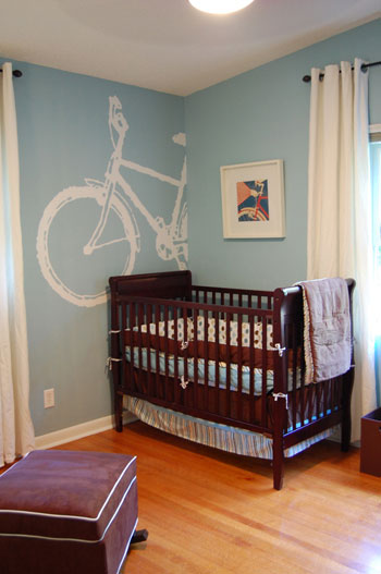
- The paint color we used (blue) was Valspar – 5001-5B, High Noon – and low VOC for baby on the way.
- We did the bike mural by borrowing an overheard projector from my sister’s school (middle school teacher) and projecting a bike image up on the wall that we found online. I traced this bad boy with a white paint pen and then filled in with some ceiling white paint.
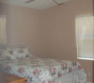
- The before picture was from before they moved in, so please excuse the heinous floral bedding and lacy window treatments.
Keep up the good work! – Audrey
We are suckers for a good before and after! And this one’s especially delicious. Here’s the granny-inspired before picture:

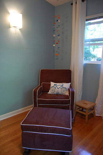
And the amazingly adorable afters:


Isn’t Audrey’s nursery makeover inspiring? It’s crisp and cute and oh so fun. And you know we’re crazy about that bike mural, right? That’s one lucky baby (and sister for that matter)!

Stacy says
Love the makeover!!
The link to Audrey’s blog doesn’t work??
Any chance this will be fixed soon?
I’m curious to check out her other stuff! :)
Keep up the great work Youngsters!!
YoungHouseLove says
Hey Stacy,
Sorry about the link snafu! It’s up and running now. Enjoy!
xo,
s
Jane says
The best part of the whole design is that it will *completely* grow with the child. This would be just as awesome for a preteen! Now that’s a gift that keeps on giving!
Stacy says
Thanks Sherry!!
:)
Jaime @ Project [Casa de Ayala] says
I am already a fan of Audrey’s blog… and loved the nursery. Simple and perfect. I do have a question though… why the bike theme? It’s too cute, but just curious!
Lynn says
Ooooooh, I LOVE that bicycle. We are moving into a house in a couple of weeks and need to create our son’s first room (he’s already 18 months old but has shared our bedroom until now). He is obsessed with trucks, so now my mind is reeling with the possibility of doing a digger or tractor like that. I think it’s beyond my abilities, but it would look so adorable. Beautiful work!
joolz says
omg, that bike mural and the little bike pillow on the chair rock! and jane’s right. that room will totally grow with the kidlet.
he’s got some great aunts :)
sammyw says
love the non-babyish look. that bike is amazing too :)
Hilary Taylor says
What an adorable nursery! Does anyone have a suggestion on the perfect sort of lime green paint color for a boy or girl…something cute but not too terribly bright (like a highlighter…per my husband’s request).
YoungHouseLove says
Hey Hilary,
You might have some luck with Benjamin Moore’s Spring Moss, Pear Green or Hibiscus (our personal favorite of the three). They’re all cheerful and definitely in the lime green family but not nearly as neon as some of the other lime tones out there. Especially if you cut all the green with crisp white trim and doors and some dark chocolate furnishings. Hope it helps!
xo,
Sherry
kelly says
Oh, Thanks so much for featuring a nursery!!! I will be helping my pregnant sister with her nursery soon, and it’s so great to get ideas! You guys are my favorite and I would love to see more nursery/kid ideas form you both.
Side note- pottery barn has a great 4-part canvas right now with a bicycle for two on it… it would be a perfect addition to a kid’s room or even a living room. Pricey, but with Audrey’s projector technique you could definitely diy!
http://www.potterybarn.com/products/p12561/index.cfm?pkey=cwall%2Dart
Audrey says
Thanks for posting my before and after, Sherry! I’m so glad that everyone is enjoying it! Jaime, the bike theme came about because my sister already had some circle themed bedding, so circles led me to bike wheels. I also wanted something active and kid themed, since this boy’s papa is super active and I’m sure he will be as well. :)
Holly says
LOVE the bike!
Kate says
Too cute! I love the nursery and am totally liking the non baby theme!
P.S. I voted today! Don’t forget!
Stephanie says
love it!
any idea where the mobile is from?
I think this this is great ’cause although the mural looks hard, sounds like with the help of a projector, this really could be DIY!
thanks for sharing!
YoungHouseLove says
Hey Stephanie,
Good question! Audrey is certainly a DIY girl so it’s very possible that she whipped it up herself. Why don’t you drop in on her blog and ask her how that lovely mobile came about? Here’s the link for ya: http://theartfulabode.wordpress.com/
xo,
s
Audrey says
Stephanie, I did in fact make the mobile and it’s super simple. You can check out how I did it here: http://theartfulabode.wordpress.com/2009/04/20/make-me-a-mobile/.
miss bliss says
I LOVE the bike and the mobile is adorable… amazing work… :)
Jaime @ Project [Casa de Ayala] says
Audrey – thank you for your response. Just too cute.
Sherry & John… you are catching up [at least it looked like it when i voted this morning]
Vote people!
heather s. says
Very cute but are the curtains hung at different heights or is it just me? That would drive me crazy.
Audrey says
Thought I’d drop in for another response if Sherry and John don’t mind! :) The curtains are hung at the same height, but the room has a vaulted ceiling. It’s a bit of an optical illusion, but the curtains are both at the same height – that would drive me crazy as well!
YoungHouseLove says
Thanks so much for dropping in again Audrey! We can’t get over how lovely that room is, and we wish your sister all the best with the bambino.
xo,
s
Judy Behnke says
My husband and I are long time DYIers and sooo inspired by your endless energy for projects. Recently, when you painted the nursery ceiling, I was reminded that I had always wanted to try a stormy ceiling . . . and I did. Thanks for your continued artistic approach to making a house a home. P.S. Did this with paint samples (8) from our local home improvement store; Lowe’s.
Can’t find option to attach photos???
YoungHouseLove says
Hey Judy,
The best way to attach photos is to upload them to a site like Flickr or Photobucket and link over to them. We’d love to see your stormy ceiling!
xo,
s
gez says
I love this nursery! Where did the slipcovers for the chair and ottoman come from? Thanks!
YoungHouseLove says
Here’s hoping she stops in with that info for you. Stay tuned…
xo,
s
Audrey says
Gez: the chair and ottoman aren’t slipcovered – they’re upholstered in brown ultrasuede with white piping. They hailed from Babies R Us, so hopefully they’re still in stock if you’re interested! Thanks again for posting this, Sherry and John!
Rich says
Its pretty amazing how a lick of colour can transform Anything really.
people dont colour enough in my opinion.
Claire says
Hi!! How I get that bike?! I love it!! I am looking for
Bicycles stuff to decor my baby room and I
Don’t find anything :(
Please help !
Claire.
YoungHouseLove says
She projected a bike shape on the wall and painted it to make a mural!
xo
s