When Totty and Dave sent us their latest room makeover we had to share the goods. After all, everyone loved their amazing bathroom overhaul so much that we knew their kitchen would be a hit too. Here’s their letter:
Dave and I have another Reader Redesign for ya. Our kitchen has been undergoing a facelift for the past six months. What started as a simple “let’s move the cabinets around a bit” turned into a full blown kitchen renovation. We relocated all of the upper cabinets, built floating shelves, got new cabinet doors and hardware, new appliances, tiled the backsplash, and discovered hardwood floors hiding under ugly orange tile! Shew- I think I covered it all! But the best part is that several of the key items we already had on hand and didn’t have to go out and buy! For example, the blacksplash was created with leftover tile and grout from our bathroom renovation (which you showcased back in November). We also reused all of the cabinet boxes and just got new doors and hardware! Plus we did all the work ourselves (minus sanding and refinishing the floors). That really helped to keep our little renovation under budget! I still can’t believe it is the same kitchen. For the entire scoop and photos check out www.bootsandtotty.com. – Totty and Dave
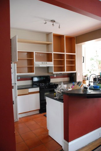
Here’s their kitchen before the redo:

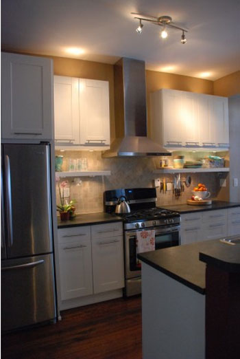
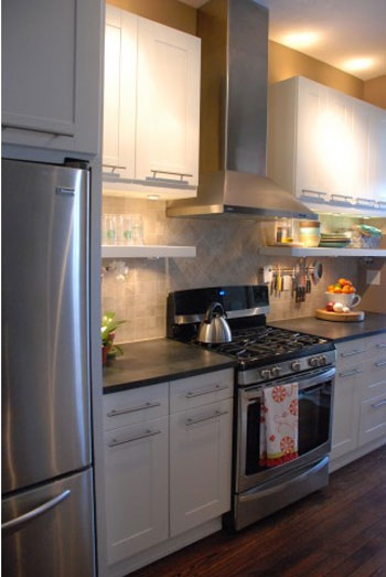
And here’s their amazing kitchen masterpiece as it looks today:


Oh and here’s a quick source list from Totty and Dave:
- Cabinet doors and hardware are from Ikea
- New fridge & stove were bought from Sears “Scratch & Dent” at majorly reduced prices
- Tile and grout for backsplash were leftover from our big bathroom reno
- The hardwood floors were sanded & refinished by Mr. Sanders (thanks for the recommendation- we loved him!)
Didn’t they do a fantastic job? We love that they reused, repurposed and salvaged as much as they could (like using leftover bathroom tile for the backsplash, refinishing their existing floors, reusing their cabinet boxes and just getting new doors and hardware for a totally new look). Gotta love a reno that’s easy on the wallet and good for the planet. Plus we can’t believe that they did so much work themselves (except for calling in the same guy who refinished our wood floors– love him). This reader redesign really shows that a little creativity, some smart repurposing, and a little elbow grease really can go a long way. But now let’s play the what’s-your-favorite-part game. We’re torn between the gorgeous and sleek horizontal door hardware to those awesome floating shelves below their high-hung “new” cabinets.

Meredith says
Looks so great!!! Love seeing the makeovers!
Ashley says
Wow! What a transformation. It looks amazing! Good job Totty and Dave!
luckyjayne says
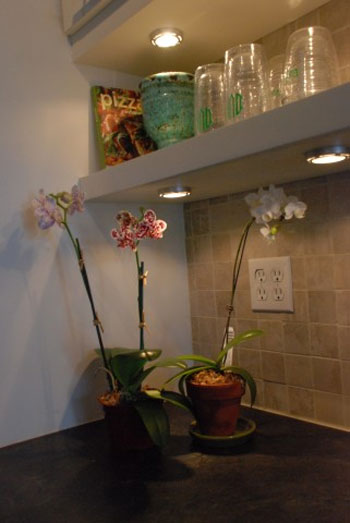
Wow! Do you think they would share their “how to” for the shelves? I have been looking for some and would also like to place puck lights underneath, like they did.
YoungHouseLove says
Hey LuckyJayne,
I think they addressed how they hung those shelves and did the lighting in a comment above, so feel free to scroll back for that info. Hope it helps!
xo,
s
Carly says
Thanks for the inspiriation, this is great! I’ve been trying to convince my husband on white cabinets for our kitchen remodel, and after seeing these stunning photos, he is game. I love how stainless steel and white go well together.
My only question – how tall are those ceilings? They look awfully tall to lighting above them. Lucky!!!!
Jenn says
I love the outcome! I have been struggling with a very similar issue in my kitchen. It looks like we had the same initial designer. We also have orange faux terra cotta tiles and laminate and wood accented cabinets. We hate them! I was trying to research new cabinet doors and never thought of IKEA. I love the way it all came out! I have to show my husband and start planting a seed there! Lol!
KC says
fantastic transformation! i think it really uses the space well and also really gives it a more decorative feel! I love your blog! How fun and what a great story!
http://www.letterstobetsy.com
Worldwide Wall Tapestries says
I love how they chose great, warm classy, colors for the kitchen that makes it look like a million bucks even though it was done with a budget in mind! And lighting is so important in a kitchen as it’s a working area, and the added lights do help as I have found many kitchens a little dark still even with halogens especially if the ceiling is high!
Sandy says
Amazing transformation! Looks fab fab fab!!!
Kat says
I love that kitchen. The hardwood floors and floating selves are my favorite part. This makes me want to move or redo our kitchen.
Paula says
What is the counter top material?
From where, color, etc?
YoungHouseLove says
Here’s hoping she stops in with that info for ya!
xo,
s
Frank says
I love how the kitchen turned out! Using “scratch and dent” appliances is budget friendly, great job! Was it expensive to hire an electrical man to do the wiring? I know those tend to be pricy.