Since we’re clearly in a kitchen state of mind, we had to share Kacie and her husband Kyle’s makeover. With the help of their parents, they took advantage of their home’s open floor plan and created a sweet and much-more-functional spot to fry up some eggs in the morning. Here’s Kacie’s email:
My husband and I just finished our first remodel! When we moved into our house one year ago we knew we were going to redo the kitchen and the flooring. The kitchen was completely closed in and all of the cabinets were poorly placed – there was only one usable drawer! I absolutely love to cook and this was not a cook’s kitchen:
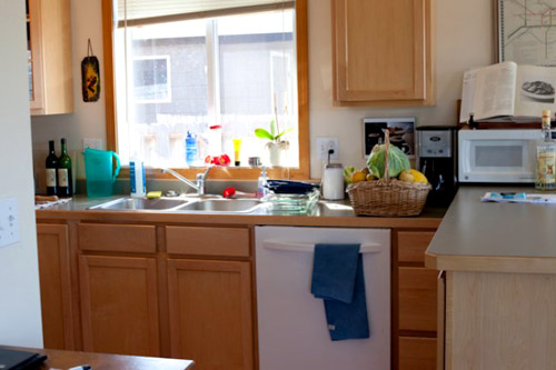
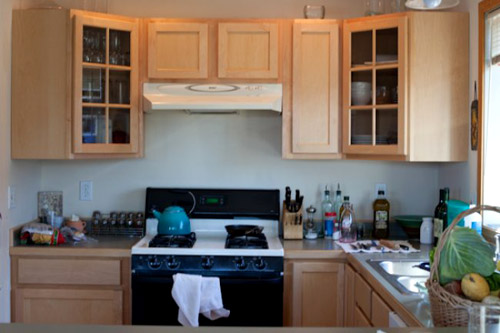
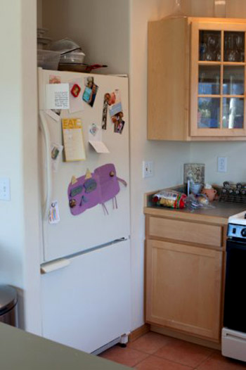
The goal was to really open the kitchen up and make it the first thing you see when you walk in the front door. With our in-laws’ help we spent a month and half remodeling:
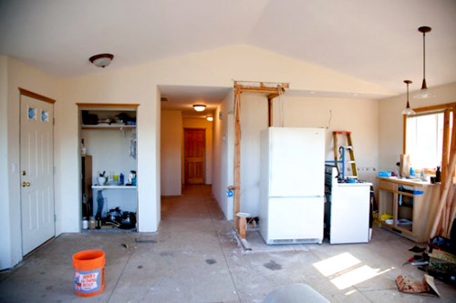
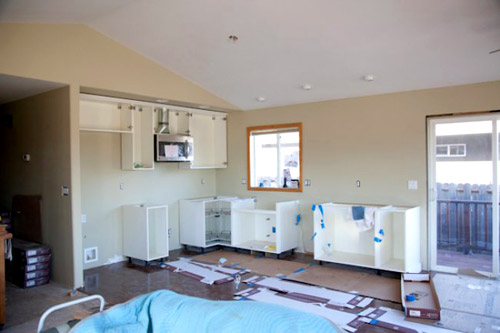
We got all of our cabinets, our countertop, the island, our sink, the floating shelves, and our hardware from Ikea.
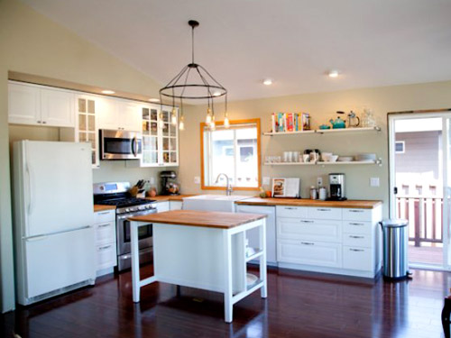
The new flooring is from Lumber Liquidators (Westminister Rosewood Laminate) and we found our Kenmore appliances at Sears.
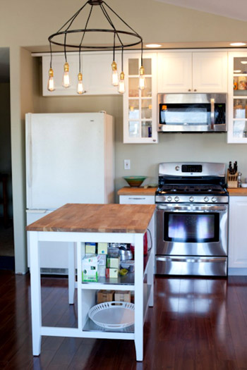
Our faucet is from Costco and the paint that we used is Benjamin Moore Providence Olive and Richmond Gray from Home Depot. Our chandelier was from Anthropologie (we got the bulbs for it on Amazon).
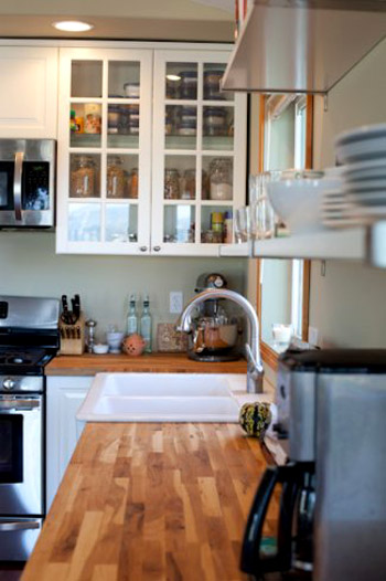
We’re beyond thrilled with how it turned out. We can’t wait to really get cooking in here. You guys were a huge inspiration for us. I hope you enjoy the photos! – Kacie & Kyle
Well, the whole “huge inspiration” thing is mutual, guys. You have no idea how encouraging pretty finished kitchens like yours can be as we head into our adventures in backsplash tile! And how awesome is that chandelier over the island? You can check out more of Kacie & Kyle’s transformation on Kacie’s blog. And if you have a makeover of your own to share, you can submit it to [email protected]. You know we like snooping around other people’s houses…

Regan @ RenovatingRothenbergers says
I love the butcher block & open shelving! Great job!! :)
Diana @ Boy + Girl says
I love this kitchen. The countertops, the sink, the cabinets, the shelving, the layout – everything is beautiful. And I see that the fridge handle has already been adressed and responded to many times so I won’t even mention it – oh wait. Anyway, the trim around the window – Have you thought about painting it white Kacie? It seems to photograph on the yellow side. Is it bare wood? It’s the only thing that sticks out to me. I didn’t even notice the mismatched appliances until I read a comment about them. Well done!
-Diana
Kacie says
Diana, they are consistent with the rest of the house so I’m afraid it would look odd if I painted just one? Thoughts Sherry?
Kacie
http://acollectionofpassions.com
YoungHouseLove says
I think it could go either way! It looks great as-is and probably wouldn’t stick out as the only painted one since it’s surrounded by interest- but since it’s an open concept room I can see how leaving it the same color as all of the rest of them would be your first choice!
xo,
s
Abra says
The kitchen is lovely, and the butcher block is great. But has anyone else noticed how organized the cabinet with the glass doors is? OMG! How do you do that? I WISH my pantry looked even a little bit that organized.
Staci says
My guess is that the glass doors help one stay organized… can’t hide a thing!
Kacie says
Staci is right. I have had to keep it super organized now that everyone can see it. I also just got a lot more jars (the ones in the photo were from IKEA) and ditched all the cheap tupperware. I used to curse my spice cabinet but now I love it!
Kacie
http://acollectionofpassions.com
Sasha says
So pretty! I love seeing these before and afters especially since we are in the middle of one ourselves.
I have a crazy specific question for Kacie, Sherry and John: How on earth do you figure out how much “drywall reveal” to put next to doorways before the cabinets/countertops start? It is currently keeping me awake at night :)
Thanks for all the inspiration! I can’t wait to have finished before and afters to share myself!!
YoungHouseLove says
I think it’s just one of those personal preference things (or one of those I’m-at-the-mercy-of-the-standard-cabinet-size things). We actually prefer when they go right up to the doorway trim since the backsplash can run up against them (instead of having 6″ or so between the trim and the end of the cabinets). We’ve seen it done other ways that are gorgeous too though so that’s just our first instinct!
xo,
s
Kacie says
I have no idea… I didn’t do the drywall but my husband did swear at it A LOT. ;-) Sorry I couldn’t be more helpful.
Kacie
http://acollectionofpassions.com
Aunt Lesa says
Just watch out for water and those Lumber Liquidators laminates — we got beautiful bamboo laminate for our kitchen and bathroom from them and small amounts of water have cause it to delaminate and bubble up. Looks terrible. We’re going to have to replace it.
Jordan@the2seasons says
I love that you showed this they did an amazing job.
Pam the Goatherd says
Question?Question?Question?
I just got a new fridge as part of my major kitchen remodel (been at it for 15 months now) and have noticed in most pics of kitchen re-dos that the “before” pics all have artwork/pictures/lists stuck on the fridge, but then the “after” shots have a clear fridge door. Do you guys ever go back to attaching stuff to the fridge or do you keep it cleared off? I’m really liking the clean lines of a non-cluttered-up fridge front but also need a place to hang all those family and friend pics that we love to look at while we’re eating. What have those of you who finished your remodel done?
YoungHouseLove says
We like to make an in-cabinet cork board for all the stuff that would go on the fridge (details here). It just feels cleaner and the room is somehow less chaotic/cluttered when the fridge is clean to me – even if stuff is all over the counters, at least the fridge is a nice breath of fresh air. Haha. It’s total personal preference though!
xo,
s
Kacie says
Pam, we have kept ours pretty clean. Besides one list and a couple of photo booth strips it’s clean. In such a nice clean kitchen I can’t bare all the clutter. I moved them all down the hall to a bulletin board by our mail-organization zone. Now all the birth announcements, etc. go there. When we paint the fridge with chalkboard paint there won’t be room for anything but interesting drawing by our daughter and profanities written by our immature friends. ;)
Kacie
http://acollectionofpassions.com
Pam the Goatherd says
Thanks for the replies. I was sort of leaning toward a corkboard or doing a magnet wall like the one Ana White did. So the fridge will stay sleek and clean. I’ve got pics of my remodel so far on my Facebook page. I think you should be able to view them. http://www.facebook.com/media/set/?set=a.416196276283.192101.534026283&type=3
After 14 years of “temporarily” living in our 1987 model mobile home while we save up the money to build our dream house we finally decided we’d better do some remodeling. The bathroom was first on the list when the floor under the bathtub rotted out to the point we were afraid that one of us was going to end up going right through to the ground while showering! The kitchen still needs new flooring and a few other finishing details. I’m not sure if it’ll ever be up to YHL Reader Redesign standards, but it is definitely a major improvement over what it was.
Pam the Goatherd says
Hmm, maybe you can’t see my Facebook pics after all. I’ll post a link on the YHL FB page so you can see them there.
YoungHouseLove says
Ooh I can see the pics! Amazing job!
xo,
s
Kate @ The Loud and Clear says
I love those butcher block countertops! I also like how they used the glass front cabinet to feature jars and containers of grains etc. It definitely makes it feel like a cook’s kitchen.
Jenna at Homeslice says
Wow! What a huge transformation! I love their light fixture!
Jillian@TheHumbleGourmet says
So cute! It’s really inspiring seeing people take small kitchen spaces and make them so beautiful.
Stefany says
Great transformation! We’re looking at Ikea butcher block counter tops ourselves. Which wood did you go with? The oak or beech?
Kacie says
Stefany, We got the oak and I love that it has some warmth. Also, stains don’t show up AS much. It’s definitely a personal preference though.
Kacie
http://www.acollectionofpassions.com/
Holly says
Love the new kitchen. When I saw the before pics…I couldn’t believe that the kitchen was designed that way. They have so much space now….looks great!!!! Also someone mentioned wood countertops. I think the butcher block stands up pretty well, from what I have heard. Of course you need to take care of them…but I think just have to oil them up. I would love butcher block countertops.
Laura says
Oh, I love it! Such a gorgeous kitchen!
Small Houses says
LOVE the open shelves. I have always wanted to do that. I’m thinking you have a big pantry for storage?
Also, the chandelier from Anthropologie.. oh yeah!
Dee :)
Aimee says
Hi! I LOVE before and afters more than anything, and this one came out great! I just started a blog a few days ago, and I have a kitchen B&A with some amateur designers (me and my husband). Your blog is awesome, thanks for the inspiration.