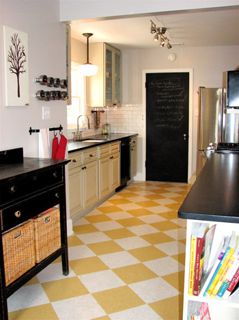
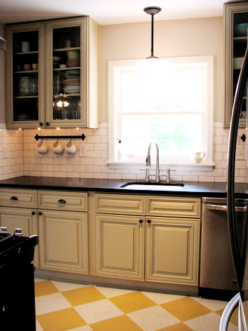
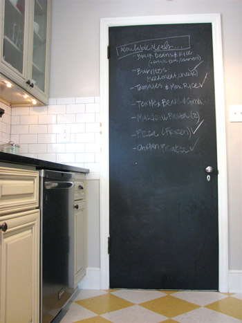
Still working on the drywall situation for our new opening! While we get that together and snap some pics for this afternoon, let’s look at an awesome kitchen makeover – you know to keep the momentum up. Of course we perked up when we spotted the words “1948 ranch style house” and “kitchen renovation” in our inbox. Then we saw the awesome before & after pictures attached and, well, see for yourself. This is one of those makeovers that reminds us that whatever the budget, making one or two daring or unexpected choices can make the room (and make it feel like yours). We’re loving the playful choices like the yellow floor and the chalkboard pantry door along with a ton of functional upgrades like the large glass cabinets and the glossy white backsplash. Here’s Kathryn’s email:
We had a very outdated kitchen in our 1948 ranch style house. We bought our house in 2009 knowing that we’d have to do something about the kitchen – the overhead light didn’t work, the stove worked about 50% of the time, and it was claustrophobic.
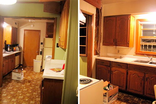
We used the first time tax-buyer’s credit plus some other savings to re-do the kitchen and ended up redoing everything to make more sense of the room and update the dark and dated feeling (we removed a soffit, got new flooring, new cabinets, new counters, new lighting, new backsplash tile, new appliances, a new sink & faucet, etc). Hope you like it as much as we do! – Kathryn
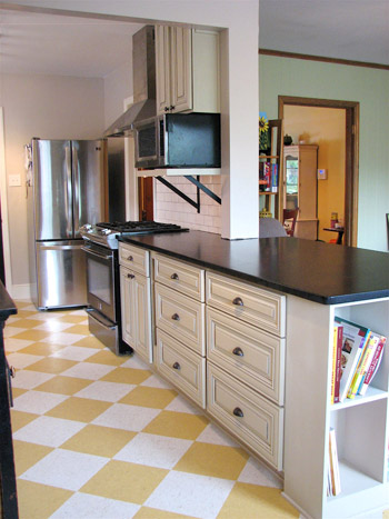
Isn’t that amazing? A big thank you goes out to Kathryn for sharing! She has more awesome after pictures here on her blog, and you can see more of the in-progress pics here. It’s like a totally different room, huh? And when you take a moment to really check out those cabinets (the lines of them, the glass fronted ones, the fact that they go all the way to the ceiling instead of hitting a soffit, the abundance of large functional pull-out drawers, the open bookcase for cookbooks on the end of the counter, etc) it’s clear that the room’s not only a lot easier on the eyes, it’s a lot more fun to cook in too! So let’s make like the floor and have some fun… playing the what’s-your-favorite-part game. Mine are the glass cabinets, giant drawers, and the pendant above the sink.

Erica says
I do really love the chalkboard – we have one in our kitchen as well and love it.
http://www.affordablemedicaldental.com
Ashley @ Lewis in Love says
Ahhh the FLOOR!!! It’s amazing. I have a similar kitchen floor, but it’s traditional cream and black. I ADORE the pop of color with yellow!
Ashley says
The floors and the schoolhouse pendant, hands down!
Clare says
That is an awesome kitchen. I love the floor, the cabinet doors with the glass and the chalkboard door!
Stephanie Phillips says
I love seeing midcentury ranch kitchen upgrades! Anybody else have some before and afters like this to share? I’m pinning this kitchen for sure!
Jill says
Wow! Looks awesome! I did have to laugh when I saw the old floor though- that’s exactly what my Nana has in her kitchen! And a funny little side note about that floor- Back when that song “Redneck Woman” was popular, I got the cd from my Nana for Christmas. When I opened the case (I was sitting in the kitchen) I popped the cd out and saw the background photo that lines the inside of the cd, it was the SAME exact retro orange brick laminate. I blinked my eyes several times just to make sure I wasn’t hallucinating. Yes in fact, it was the exact floor I was standing on. Anyways, that’s a random lil thing but that flooring seems to pop up in the most random places in my life! HA!
Evita says
Absolutely wonderful transformation! I love every inch of this. Thank you for the inspiration!
Emily E says
That looks gorgeous! Has me chomping at the bit to get started reno-ing our 100 year-old farm house! We close in 8 days!
Lea says
OMG WOW!!!!!!!!!!!!!!!!
This is absolutely stunning and amazing! I love it! It’s beautiful! I even love the cabinets by the sink and I usually don’t like that style.
Tiffany says
LOVE LOVE LOVE!!! I think they somehow got into my brain and projected what I want my future kitchen to look like ;) amazing job!
Kristi says
I had to click through…we have the exact floor in our kitchen, yellow and off-white Marmoleum laid on the diagonal. We did it ourselves and it turned out fantastic. Maybe it is a trend!
Rach says
Um, am I imagining things, or is the Kitchen app on the Gold Peak Tea Facebook page YOUR old kitchen? It looks just like it!
YoungHouseLove says
Huh? Any link? We’d love to check it out!
xo,
s
Amy @ A New Old House says
I love the cabinets paired with the dark countertops! Any idea what material the countertops are? I tried to access the blog to try and find out and wasn’t able to get to it!
YoungHouseLove says
Here’s hoping Kathryn will stop in with that info!
xo,
s
Lauren Nicole says
The yellow checkerboard floor and the built-in cookbook cabinet are the best parts for me. Actually, I’m not sure why I never thought of putting an awesome floor like that in my kitchen? My wheels are spinning …
Kathryn says
For my Southerners – cabinets. Check out Surplus Warehouse (http://www.surplus-warehouse.com/)to see if there is one near you. We shopped for a long time for cabinets – IKEA, HD/Lowe’s, Local Builder, refacing, painting, etc and this was the best deal and our cabinets have all the bells and whistles that the nicest of the ones we looked at but couldn’t buy did. They are a warehouse direct place but you don’t have to have a membership. The selection is limited but I liked several of their options.
YoungHouseLove says
Such a great tip!
xo,
s
mp says
This is perfect! My house is a 1975 rancher with almost identical kitchen layout, and I’m filching ideas. Kathryn, you have a LOT to be proud of!
Kathryn says
Hey Amy! The counters are actually Formica’s new(ish) solid surface line. We wanted Solid Surface and this brand was the best bargain, better priced than Corian and the like but a similar look AND we wanted an almost solid, matte black and Formica was the only to have that color. Don’t quote me but I think we paid something like 42/sq. foot? Sink was included. We got it at Lowe’s.
Kathryn says
PS – here is my source list. Isn’t isn’t perfect but I tried to list most things:
http://kathrynjasper.blogspot.com/2011/05/kitchen-renovation-source-list.html
Paige says
One of my favorite things about the room is how they incorporated black appliances into the design (excluding the fridge). They did a great job balancing the black with other elements in the room like the chalkboard, the sideboard, and the counter tops. It just goes to show that you don’t always have to go with stainless if you want to upgrade. What a transformation!
Ann says
I love that for such a utilitarian room you really get a feel for the family that lives there. Especially with that fun floor and boy, do they keep their counters clear. I’m so envious!
RLB says
I like how the spices are magnetically held on those strips.
Can I play what I wish they would change? The support for the microwave shelf looks like a hospital TV wall stand. Maybe make a hidden cleat that the shelf rests on so that the space below the shelf is open like the rest of their great kitchen.
Katie of Cabbage Ranch says
This is so chock-full of great ideas for updating galley-style kitchens. [ours: purple counters, pink floors… Hello 1980s, how I’ve missed you.] We’ll be using this for some inspiration along with lots of YHL posts!
Teresa says
This remake should give anyone who has an “unsightly” room hope!!! Wonderful work!! Love the floors, you wouldn’t have seen that coming for sure!! Love the daring ideas!!
Jodie Kirk says
Great renovation! I especially love the floor!
I’m kind of over the subway tile though…
it reminds me of, well, down in the NYC subway tunnels. Really gross and not very clean. Obviously this kitchen is very clean, but I can’t help but imagine…
Nessa@{CasaBraaflat} says
wow, from the floor to the chalkboard door…i love!
Randa says
I too love the flooring, the colors, and how easily accessible everything seems to be! Gorgeous.
Jill says
Oh my gosh that floor seriously just made my heart go pitter patter!!! A-ma-zing! I am planning on doing grey & white linoleum tiles on my kitchen floor and this just totally reinforced my decision to do it. I can hardly wait!
Mary says
Great job! And so inspiring to see what you started with and ended up with.
Our 60’s Ranch has the identical gold linoleum floor and eerily similar dark cabinetry. We could be twins, only we haven’t bitten the bullet on deciding what to do to change it up.
Such a great re-do!
Lauren says
Oh I want that backsplash. Love it. Would love to put it in my kitchen, but right now I’m not going to out of spite.
My three year old fridge conked out yesterday and EVERYTHING was ruined and melted and it took three hours to clean up.
So if my kitchen is going to keep acting so dumb then it is just going to have to deal with looking dumb as well.
HA! Take THAT kitchen.
Seriously beautiful makeover though.
YoungHouseLove says
Hah- you show that kitchen who’s boss.
xo,
s
Carolyn says
Awesome! I’d love to have glass cabinets like that … sigh. And wow, do they ever like their Mexican food! ; )
Kathryn says
Carolyn – how funny! I hadn’t noticed that until you mentioned our plethora of Mexican meals. I’d imagine that it is because when we buy groceries, we try to cut down on the amount of ingredients we have to buy so we reuse things – so if I’m buying cilantro, I try to have several things with cilantro, etc. But really I do love Mexican! It pretty much goes Mexican/Italian/Mexican/Italian.
Libby says
YELLOW FLOORS = LOVE!
katelyn says
annnddd pinned! goodness i love pinterest.
and YHL too of course ;)
joannegarcia says
i love the way you re-did your kitchen! you guys are awesome … totally an inspiration!
Luke says
I am in love with the floor – it’s retro, yet crisp.
Chrissie says
I actually gasped at the afters, that kitchen looks beautiful! I love the mix of old and new – I’ll definitely be storing this away in my memory bank for when we redo our kitchen =D
What an amazing transformation!
Ellen says
My favorite part is the people who did it! How cool to see two friends kitchen on one of my favorite blogs! In all seriousness I love the built in bookshelf at the end of the counter, what I wouldn’t give for one of those.
Cassie Helwig says
I love the floor, chalkboard door, and the open shelving for cookbooks! my grandmother has the open shelving as well, and it looks great in both places, since it’s built in instead of just a random bookshelf placed at the end of the cabinets.
JennyTheArtist says
you must be so, so pleased with this. the floor is amazing.
houseofearnest says
I love this redesign! It looks so modern and fresh- Great Job, Kathryn!
eileen marie says
Wow. So great! This is good inspiration b/c nearly, OK ALL the kitchens in the houses we’re looking at need updating (and we’ll def. be on a budget!)
Brooke says
I love the subway tile and chalk door! Great remodel.