Okay, so maybe the red bathroom Melissa and Ian inherited with their house isn’t bad enough to deserve a nod to The Shining, but it was pretty killer on the eyes. Fortunately they remedied things with an awesome redo that they sent our way. Here’s their letter:
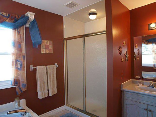
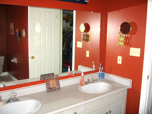
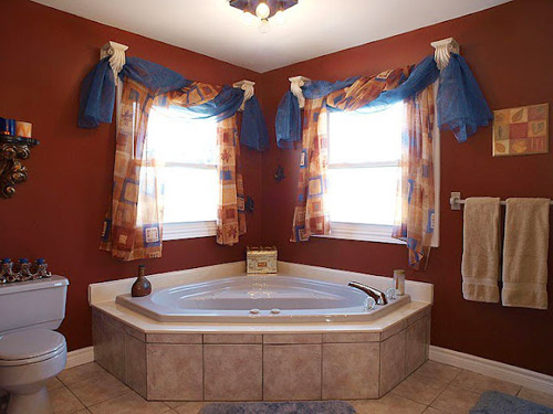
Hi John and Sherry! We bought our second home up north in good ‘ole Canada in April of 2011 and started our DIY magic – or whatever you wanna call it ;) So far we’ve done 2 bathrooms, an office, a guest room, and our bedroom and I still feel like we have tons to do (I’m sure you know the feeling). However, we’re really happy with how our bathroom turned out. Let’s start at the beginning. Here is what we had to work with:
Where to begin? The pink floors? The vanity that was about as tall as my lower thighs? I was barely able to wash my face without sitting on the floor.
The room looked a bit like a rainbow exploded in it. We don’t do rainbow guts.
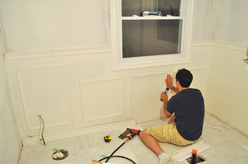
In all reality there were no words. We just knew we wanted to change the ENTIRE thing. I had been saving up tons of ideas and we pretty much knew what we wanted: a ‘spa’ feel with light, bright colours, and a clean look. We also really wanted to incorporate a little bit of architectural detail somehow. We had seen paneling done in a variety of different forms, and we figured this might be a good place to try it out. We ended up choosing picture frame style wainscoting. Overall, this process wasn’t as difficult as it sounds.
Sooooo… here it is: our pride and joy!
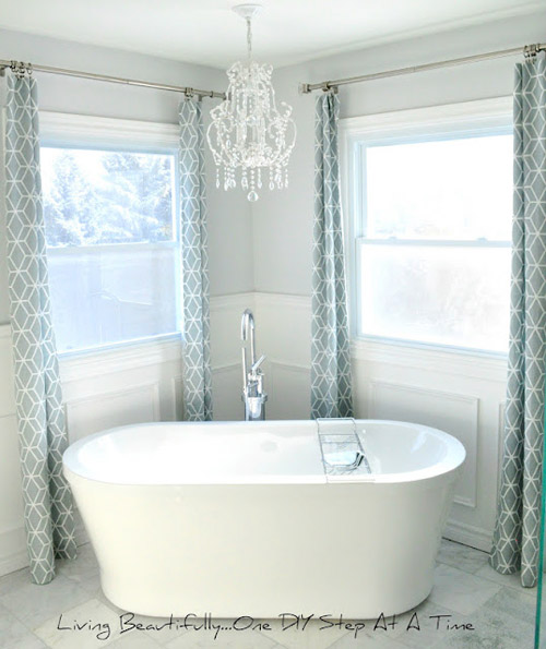
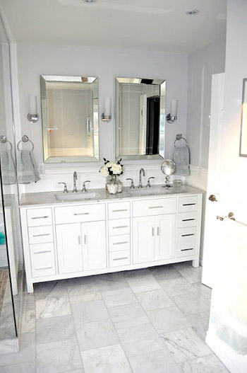
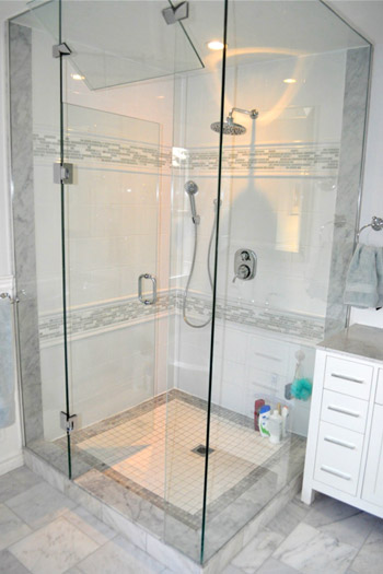
We did a lot of other things besides the wainscoting ourselves – just to stick to our tight budget – like doing the shower tile pattern ourselves, making our own curtains, and searching high and low for the best priced materials and fixtures (the tub is from Costco and the mirrors over the vanity are from HomeSense – which is also known as HomeGoods in the states).
Thanks again for being a huge inspiration for a young couple like ourselves. All the best, Melissa and Ian (oh and Clover, our 85 pound golden doodle who thinks of herself as an 8 pound chihuahua).
Oh to have a bathroom that large and that gorgeous! Nicely done Melissa and Ian (and Burger gives two paws up to Clover, to whom he gives all the credit). You can see more photos of their beautiful bathroom on their blog, where they’ve also got a full source list as well as a breakdown of projects like the paneling and the curtains.
Psst- Got a before and after of your own that you’d like to submit? Send your best pictures, links to any blog posts, and brief description to [email protected].
Psssst- We’re sharing our latest Clara-conversations over on Young House Life (she’s definitely the comedian of this family).

Maureen says
Holy schmoly this is one awesome bathroom. I have major tub envy going on right now.
Cheryl says
Lovely!
But I’m another one that worries about the chandelier over the tub. Usually I’ve heard that bottom of light over tub must be something like 8 feet above tub or the light must be several feet away from being over the tub. I assume the distances required are so someone cannot be in the tub full of water and reach the light (to avoid electrocution issues). Are building codes different in Canada?
Seriously Sassy Mama says
That is gorgeous!
Liliana says
Wow, great job! Looks like a completely different room!
Lara says
I’m driving to Canada to steal this bathroom and bring it home. Just need to find my passport…
Mamaw says
That is STUNNING! I have no other words.
Nora says
so, SO beautiful. it that what heaven looks like??
Lina Neufeld says
omg! love it
Sammy says
Awesome transformation! It’s incredible how they were able to turn such a dark room into such a bright one! Thumbs up!!
xx
Michelle says
Holy soaker tub Batman that is gorgeous!! I love the clean airy feel of that room. Two thumbs WAY up!!
John@Our Home From Scratch says
Wow, that looks AWESOME! Going to be pinning the living crap out of these photos.
Ashley@AttemptsAtDomestication says
Looks amazing!! I love it!
joyce says
WOW What an amazing transformation. They did an amazing job
Amy says
Wow, that first ‘after’ picture took my breath away. I love everything they did!
Jen @ Migonis Home says
This is my favorite makeover ever! I am in love with every choice you made. The marble and white is such a stunning combo… And hello?!? Why would someone live with such a crazy red bathroom?
Laura@Elegant Nest says
Just one word for that bathroom re-do…WOW!! Just posted pics of my own bathroom remodel…wish I had before pics so you could really see the difference!
Col & Kate says
That’s amazing – love the curtains as well !
Alina says
My mind has been blown. Great job!
Maria @ All Things Luxurious says
This looks amazing! They did a fabulous job. Thanks so much for sharing!
Julie S says
Whoahhhh… that is one amazingly well done remodel. It does NOT have the mismatched undertones or fixture sheens that most DIY low-budget bathrooms have. Thanks for linking us to it!
Ally says
Beautifully done, Melissa & Ian! I AM CANADIAN, too…very proud of you guys :)
I had to laugh when I saw how the previous owner accessorized their toilet tank. At first glance, it looked like the 7 Dwarfs in Viking Helmets? After seeing the larger pics on your own blog, I see it was actually a very ornate candleholder :)
xox
Kristin Cadwallader says
Oh my goodness! They did a great job! It looks so luxurious! Love it! Kristin
vel says
So gorgeous!!!! I cant believe its the same space! definitely an inspiration for us when we re-do ours!
jane says
Unrelated to this post, but… I just saw a sneak peak of your book cover on amazon – John, is that you giving bunny ears to Sherry? How hilarious (love it!) – and how *you*! You should definitely share it out to the readers to start building the excitement for the impending book arrival! (but you probably have a post written – and queued up – about it already, LOL)
YoungHouseLove says
Aw thanks Jane! We do have a post planned all about the cover process! It was so interesting (and completely different) than we expected! We learned so much!
xo,
s
jane says
Awesome – I seriously cannot wait to read it!
jessica@fourgenerationsoneroof says
What gorgeous bathroom! I love everything but especially the wall treatment & drapes! Would you be so kind as to come do my bathroom? hehe . Love this reader redesign!
quirkstreet says
Wow! Amazing transformation!
Melissa and Ian @ Living Beautifully says
We are so overwhelmed with all of the incredible comments on our bathroom :) A MASSIVE THANK YOU to John and Sherry (Clara and Burger!) for featuring our master bath. We can’t thank you enough and are honoured to be featured on your incredible blog that we read daily and have used as a major inspiration :) All of your readers are so support and wonderful!! Thank you all SO much- this has totally made our week…and has inspired us to do another bathroom, maybe sooner than later! lol! Much love, Melissa and Ian (and Clover!)
YoungHouseLove says
Aw you’re so sweet! It was so well deserved. Thanks for sending the eye candy our way!
xo
s
Kelley says
This transformation is amazing! Those original window treatments were what my dad would call “aggressive.”
john De Handson says
hi John,
What a beautiful bathroom!! The layout was already great, but the trasnformation they made is incredible. Looks like the perfect place to relax
Cara says
I WANT IT! So pretty. Great job guys.
B says
Beautiful!!!
Does anyone know what paint color was used? I tried to check their website and didn’t find any info.
Melissa and Ian @ Living Beautifully says
Hi B!
Actually if you check out our sourcing blog post, we’ve listed the paint colours on there :) Just scroll down to the bottom of the post! http://livingbeautifullydiy.blogspot.ca/2012/04/sourcing-sourcing.html
Melissa :)
Sherry says
Wow, just wow! They really did a professional job. It’s downright stunning! I might need to know where they got those curtains from. Thanks for sharing!
Sherry says
…or where they got that fabric
…since it says they made them!
YoungHouseLove says
Check out the last sentence of the post for a link all about how she made the curtains (it’s linked in the word “curtains”).
-John
Melissa and Ian @ Living Beautifully says
Hi Sherry! I did make the curtains :) Fabric was from an online store in Canada (that also ships to the US) called Tonic Living. Here’s our post and “How To” on the curtains: http://livingbeautifullydiy.blogspot.ca/2012/03/master-ensuite-curtains.html
Melissa :)
Kindra - Wickfreeforever says
I love love love the redone! It not only looks a million times better it looks like a much higher end bathroom. I am sure that if they were to try and resell it has added a lot of value! Well done!
Rachel says
BEAUTIFUL! But…am I the only one who noticed that the shampoo bottles are on the FLOOR in the shower?? I think that’s a very common thing that people overlook when renovating bathrooms. We just bought a house, and our master bath shower is huge, but there is nowhere to put anything. Don’t forget about shelves, folks!
Melissa and Ian @ Living Beautifully says
Hey Rachel! We actually decided against putting a shelf or anything like that in permanently, since we didn’t want to ruin the look of the walls. We decided on getting a separate stool or shelf that we can put it and move around ourselves, we just haven’t found the right one yet ;) We did consider it though, we all know how annoying it is to bend down for shampoo ;S lol…
p.s we recently found a great wire caddy at HomeSense (Home goods in the US) for $9 that suction cups to the walls…perfect!
tracy a says
Wow. Absolute wow! The before is awful (those curtains? they deserve an ugly award), but the after is incredible. And about the name thing…I married a man with the last name Ashley. People I have known my whole life all of the sudden can’t remember that my name is Tracy, doctors reading my chart all of the sudden get confused at why that comma separating names exists! It is crazy! Good thing he’s worth it! :)
Laura says
Beautiful.
Wom-mom Ethne says
Oy, the before pictures were terrible! Those curtains! The starfish! Very nice job, well done.
Paulina J! says
One of my favorite reader redesigns so far. Also very educational. I had no idea Costco sold tubs!
Cece Summers says
That is a huge change! It looks like the rooms are two different rooms. The white/gray theme made it look clean.
Dani says
Beautiful remodel! Reminds me of something Sarah Richardson would do. I wish I had all of that space!
Christine Witt (Brush Dance) says
This really is an incredible makeover. Looooove that tub.
Laura says
Hi. I really enjoy the reader redesign posts. They give me lots of ideas. Is there a way to look at older ones without going back through all the posts? Maybe a special section just for them?
YoungHouseLove says
Yep! If you click on the “Categories” tab right near our picture on the sidebar you’ll see a list of topics – one being “Reader Redesigns” and that will show you just those posts. Here’s a quick link to it also: https://www.younghouselove.com/category/reader-redesign/
-John
Elnaz says
I am an Iranian living in Tehran. Today, for the first time I saw your website and I liked the idea and your lifestyle. I wish you success and happiness.
Kath @ couverture nevers says
That bathroom looks great and I wanted to have a glass shower too. I really like to remodel my bedroom.
Ashley @ sunnysideshlee.com says
I can’t believe that tub is from Costco!!
how2home says
We have been so busy for the past week….and now we are catching up with your blog and came across this. WOW…we love it! The bathtub is stunning with the stand alone glass shower. We want it all!
Rachel says
Its insanely stunning room and this tub seems really awesome. The work is just fantastic. BTW never make any mistake in my name, I’ll gonna sue you. :P LOL!
Gena@BakeAllTheThings! says
Ohhhh it looks FANTASTIC!! I looove the tub and the placement of it and all the white/silver/gray and the curtains and that vanity, and I just want to come visit! :)
Jackie Toye says
Peaceful Transformation