Some of our friends with sons lament that it’s hard to find inspiring boy rooms, which is why we’re always excited when a cool one shows up in our inbox. And our excitement for Dacia and Jordan’s nursery creation could almost be described as “out of this world.” Pun intended. Here’s Dacia’s email:
Hi John & Sherry! I wanted to share my nursery with you guys. When we found out that our very first wee one was going to be a little dude, I immediately took off with designing the nursery. I had a plan all worked out, and then one night my hubby (who normally couldn’t give two hoots about decorating) sweetly said, “Would you mind if I helped design the nursery?” Being the emotional pregnant woman I was, the fact that he wanted to help design a room for our son melted my heart and I threw all my plans out the window! So we started planning things out together, and I have to say, I’m so happy we did it together because I love the direction it took!

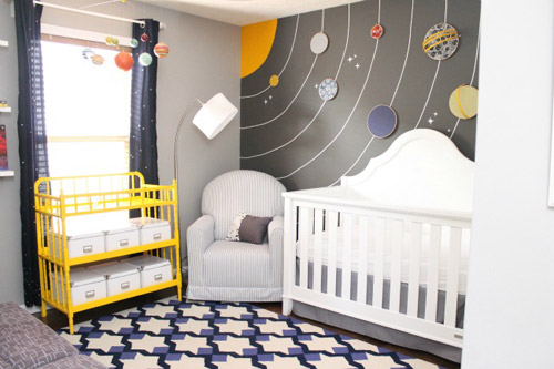
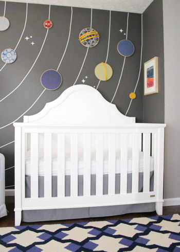
My husband has a fascination with all things astronomy so we infused that into the nursery. We put our own twist on a traditional mural wall by using embroidery hoops to create a 3D planet ‘mural’.

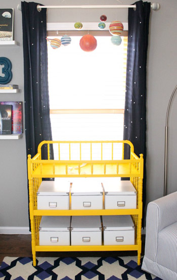
Most of the nursery is done in grays and blues, but we wanted a fun pop of color so I made over a changing table that I got on Craigslist for $30. I also updated some run-of-the-mill navy curtains with simple star embellishments.

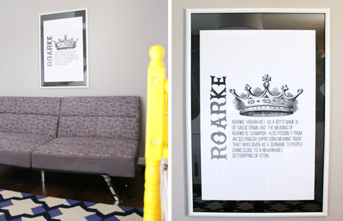
On the wall opposite the crib, we added a futon so that my husband and I both have places to sit if we’re in the nursery together. Hanging above it is some art that I designed explaining the meaning behind our little man’s name. We plan to add some family pictures on either side of it once we get those taken and framed.

Sherry, I totally get what you mean when you say that Clara’s nursery was your favorite room in your old house… I’ve already fallen hard for the nursery. We love spending time in it with our son! – Dacia
How cool is that room? Got any favorite parts? The mural is so creatively done (such a great use of embroidery hoops), not to mention the little nods to outer space elsewhere in the room (notice the stars in the rug?). Thanks for sharing your little astronaut’s room with us, Dacia and Jordan!
UPDATE: Here’s a link to Dacia’s blog post about the nursery, complete with more pics. So sorry for not including it earlier!

GreenInOC says
I’m cheating, I have 3 favorite things: the rug, the futon and the mural.
I LOVE Dr. Neil deGrasse Tyson, I can almost understand science when he’s speaking about it! Here’s a funny (and enlightening) clip about Pluto:
Victoria says
Really love it! Stylish, fun, practical, and creative. I love that they designed it together – the result couldn’t be better. Like others, I adore the mural, the yellow changing table, the rug, the drapes, …. oh well, I guess I adore it all. Roarke is such a great name too. I really like that you guys bring us reader re-designs – so much talent out there and so inspiring.
Just an aside – I am so happy you updated your comment “rules”. It makes me sad when people are nasty just for the sake of stirring things up. I admire “constructive disagreement” but malicious comments don’t belong here. I come here for inspiration and a dose of happy (which you always provide)
Amber says
Dude, as a furloughed NASA person, this is so giving me my space fix for the day. Awesome, awesome room, and awesome timing. Well played John and Sherry, well played.
YoungHouseLove says
Aw thanks Amber! A NASA approved project = the bees knees in our book.
xo
s
Julia at Home on 129 Acres says
I like that it’s a theme room, but the theme doesn’t seem to be in your face… at least in my opinion. Obviously the mural isn’t subtle, but I feel like the drapes and the rug and the mobile combined with the fun colours don’t hit you over the head with “SPACE!”
judykr says
My girls would definitely love that! They have always been interested in astronomy.
Ashlee @ The Crunchy Moose says
So perfect!! Good job!! ~ Ashlee @ Thecrunchymoose.blogspot.com
fmchoff says
Fabulous nursery! I love that Pluto is present and accounted for!
Tom says
Great article! Thanks.
EngineerMom says
Love it!
We have a boy/girl shared room, and the main “feature” is a curtain I made from a panel of world-map fabric I found at Joann’s. I bought only one panel, then framed it out in white fabric, and trimmed the whole thing in red bias tape. My daughter sleeps in the toddler-ized version of her white crib with all her animals, and my son sleeps in that “flippable” bed from IKEA, with a curtain around the bottom that is made of white fabric and a space-themed print near the bottom that coordinates with the blue in the map fabric and on his bed. Right now, my daughter doesn’t like any kind of a blanket, so her space is rather spartan. Both kids have white Trofast frames, daughter’s filled with green and blue bins, son’s filled with blue, and then each kid has their own letter, plus a piece of artwork created for them by a family friend (in my son’s case, a painting of him done from a photo, in my daughter’s, a painting of a tree with a heart and her name carved in the bark).
I think gender-neutral spaces aren’t difficult if you just steer clear of the uber-girly! Nature, science, math, art, literature, are all gender-neutral, but lend themselves well to personal adaptation as the kids grow and have their own opinions.
YoungHouseLove says
Sounds really charming!
xo
s
Sunday says
Wow! I want this room! I love that the rug has ‘stars’ in it and those planets on the wall are just gorgeous. Thanks for sharing!
ashley @ sunnysideshlee.com says
what an adorable nursery! love to see a planet/universe theme that doesn’t look tacky! super adorable, super well-done!! love it!
Dana @ chocolateandsunshine.com says
Such a cute space for baby but my favorite is the changing table painted in bright sunny yellow. I’m beyond baby nurseries but with my two kids, their rooms were ever-evolving with their interests so there are many opportunities to decorate.
Congrats to you, too!!
Karis says
I love all the details — especially the 3D mural and the yellow changing table, not to mention the starry curtains and the planet mobile… AND the fact that Dacia and her husband planned this together. Great job you two :).
Erin J. says
I especially like that they put a futon in the room so that more people can sit! Means more opportunities for family cuddle sessions :)
Marcie says
This is amazing! I love the colors and the implementation of the theme without being too “themey”.
So handsome!
Kyle ( http://plushrugs.com ) says
This is such a fun room. The solar system is a great idea and it is so well done. I like how the rug has a quasi star pattern too. It is subtle enough that it just hints towards the theme that the wall has already defined. The framed prints are really cool too! I love the vintage mappings.