We loved Stacy’s kitchen makeover, not only because it’s beautiful (and a huuuuuuge improvement over the original) but also because we thought it was a great example of balance. Stacy found out where she could eke out the most savings and took her time figuring out what she could do herself (and where she needed a little help). And the fact that her new kitchen appraised for… well, we’ll just let her tell you the story:
Hi John and Sherry, I waited about a year after I bought this house before I started re-doing the kitchen. It gave me time to save up, live with the space to see what it needed, and figure out what I wanted. I quickly realized that the original kitchen was majorly lacking in counter space. It was hard to find a place to cut vegetables. I basically ended up using the kitchen table to prep food!
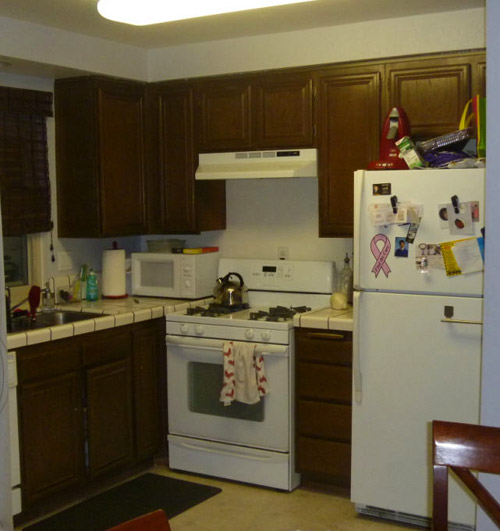
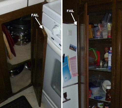
Also, the corner cabinets were placed so that the doors didn’t fully open and you couldn’t see what was inside. The fan didn’t work very well, so a lot of times the second floor of the house smelled like what we ate for dinner. Let’s not even talk about the gross linoleum floors. The one good thing is that the appliances were all in decent shape.
I work full time and also am getting my MBA part time, so spare time is very limited. I went through a contractor for the demo and installation (took about three weeks for everything), but I did the designing of the floor plan and picked all the finishes myself. I took a risk and changed the floor plan completely. I moved the refrigerator over into the dining area and created a pantry area. This let me extend the countertops into a U shape. What a difference!! Three people can now work in the kitchen at once.
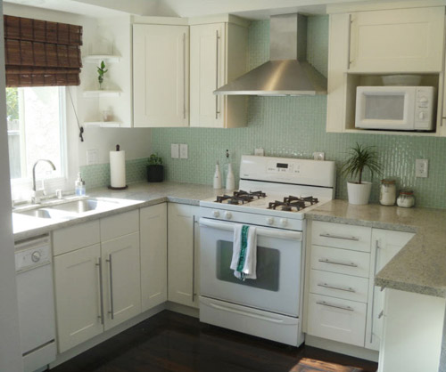
I saved a lot of money by re-using the existing appliances. Although I really wanted stainless appliances, these white ones still worked well and have a few years left in them. I also saved money by finding deals on a lot of the finishes. The vent hood, hardware, and cabinets are from Ikea. I assembled them and the contractor hung them. The backsplash was a really reasonable find as well (from Home Depot).
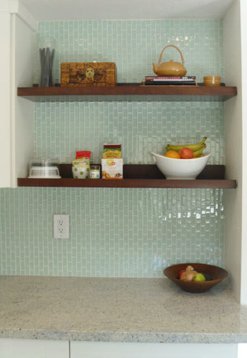
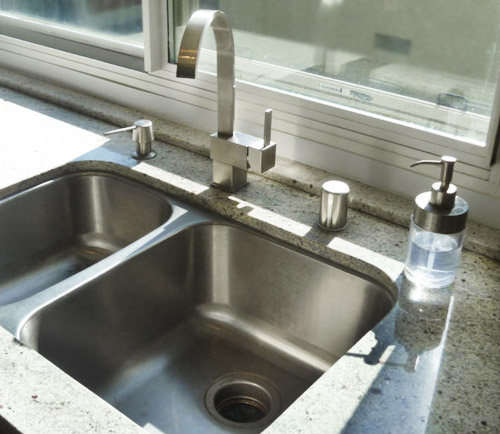
You inspired me to include open shelving, so I re-used the open shelves I had in the previous bar area. This also saved money that I would’ve spent on additional cabinets. The sink was also a major online bargain as well as the faucet and soap pump. I really love how the kitchen turned out. I had an appraisal done for my refinance and I recouped 100% of my costs of the reno in added value to the house. Really added a cherry on top to the whole project! Hope you enjoy! – Stacy
Can I just say one of my favorite decisions in the whole kitchen is not just the backsplash, but the direction of the backsplash? The vertical orientation is such a nice touch. Makes that Home Depot tile look so much more custom! Nice choice Stacy. Thanks so much for sharing! We love all the cost-saving details and that you took a chance and moved the whole layout around to make it a lot more functional (and recoup all of the money you spent). What about you guys. What’s your favorite part?
Psst- We announced this week’s giveaway winner, so click here to see if it’s you.

Crystal @ 29 Rue House says
I love the way the stainless steal hood looks against the tile (which is a nice change going vertical).
So bummed I didn’t win! Maybe next time! lol
Kate says
It’s just lovely! I love that she used a wood tone for the open shelves. Every room needs a little bit of contrast!
RebeccaK says
Oh my goodness! I am completely serious, I thought the first ‘after’ image was her inspiration image!!! It took me a second to realize that was her finished kitchen! Wow, wow, wow.
Stacy says
Thanks RebeccaK!
Val says
I’m surprised the recoup was only 100% and not more!
I thought the tile was Heath at first–makes me think twice about HD for sure. Is the counter also Ikea?
Stacy says
No, the counter is from a local shop my contractor regularly uses. Felt nice to support a local business!
Karen says
I adore the green back splash tile. I might just do that for our own kitchen renovation!
Amanda says
Gorgeousity! Love how much lighter and brighter it is in there now – and the backsplash is such a fabulous color. We’ve done a bunch of changes in our house in the last couple of years…might have to pester the hubby to get an appraisal (it might make him more ok with the money we’ve put into the house so far).
Jen@The Decor Scene says
OMG this kitchen is gorgeous!!! Thanks for sharing. Love how light and bright it is now and that tile backsplash is gorgeous!!! :)
Emily says
Can you tell me the name and color of your tile? I am doing a back splash and really like but I would love to see if they have different colors in that same style.
Stacy says
Hi Emily – the tile is from Home Depot, “Glacier Ice” by Jeffrey Court (Model# 99185 Internet #202530987 Store SKU # 29323)
http://www.homedepot.com/Jeffrey-Court/Jeffrey-Court/h_d1/N-5yc1vZ4gmZ4gm/R-202530987/h_d2/ProductDisplay?langId=-1&storeId=10051&catalogId=10053#.UCU0uKFlSuM
Karla@{TheClassyWoman} says
Awesome! Everything is so bright and airy! Before I read you text at the bottom, that is what I noticed too-the backsplash direction! Even though she kept the white appliances it still looks great and with the sink and fan hood being stainless, she’ll be able to transition and maybe sell those existing white ones one day to put towards what she really wants.
Overall, a fabulous makeover! I love the little 3-tiered shelves in the corner near the sink. I had that in my old house and it’s great for displaying items or a little plant/flower. :)
Stacy says
Thanks Karla! I have a couple of fun plants on the shelves there now. Brings some life into the room.
jillian says
What a beautiful design! It kind of looks like your old kitchen. Is there a link to her blog?
YoungHouseLove says
Sadly no blog! Maybe she’ll start one soon!
xo,
s
Stacy says
Hi Jillian – no blog yet, but I’m an avid pinner!
Follow me on Pinterest! sdub001
My Kitchen Board:
http://pinterest.com/sdub001/my-kitchen-mood-
Karen F says
amazing makeover! it’s such a transformation that it almost looks like a total gut job. she did an amazing job with this! love the tile orientation, too!
Victoria says
Do you happen to know where the faucet came from? We are looking for a new one for our kitchen and I’m loving this one. I am also loving the backsplash.
Stacy says
Hi Victoria – It’s from amazon:
http://www.amazon.com/gp/product/B002QYI8ZW/?ref=oh_o00_s00_i00_details
To be honest with you, I wouldn’t recommend it. It’s very pretty, but it doesn’t have an aerator on it so the water flow comes out really fast. Hard to wash dishes without having water everywhere. I think this faucet might be good for a bar sink!
GreenInOC says
It’s so amazing it seems like someone is trying to pull a fast one! I had to keep scrolling back up to compare. WOW!!!
My favorite thing besides the open shelving, the backsplash (oh my!), the faucet, and recouping the cost through appraisal has to be the floor plan.
I would love to see a before and after of her flooring since she mentioned her grody linoleum she started with.
I said it before, but it bears repeating – WOW!!!
Stacy says
Thanks GreenlnOC! I unfortunately don’t have a good picture of the old floor. Let’s just say they were kind of yellow and had a paint stain on it from the previous owners. Also, the linoleum was only in the kitchen and there was beige carpet everywhere else. Now I have all hardwood on the first floor.
Kelly B says
Would love to know the type/color countertop that she used.
YoungHouseLove says
Here’s hoping she drops in with more info for everyone with questions!
xo,
s
Liz says
Ditto! I’d love to know that too!
Stacy says
Hi Kelly B – The countertop is from a local shop out here (in California) in Kashmir White Granite. I got to pick my slabs which was really fun.
I love it! I sometimes catch myself studying the color variations in the stone while I’m wiping the down the counters. That’s not weird right?? :-)
Sada says
Love that backsplash!!
Melissa says
great makeover… the white really opened up the space. :)
xoxo,
Melissa
Heather says
I gasped when I saw the difference! It looks so much more airy and modern, like a place that you’d want to be in! The color scheme is really nice.
Megan says
I love it! I was at IKEA for the first time while on vacation (the closest is around 6 hours away) and loved some of their kitchens! I found my perfect dream kitchen there but living so far away makes it hard to use them. However, if I did what she did, I could have my dad install everything and just use a local place for a counter top. Thanks for all the inspiration. Now, I need to save up my money. :)
Kaitlyn says
I loooove the backsplash! What an inspiring reno!
Katie G says
Great job! Even though you kept the white appliances to save $$, I really, really like them! They look fresh and original IMO. I’ve been slowly replacing our kitchen with stainless steel (only the stove/oven left!) and will finish with stainless steel so everything matches, but I think I’d like something like the new whirlpool ice collection (http://www.whirlpool.com/kitchen-collections_kitchen-ice-collection.content.html) in the next house.
Stacy says
Katie G – I LOVE these appliances you sent the link for. You’re so right they look fresh and original. Those might be what I replace my appliances with when they konk out!
Stephanie says
I want to pet that tile.
I’ve said this before when you posted redesigns with pretty tile. I obviously have an issue. I think I need Pretty Tile-aholics Anonymous!
Suni says
I’m infatuated with the grey counter tops, white cabinets, the stainless hood range, and how the backsplash adds color..just makes me happy!!
Gabriella @ Our Life In Action says
The before looks like my kitchen – we were thinking that we would have to convert another room into the kitchen since it is so small but I love what they did. And the back splash is georgeous!
Bonnie Morscher says
So very lovely! The backsplash is definitely the highlight.
Carmen says
This is such a great makeover! You did such a great job! I love how bright and open it looks.
Marion says
I’ll add to the list of questions, hoping we’ll hear back from Stacy. :)
Could you share more information about the countertop (brand, color)?
Stacy says
Hi Marion – the countertop is Kashmir White Granite from a local granite shop out here in California. They did a great job!
Betty says
the floor plan being shown, is almost exactly like the one in our newly purchased 1967 home – we will be redoing the kitchen soon. Is there any way you could connect me with her – I would love to see the whole previous layout and the now wonderful layout – Is the frig not in the triangle layout?
I love the space created by moving the frig – thanks
YoungHouseLove says
We don’t share other people’s emails just because we have a privacy policy, but if you leave an email here in a comment for her, perhaps she’ll reach out to you? Good luck!
xo,
s
Betty says
Please, pretty please…my email wetmib zero zero seven one at yahoo dot com
I understand completely
thanks.
Sue says
I am about to re-do my kitchen and I really really hope she shares the backsplash info. It’s my favorite detail in the whole kitchen! Love the orientation of it too!
Kate says
Yes, please let us know what kind of tile that is…I love the backsplash.
Stacy says
It’s Home Depot “Glacier Ice” by Jeffrey Court.
http://www.homedepot.com/Jeffrey-Court/Jeffrey-Court/h_d1/N-5yc1vZ4gmZ4gm/R-202530987/h_d2/ProductDisplay?langId=-1&storeId=10051&catalogId=10053#.UCU0uKFlSuM
Esther says
Wow!! this is maybe my favorite reader redesign yet, i love the nature/airy/spa/vacation vibe in there! Beautiful color scheme, beautiful everything!
Jenny says
Totally agree! I love that tile color, I like the appliances white much better than if they were changed out, the whole effect is just nice and airy and classic. Great work!!
Stacy says
Thanks Esther and Jenny!
Erin says
Wow, what an amazing transformation! LOVE IT!
Carrie says
I want to see the whole layout too! Like where is the fridge? :) I know she said in the dining area but I want to see it. Give me more, give me more! :)
YoungHouseLove says
I know, right! Wish she had a blog full of more pics. Maybe all this love from you guys will inspire her to create one!
xo,
s
Stacy says
Hi Carrie – I have more pictures on my Pinterest board!
http://pinterest.com/sdub001/my-kitchen-mood-board/
Lynn @ Our Useful Hands says
The direction of the backsplash definitely is my favorite. It kind of bent my brain for a second trying to figure out in the first picture what was so different in that picture. Then when John mentioned the vertical take on the backsplash that’s when the lightbulb turned on. Turn it sideways – who knew? Beautiful job Stacy.
My best, Lynn
Stacy says
Thanks Lynn!
Amy says
I like that it’s just so *pretty*, definitely a room you want to spend time in. Love the color of the backsplash, on its own and with the counters (also curious about those!) and cabinets. Great job!
Taya says
It’s gorgeous!!! My husband and I are planning a semi-makeover for our inherited/dated kitchen. Seeing what others have done is so helpful!!
Kit says
Love the backsplash!
Krysta says
Love that the open shelving is not white like the cabinets. Such a nice contrast. And I love the backsplash.
Betsy says
Swooning!
Kristie says
I’d love to see where the fridge went.
Sarah@SBrandesDesigns says
I love the backsplash and I really love the way the refused brown open shelving contrasts with the cream (or are they white?) cabinets. Gorgeous!
Brooke says
OMG I love her new kitchen!!! Would love to know what the counters are and where she got them. My kitchen is in dire need for help and this is added to my inspiration folder. Thanks for sharing :)
Stacy says
Thanks Brooke! The counters are Kashmir White Granite from a local shop here in the San Francisco Bay Area. If you’re local, ping me and I’ll forward the contact information!
Ashley@AttemptsAtDomestication says
I love it!! How gorgeous! And I love the darker wood open shelving in contrast to the white!
Brenda says
I definitely did a double-take when I saw that the subway tile was vertical. I love the square faucet! So unusual and cool looking.
Amanda says
It’s gorgeous – I love it!
Erin says
John and sherry do we know the name of this tile?? I love it!!
YoungHouseLove says
Here’s hoping she drops in with that info for you guys!
xo,
s
Stacy says
Thanks Erin – It’s “Glacier Ice” by Jeffrey Court from Home Depot
http://www.homedepot.com/h_d1/N-5yc1v/R-202530987/h_d2/ProductDisplay?catalogId=10053&langId=-1&keyword=glacier+ice&storeId=10051#.UCWNfaFlSuM
Kristen | Popcorn on the Stove says
Wow! What an update and that backsplash is beautiful!
Paula M. says
Wow, amazing before and after! What a difference!
Love the color choices and the new layout and the clever use of brown open shelving to gel with the dark flooring and the color of the blinds — and I think the white stove and dishwasher look just fine in that setting.
(I may be “biased” because I have white appliances myself, but in my predominantly white galley kitchen, I think they really make sense, since they don’t “break up” the space visually as much as stainless would.)
Like other commenters, I’d be curious to see a photo of the fridge and surrounding area to get a better idea of how they solved the placement/space dilemma.
Fabulous job!!! :)
Allison says
Gorgeous reno! Love the new book promo on the side bar – “get your paws on it” – Burger is a natural salesdog :)
YoungHouseLove says
Haha, he’s in the book more than any of us, so we figured he could be the “spokesdog”
xo,
s
Christine says
Wow! That kitchen is what my husband would call, ‘a pin,’ meaning… perfect! I love how it is stil a real-life size of kitchen. Where does the open shelf niche fit into the floorplan? And the fridge/pantry? Could we pretty-please get a few more photos of the other side of the kitchen? :))
Stacy says
Thanks Christine! I have a few more pictures on my pinterest board here:
http://pinterest.com/sdub001/my-kitchen-mood-board/
Kim G says
I wonder what inspired her to turn the direction of the backsplash vertical? I will agree, it does add a very nice touch, and makes it look much more custom! Great idea!!
Stacy says
Hi Kim – the inspiration was two fold – From the start I wanted something a little different than your run-of-the-mill Home Depot tiles. Turns out the contractor found that the walls have a slight bend in them (house was built in the 70’s). Running the tile vertical removed the chance that the horizontal subway lines would end up looking crooked. This orientation was a great solution to both situations!
Amy @ a new old house says
I love how bright the new kitchen is! Great job!