We loved Stacy’s kitchen makeover, not only because it’s beautiful (and a huuuuuuge improvement over the original) but also because we thought it was a great example of balance. Stacy found out where she could eke out the most savings and took her time figuring out what she could do herself (and where she needed a little help). And the fact that her new kitchen appraised for… well, we’ll just let her tell you the story:
Hi John and Sherry, I waited about a year after I bought this house before I started re-doing the kitchen. It gave me time to save up, live with the space to see what it needed, and figure out what I wanted. I quickly realized that the original kitchen was majorly lacking in counter space. It was hard to find a place to cut vegetables. I basically ended up using the kitchen table to prep food!
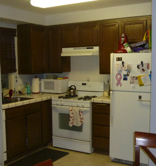
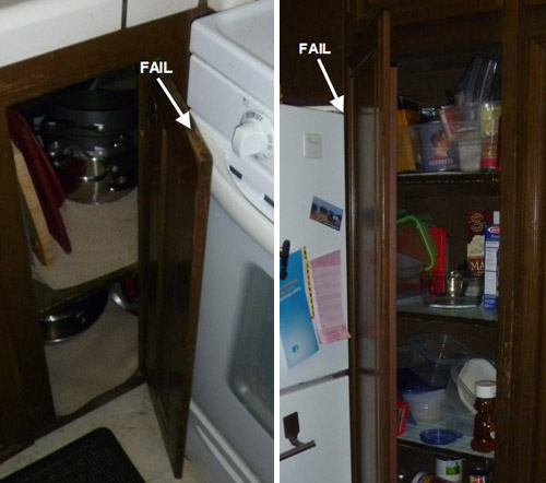
Also, the corner cabinets were placed so that the doors didn’t fully open and you couldn’t see what was inside. The fan didn’t work very well, so a lot of times the second floor of the house smelled like what we ate for dinner. Let’s not even talk about the gross linoleum floors. The one good thing is that the appliances were all in decent shape.
I work full time and also am getting my MBA part time, so spare time is very limited. I went through a contractor for the demo and installation (took about three weeks for everything), but I did the designing of the floor plan and picked all the finishes myself. I took a risk and changed the floor plan completely. I moved the refrigerator over into the dining area and created a pantry area. This let me extend the countertops into a U shape. What a difference!! Three people can now work in the kitchen at once.
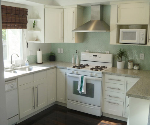
I saved a lot of money by re-using the existing appliances. Although I really wanted stainless appliances, these white ones still worked well and have a few years left in them. I also saved money by finding deals on a lot of the finishes. The vent hood, hardware, and cabinets are from Ikea. I assembled them and the contractor hung them. The backsplash was a really reasonable find as well (from Home Depot).
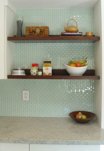
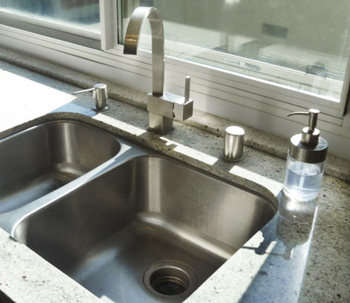
You inspired me to include open shelving, so I re-used the open shelves I had in the previous bar area. This also saved money that I would’ve spent on additional cabinets. The sink was also a major online bargain as well as the faucet and soap pump. I really love how the kitchen turned out. I had an appraisal done for my refinance and I recouped 100% of my costs of the reno in added value to the house. Really added a cherry on top to the whole project! Hope you enjoy! – Stacy
Can I just say one of my favorite decisions in the whole kitchen is not just the backsplash, but the direction of the backsplash? The vertical orientation is such a nice touch. Makes that Home Depot tile look so much more custom! Nice choice Stacy. Thanks so much for sharing! We love all the cost-saving details and that you took a chance and moved the whole layout around to make it a lot more functional (and recoup all of the money you spent). What about you guys. What’s your favorite part?
Psst- We announced this week’s giveaway winner, so click here to see if it’s you.

Carla says
Lovely design. Very sweet and simple. I adore the YHL website, but feel their kitchen is too blocky and choppy with their gorgeous hidden and lots of protruding corners. Yours is very fresh and welcoming, and I especially love the contrast of the wood element for balance. Nicely done.
Carla says
… gorgeous hidden hood! :o)
I’m preordering the YHL book. Very excited about it.
YoungHouseLove says
Aw thanks Carla!
xo,
s
Jill says
Good job! It looks beautiful!
We remodeled our kitchen last fall and bought white appliances. They were the same price as the stainless, but I like the white better! To me, stainless looks heavy in an all white kitchen.
Tiffany S. says
I could totally live with white appliances. I have stainless now because they came with the house, but it wouldn’t be a deal breaker for me to not have them. This is beautiful. I love the grey counters with the white cabinets.
Tatyana says
Amazing! What a difference.
We are in the middle of a kitchen reno and living with the empty space for so long is a bit a downer. Seeing kitchens like this gets me excited and motivated to get it all finished.
Ginny @ goofymonkeys says
Beautifully done! I love the choices.
Rebecca says
I am guessing but the countertop looks like Kashmir White Granite
Suzanne says
I turned plain subway tile that direction in my shower, and turned the accent strip that way as well. Very modern fun touch that I love – like her backsplash. Good Job!
These Reader Redesigns are fun (although IMO a bit too many lately) but is there some way for better coordination with the people so they know when you are posting and to come answer questions?
YoungHouseLove says
We usually hear from folks on the day we post – although sometimes not within the first few hours since they’re at work. Maybe just check back tomorrow morning? As for our schedule, we share Reader Redesigns once a week (every 8-9 posts) since they’re back by popular demand (last year we stopped for a while and really missed them along with a lot of readers who requested them back). Last week we actually didn’t share one and got sad folks who were looking for it, so once a week is just a pace that works for us. Plus one project a week by someone else (often with great budget/source tips, a different style, & new finishes like this backsplash) allows us to share something big every week that might take us months to pull off ourselves AND gives us time to do our own projects to share throughout the week. So if we did fewer RRs we’d probably share fewer of our own projects too, since we’d have less time to tackle ’em. Hope that makes sense :)
xo,
s
Tahlia says
I like them. Nice to see others style and share the love. :-)
YoungHouseLove says
Thanks Tahlia!
xo,
s
Wendy says
Love the frequency of the RR.
I was one who now-not-so secretly missed the RR last week. I appreciate your balancing the posts and allowing us all to learn, while giving yourselves the time you need to do what you do (be it DIY, Clara, book, other..).
Living with a husband who is a writer/grad student, I’m gently prodding him to take “Scott time” when he needs it.
Sometimes the creative work is just intense! Time away is
a good thing and much needed depending on the project! Perspective, one might call it. :-)
Thank you for listening to your readers and yourselves!
Keep up what works! We support you! :-)
YoungHouseLove says
Aw thanks Wendy! You guys are sweet :)
xo,
s
Kristina says
I’m in love with that backsplash!
Stephanie N says
Love the kitchen makeover! Love white cabinets, they look so clean!!
Sherry, I just looked and you are #2 on the Amazon top 100!!!!!!!!!!!!!!!!!!!!!!
:)
YoungHouseLove says
Whaaaaa? We look and it says 8. That’s so funny. Maybe it’s a caching thing. Either way its TOTALLY CRAZY AND WE DON”T KNOW WHAT TO DO WITH OURSELVES!
xo,
s
kelly says
Love! The open shelves look great!
Tahlia says
STUNNING! So clean and bright! And you’re right, the direction of those tiles is awesome.
Well done Stacy!
Stacy says
Thanks Tahlia!
Kelly says
Wow! So pretty and bright! Love the tile!!
Stephanie says
So far, this has been my favorite reader redesign! I love everything about it, especially the tile.
Stacy says
Wow! Thanks Stephanie!
Nicole says
This might just be my favorite RR ever… Nice work, Stacy!
Also, I am SO EXCITED for you guys and your book success!! I just checked the Amazon Top 100 list and sure enough, you two are #8- CONGRATULATIONS! Seriously, I’m squirming in my seat doing a mini happy dance for you!
YoungHouseLove says
Aw thanks Nicole! It’s so crazy! We pretty much blacked out when we saw that Hunger Games was under us. Hahaha. We took screen grabs because we’re sure it’ll be fleeting but we’ll never forget it! Haha.
xo,
s
Jenny says
Amazing job and major snaps for managing it while working and going to school. Looks so light and pretty!
Stacy says
Thanks Jenny! It’s definitely rewarding to come home from the chaos to a nicely organized kitchen.
molly says
Beautiful and very of the moment. And while working and schooling. What an ambitious girl!
Joanna says
Stacy gets an A+! The before and after contrast is jaw dropping! I would love to see a photo from the other end of the kitchen to see how she fit the fridge in there.
Stacy says
Thanks Joanna! I’ve loaded a few more pictures of the fridge side of the kitchen on my pinterest page:
http://pinterest.com/sdub001/my-kitchen-mood-board/
Enjoy!
anna see says
Bravo, Stacy! That is a beautiful kitchen!
danielle says
i love the tile backsplash… it’s a smart layout, too!
Denise says
That’s beautiful! I didn’t even notice the old appliances, they fit in perfectly.
Chad Raynes says
We just redid our kitchen with these exact same ikea cabinets and backsplash! We used it horizontal, but I love the vertical layout too! We did go with stainless appliances and a tad darker countertop, but it’s basically the exact same thing! Without knowing exactly what she used, I am 99% sure those are akurum cabinets with “arctic ice” backsplash. Don’t know about the countertop though.
Chad Raynes says
Correction *ädel off white* cabinets
Stacy says
Chad – you are completely right! That’s exactly what I used. You have great taste! :-)
[email protected] says
Looks great! I would like to see the side where the refrigerator is. :)
Kari @ Ryan and Kari Plus One says
Awesome job! Such a gorgeous kitchen!
LauraC says
Very, very nice. Great job!
Kelsey says
OH man! I clicked over to the giveaway post and when I saw “Kelsey” my heart skipped a beat! And then I realized it wasn’t me. No one else should be allowed to have my name! :) By the way, do you all notify the winner in a way other than posting it on the giveaway? I assume if someone wins, you email them or something, too. My almost-win today made me wonder. :)
YoungHouseLove says
Sorry other Kelsey! And yep, winners get an email as well. So sorry I wasn’t sending good news to your inbox today. Maybe next time!
-John
Ann says
I agree, please ask her to give more details about the fridge placement and general floor plan before and after. Love that tile!
Stacy says
Hi Ann – I’ve uploaded a few more pictures on my pinterest board. It has a marked up layout and some more pictures of the fridge.
http://pinterest.com/sdub001/my-kitchen-mood-board/
Braelin says
This is one of my favorite kitchens ever– love it!!!
Stacy says
Thanks Braelin!!
Jen says
We have the same faucet in our kitchen!! It is so sleek and I searched forever for it!
Great idea turning he tile backsplash!
Ashlee says
I love the white, gray, and teal color palette! This is off topic, but I had to mention that I saw the “pre order” book link on your blog! So excited! Can’t wait to order them for Christmas gifts for all the ladies in my family. We all love your blog and DIY!
YoungHouseLove says
Aw thanks Ashlee!
xo,
s
Lynn says
Great kitchen. Love the backsplash! Perfect timing for my kitchen redo…I’m using this vertical tile idea for sure!!
Heidi (hi-d) says
Gorgeous!!! I love the added counter space and a spot for the microwave, up above. We have our microwave on a cart in our dining room, due to the limited counter space in our kitchen…
Meike says
Wow, so beautiful! That backsplash tile is exactly what I have been looking for.
Stacy, if you read this, could you pleeease let us know the brand and the name/number of the tile? Maybe I am lucky and I can get that brand here in Germany ; ) Thanx!
YoungHouseLove says
Here’s hoping Stacy drops in with that info for you guys! We emailed her to let her know so many of you were chomping at the bit for more details (and it’s no surprise since she did such an amazing job!).
xo,
s
Stacy says
Hi Meike – it is Home Depot “Glacier Ice” by Jeffrey Court:
http://www.homedepot.com/h_d1/N-5yc1v/R-202530987/h_d2/ProductDisplay?catalogId=10053&langId=-1&keyword=glacier+ice&storeId=10051#.UCWNfaFlSuM
Good luck on your tile hunt!!
Meike says
Hi Stacy,
thank you so much – vielen, vielen Dank – for the info on the tiles.
I will try to hunt them down here in Germany : )
Anke says
Wow, this is an amazing redesign that required a real vision! I find it hard to believe this is actually the same room. Well done!
Morag says
Stainless has been starting to look dated for a few years already, so you are ahead of the game by keeping the white.
Jennifer says
So refreshing to see someone hang on to their white appliances rather than automatically “upgrade” for ss. We did a budget kitchen reno three years ago and had to replace all the original (to 1968!!) appliances. I chose ss and really regret it. My appliances show every imperfection.
I would love to see more pictures of Stacy’s layout, learn about the floors and countertops as well as get a budget breakdown. Love this kitchen.
Stacy says
Hi Jennifer – I have a marked up layout and more pictures of the fridge on my pinterest board:
http://pinterest.com/sdub001/my-kitchen-mood-board/
Budget – Including the floors for the entire first floor came under $13K.
Peggy McKee says
Like many others, I’d love to see old vs. new floor plan. If featured renovator supplies it, could you please put it in a new post–not just have it as part of the comments where I’ll never find it? Many thanks.
YoungHouseLove says
If she sends over more info it’ll be in the comments, but in a future post I can link to alert you guys of it and send you back in one click. Hope it helps!
xo
s
Stacy says
Hi Peggy – I have more pictures on my pinterest page:
http://pinterest.com/sdub001/my-kitchen-mood-board/
Shannon says
Would love to see the design layout for this kitchen. I’ve been messing around with the kitchen designer on ikea and just can’t get a good layout. Love this kitchen.
Stacy says
Hi Shannon – I have more pictures of the layout (including a markup) on my pinterest board:
http://pinterest.com/sdub001/my-kitchen-mood-board/
Lindsey says
Any idea what the total cost was on this change up? Seems like a great example of an affordable kitchen re-do that I might be able to tackle in my house!
YoungHouseLove says
Hopefully she can drop by to answer these questions soon guys! I think between school and work she’s a busy bee.
xo,
s
Stacy says
Hi Lindsey – if you include the floors I came in under $13K. Kitchen stuff only – under $11K
Kitty says
Wow, it looks gorgeous. Stacy has an amazing vision for transforming that space. It looks so bright and clean.
Personally I like the white appliances (there’s a reason we call them White Goods in the UK!) it contributes to the bright and crisp look.
Definitely one of my favourite Reader Redesigns to date.
Kat says
The backsplash is so fresh and nice looking!
ani says
In love with the countertops and backsplash… I wish she had told you the material/color/brand of the countertops!!
YoungHouseLove says
We emailed her to ask her to drop in with info soon for you guys! I think juggling school and a full time job makes her a busy gal!
xo,
s
Stacy says
Hi Ani – The countertop is Kashmir White Granite from a local California bay area granite shop.
Amy R. says
This kitchen looks great! I love the backsplash and bought the same tile to use in a client’s bathroom. Can you tell me what color of grout she used? I like how it’s not stark white and the color flows with the tile.
Thanks!
Amy says
Amy, I didn’t even think about the grout! I just asked about the tile color/name but the grout type is important too! Good call. :)
Stacy says
Hi Amy – I can’t remember the color of the grout :-(. I think it’s a pale grey…but can’t be certain. I was lucky to have a contractor that helped me pick!
Amy says
Hi there! I really love this kitchen- it was brave to change the layout but it ended up perfect! I’m just hoping that Stacy comes back and tells us the name of the backsplash tiles!! I’m a little obsessed with that color and the size? Perfect!! Thanks for such a great blog…I’m really looking forward to your book coming out!
Stacy says
Hi Amy – I have all of the finishes and sources pinned on my pinterest page:
http://pinterest.com/sdub001/my-kitchen-mood-board/
Hope this helps!
Erika says
Wow – What a difference!!! That new space is gorgeous – so clean and inviting.
Jen says
She did a fantastic job! The renovated kitchen is so much more calm, serene and I breathe easier just looking at it compared to the original. Kudos to her for keeping her appliances a little longer to keep the cost down.
That backsplash tile is gorgeous and really makes the room. I would love to see more pictures and here about the flooring and countertops.
Congratulations, Stacy, great job!
Stacy says
Thanks Jen!
The flooring is from Simple Floors called “Purple Heart” and the counters are Kashmir White Granite from a local shop out here in California. I have my sources pinned on pinterest:
http://pinterest.com/sdub001/my-kitchen-mood-board/
Enjoy!
Brynn says
The whole thing is gorgeous, and is now MY inspriation kitchen!!
I love the faucet. Its so cool!
Wom-mom Ethne says
I feel claustrophobic looking at the picture of her original kitchen! The new one is fab. I agree on the backsplash. The color is my favorite part.
maribel says
OH Stacy please stop by the blog….super curious where the frig is and the pantry. Awesome kitchen…
Stacy says
Hi Maribel – I have more pictures on my Pinterest board:
http://pinterest.com/sdub001/my-kitchen-mood-board/
Enjoy!
Mamaw says
Love that kitchen! The tile is uber cool.
Ashley says
Wow, this is amazing! I totally thought her reno was the inspiration picture at first glance too. It’s always so refreshing to see a room go from dark and dreary to light and airy! & I love that countertop. Wondering what kind of stone that is?
Stacy says
Hi Ashley – Thanks! The counter is Kashmir White Granite. Enjoy!