We loved Stacy’s kitchen makeover, not only because it’s beautiful (and a huuuuuuge improvement over the original) but also because we thought it was a great example of balance. Stacy found out where she could eke out the most savings and took her time figuring out what she could do herself (and where she needed a little help). And the fact that her new kitchen appraised for… well, we’ll just let her tell you the story:
Hi John and Sherry, I waited about a year after I bought this house before I started re-doing the kitchen. It gave me time to save up, live with the space to see what it needed, and figure out what I wanted. I quickly realized that the original kitchen was majorly lacking in counter space. It was hard to find a place to cut vegetables. I basically ended up using the kitchen table to prep food!
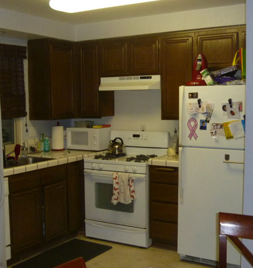
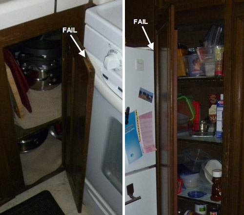
Also, the corner cabinets were placed so that the doors didn’t fully open and you couldn’t see what was inside. The fan didn’t work very well, so a lot of times the second floor of the house smelled like what we ate for dinner. Let’s not even talk about the gross linoleum floors. The one good thing is that the appliances were all in decent shape.
I work full time and also am getting my MBA part time, so spare time is very limited. I went through a contractor for the demo and installation (took about three weeks for everything), but I did the designing of the floor plan and picked all the finishes myself. I took a risk and changed the floor plan completely. I moved the refrigerator over into the dining area and created a pantry area. This let me extend the countertops into a U shape. What a difference!! Three people can now work in the kitchen at once.
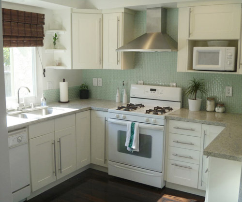
I saved a lot of money by re-using the existing appliances. Although I really wanted stainless appliances, these white ones still worked well and have a few years left in them. I also saved money by finding deals on a lot of the finishes. The vent hood, hardware, and cabinets are from Ikea. I assembled them and the contractor hung them. The backsplash was a really reasonable find as well (from Home Depot).
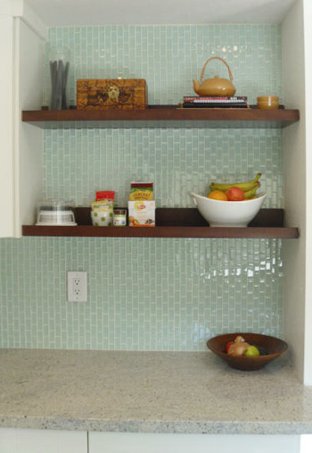
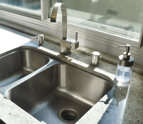
You inspired me to include open shelving, so I re-used the open shelves I had in the previous bar area. This also saved money that I would’ve spent on additional cabinets. The sink was also a major online bargain as well as the faucet and soap pump. I really love how the kitchen turned out. I had an appraisal done for my refinance and I recouped 100% of my costs of the reno in added value to the house. Really added a cherry on top to the whole project! Hope you enjoy! – Stacy
Can I just say one of my favorite decisions in the whole kitchen is not just the backsplash, but the direction of the backsplash? The vertical orientation is such a nice touch. Makes that Home Depot tile look so much more custom! Nice choice Stacy. Thanks so much for sharing! We love all the cost-saving details and that you took a chance and moved the whole layout around to make it a lot more functional (and recoup all of the money you spent). What about you guys. What’s your favorite part?
Psst- We announced this week’s giveaway winner, so click here to see if it’s you.

Julia at Home on 129 Acres says
My favourite part is the contrast of the wood in the open shelves. Oh, and I also love that this is pretty much the same layout and the same issues as I have in my kitchen–lots of inspiration!
Lisa Van Gemert says
This is seriously the first kitchen redo that made me feel like I could actually do one of my own – I love that she used affordable stuff, accepted that white appliances won’t bring the world to an end, and used little twists (vertical tile – awesomesauce) to personalize it. Fab!
Stacy says
Hi Lisa – Thanks so much! This reno was not bad! Researching everything to where I knew exactly what I wanted helped make the actual installation and reno go so smoothly. Good luck on your future projects!
Megan says
Looks great! Our kitchen has almost the exact layout – we have been playing with different layouts in order to gain more counter space. I would Love to see the other side of the kitchen with the fridge! Love this!! Great inspiration!
Stacy says
Hi Megan – Thanks! I have more pictures on my Pinterest board:
http://pinterest.com/sdub001/my-kitchen-mood-board/
Enjoy!
Jenn says
This looks fabulous!! We are just starting to look at making some kitchen updates, and I’m in LOVE with that countertop. Here’s hoping I can find something similar locally!
Stacy says
Thanks Jenn! The counter is Kashmir White Granite. I bet you’d be able to find it in your area!
Amy @ PaintWineRepeat says
OOOOH the up and down vertical orientation of the tile is such a fresh idea! LOOKS AMAZING!!
Rita says
This kitchen makes me realize what I want! White cabs, minty blue/green tiles, gray counters… And I have the exact corner-stove-fail problem, except mine is a drawer that opens 4 inches out before it hits the oven handle.
Did the contractor have to move the ventilation outhole on the wall, since the vent is moved to the right?
Is the sink-cab “hacked” or is it a standard Ikea stock? I’m debating between their Domsjo sink (not liking the overmount, though) and a non-Ikea undermount sink.
Stacy says
Hi Rita – Thanks! Yes, the contractor moved the ventilation hole over. The sink cab is a standard Ikea stock. I didn’t like the Domsjo sink either. I used a non-Ikea undermount sink my mom found for me online. Such a bargain! I have the sources on my Pinterest page here if it helps your shopping:
http://pinterest.com/sdub001/my-kitchen-mood-board/
Hope this helps!
Katie says
Stacy…..Beautiful!!!!! What color are the cabinets? Is it slightly darker than the paint? The tiles look blue in your photo but clear with no tint at HD site. How did you achive the blue tint? Do you have a photo of the other side of your awesome kitchen?
Stacy says
Hi Katie – Thanks! Yes, the cabinets are slightly darker. It’s an off-white and the wall paint I used is Suisse Coffee from Kelly Moore. It was reused from the trim paint used elsewhere in the house. The HD site isn’t a very accurate picture of the tiles. They really are a pretty minty green when they’re hung and grouted!
I have more photos on my Pinterest board here:
http://pinterest.com/sdub001/my-kitchen-mood-board/
Enjoy!
Liz says
Love your new kitchen design. The granite and undermount sink look beautiful. You are an inspiration!
Stacy says
Thank you Liz!!
how2home says
Wow! Love this little kitchen! White kitchen + turquoise back splash! Great combo ;)
Shauna @Satori Design for Living says
What a beautiful backsplash. The kitchen looks so fresh and cheery!
Stacy says
Thank you all for your kind words! I’m so happy John and Sherry helped me share my kitchen with you all!