A little bit of us is always envious of a proper entryway in a home (since both of ours have been just a door that opens into a room). Plus, with our own plans to do some sort of board and batten in our hallway eventually, we’re totally loving Jenna Sue’s sweet makeover of her foyer. Here’s her email:
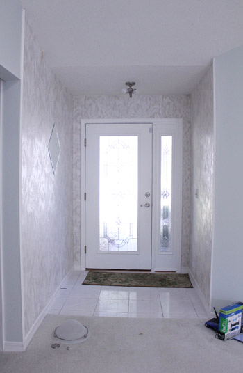
We’re in the middle of 92,835 projects at our house, but we recently completed one that we’re pretty proud of and I thought I’d pass it your way. Our entryway started out with old white faux marble tile floors, metallic floral wallpaper, and a cheap outdated light fixture.
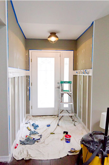
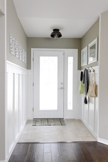
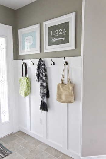
We ended up replacing the floor with travertine-style porcelain tile, DIYing board and batten with coat hooks, adding a fresh coat of paint, and a new rustic light fixture.
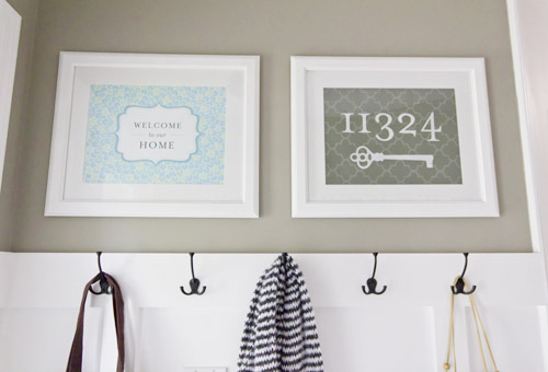
I designed some art for the space and voila!
We love the open feeling you get when you walk into the house now, it’s such a breath of fresh air.
Thanks for looking, and I can’t wait to see how your kitchen turns out (we’re adding open shelving in ours soon too, can’t wait!) -Jenna Sue
You can read more about the processand see extra photos of the foyer-y goodness here on her blog. And if you’re pining over some of her art, she’s got a shop where you can snag your own. Thanks so much for sharing Jenna Sue! Let’s play the favorite-part game. Sherry loves the board and batten along with the cool industrial light and I’m into those dark coat hooks (along with the board and batten).

Kate says
What a huge difference!
Andrea Surrey says
Lovely makeover. So clean and fresh now!
Wendy M. says
I love the contrast between the dark wood floor and the light, open entryway! It’s so inviting!
That new light fixture is pretty fantastic as well.
Thanks for sharing! :)
Krystle Clark says
What a transformation! The coat hooks would be dangerous in my house (I like my clutter hidden behind a door) :-) , but love how fresh and clean this looks! Great Job Jenna!
Whitney Dupuis says
That is beautiful, Jenna Sue! Man, I really need to get on the bandwagon of just biting the bullet and doing all of the DIY renovations that I keep dreaming about.
Melanie @ Mailbox Journey says
That artwork is awesome.
Elysia says
I love it! So fresh and clean looking :)
Teresa @ wherelovemeetslife says
I have seriously been culling the internet and Pinterest all day yesterday and today for board and batten inspiration :) How did you know???
What an awesome job. It really does make you want to come on in…
Emily W. says
Um, I kind of love the metallic floral wallpaper? But I love what you ended up with, too! Great job!
Keally N says
I’m loving the artwork hanging above the hooks, ill have to check it out! Thanks for sharing YHL!
Staci says
What an upgrade!! Goodbye “90s” hello “now”!!
Hmm… “viola” up there should really be “voila” … don’t know anybody who shouts “viola” during a reveal but they could be out there!!
YoungHouseLove says
Fixed (after a good laugh at your comment). Thanks for catching it!
-John
Meredith says
This is actually kind of a joke with my roommate and I; I was tired one night and told a story finishing with, “and VIOLA!” (said loudly with a flourish). So we DO now use “viola”. But we’re weird like that. :)
YoungHouseLove says
Hah- I love it.
xo,
s
Jill says
Yeah, my hyper-grammatical, pronunciation-perfectionist dad does this too. He yells, “Luh viola!” And sometimes, “Mahn dewey!” (The latter comes from “mon dieu”.)
YoungHouseLove says
Haha- we say: germ apples John and Sherry (instead of Je m’appelle John and Sherry). Dorks for life.
xo,
s
mjr says
That looks FANTASTIC!!!
Barb says
I want to know where she got that woven bag on the right. Love it!
Rebecca @ the lil house that could says
Ohh I love her house! We just did our own little board and batten spin in our nursery this weekend! We opted for a whole wall after teetering between doing it halfway up the wall, all the way around the room!
http://thelilhousethatcould.com/2012/02/08/how-to-create-a-paneled-accent-wall/
Penny says
I love that warm paint color! Beautiful work!
KiTx says
This is EXACTLY what I was envisioning for my entry way! love it, she did a fabulous job!
julie g. says
It looks fantastic – thanks for sharing! My husband is in the midst of finishing a board and batten treatment on our main level and I love it. In a small space it really opens things up. The height is a tough choice. I prefer higher like you have it but there was so much artwork I would have lost so we stuck with 46 inches (right below the light switches). This way it still looks more contemporary than chair rail height but there is room for all of my art.
Kelsey says
Gorgeous! I love the flooring.
Sara says
Soo beautiful!
Ashley@AttemptsAtDomestication says
Love the art! Definitely keeping this in mind for our new place!
Shannon @ Bungalow960 says
I have seen the second to last photo on Pinterest a billion times… it’s nice to know the backstory of it now!
Elisa says
She’s right – it feels so fresh and happy! And the light fixture didn’t go unnoticed — purty!
Kristen @ Popcorn on the Stove says
What a difference! The entryway looks lovely :)
em says
This is lovely. And, I, too, am jealous of that entryway. If we had one, maybe we would actually use our front door instead of entering through the mudroom.
I do have a suggestion for Jenna Sue- how about a little bench with storage bins to hold shoes so they get removed at the door?
The Mrs @ Success Along the Weigh says
I love how much more character it has now! Beautiful!
moving to charlotte says
Wow the difference is amazing!
Emily says
My favorite part is how she laid the floor tiles. I think I’m stealing that for our bathroom…
I love the paint color on the upper part of the wall too.
Traci says
ah! love the board and batton! remodels like this (and yalls house) are just a few reasons why i am dying to get out of an apt! :)
Krystle @ Color Transformed Family says
I love the tile flooring and the dark and light contrast. This looks like an inviting enty way. I wish I was brave enough to allow that much visible storage (sigh).
Jane {In the Pink and Green} says
Ooh I love this entry, it’s so bright and airy! :)
Nicole says
Gorgeous! I love how light and airy it is now!
Andrea B says
Lovely! Gives me a lot to think about for our own entry!
Lisa T. says
Love it! Nice contrast, and so fresh and clean looking. I love the artwork, especially the address and key. Great job!
Jenna Sue says
You guys! What a pleasant surprise… thank you for the feature! BTW, just finished up that kitchen remodel, complete with white open shelves and all. I followed your kitchen cabinet painting instructions so huge thank you, they turned out great. Check it out! http://jennasuedesign.blogspot.com/2012/02/big-kitchen-reveal.html
YoungHouseLove says
Love it!!!! Looks amazing. Congrats!
xo,
s
Betsy says
Very cute! And the “before” was so, uh, glamorous!
Melanie says
I bought two of Jenna Sue’s city map prints back in January! One of Knoxville, my husband’s college town (and our current home), and one of Athens, Ga., my college town. We love them and are thinking about getting a few more of other places we’ve lived.
Diana @ Boy + Girl says
Love this! I’m totally addicted to her blog now!
-Diana
robyns says
so digging her artwork! i see some of the maps in our decor future….
Sarah says
Lovely job! This space looks so clean, bright, and classic now!
Kim says
Awesome!
Andrea @ the yellow cottage says
I kinda like the silver wallpaper too! But it would fit better in a Los Angeles home designed by Emily Henderson… or a glam little half-bath.
Lisa says
I like the entryway, especially the hooks. Why don’t people just call those lights what they are – boob/breast lights?!
Lauren Nicole says
Really? I totally thought you’d both be swooning over the key/address art. It’s right up your alley.
YoungHouseLove says
Of course the art is super sweet too! Hard to pick faves without listing everything! Haha.
xo,
s
Suzy Smith @ Suzy Home Made says
Beautiful! I wish I had an entryway to makeover!
Justine says
Love it! I’ve always wished for an entryway too. Hopefully in our next place!
Jessica says
I am officially addicted to her blog now. I have seen so many similarities in my own home (floorplan, guest bathroom, etc.) Our entryway is almost identical to theirs and I’ve been searching for inspiration for weeks. I think I have found the answer! :) Thanks for sharing this YHL!
Paige says
Love, love, love this!
Marianne says
Love the walls!!! Gorgeous!
Andrea Summerhays says
Very nice! I love a great entry. I like your light. It is different which is nice.
Lindsey @ arkadian belle woods says
She did so great! This entry is breathtaking! So crisp and clean