Earlier this month we took the whole family (dog included!) up to Brooklyn for a few days to put together the space we’ve be designing for this year’s Real Simple Idea House over the past five or so months.
I realize there’s a lot to unpack in that sentence (especially if you missed our podcast episode or Instagram stories about it) so we’ll catch you up right here and show you the *almost* finished space. And explain what’s still left to be done before their big photoshoot for the magazine and tell you about how some last-minute curveballs actually made the room better. And tell you what they do with everything in the house once the idea home is all said & done. That’s a lot of ands, so buckle up because we have a lot to tell ya.
This is the second year that Real Simple magazine has taken over a home in Brooklyn, assigned each room to a different “designer” (there’s typically a mix of certified interior designers & bloggers & design TV personalities, etc) and then they photograph the finished spaces for their magazine (this one will featured be in their October issue). Here’s last year’s house which we loved following along (especially since our friends Jenny Komenda & Sabrina Soto each got a room in that house.
We were completely surprised & extremely thrilled when they asked us if we wanted to do a room this year – and they assigned us the “multipurpose room” which they envisioned as a guest room with a twin bed that also has a small kids area worked in. It felt just perfect for us (we love multi-function rooms, especially when it involves balancing the needs of both grown-ups and kids… even if the family is imaginary in this case).
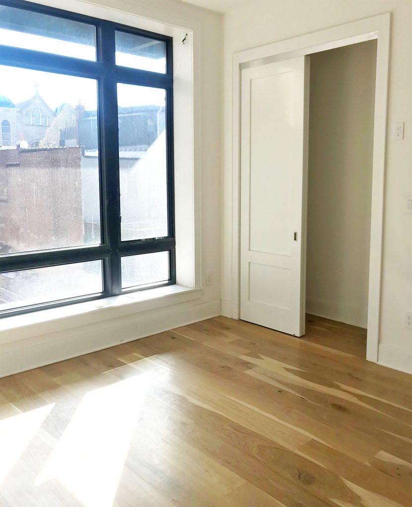
So since March we’ve worked remotely with the Real Simple team to make this room happen. They sent us pictures (like the one below) and measurements and floor plans, we sent back design plans and a mood board and a floor plan and links to each product selection. Everything had to be approved by their editors (they didn’t want a certain space to feel wildly incongruous with any of the other rooms and they also didn’t want duplicate or too-similar items or ideas from space to space) so it was a fascinating puzzle to put together from afar.
Once everything that we ordered had arrived in the room, we spent one marathon day putting things in place and navigating some 11th hour challenges that are inevitable in these types of projects. We didn’t get EVERYTHING completed (most notably our long white curtains were back-ordered so they’ll go up later – which will completely soften that industrial back wall so it looks a lot more like the rest of the room) but it’s around 95% done in these pictures, and the Real Simple crew will get it to full 100% before their photographer comes in.
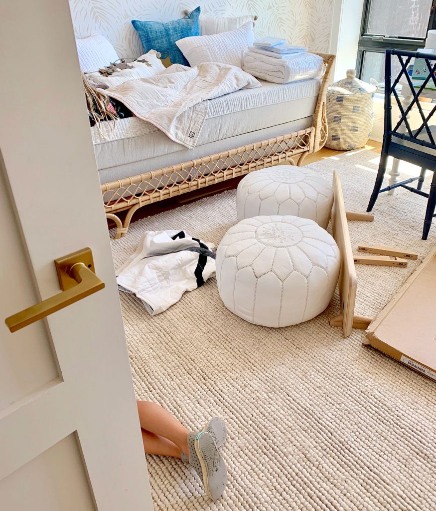
And yes, those are our son’s feet poking out in the picture above and our daughter is laying on the bed under a blanket. We decided to make this a big family trip – mostly because we wanted to see relatives and friends in the NYC/NJ area while we were up there, but also because we thought it’d be fun for our kids to see us tackle this firsthand. It was basically one big “take your kids to work” adventure, and they both got into it and started suggesting what they’d like (our daughter even sketched out some ideas on her little magnetic drawing tablet), and they both served as “quality control” to make sure the beanbag was comfy and the rug was soft enough to roll on. In short: it was a ton of fun to have them there.
In any of these multipurpose rooms, there can definitely be a range of percentages when it comes to the balance. For example, sometimes people have a playroom with a futon in it and it’s 95% playroom, and 5% guest room (that futon is literally the only guest room-ish thing about it, and it’s used very rarely).
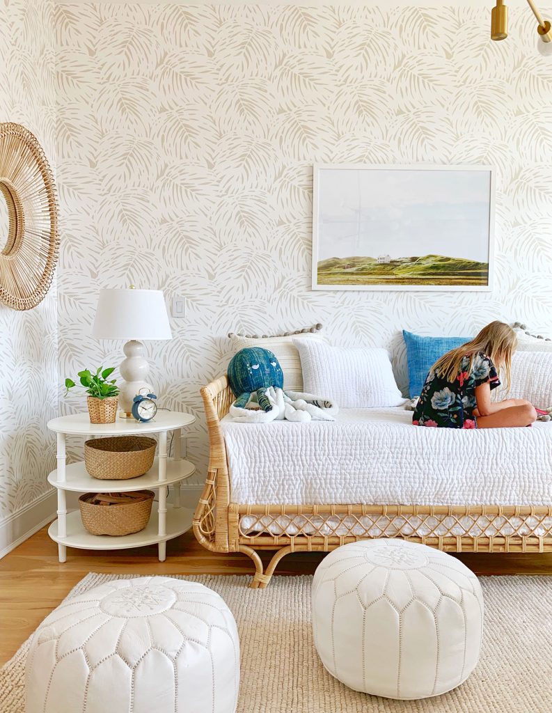
In this case, the brief from Real Simple was to make it look mostly like a guest room, so any grown up would walk in and love it and want to sleep there, but to also work in a small kids area – both with hidden storage (bins, baskets, behind closed drawers, etc) and some stuff on display (using open shelves, lidless baskets, etc). So I’d call this room’s particular percentage 75% guest room & 25% playroom. When you’re tackling a multi-use space like this, do whatever percentage actually works functionally and feels right for your home (remember, this is an imaginary family).
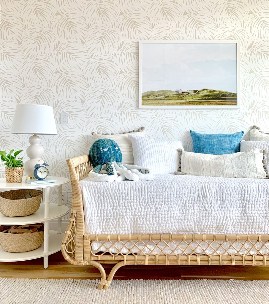
As for pulling this room’s design together, I’ve been obsessed with this daybed for years, so it was the launch point for the whole room as soon as Real Simple said that a single bed was their preference for the space. Picture me punching the air and screaming “I GET TO USE MY DREAM DAYBED!!!!”
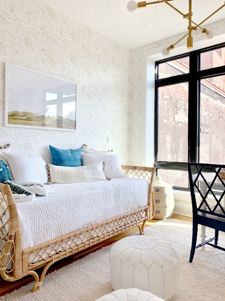
Daybeds are also great because they can function as both a bed (when it’s in guest room mode) and a couch (when it’s in playroom mode). We also balanced some other needs for both functions with some other furniture choices. A nice big side table with books & mags for a guest along with a reading lamp checks the guest room box, while some large lidded storage baskets on the other side of the bed checked the playroom box (see photo above).
The wallpaper was also sort of a happy accident too. The original wallpaper we had suggested was also very tone-on-tone and I had picked it because I LOVED how playful the pattern was (look how cute!). Since it was still an extremely neutral color palette, but the pattern was fun for kids, I thought it would be perfect for this dual space, but the editors worried it might skew too playroom so we selected this more affordable palm one instead. We love how the room turned out, but I still love the original wallpaper pick too – so if you’re creating a playroom or a kids room, I think it would be so much fun (heck, as a grown woman I’d like it in my space too).
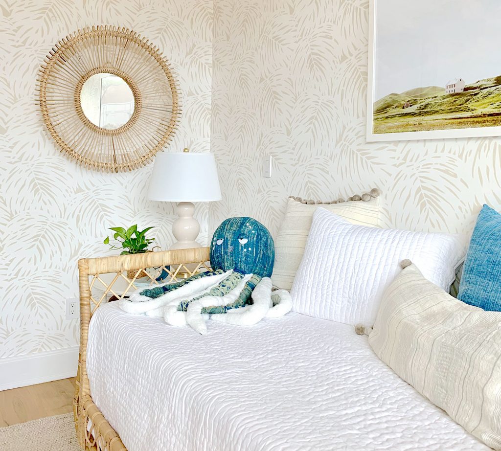
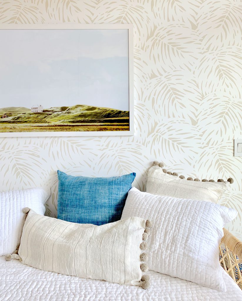
I am just in love with that octopus, as were the kids. What is it about a big stuffed animal with a slightly dopey expression that steals your heart? Also, some of our pillow fills hadn’t arrived yet so that droopy bolster pillow below is stuffed with spare bath towels. THE MAGIC OF PHOTO STYLING, EVERYBODY! Also this large print from Juniper Print Shop was such a perfect solution (all the right colors, looked great with the wallpaper, and feels like a kid would love staring at it just as much as a grown up – in fact our kids asked us whose house it was – ha!).
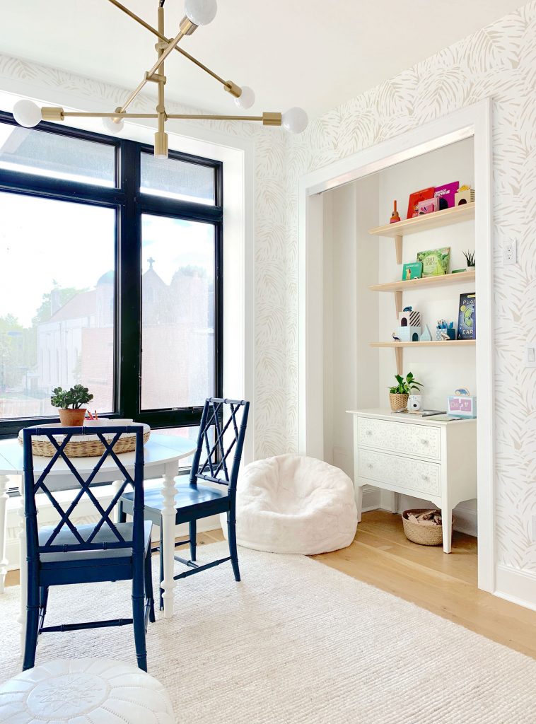
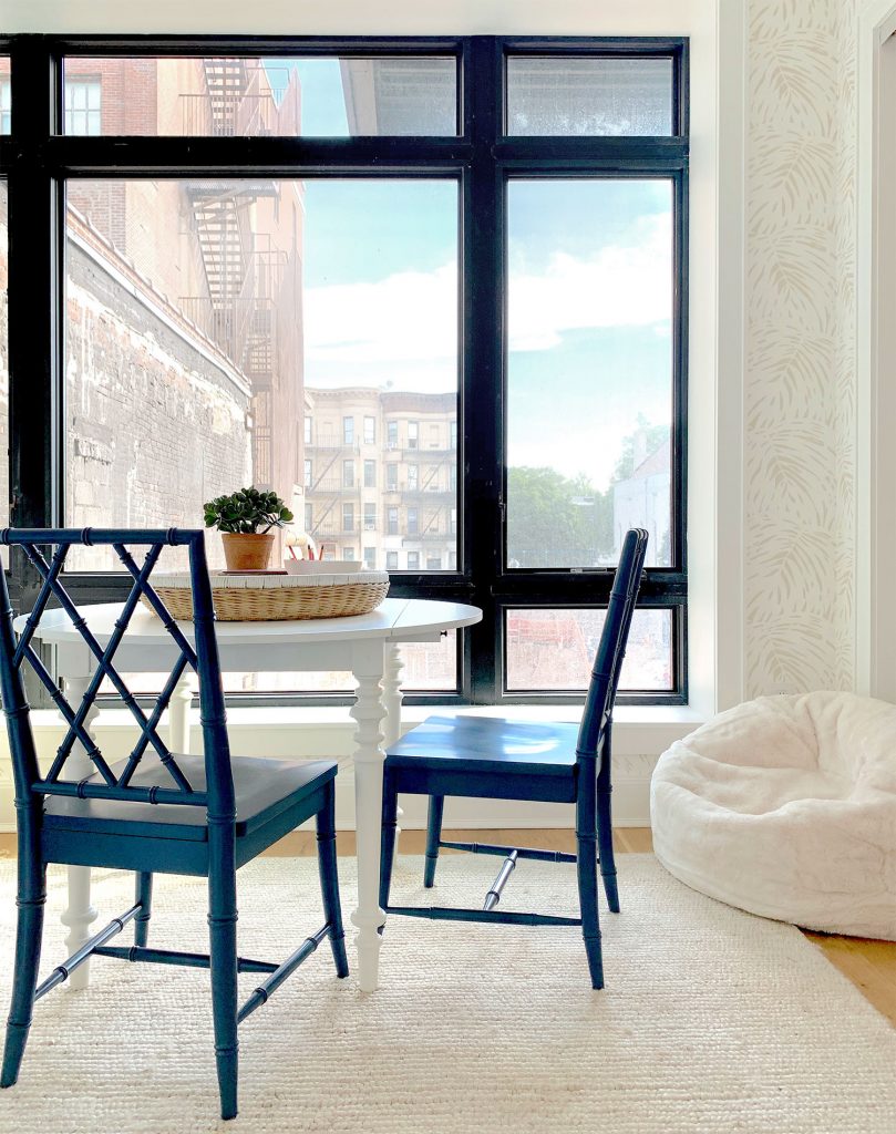
Another playroom “must” for us is a table or desk that can serve as a craft/art/game space. This room had very little wall space (aside from the bed wall, it was pretty much all windows, closets, and doors) so we knew a floating desk or table was our best bet. A round table is always great in these scenarios and we knew our drop-leaf table would earn bonus points because the leaves can be folded down to make it more compact if needed. Plus there’s room for two blue-gray chairs that can be moved to any of the four sides of the table. Flexible furniture is always a win.
So we just hoped when we showed up that we could make it work, and we love how it looks by the windows. Imagine coloring or doing a puzzle there while looking outside on a gorgeous sunny day. Please also imagine my double wide white flowy curtains because all of that industrial black frame that you see below will be muuuuuch softer once they’re hung. I can’t wait to see the photos from the magazine because it’s going to be yet another demonstration about how curtains completely change a room. Stay tuned…
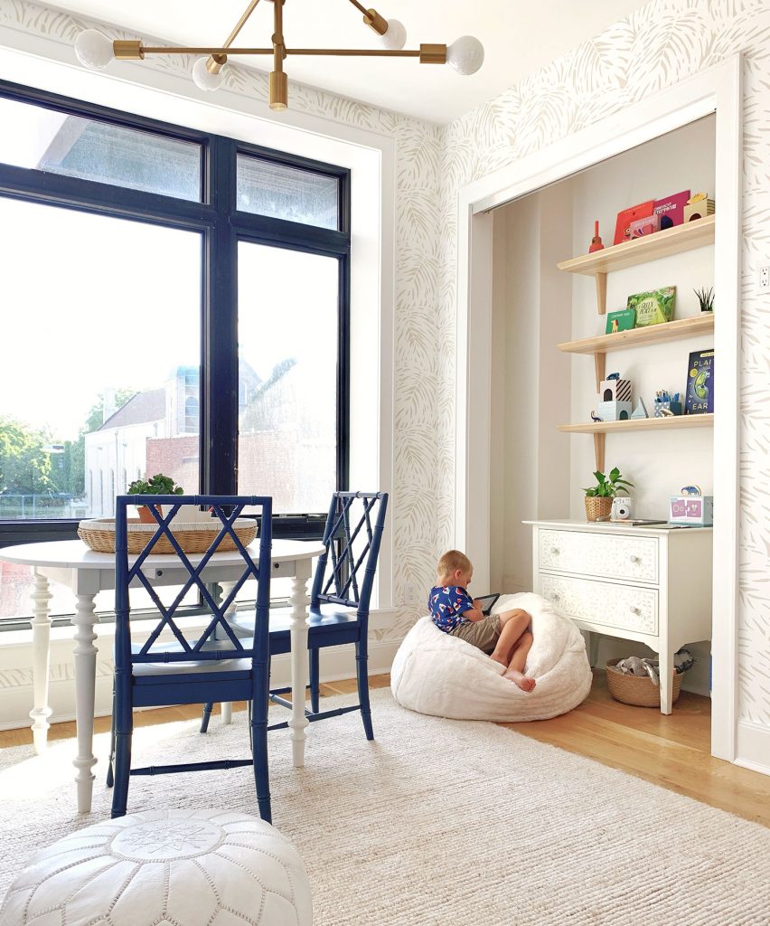
This room is also great because it had two matching closets along the wall to the right of the window above. Why is that great? Well, it was a no-brainer to make one useful for guests (their clothes, a suitcase, etc) and use the other one for kids storage (games, books, art supplies, etc). The guest closet is being outfitted by professional organizers (they’re doing pretty much every other closet in the house too, as well as the pantry) so our task was to tackle the kids closet, which we wanted to make open and accessible – and cute enough to be in plain view 24/7… so our first step was to remove the sliding doors.
I realize that “doors off” approach could sound counterintuitive since the fastest way to clean up for guests is to just throw stuff behind closed doors, but we’ve found that can also breed Monica closets (especially when toys are involved). Plus this is an idea house… how fun would this room be if we just had kids stuff hiding behind a closed door? So instead, we got to create this little nook full of functional storage that looks good too (the stenciled dresser is such a great piece that’s easy on the eyes yet super smart for storing things out of sight).
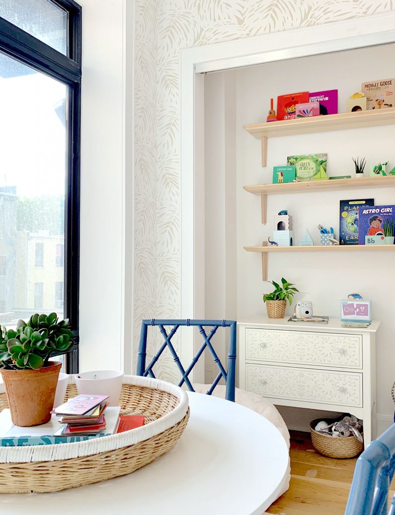
So at least consider creating some storage like this in your home, which can fend off the urge to shove everything into a closet, and instead create a manageable and simple system for things (both concealed and out in the open) so that you love looking at it. When everything has a legit spot to go back to after it’s done being played with, it really isn’t very hard to maintain (and even kids can clean up on autopilot).
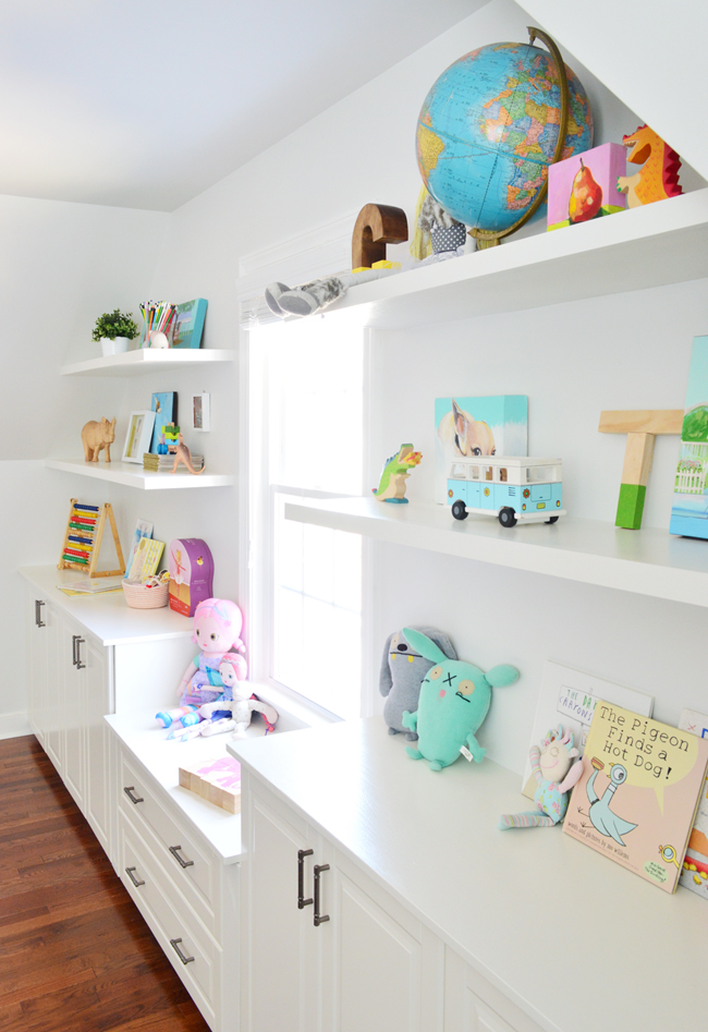
Another example of this concept is the back wall of our bonus room in our house, where we have concealed cabinets for storing games and art supplies and puzzles and even bonus guest blankets and pillows for when people sleep in there, but also has fun open shelving so you walk in and see some playful and very functional items right out in the open.
But back to the idea room. These shelves were actually our biggest hiccup in the plan, and they’re what ended up taking up the biggest chunk of time during our install day. Our original shelves were backordered, but we didn’t find that out with enough time to order new ones.
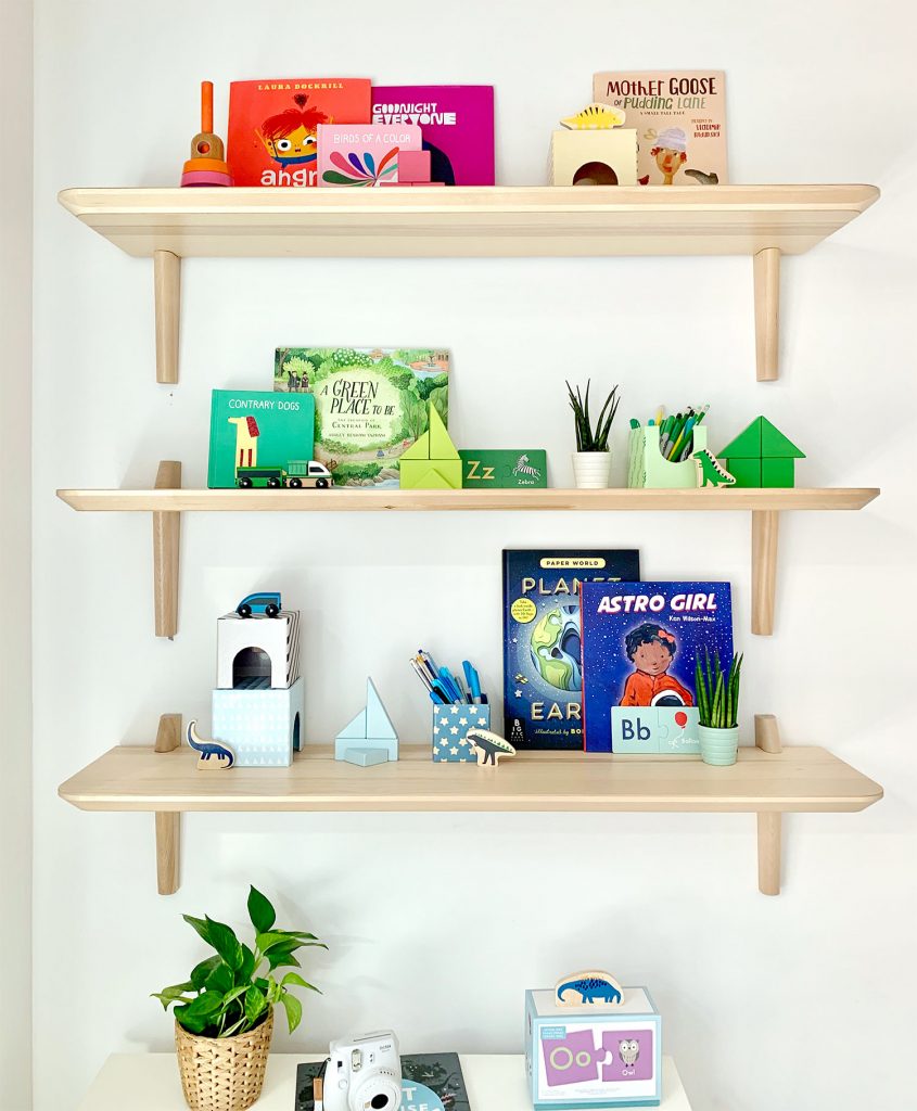
Originally we were going to do colorful shelves full of books & toys, but physically being in the room that day made it clear that this wall needed some wood tones to balance out the daybed and the other lovely wood tones on the other side of the space.
HOORAY FOR THE COLORFUL SHELF DELAY! It truly was the best hiccup we could have asked for, because these wood shelves made the room turn out so much better than it would have if those hadn’t been backordered. After we arrived, we immediately began hunting for options that were in stock and available that day, and landed on these LISABO shelves from Ikea. And there was an Ikea like 15 minutes from the house in Brooklyn so we were able to have them in hand by lunchtime!
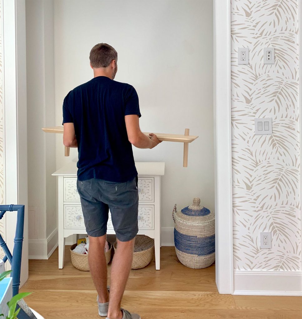
We filmed a whole segment with Real Simple about hanging the shelves (who knows if we were coherent enough for them to use it but we’ll share it if/when it comes out), and you can see that the more neutral shelves still ended up looking colorful and fun, thanks to the addition of some toys and books and blocks.
And I know the idea of color-coding your shelves can be eye-roll inducing, but it ended up being great for this tiny space. I wasn’t super Type-A about it. I just quickly tossed things together mostly by color… but there’s yellow & pink in that top right corner and orange & hot pink in the top left, so it’s not anything that took too long or was overwrought.

In fact it took us about 1.5 hours to hang these shelves (two words: cinderblock walls) but it took me like 9 minutes to style them. Not kidding. And the cool thing is that as people use items and kids grow and change, shelves evolve too. Open shelves aren’t a museum. Nobody has to painstakingly put things back the same way each time. It’s actually fun to try different groupings, and this rainbow-ish approach made our eyes happy, but the shelves in our bonus room have changed so much over the years. It’s all gonna be ok. Don’t stress. Just put things you like to look at on open shelves and hide stuff you don’t wanna see in concealed cabinets or drawers or baskets or bins. Truly, it’s a simple system that you can actually can keep up with.
A note on the shelves themselves, because they exceeded our expectations by like a million. I had never personally heard of or seen these shelves before (they said “new” on the Ikea site when John dug them up on his phone in that panicked we-have-to-find-something-today search) but I’m SUPER impressed by them. They’re very solid, relatively easy to hang (would’ve taken about 10 mins per shelf if we didn’t have cinderblock walls which required a masonry bit), and the wood tone is perfect. Blonde and casual. Smooth & expensive looking. But not.
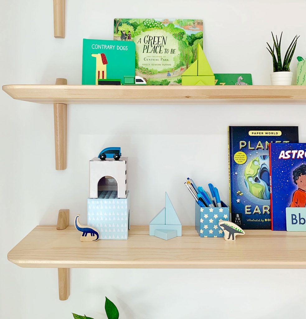
And since we know keeping picture-perfect shelves isn’t realistic for all of your toys, we always like to incorporate some closed toy storage too – like the chest of drawers underneath the shelves and those large floor baskets across the room that we mentioned earlier.
Oh, I also think we need to buy a beanbag now. Our kids were obsessed with this one. Like the chairs were chumps. They both wanted to be ON THE BEANBAG AT ALL TIMES.
I’m so excited to see the finished pictures of this space in Real Simple’s October issue. Plus there are so many other amazing spaces that we already got to see in various states of near-completion, like Mandi’s bedroom and Shavonda & Carmeon’s office. Speaking of which, we overlapped Shavonda and Carmeon‘s visit and it was SO. MUCH. FUN. to finally meet them both in person. We’ve been IG buddies for ages (you might remember that Shavonda talked to us about downsizing on our podcast last year) so hanging with them was the perfect end to an extremely fun day.
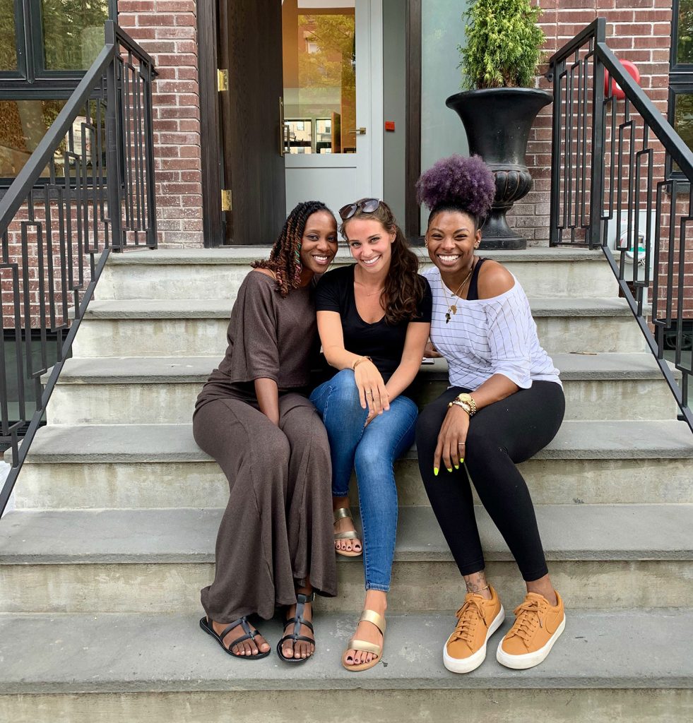
Plus Shavonda got this sweet picture of me and John where we look like we’re wearing one large black t-shirt with three arm-holes. If that ain’t marriage, I don’t know what is.
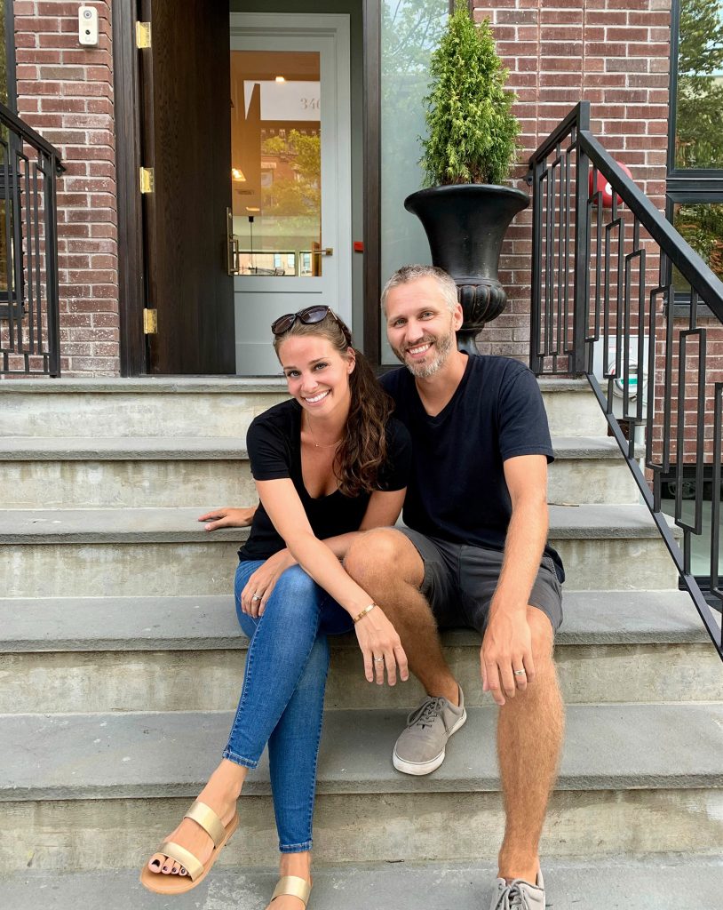
Oh, and as for what happens to all of this stuff and this house when the photos are taken for Real Simple’s October issue… well, the house gets sold and the furniture gets auctioned off for a good cause! I love that nothing goes to waste, and in creating such a fun space, everything ends up benefiting people who need a helping hand. They haven’t picked this year’s charity yet, but when they do I’ll let you know.
So thanks, Real Simple! It was Real Fun ;) #MomJokes4Days
P.S. If you’d like to see other rooms we’ve designed for a good cause, we loved doing this very special room makeover for a local family, this teacher’s lounge for a local school, and these three bedroom makeovers for three amazing kids.
*This post contains affiliate links
