Our entry table from the old house naturally landed right next to the front door of the new house too. It has lived there since day one without much second thought. Until recently.
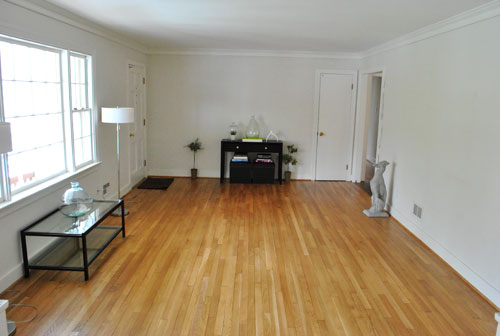
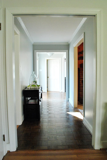
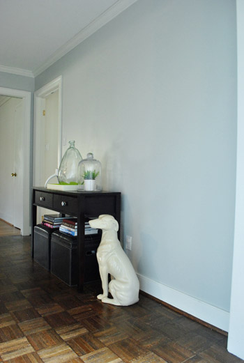
Just for fun we moved it to a new spot and ended up liking it there more. It wasn’t a major relocation. It just sorta “drifted” down the hallway a bit.
The new spot seems to suit it better for some reason. It’s probably a combination of these 3 things:
- It moved from an unpainted rough looking space to a painted area that feels more polished.
- Visions of the previous owners’ furniture linger in our minds (they had a console there too).
- It was waaay too small to balance out the built-ins on the other side of the future dining room.
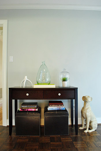
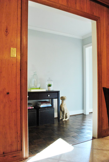
The only dilemma we had about the shift was how to center the table. You can actually see in the pic above that it hugs one door frame pretty closely while leaving lots of extra space on the other side (see below).
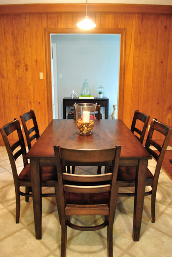
After looking at it in a bunch of different places on that wall (centered, cheated a little, totally flush on the left, etc) we opted for this “off-center” wall placement because of how it looked from the kitchen – the view we’d be seeing it from most often. See? Looks perfectly centered through the kitchen doorway. Warning: ugly paneling alert.
Of course now we can’t just recreate the same symmetrical frame arrangement above it like we had in our first house because it’ll look crazy crooked. But who wants a house clone anyway? Not this guy (points to self with thumbs). So we’ve hatched a new frame plan to finish off this little vestibule area. Yes, I just said vestibule. 500 points to me.
We’re actually thinking we might go crazy and fill the walls with white frames of all different sizes & shapes for a mixed-and-matched-collected-over-time vibe. We figured taking the collection nearly floor to ceiling will help address the negative space next to the console, while also creating an awesome gallery for personal photos, kid art, old maps, favorite fortune cookie fortunes, and everything else we love to slap in a frame. It’ll almost be like wallpaper since the arrangement will be so dense.
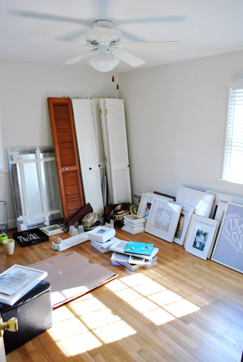
You know, kinda like this and this and this. But different because those pics are probably full of real (read: expensive) art and most of ours will be DIY & Etsy & images from old calendars. You know, the whole champagne taste on a root beer budget debacle (I’m a soda guy, just go with it, ok?). And speaking of saving loot, fortunately we already have tons of white frames sitting around just waiting to be hung. See them all leaning against the wall in the guest room?
Oh and as for what will go where it once lived near the front door in the future dining room, we’re keeping an eye on cragislist for a bigger more proportionate cabinet or buffet for that zone. Details to come when we find “the one.”
Psst- Ack- we just learned that Facebook changed everyone’s options. Grrr. So if you’re not getting our posts in your feed anymore, simply scroll down to the bottom of your Facebook Home Page and click “Edit Options” and then choose “Show Posts From All Friends And Family” instead of just those people you interact with most often. Leave it to Facebook to keep us on our toes…

Sarah says
I LOVE the look of floor-to-ceiling mix-matched frames! I have seen the look in my Domino book, but I’ve been too intimidated to try it out. Can’t wait to see how it turns out!!
Shannon in TN says
I love the new location and I think it would look fab with frames all around, but I agree with Karen about the “floor to ceiling” frames with a toddler. It would certainly be interesting.
On a side note, I LOVE your dining room table. Where’d ya find it?
YoungHouseLove says
That’s from Target. Hope it helps!
xo,
s
Amy says
where did you find the neat bell jar? I have some plants that could use a little greenhouse.
YoungHouseLove says
That’s from a garage sale for $4!
xo,
s
shannon says
Can I just throw it out there that I love the ‘warning: ugly paneling alert’? All jokes aside, I giggled out loud. You two are absolutely phenomenal..love your site, love the ‘tones’ you both use when you write, and simply love your ideas.
Warning: yhl addiction…whoops.
CasaCullen says
John,
I think you’re writing is AWESOME! I always laugh out loud, seriously!
Great post and the gallery/collected/collection wall is going to look BONKERS good!
Did you guys spy our chandy over on Apt. Therapy today? Eeeeeek, our first big feature…we’re kinda doing cartwheels over here at CC!
YoungHouseLove says
So excited for you! Congrats!!!
xo,
s
Lisa says
I like the way you can see the table from the kitchen…that looks nice. Good job!
I wasn’t sure where to ask this question since it has nothing to do with today’s post, but if you could just let me know if you know anything about the giani countertop painting product? http://www.gianigranite.com/index.html
I want to paint our old countertops and I heard about this and a lot of people said it worked well. Have you heard of this or have evr used it? Sorry, it is not on topic today, but just thought I’d ask the “pros”. Thanks!
YoungHouseLove says
We’ve never used it but have heard from a few people who did and were happy with it. Just be careful of the fumes. Dont forget to ventate! Good luck!
xo,
s
annabelvita says
Ms Brooklyn Limestone wrote a post about this the other day: http://www.brooklynlimestone.com/2011/02/shore-files-painted-countertops-check.html
Cait @ Hernando House says
Our countertops were painted when we bought our house, and they have held up really well so far!
Cait @ Hernando House says
Also, Apartment Therapy just posted today with a bit of info about the Rustoleum version: http://www.apartmenttherapy.com/ny/at-email/the-under-400-kitchen-makeoverin-a-box-rustoleum-transformations-in-the-test-lab-139345
Jamie says
I love the paneling! I desperately wanted to buy an old bungalow with a completely paneled kitchen/dining area so I could paint black and white stripes over it… and all the windows were covered in vines and wildflowers. it was perfect….but someone else got it first. I seriously cry a little inside every time you post kitchen pictures :)
Lisa says
I just found your site and I love it!
What is the paint you used in the hallway? I love that shade of blue.
Looking forward to finding lots and lots of good ideas and reciprocating when I have something to share.
YoungHouseLove says
That’s actually a soft gray color called Moonshine by Benjamin Moore (color matched to Olympic No-VOC paint). Hope it helps!
xo,
s
Samantha says
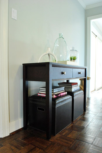
So a question I’ve wanted to ask for awhile and the books stacked on top the little ottomans (under the console table) reminded me – how are you balancing the design aesthetic with the reality of life with a little person?
My 9-month-old daughter is a crawling everywhere-pulling-up-on-furniture-and pulling-things-off-from-everything fool and those books would be on the floor in an instant. I also have a 3-year-old son and he is thankfully old enough now to understand not to do those types of things, but I recall when he was this age (and for quite awhile after that, actually), we had to keep things above a certain level.
Sorry to ramble, just something I’ve wondered about for awhile since I know you want to make sure the house is also kid friendly.
YoungHouseLove says
We’re just babyproofing as we go (and will share the process as Clara gets more mobile). So far she is only scooting on her butt and occasionally crawling backwards (we wonder if she’ll be one of those kids who goes straight to walking) so those books aren’t things that she messes with yet. If and when she does we’ll definitely change things up and blog about those happenings!
xo,
s
Nicole says
LOVE the inspiration pics with the dense wall art/frames! The 2nd picture looks EXACLTY like our upstairs landing that branches off into the bedrooms!! I’ve been waiting for some inspiration on what to do up there…and this would look soo amazing. Thanks for sharing this!
Cheers for you guys! Keep up your good work!
Kimberly says
Hi Nicole, I posted below — our upstairs landing does exactly the same thing, with a bedroom on either side. We’ve put frames up (starting in the center and working out way out so it looks good regardless of what else we add), and I love how they look.
QS says
Love the frame idea! Can’t wait to see it as I have been thinking about doing this down a long hallway we have.
Not sure if you have mentioned it, but how wide is your hallway? I don’t know how big parquet flooring is, or I could have guessed myself.
OT, but re: kid-proofing. Since this console is near the kitchen, you may want to think about giving Clara her own cabinet in the kitchen (not the one under the sink) that she can open up and store her things in. We did this with both of my kids and they never tried to open any of the other cabinets (even though we did take the dangerous things out of them). Worked great!
YoungHouseLove says
Love that idea about Clara getting her own cabinet! And as for the hallway, it’s about 6 feet wide. We got so lucky.
xo,
s
QS says
Forgot to say that this also helped with the kids not touching other things on the walls. We diy everything and routinely had something going on so this helped them not touch other things they would find. HTH
Lynsey says
Not sure I like the legs on this, but I really love the lines on this. Painted, new drawer pulls?
http://appleton.craigslist.org/atq/2151204184.html
YoungHouseLove says
Cute. We say go for it!
xo,
s
Allison says
Ooh, exciting! The wall o’ frames will look great in that space. Can’t wait to see it!
Emily says
I really like how your wrote out your thought process for placing the table.
Kimberly says
I love that arrangement idea — we’ve got something similar going on at the top of the stairs in our place. We’re putting all family photos there, so it’s going to be just a wall of photos. The frams arent’ all uniform, but I think that’s okay; the space isn’t that big, so I don’t think it’ll be too overwhelming. We’ve started from the center and just add as we go along, so it doesn’t look half-done. Every time I reach the top of the stairs I have a look and smile.
meganleiann says
Have you thought about building a hutch a la Ana White? She has a couple plans I am aching to try as soon as I save up for my Kreg. I LOVE the idea of custom furniture!
YoungHouseLove says
Yup, building something is always an option too! We’re definitely planning to build a super long console for behind our sectional soon…
xo,
s
Emily Stearley says
Saw this yesterday. Not that you two need a tutorial (!) but hey…might help.
http://www.oprah.com/home/How-to-Arrange-Photos-on-the-Wall
JoDi says
LOVE the new placement of the table. It was definitely lost in that large, undefined entry space. I can’t wait to see what you do with that area in the future.
The gallery wall is going to be awesome! I love the idea of wrapping it around to balance everything out. My first thouh was a chair, but that is SO boring and typical. This is going to look ah-MAZ-ing!
Sheila Zeller says
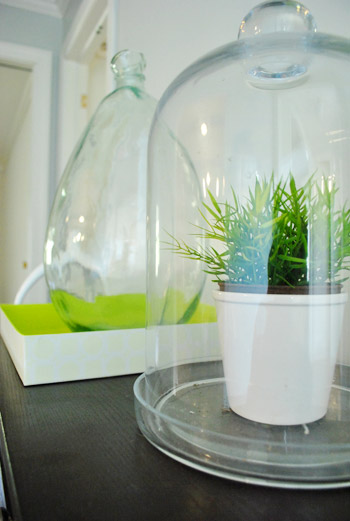
Something else has caught my eye… did you paint the inside of the white tray, or did it come already finished in that fabulous green? I LOVE the jug?/vase?/bottle? (what do you call that magnificent piece???) that sits in the tray, too. Can’t wait to see the finished presentation :-) Sheila
YoungHouseLove says
That tray is actually just a box from Target that held a photo album that we registered for over three years ago! It looked so good I couldn’t throw it away. That pop of color in the inside always makes me smile! And as for the glass dome, that was a garage sale find for $4. Hope it helps!
xo,
s
Kimberly says
Also, boo to my typos.
Kim says
Love the new spot for the console table. Looks great. And I love the idea of getting something more substantial for the entrance way. we recently did the same thing, moved a small bookshelf that used to be in our entrance way and replaced it with our buffet/hutch (whatever its called – the lower half without the glass upper part) from the dining room. Much more substantial, and we centred it with coming down the stairs from the bedrooms. My hubby thought it was way too big for the hall, but we get nothing but compliments on it now. And closed storage for little mittens and hats is also a nice bonus!!!
Carolyn says
What is the color on the walls behind the table? I love it!
YoungHouseLove says
It’s Moonshine by Benjamin Moore color matched to Olympic No-VOC primer.
xo,
s
Annalea says
I like it! :o) Can’t wait to see how it all turns out. Have you thought about painting all of the white frames the same color as the trim, for a really nicely-balanced vibe? That occurred to me as I read over your post, and thought I’d throw it out there.
Have fun!
YoungHouseLove says
The trim is white just like the frames – probably not an exact match but we’re ok with that!
xo,
s
Kendel @ Eating Abroad says
My youngest brother’s babysitter had an entire wall of her living room full of photos of her kids and their artwork. I’ve always loved the idea since then. I used to just stand and stare from one edge of the wall to the other and soak up the years of love hanging on the walls.
EcoFront - Jessica says
LOVE those glass vases!! I think I’m going to try and imitate the look for my work plants.
Mallory says
Am I the only one that’s thinking, “I’m trapped in an ATM vestibule with Jill Goodacre!”?
Kimberly says
Nah, you’re just the only one thinking it aloud. ;)
Harinee says
Ah! I thought I was the only one!!
gk says
me too!
Rebecca says
Oooh, I’m working on the same type ‘art gallery’ wall in our playroom. I had a lot of frames already, and I’ve picked up several more on clearance. My latest score was five 8 X 10 frames and four 4 X 6 frames for $1.78 each at Target – they were white, but scuffed up. Nothing a little primer and spray paint can’t fix! Now all of my frames have been painted the same color and I’m filling them up with pictures and colorful art courtesy of my little boys. Such a fun and personal look. It will look great in your space!
Heidi Graves says
I am new to your blog… only a few days now and oh my, I LOVE IT! Here’s my Valentine’s Day comment:
On the husband front. He is such a sweet guy, almost always! This year (and every Valentines) he so proudly brings home the usual Victoria’s Secret bag. But this year, instead of the fun sexy stuff… I was surprised to find, he got me a really nice state of the art padded bra. (???) I am extremely flat chested and not a bit self conscious! But, I laughed, this was sorta like an overweight wife getting a treadmill for Valentine’s Day.
I had to laugh!
Poor guy… He honestly meant really-really well. And, I would have loved it… if it had fit. He didn’t realize Victoria’s Secret doesn’t even carry my size. In that department, I’m special order all the way! Maybe I’ll exchange it today for the fun stuff…
Liz@WashingtonPharmGirl says
i see the former owners of your home shared a love of paneling with our formers.
LauraC says
Hey John and Sherry,
If you have not checked out this site:
http://vintageprintable.com/wordpress/
you really need to. I’ve been planning to do the same grouping of pictures in our living room, and this site (all public domain, free, printable images) is absolutely perfect. There is something for everyone, style-wise. Hope you like it! (was going to email it to you, but thought other readers would appreciate it too.)
YoungHouseLove says
Wahoo! We’ll definitely have to check it out. Thanks for the tip!
xo,
s
Martha says
I was also going to suggest Vintage Printable. They have some great stuff! Another really cool resource is the New York Public Library. They have a digital library with loads of pictures in a variety of genres. It’s really interesting stuff: http://digitalgallery.nypl.org/nypldigital/index.cfm
Britt says
for really great art you should check out 20×200 if you haven’t already. Such great stuff – starting at $20!
YoungHouseLove says
Oh yeah I love that site!
xo,
s
emily @ the happy home says
totally the right decision to center it in the doorway! that looks fabulous!
Christin says
Love the plan. Excited to see how it turns out! :)
Jackie K. says
I was thinking the same thing about having a toddler and having “reachable” frames. My daughter is 20 months old and she would be ALL OVER any frames hanging on the wall within her reach. haha Otherwise I really, really love the idea of the floor to ceiling frames. Can’t wait to see how it turns out! :)
lauren says
Hey guys – what about a pie safe? I’ve been searching Craigslist for awhile for one, but I think that an old rustic looking pie safe or jelly cupboard would look great in that area! Re-stain and maybe knock out the tins and do something else in that area? Just a suggestion…
YoungHouseLove says
That’s so funny! John’s patents offered us theirs for free but pie safes are not really our thing. They’re cute, but they feel a little too country for the rest of our furniture.
xo,
s
Cait @ Hernando House says
J&S, I bet you could make a pie safe a lot more modern! You can’t beat free with a stick!
lauren says
Yep… I really think you could clean one up… but hey, while they’re giving one away I’ve been searching and scouring for one for 2 years now. And my parents live in Midlo… any chance you can contact me a/b theirs? We’re expecting and I want to make it the baby’s dresser.
YoungHouseLove says
They sold it about two weeks back on Craigslist in DC (they live in Northern VA). So sorry!
xo,
s
lauren says
aw that stinks!! and I live in Maryland… ugh! :(
YoungHouseLove says
So sorry! If it makes you feel any better, someone paid $100 for it and had a really time lifting it/getting it home. It was a major project!
xo,
s
susan says
Great job on moving the table. It looks oh so much better there. BTW when Clara starts walking you might have to move that big white dog:) susan
Hilary @ My So-Called Home says
Much better positioning and the frames filling in the right side will looks nice and balanced. Plus adding a buffet or larger piece of furniture will make more sense since that room will become the dining room. When’s the table coming?
YoungHouseLove says
Today!!!
xo,
s
kellie says
I love it, it looks so much better with where it is now :) And I love the idea of a bunch of frames, I want to do that somewhere in my house too I just haven’t decided on the location yet :)
Zoe Feast says
Easy graphic to help your fans deal with the Facebook issues.
http://www.indigoimage.com/wpblog/2011/02/changes-in-facebook-feeds-chicago-web-designer-tip-of-the-day
Megan S. says
Been stalking eBay for the candle holder for some time now to no avail. Off to cry now! ;)
Love your set up, looks great guys!
Emily says
Love the new location. Although I would have centered it on the wall, and not in the doorway.
To each their own.
Emily
Lori @ Richmond, BABY! says
Looks fabulous! How crazy that just a little room shifting now gives that table the “wow!” factor.
Continued wishes with your guest room…my mom, sisters, and two little nephews arrived on Sunday and thankfully, we pieced ours together in just two days with happy results. Nothing like a time crunch to get ya moving!
Blair says
I love the picture frame idea! I had some extra picture frames and a very bare bedroom wall (also a very empty wallet) so I used them to hang jewelry from, you can see my pictures here: http://thefirstapartment.blogspot.com/2011/01/jewelry-frames.html It’s a great idea if you have some extra frames for your closet or bedroom.
Good luck!
~Blair
D says
Love the ‘frame wall’ idea!
Serena says
So, speaking of ugly paneling…I need some advice YHL nation. My husband I are moving into a house provided by his company. The main living area has wood paneling floor to ceiling and on the ceiling. It is real wood and not that awful fake stuff (thank God) but these are 20 ft ceilings and…it’s just a lot of wood paneling. Painting will not be an option since it’s not our house. Any ideas on how to work around it and make it less in your face?
YoungHouseLove says
Hang curtains and art galore! They’ll break it up and soften it. Good luck!
xo,
s
Sara @ House Bella says
Looks great! I’d like to do something similar with a mass of white frames on the wall behind our credenza. The trick is finding the frames!
Kiran says
Love all the ideas and relocation. Btw, how’s the guest room coming along? :)
YoungHouseLove says
Very slowly. We’re still waiting for the ReStore pickup. And we’re going mattress hunting tonight or tomorrow. Yikes! More details when we get going…
xo,
s
Monika says
I loooooooove the wall full of frames idea. Can’t wait to see that project! Also, good luck with the mattress hunting and the guest bedroom.
Melissa says
I think that’s a great wall to do a gallery on and the console table looks great there – especially from the kitchen. Seeing that paneling makes me think how hard it must be not to take a sledge hammer to it every time you walk by it!