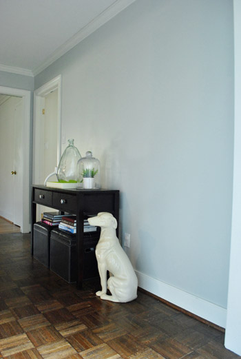
Our entry table from the old house naturally landed right next to the front door of the new house too. It has lived there since day one without much second thought. Until recently.
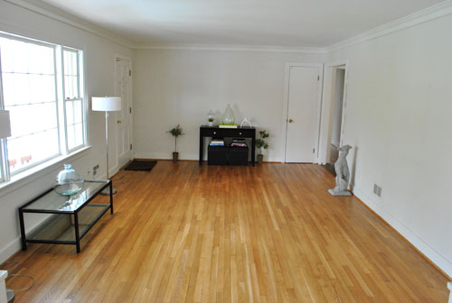
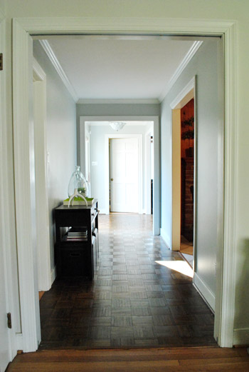
Just for fun we moved it to a new spot and ended up liking it there more. It wasn’t a major relocation. It just sorta “drifted” down the hallway a bit.
The new spot seems to suit it better for some reason. It’s probably a combination of these 3 things:
- It moved from an unpainted rough looking space to a painted area that feels more polished.
- Visions of the previous owners’ furniture linger in our minds (they had a console there too).
- It was waaay too small to balance out the built-ins on the other side of the future dining room.
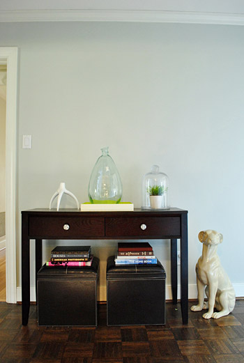
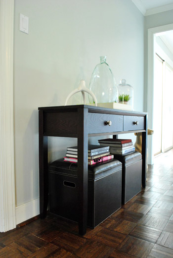
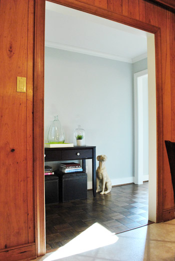
The only dilemma we had about the shift was how to center the table. You can actually see in the pic above that it hugs one door frame pretty closely while leaving lots of extra space on the other side (see below).
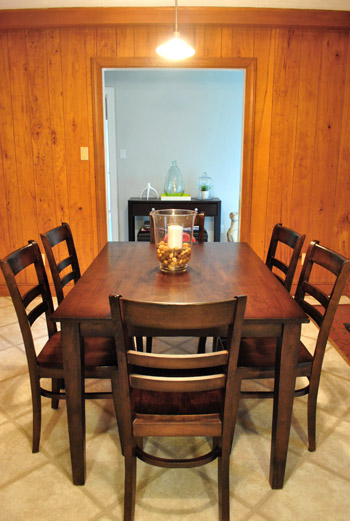
After looking at it in a bunch of different places on that wall (centered, cheated a little, totally flush on the left, etc) we opted for this “off-center” wall placement because of how it looked from the kitchen – the view we’d be seeing it from most often. See? Looks perfectly centered through the kitchen doorway. Warning: ugly paneling alert.
Of course now we can’t just recreate the same symmetrical frame arrangement above it like we had in our first house because it’ll look crazy crooked. But who wants a house clone anyway? Not this guy (points to self with thumbs). So we’ve hatched a new frame plan to finish off this little vestibule area. Yes, I just said vestibule. 500 points to me.
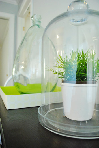
We’re actually thinking we might go crazy and fill the walls with white frames of all different sizes & shapes for a mixed-and-matched-collected-over-time vibe. We figured taking the collection nearly floor to ceiling will help address the negative space next to the console, while also creating an awesome gallery for personal photos, kid art, old maps, favorite fortune cookie fortunes, and everything else we love to slap in a frame. It’ll almost be like wallpaper since the arrangement will be so dense.
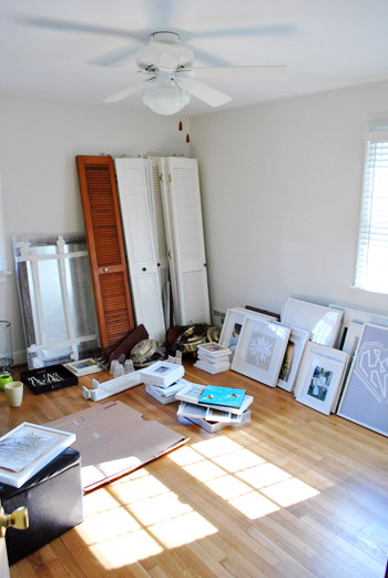
You know, kinda like this and this and this. But different because those pics are probably full of real (read: expensive) art and most of ours will be DIY & Etsy & images from old calendars. You know, the whole champagne taste on a root beer budget debacle (I’m a soda guy, just go with it, ok?). And speaking of saving loot, fortunately we already have tons of white frames sitting around just waiting to be hung. See them all leaning against the wall in the guest room?
Oh and as for what will go where it once lived near the front door in the future dining room, we’re keeping an eye on cragislist for a bigger more proportionate cabinet or buffet for that zone. Details to come when we find “the one.”
Psst- Ack- we just learned that Facebook changed everyone’s options. Grrr. So if you’re not getting our posts in your feed anymore, simply scroll down to the bottom of your Facebook Home Page and click “Edit Options” and then choose “Show Posts From All Friends And Family” instead of just those people you interact with most often. Leave it to Facebook to keep us on our toes…

Erin says
Looking good! Is the paint on your hallway walls Moonshine? Thanks!
YoungHouseLove says
Yup, the very same.
xo,
s
Sarah @ The Strength of Faith says
Are you guys up for any reader photography submissions for that wall? I won’t be offended if you say no, but if you have an idea about what you’re looking to hang, I could dig through my files and email you some stuff to look at …
YoungHouseLove says
Aw thanks Sarah! We actually have a no swag or special treatment policy (we like to keep it real and not fill our house with stuff we got on the house) so we hope you understand! You can read more about our decision to go that route here. Hope it helps! And thanks again for your kind offer.
xo,
s
Emily T. says
This picture has been in my inspiration file for ages. I wonder if an asymmetrical look like this would work for you?
http://media.onsugar.com/files/ons1/192/1922794/30_2009/23d6de0118cbe43c_c772543f135a241d_livingroom2.preview.larger.jpg
Pam says
Didn’t read all the comments (so many!) but did anyone suggest putting one of the slipper chairs there next to the dog? It looks like the hallway is wide enough and it would be a nice place to take off your boots or wait for the one who didn’t get ready to leave fast enough (those days are coming). Love the frame idea, it will be beautiful. And, oh yeah, maybe the other slipper chair can go in the guest bedroom?
YoungHouseLove says
Yup, a few people recommended putting a chair there (and a slipper chair in the guest room is a strong possibility). We’ll have to see where things land and report back. Should be interesting!
xo,
s
Anita says
In The Breakup with Jennifer Aniston, I really liked what she had going on in her apartment at the entrance. It was like a large corkboard full of cool stuff pinned to it. This would be a great hallway for that too.
Rachel says
This may sound a little odd, but I really think that doggie wants to be sitting ON the table…at least, until you get some art above it. I say this mainly because I used to do visual merchandising for the Biltmore Estate & we love putting stuff on top of stuff on top of stuff, etc etc…but also because he would give you some nice height & draw the eye up. You could hang a sign on a ribbon around his neck for a little color & he would be perfect! Sorry, like I said, this sounds a little odd, but I just had to post it! :-)
YoungHouseLove says
Haha, it sounds like fun to me! Ceramic dogs on display with ribbons? I’m in.
xo,
s
Paula/adhocmom says
I have spent YEARS buying smaller furniture for our Brooklyn apartment (which is seriously not always easy to find), so I can’t wait to have the problem of our furniture looking too small. CAN NOT WAIT. I mean, this will mean our house will likely be partially empty for ages, but this is a problem I look forward to having. TOO SMALL FURNITURE. Yes!
Lindsey says
Are those anthropologie knobs????
I have ones form Anthro that are antique clocks; they have taken my Grammy’s mission-style coffee and side tables to a fun-looking find!
YoungHouseLove says
Yes! Here’s the post about them from a while back: https://www.younghouselove.com/2009/02/with-a-name-like-hardware/
xo,
s
Katie says
HAPPY VALENTINE’S DAY!
I celebrated with my wonderful boyfriend. He made us dinner and gave me a sweet card. He’s the best!
Katie says
OOPS! wrong post
erica says
beware putting things like framed art close to the floor with the beaneete starting to move around soon – baby proofing! other that than – I love the idea on that wall – I have a similar hallway and I did something of the same idea, but with country type signs – it was a great talking and design point in the home!
YoungHouseLove says
We’re thinking of using 3M strips to secure them to the wall. Safety first! We’ll let you know if it works (and if it doesn’t- you know we share our failures too!).
xo,
s
Ashlee says
Are there any ‘rules’ for gallery walls? Like photos with darker colors hang near the top? Or larger frames in the center? Just curious, b/c these walls seem so difficult to configure.
YoungHouseLove says
Not that we know of! We just plan to use our eye and hang things sort of haphazardly and see how it all turns out. Details when we get there!
xo,
s
Petite Josette says
I could totally see a nice simple armchair next to that table. With a old-fashionned telephone on the table to make it look like it was in the old days, when telephones had cords and an actual “sitting area” allocated to them…
erica says
I cant wait to hear if the 3M strips work to keep the frames in place – my kids are older now (6 & 11)and are FOREVER knocking things off the walls – I gave up hanging things up in certain locations! Maybe theres hope yet!
LOVE your blog – its a constant source of inspirtation and I live vicariously thru your projects when we cant do projects of our own right now! :)
Smitha says
Hey Guys! Love all that you are doing with the new house. We are in a new house and I get so frustrated not having all of the rooms decorated and finished. Thanks for reminding me that decorating a house into a home you love takes time! In terms of decorating, I have a framing question. I am interested in purchasing an unframed 40 x 30 inch poster from an online store for $69.99. In your experience, is it cheaper to have the poster custom framed at a local store like hobby lobby or have the online store frame it for you? If I were to have the online store frame it, it would cost me $285. Yikes!
YoungHouseLove says
We have never custom framed something. And we have about five million frames. We have just found that Ikea or Target sells standard (and very affordable) frames that we can retrofit things to (trimming a bit off the top or bottom of a print has never bothered us, we’re casual about stuff like that in the interest of saving a few hundred bucks each time). So that’s one idea. We also notice that Michael’s offers 50% off custom framing order coupons all the time, so that’s a good way to save some money and still go custom. Hope it helps!
xo,
s
nikki says
hi! a friend of mine had an art arrangement on her wall similar to what you describe/show. as her hallway was a high traffic area the frames kept getting knocked off the wall and she was forever cleaning up broken glass. she finally took them all down and just decorative-painted the wall which made it into a feature all by itself. something to consider.
another suggestion: maybe putting an armoire near the front door as a coat closet? it looks like the room is big enough to handle a substantial piece, it’s good to have a place to dump coats and related outdoor items and you could even put hooks on the inside of the doors for keys and etc. to make it into a “landing pad.” and since the space is a functional room the armoire would hide that clutter and not turn your dining room into a mudroom. (speaking from the experience of three kids’ worth of coats, boots and knapsacks that have finally found a home in my new front entry closet…)
YoungHouseLove says
We actually have a nice big coat closet near the front door (see the door in the top pix next the the console?) so although we love the armoire idea it’s probably not necessary (and some sort of buffet will be nice to have near the dining table when entertaining) . As for the hallway, we’re planning to use 3M adhesive strips to secure and frames that are within reach to wee ones, so we’ll share how that goes. Might not work at all, but we won’t know until we try!
xo,
s
Natalie says
That piece looks great in the vestibule, and I love the collage frame idea! It’s a great way to use up wall space, and is even better for someone {like me} who is obsessed with collecting frames! :)
Anna says
My mom has a gallery wall of family pictures in a small hallway. It’s full of mismatched frames in all sizes (mostly small) and showcases both vintage family photos, baby pictures of multiple generations, ‘big’ moments like proms, weddings and graduations — pretty much anything! Nearly every inch of space is covered. It was my favorite place as a child to just look and learn about our family (so that’s what dad looked like as a baby!) It’s still a spot I linger everytime I visit.
Tina Bland says
I linked this page of yours to my blog, I hope that is ok! I love this entry table and the little cubes, we are using it for inspiration in our entryway, which is a disaster right now! Please let me know if this is not allowed, I looked all over to see if there was a “please dont link” somewhere and I couldnt find it. You can see the blog here: http://teebliterary.blogspot.com/2011/03/welcome-home-shelf.html
YoungHouseLove says
Love it! Thanks for the link!
xo,
s
Bibi says
I love the dog you have sitting next to the table! Sooo cute, where do you find him? :D
YoungHouseLove says
He was just $29 about three years ago from HomeGoods. Love that guy!
xo,
s
Mindy@FindingSilverLinings says
I love the graphic pattern of a frame collage. Unfortunately, my husband thinks I’m on a mission to turn our walls into swiss cheese with all of the holes I am proposing to nail into the wall.
Did you guys ever disagree about this? How did the “winner” plea their case? LOL! Seriously.
xo
Mindy
YoungHouseLove says
We figured we could avoid making “oops” holes if we actually planning things out this time, hence all the paper templates that we made and taped up. It seems like a pretty low risk way to do it, so maybe convince the hubby that it’s not a big deal? And even if you make a wrong hole… there’s always spackle!
xo,
s
heather j. says
Have you guys ever been to the Alexander’s Antiques auction? You probably have. If not, you’ll probably freak out if you go. I went for the first time last Thursday night (it’s every Thursday night on Midlo. Tpk. near the Powhite). When I read that you were looking for something in the way of a console table/sideboard, it was the first thing I thought of. They had a ton of them, some of them going for way cheaper than you could ever find on Craig’s.
Plus, there is something about the first auction experience. (for me anyway)
It was exhilarating!
YoungHouseLove says
Love it! We’re due for another visit! Thanks for the reminder.
xo,
s
LA says
Have you all thought about widening the doorway from the kitchen into the hallway? just a thought. ps: yall are the sh*t! :)
YoungHouseLove says
Haha, we’ve considered widening pretty much every doorway in the house! Who knows where we’ll end up. For now that one’s nice and wide though (about 5″) so we have other tinier doorways to tackle first. Haha.
xo,
s
Melinda Vooys says
I was just wondering where you guys got your console table? I am looking for on quite like this with 2 drawers. Or do you know of anywhere that has one like this??
Thanks
Melinda
YoungHouseLove says
We got it at target.com a while back. Hope they still have it!
xo,
s
pbblythe says
Ok, I’ve looked, what color is the wall paint?
YoungHouseLove says
It’s Moonshine by Benjamin Moore (color matched to Olympic No-VOC paint). Hope it helps!
xo,
s
Amanda Spencer says
I *LOVE* this entirely and plan to totally steal your idea. Lol. However, I have (what I consider) a more “standard” hallway (read: narrower). I’m unsure of the exact width, and I hesitate to even hazard a guess, but suffice it to say that there is no way even the smallest table would fit while still allowing comfortable passage. So, my question to you is, do you think an arrangement such as this would overwhelm a smaller hallway? I definitely feel it would if I were to use the frames I have, as is (they’re black), but I figured I’d paint them a soft off-white. Obviously, the only way to know for sure is to give it a try, but seeing as you seem to have such an awesome eye for home decor, I thought I’d get your opinion. Thanks and keep up the great work!
YoungHouseLove says
Hmm, I would try it! If you paint the frames a soft off-white they should feel too heavy. How about doing one side and seeing how it feels? Then you can tape up placeholder paper on the other side and stop if it feels too closed in. Probably will just add interest and subtle texture though! As long as nothing sticks out too far!
xo,
s