During last week’s update about our Homearama Showhouse for Habitat For Humanity, we included a few peeks at how some of the rooms were shaping up.
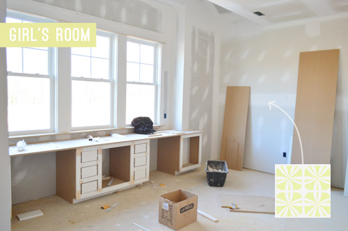
Well, shaping up in our heads, technically, since we’re still about three weeks out from being able to put any furnishings into the house (the walls are getting painted as I type this, and then the cabinetry will go in and the hardwood floors will be stained on site), so everything has been in shopping list and mood board form so far.
But in the last week the builder and his awesome team have been humming along, and we’ve made some really good furniture-and-accessory planning progress in several of the rooms. Enough that we can finally share a few room plans with you guys that are no longer missing major elements. Some spaces are definitely further along in the planning process than others, and the two in the lead are: the study (aka: the home office) and the dining room.
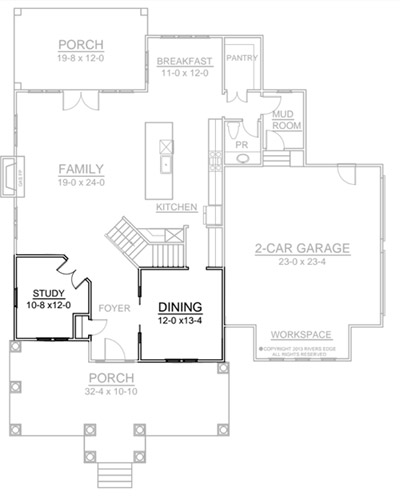
They’re the first two rooms in the house when you walk in, so we’re grateful that they’re shaping up to be a good representation of the feeling that we want this house to have. One kinda skews light & happy while the other brings in a bit more of a cozy & moody feeling that we also really like. So we figure that together they’ll help set the tone for the rest of the house.
Let’s start with the study, er, office as we keep calling it. Here’s what it’s looking like now.
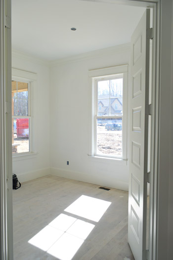
Since we’re sort of designing for a hypothetical future version of our family (hence the tween girl & young boy rooms that we mentioned last week), we thought it’d be fun to do a home office for a woman who works (perhaps blogs?) at home. Not only is it an easy mental leap to make, but we also thought it would differentiate it from all of the manly mahogany studies that we’re used to seeing in model homes. So light, cheery, and a smidge feminine was our goal.
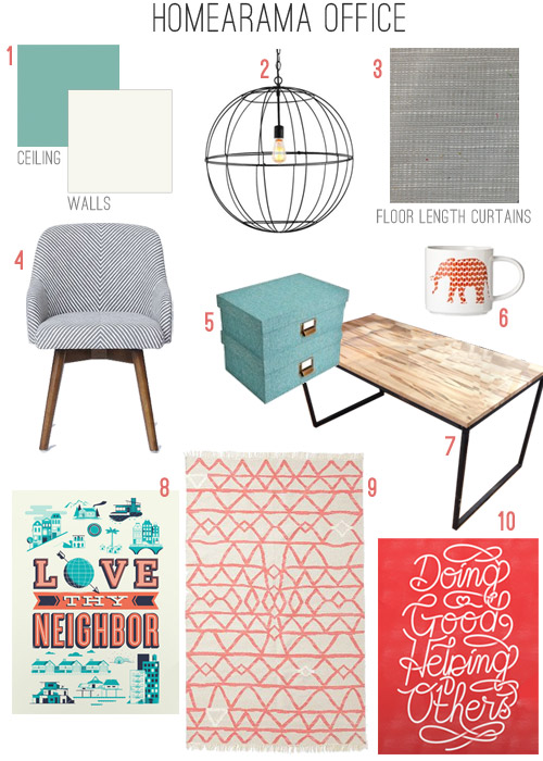
- The walls are already Benjamin Moore Simply White like the trim, but the painters still have to put our bold accent color on the 10′ ceiling, which we thought was tall enough to handle a rich and saturated turquoise color called Skydive.
- This Wire Globe Lantern in rust from our lighting collection (donated by Shades of Light) will hang over the desk that will float in the middle of the room.
- Floor length curtains in a textured & modern feeling fabric (Dapp woven fabric in Elephant) will hang floor to ceiling on either side of the window (our favorite local fabric shop, U-Fab, is donating them to the cause).
- West Elm is also excited to help Habitat, so they offered up this striped Saddle Office Chair but we hear it’s on back order (fingers crossed it comes through in time).
- We’d love to add some chic storage boxes, like these from Target.
- While we’re at it, a cheery mug for pencils and other desk stuff could be fun. Maybe this one?
- This wood & metal desk hails from Green Front Furniture (sorry, we don’t know the maker) who is loaning furniture to all seven of the homes in the show (more on that here). Please forgive the wonky photoshopped top (I attempted to remove some display materials that were in our shot).
- We love this art from Help Ink, where $1 of every $5 spent goes to a charity of your selection. We’re thinking this print would be perfect, since the colors fit right in, and the message is pretty great too.
- West Elm was also happy to donate this Torres Wood Kilim rug in Guava, which we think will keep things casual and light.
- We’re also thinking about buying this Help Ink print as well. Feels nice to choose accessories with a charitable goal while decorating a house for charity.
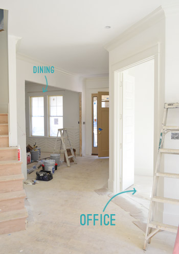
Although most of the items above are already locked in, a lot of the accessories and art are things that we’re going to purchase and fill in as the rooms get further along. So we’re sure some might change as we go, and of course a ton of other stuff will end up in each room as it evolves. But on to the dining room! Last week it was looking like this (we’re still waiting for our big glass pocket doors with a transom window to be installed at that extra-wide entryway).
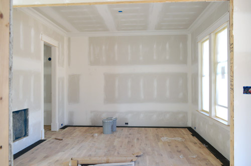
But as of yesterday it had made some great progress thanks to our custom wainscot being finished and freshly painted! It’s not your typical wainscoting, but with a very talented carpenter at our disposal, we wanted to try something a little different (remember how we chatted about trying to take risks and all that good stuff here?). We thought about something like a herringbone or a chevron pattern, but didn’t want it to be too overt (like this) and were inspired by something a little more subtle and less common (oddly enough, like the pattern on these shoes that Sherry saw on Pinterest).
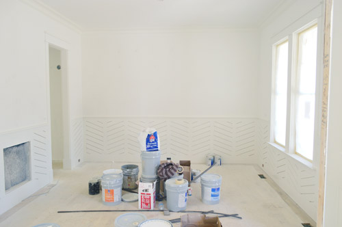
It’s a wide-angled pattern made up of wood slats with a 1/4″ gap between them, so the lines are kind of “engraved” into the wainscot instead of sticking out. Before putting it up, we literally sat with the carpenter and drew various angles right onto the walls and used different board widths and spacing methods until it looked subtle enough not to be too crazy (but not so soft that the pattern would disappear completely when it was painted). For anyone interested, we went with 1 x 3″ boards, a spacing of one quarter of an inch between them, and the angle is around 22 degrees from the floor.
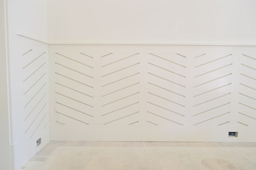
It’s sort of hard to get “the full picture” for the room from that shot above (since about 99% of the other elements are missing) but once the rest of the furnishings/accessories get added (and the upper wall gets painted a nice dark color to balance out the wainscoting) we think it’ll be a great background texture among some other elements, like:
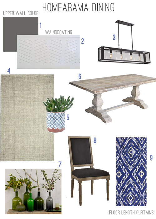
- The upper walls are going to be Kendall Charcoal, a deep brown-gray color that will bring some moodiness to the top of the 10′ tall room.
- Here’s the aforementioned wainscot that we added for reference (it’ll remain glossy white, along with the trim).
- This is the big Industrial Modern Island Chandelier in Bronze that Shades of Light is donating for over the table.
- We fell hard for this Jute Boucle in Platinum, which West Elm is kindly donating.
- We’d also love some potted greenery as centerpieces, like these that we found on Etsy.
- This rustic wood pedestal table that Green Front Furniture is loaning us for the show will float in the middle of the room with the chandelier over it.
- Among the potted plant centerpieces, we thought a collection of old wine bottles or green vases would be a nice mix (image from West Elm).
- We liked the idea of dark upholstered chairs, which would pop in front of the white wainscoting. Maybe these from World Market?
- We’ll also be adding floor length curtains in this fabric (Stri fabric in Ultramarine, donated by U-Fab). We love that they subtly reference the angled wainscoting, and while we wanted the room to be sort of quietly elegant, we couldn’t resist some color on the window wall.
I don’t know about you, but we’re excited to be getting to this phase of the project: where things start feeling like real rooms – and we finally get to work on filling them up and making it feel like home. It’s crazy to think this was just a dirt lot a few months ago. It’s also pretty crazy to think that in two short months we’ll have an entire finished house (with over 20 different spaces) to share with you guys. That’s a whole lotta before & after – and about 95% faster than we’re used to moving. Oh yeah, and somewhere in there we’ll have a baby. Guess it’s time to buckle up and hold on…
Psst – Wanna see the finished showhouse? Click here for Our Full Showhouse Tour, which includes final pictures of every room, the floor plan, budget info, a video walk-through, and shoppable showhouse furniture & accessories.

Erin says
Did you ever consider painting the wall/surface behind the wainscotting a fun color, for a hidden but unexpected pop of color? Or were you just thinking that the spacing with the shadow effect that I’m sure it has is enough?
YoungHouseLove says
That would have been really fun too! I think since we wanted it to be more of a subtle texture than a true bold pattern we didn’t think about that, but it’s a fun idea for someone who wants to go bolder!
xo
s
Carmen says
Nothing makes my heart beat quite like floor plans. And I love watching these ones take shape.
I’m curious — it looks like there’s an opening in the wainscotting, across from the window. What’s that for? (Please say fireplace insert.)
YoungHouseLove says
I wish! It’s the intake for the heating/cooling system. But man, a toasty fire would be awesome.
xo
s
Heather says
I LOVE the wainscoting. I am not in love with the dining room table, I think it doesn’t work for me with the rest of that room. I’d go for something sleeker. The shape of the top mirroring the chandelier works great, I think maybe it’s just the rustic wood and pedestals I’m not feeling. Hm.
This is why I love design blogs. I get to try things and figure out my own style without breaking the bank! This house looks fab y’all, keep up the good work!!
YoungHouseLove says
Aw, thanks Heather!
xo
s
Tara says
I’m not a fan of the wainscotting – a little too trendy and not in keeping with the Craftsman exterior. If the new/future occupant of the home doesn’t like it, do you think it would be easy to remove? Or are you guys planning to move in? (Sorry – I’m only a casual reader of your blog.)
YoungHouseLove says
Oh yes, the new owner could either remove it and add something traditional (the builder could help with that too) or just fill those cracks so it all looks flush and more basic. We’re definitely not planning to move in, but we think whoever buys any of these seven showhouses will probably be drawn towards the less common choices that each team has made inside, since they’re sort of known for being “idea houses.” There’s more about that balance of doing something safe for the masses vs. doing something interesting/risky for the show in this post for ya.
xo
s
Jenn says
Just wanted to let you know that “wainscoating” in the last mood board should be spelled “wainscoting”.
Hope you all have a pleasant weekend!
YoungHouseLove says
D’oh! Thanks Jenn!
xo
s
Carolyn says
That wainscoting just blew my pants off!
Oh and I’m probably the last person on the planet to know, but how do you create those mood boards? Thanks for the amazing inspiration!
Carolyn
YoungHouseLove says
Is it wrong that I wish I could have seen your pants blow off. Assuming you’re wearing a bathing suit underneath or something. Anyway, this is getting awkward fast. As for the mood boards, we use photoshop to make them, but we have heard good things about polyvore.com or free downloadables like Gimp. Hope it helps!
xo
s
Heather Wingate says
This looks like it is turning out to be absolutely amazing!! I can tell that so many people will walk out of there with such amazing ideas that they will be inspired by! I love your updates on the showhouse!!! :)
YoungHouseLove says
You’re so sweet Heather! Thanks!
xo
s
Sara R says
Love all the ideas! Is there another post that has a pic of the 2nd story floor plan?
YoungHouseLove says
Oh yeah, here ya go! https://www.younghouselove.com/2013/09/laying-showhouse-plans/
xo
s
jbhat says
I love the plans you have for these rooms. Oh my gosh. I’m sort of dying to see everything all finished and wish I could stroll through in person! And yes, you guys really do have such great hearts, as well as amazing vision.
jbhat
YoungHouseLove says
You’re so sweet Jbhat!
xo
s
Alison says
Do I spy nickel hinges on those doors??? If so, I’m mildly shocked that you guys didn’t go with ORB door hardware!! Personally I love silver-toned hardware for doors… we’re about to close on a new-construction home ourselves, and I went with chrome hardware on all the doors (but not the cabinets)… kind of a different choice but I wanted something modern and sparkly.
YoungHouseLove says
That sounds really pretty Alison! The door hinges are actually ORB (you know us too well!). They’re taped off in a few shots so maybe that’s it? I can’t wait to share the doorknobs we hunted down – they’re so cool! A lot of the other builders are doing nickel or chrome door hardware though, so when we share photos of those homes you’ll get to check that out too ;)
xo
s
kati says
Looking at the coral-colored accents for the office prompted me to wonder if coral would be a good color for the front door. It might look bright, fresh, and modern; however, coordinating landscaping might be a little trickier. (But I’m still digging the possibility of a white door–or whatever else you might come up with!)
YoungHouseLove says
That’s a fun idea too!
xo
s
Ruth says
Wow!!! That wainscoting! I really love it! You guys are so creative and pair things so well together. I’m so inspired by your creativeness in general!
Jannean says
Before I even scrolled down to check I knew that paint color in the dining room was Kendall Charcoal. I used it in my daughter’s bathroom with white wainscoting below and it looks great! Loving all your selections so far and happy to see West Elm being such a big contributor. I’m really wishing I could road trip down from NJ to see this in person but if not I know you will do an awesome job describing it all for us.
YoungHouseLove says
Aw thanks Jennean! Your daughter’s bathroom sounds awesome!
xo
s
Rikki Goldsby says
Hi guys, been meaning to ask you/suggest this to you for a while.. very excited to mention it now!…have you seen Money Pit with Tom Hanks and Shelly Long? I think you guys will really get a kick out of it. It isnt exactly a DIY movie but has some renovating tones that are hugely entertaining. Its a classic go to for me!:) love you guys! (Without you Id never survive my workday!);) Enjoy the movie..its a great one. Keep doin’, Rikki
YoungHouseLove says
I think we’ve both seen parts of it but we’ll have to sit down and watch the whole thing together and laugh!
xo
s
Bailey says
I absolutely love the colors and textures you guys are choosing so far!!
CONNIE says
I really like the floorplan layout. It’s a very easy plan providing a family to maneuver around, having both quiet areas like the study and the open area living room.
Sarah T. says
I love how things are coming together! And thank you for letting me know about Help Ink. I just bought a few things from that website. You guys are awesome.
YoungHouseLove says
So glad Sarah!
xo
s
Sandra T says
Aw guys, what is with all the gray?? I want to love it, I LOVE Craftsman houses, but I’m so over gray! Those Restoration Hardware tables too! Hate to be a naysayer. :(
Will there be more color in the kitchen, please??
YoungHouseLove says
No worries Sandra! This is a big ol’ house, so rest assured that by the time we’re done, every color of the rainbow will end up in the mix! The office has red, coral, and blue accents with a bright blue ceiling, there are bold patterned curtains in the dining room, and the outside of the house is a rich blue color. These two boards aren’t complete with all of the accessories & art either, so there will be more layered in – and there will also be greens, pinks, reds, oranges, blues, and yellows in many other rooms. There’s lots more to come :)
xo
s
Meg says
Its cool that the two rooms that are the furthest along for the show house are two of the rooms that have gotten minimal attention in your current house- the dining room and the office. I know you guys like to keep moving from room to room as motivation strikes, so maybe these pulled together fastest for the show house because you’ve been percolating all sorts of different ideas for dining rooms and offices in your “free time”? I love the mood boards- especially the office, it looks like it would be a fun room to work in! And it just makes me excited to see what you guys have been brewing up for the same spaces in your own home. Always a great inspiration!
YoungHouseLove says
That’s so funny! Didn’t even notice that phenomenon, but it’s true! The subconscious works in mysterious ways! We’re also just starting to plan out our office here at home, so I can’t wait to dive into that!
xo
s
hjc says
You know how there are site crashes sometimes when you guys shout out a particular blog or link? I think the Homearama might crash in real life this year. I bet attendance will see a huge spike because of you guys and your readers! I won’t be a part of the mob, unfortunately, as it’s a little too far from home (Colorado) – but I would if I could! Great work – as always.
YoungHouseLove says
Aw you’re so sweet HJC! It’s all for such a good cause we hope they sell lots of tickets!
xo
s
Jenn says
Hi John and Sherry,
I’ve been a reader of your blog for a while, and I hope you don’t mind, but I have a suggestion that I hope you’ll take into consideration.
I’ve noticed that throughout your site, you tend to refer to certain colors as being inherently warm or cool. (e.g. Red = warm; Blue = cool) While this can be true, it doesn’t take into account the very important color theory concept of undertone (i.e. warm, neutral, cool). I thought, perhaps, that this might be a wonderful opportunity to educate your readers on a concept that is important, not only to home decor, but also applicable when picking out clothing, makeup, and even when dying or highlighting hair. I know that Sherry has an education based in the arts, so this might be a great way to pass on some of your knowledge to your readers.
While, I’m sure, many readers, especially those who have followed you for years, already understand this concept, I’m willing to bet that it would still be a beneficial post for a majority of your readers. It could be a teaching moment for your newer, younger readers as well as a good refresher for those who are more seasoned decorators. I know that, for myself, even though I understand (or at least grasp the concept of) color theory, it’s always good to be reminded of why certain shades of colors work together, and why others don’t. For example, not all reds are warm. Red CAN be warm, like an orange-red, or they can be cool, like a blue-red. Even yellows can skew cool (think of a soft pastel). Blues and greens, which we tend to think of as cool in general, definitely have their warm shades as well. Since so much of your business deals with color, I feel like this would be a worthwhile post to cover. I know I would appreciate it as one of your readers. And it might even be a good refresher for you, too!
There is no need to reply to this comment, but I hope you’ll at least consider my suggestion.
I hope you have a lovely rest of your weekend!
YoungHouseLove says
Thanks Jenn! That would be lots of fun! Although I did go to art school (and one of my favorite classes were color theory/principals of color classes, I feel like that might be an awesome post for a guest who specializes in that arena (sometimes I feel weird “teaching” anything other than something I’m actively demonstrating, like how I painted a table or how I made a shade). A few readers have recommended an awesome color theory site though (I forget the name but I bet I can look it up) so maybe I can email that woman and see if she’d like to drop in and teach us all about it! I’ve been out of college for over a decade, so I’d love a refresher ;)
xo
s
Lauren says
That wainscoting is so neat! I love how unique it is! Did you consider having the wall color pop up out between the slats? Or maybe another contrasitng color…like blue from the curtains or maybe even gold?
YoungHouseLove says
A few others mentioned that! Would have been fun but we didn’t even think about that – I think because we were going more for a tone on tone texture than an actual pattern (so other things like art and those curtains could be a little bold too). We’d love to see pics if someone does it with an accent color behind it though. Would be so cool!
xo
s
Laura says
I’m sorry if someone else asked this or if you posted it somewhere else, but how did you get your blueprint on the computer like that? I would love to be able to do that with my house.
YoungHouseLove says
We just had a digital copy from the builder and the architect. But if you only have a hard copy you can scan it or take a photo of it to get it onto the computer. Good luck!
xo
s
Amanda says
This is going to be amazing! Love the high ceilings!
How did you guys settle on this house plan? Is it available online somewhere?
YoungHouseLove says
This was all the builder (John Waters of Biringer Builders) and the architect’s (Tom Vavra) brain child. I believe John is selling the plans with a portion of money going to Habitat on his site. The plan is called The Clover :)
http://www.biringerbuilders.com/
xo
s
Allison says
I loved the art you guys picked out for the office so much that I immidiately purchased two prints for our own home! Thank you so much for introducing me to a great new, affordable shop that promotes the greater good! It adds new meaning to bringing love into your home!
YoungHouseLove says
So glad Allison!
xo
s
allyson says
Love the mood boards! I have a random question for you Sherry. What is the average amount you spend on throw pillows? I’m pretty frugal and looking for some for my couch, but it seems like all the ones I look at are about 20 bucks a pillow. Am I crazy to think that’s a lot?? Thanks!
YoungHouseLove says
I’ve had some awesome pillow scores (under $2 from Bed Bath & Beyond in the clearance bin! $9 covers from Ikea!, etc) but I’d say $19.99 is probably my average, usually from HomeGoods (so they’re marked down from something like $48 to $19 and I say “sold!”).
xo
s
Lily says
You guys are SUCH inspiration for me and my boyfriend (whose last name is Young, coincidentally) — bought us your book as a move-in present and have been taking on projects with you in mind! Thanks for leading the path! :)
xo Lily http://whilemyboyfriendsaway.blogspot.com/
YoungHouseLove says
You’re so sweet Lily! Best of luck with everything!
xo
s
Meggan Britton says
I just had to tell you this cute story. I was reading the blog, and my three year old said, “Do you just know which of those I want?” (pointing to the power tools on the sidebar). I said no, so he told me to scroll up. I start scrolling up…and up…and up….until it got the to the picture of your book. He pointed to Burger and said, “I just want that one!” I had to let him know that dog was already taken. :)
YoungHouseLove says
That’s hilarious! Burger is pretty popular with the kids…
xo
s
Hope says
I loooove the wainscoting. Seriously – How do you guys come up with this stuff?!
YoungHouseLove says
You’re so sweet Hope! Thanks!
xo
s
Mary says
Love your mood boards! Do you use Polyvore
to create them?
YoungHouseLove says
Thanks Mary! We use photoshop to make them, but we hear good things about polyvore!
xo
s
Sharon says
Hi!
Love the wainscoting but would you consider maybe navy/blue grass cloth wallpaper above it? I love that look and think it could look awesome with the curtains. If not in there, can you add some grass cloth somewhere in the house??? Pretty please!!! :)
YoungHouseLove says
We definitely have plans for some wallpaper in there. It’s not grasscloth (although we love that too) but it’s really fun and we can’t wait to see how it looks!
xo
s
Appstylist says
Hi! I am so happy to have stumbled upon your blog again (used to be a reader, but life got too busy)! We are building a blue house too. I will start stalking your site again, and might just steal some of your ideas :)
Kristy says
You have to check this out. A friend of one of my friends started this company.
http://360imagingllc.com/
It provides Virtual Archive Construction Photography that lets you see through the walls of your new house. It’s like having an X-ray of your home. Check it out on your iPad if you have one.
YoungHouseLove says
Woah, that’s awesome!
xo
s