The Homearama Showhouse train continues to careen towards our deadline (you can read more about it here, here, here, and here). The show opens May 1 – although we have a baby who’s due a few weeks before that – so we’re scurrying to get things done and holding on for the ride. It simultaneously feels like we have a million things to tell you, yet no tidy way to share the news, so this post may feel a bit scatter-brained as I attempt to update you on everything swirling around the project these days.
First up, thanks for all of your input on the front door color. We can’t believe 38,000 votes came in (!!!). It was fun to see you guys launch rust into the lead early on, where it remained the winner with 36% of the votes (the runner up was red with 21%). As we mentioned, we’re waiting for the porch columns to go in and get sealed (they’re going to darken a bit), so we need to take that into consideration before a final decision is made.
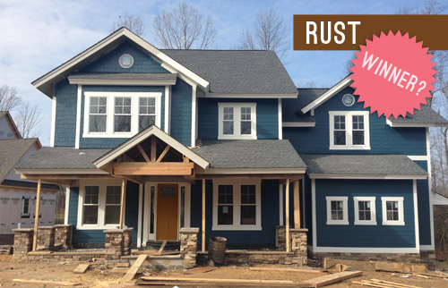
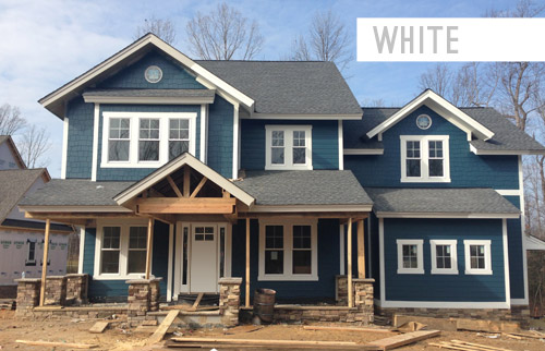
One surprise was a strong “write in” option that emerged repeatedly: white. Sherry had actually wanted to include that as one of the vote-able options, but I assumed it would show dirt too easily and wouldn’t be practical, so I talked her out of it. My bad. The good news is that the constant “what about white?” comments gave us the opportunity to ask folks with a white door if they liked it, and the resounding response was that many people with a porch/overhang like this house and a white door had no issues with it, and generally loved it.
So if the sealed beams, the porch floor tile, and other elements that we’ll be layering in start to feel too heavy, this write-in candidate could just steal the show. We like how it would integrate the white sidelights and make the whole entryway appear wider and more grand. So we’ll have to see what the builder, architect, and realtor think once the beams get sealed and we grab some paint test pots for the door. We promise to report back to you guys with all the details!
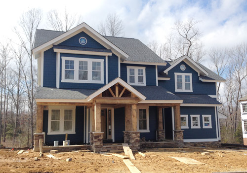
One exciting step forward, as some of you saw on Instagram, is that the porch columns are now in! It was so quite a moment to pull up and see them smiling (staring?!) back at us. They still need to be sealed, which will enrich/darken the tone of the wood, so we can’t wait to see how they look when they’re done.
Now onto the rest of the house. We’re facing a pretty constant internal debate when it comes to the choices that we’re making for this project. Do we pick the “safe” and more universally appealing option? Or do we take a risk and try something unexpected or against the grain? Since the home will eventually be put on the market, we don’t want to create a wild-card house that scares everyone off.
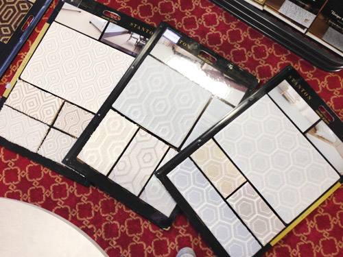
But the whole purpose of Homearama is to showcase a variety of interesting design ideas across all seven houses in the show, so they don’t all look like clones of each other – or of every other home in the neighborhood. So nearly every decision for this house has been an interesting (and sometimes paralyzing) dance between “is this too polarizing to please the masses?” and “is this too safe to make for an interesting home show?” We were even debating this yesterday while checking out some unique wall-to-wall carpet options for the kids bedrooms…
For the most part we’ve been trying to lean more towards the “risk” since the folks putting on the show have really encouraged that (along with the builder, who reminds us that the house only needs one buyer). Of course that doesn’t mean every element that we choose will be crazy, but it does mean that we’re shooting for a few showstopping choices in each room. And since there’s a whole team involved – the builder, the contractors, the architect, the Homearama coordinators, the realtor, etc – we’ve got a pretty good safety net to keep us from going off the rails.
Speaking of decisions, we’ve been checking more and more off of our TBD list. We recently picked all of the interior paint colors, and we’re starting to pin down furniture for each space. Can I just tell you how much furniture you need when you’re outfitting an entire house at once?! Our lists go on for pages. The good news is that it has been much easier to visualize what we need now that the house is all drywalled.
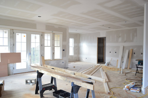
Filling this place with furniture, rugs, curtains, art, and accessories is an exciting design adventure, but also a bit of a puzzle. Things that will be sold with the house (like hardwired lighting, plumbing, tile, and paint) come out of the builder’s budget, and then each designer (or design blogger, in our case) is given a separate budget to spend on decor. But that decor budget breaks down to less than $500 per room, which could be drained by a single rug, bed, or couch.
Thankfully Homearama has arranged for each of the seven showhouses to borrow furniture from a local-ish place called Green Front Furniture (which we’ve randomly explored a few years ago here and here). So that means we can check off some of our big ticket items without bleeding the budget. Green Front is made up of twelve massive buildings with floors upon floors of options, so we road-tripped there last week and did as much shopping as Sherry’s little pregnant feet could handle.
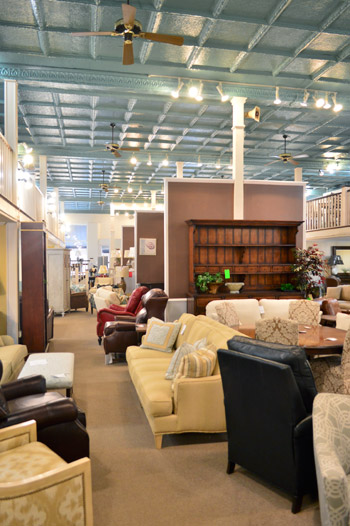
Even with that HUGE helping hand, there is a limit to how much we can get there, so like all of the design teams for each of these seven homes, we have to hustle to fill out this house. For some of the other designers it may mean borrowing items from other models they’ve decorated or calling in favors to stores they work with frequently. And for us, it means tapping some of the local artists or favorite shops that we’ve grown to know through blogging (so it’s sort of like how we recruited decor donations for The Children’s Hospital a few months back).
In the end, the more we can hustle to get donated or discounted for this house, the more it’ll help our goal of supporting Richmond’s Habitat for Humanity, because every dollar that we save from those building/decorating budgets means more can be donated to them.

We’re also donating our design fee to Habitat, and Homearama itself is collecting a bunch of generous contributions from their sponsors, vendors, and ticket sales. Oh and locals, take note – there are going to be goodies to grab at the ReStore when the show ends, since we’re also donating some furnishings and decor to them – and they’d love your business!
But this house won’t just be filled with new items. We’ve also been visiting some secondhand stores to score vintage and thrifted things that we’ll upgrade with everything from fresh paint to new upholstery. For example, we found this great wooden full-sized headboard for $9.98 that we can’t wait to paint for the girl’s bedroom (it reminded us of this $1,559 version from Ethan Allan).
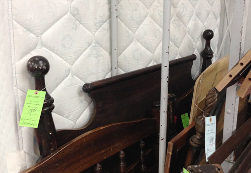
After we paint it and add a bed, it’ll sit against the right-hand wall in the picture below, which we’re also planning to treat as an accent wall with a cheery wall stencil donated from Royal Design Studio. Oh, and you can see the beginnings of the built-in desk that the carpenter (also named John) has been working on based on some very sketchy plans that we drew with him right on the wall.
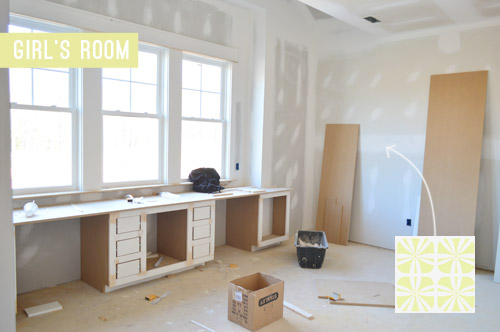
Since there’s no specific client to design the house for, we’re approaching it as if we’re accommodating a future version of us. So that might be a tweenage Clara’s space. Can you tell she’s very studious? She’s got one desk area for homework and another for artistic pursuits.
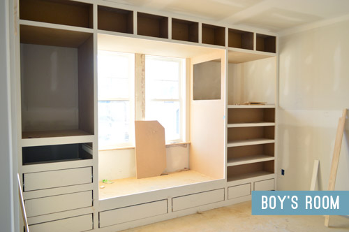
The second kids bedroom is an imagined room for the 8-year-old version of Barnacle, who is getting a sweet built-in bed/storage system. Clearly we instilled a love of built-ins in him at birth. It’s fun for the builder to add these custom creations so he can show future clients what his team can do, and it’s really fun for us to help design them since, for once, we don’t have to build them.
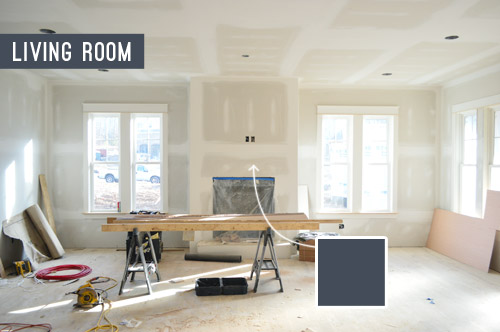
I’ll leave you with a peek at one last room: the living room, which opens to the kitchen (your back would be facing the kitchen island in this photo below). Said island will be painted navy and have some great gold pendants hanging over it, so we thought it’d be cool to pick up that same navy color on the fireplace column across the room. We think it’ll help the white mantle and the light stone surround that we’ve picked pop – sort of like this living room shot. We even have an artist friend of ours painting a big colorful portrait of Burger to hang up there. At this point we work some random Burger reference into every side project that we do, so we couldn’t resist.
We’ll do a more comprehensive overview of how each room is shaping up, well, once they’ve shaped up a bit more (perhaps with an updated video tour). Right now we have around 20 mood boards that are 40% complete, so we can’t wait to get those finished up and share all the plans with you guys. This baby boy of ours is coming in less than eight weeks, so we better get cracking.
Psst – Wanna see the finished showhouse? Click here for Our Full Showhouse Tour, which includes final pictures of every room, the floor plan, budget info, a video walk-through, and shoppable showhouse furniture & accessories.

Koliti says
Hey, I didn’t know we could write in a front door color – well, then I vote for a nice happy spring-lime green! (there’s more than enough white with all the trim) The front door needs to be a happy destination.
And for carpet for the kid’s room, or at least the boys room, how about some artificial turf? You know the nice stuff they make now for putting greens? Get a nice low pile. I got a piece for my hallway guest bathroom, I just have to make a template to cut around the toilet and pedestal sink, and put it in (it won’t be glued to the floor in there, just in case, I can take it out and hose it off).
YoungHouseLove says
That’s so much fun!
xo
s
Brooke says
Honestly, I don’t know HOW you guys do it all! The show house is looking fantastic! I’m overwhelmed just thinking if all the projects you’re juggling! Can’t wait for baby barnacle to arrive!
YoungHouseLove says
Thanks so much Brooke! This showhouse has been such an amazing opportunity to learn so many new things. We’re so grateful for it, even with an impending baby in the mix ;)
xo
s
Robin says
Just bought my tickets! Can’t wait to see it in person! My husband and I dream of someday building a custom home and will take lots of ideas from these for the future!
YoungHouseLove says
Sweet! Hope to see you there! We’re not sure with a newborn how we’ll juggle things but we’d love to pop in a few times and show people around (and pretend we live there, haha!).
xo
s
Robin says
I won’t blame you if you take the whole time off! We’ll enjoy it without you! It’ll be like touring your home while you’re not there, just in perfect condition! Keep it up!
YoungHouseLove says
Aw thanks Robin!
xo
s
Kellee says
I change my vote, White looks so much better. I only voted Rust cause it was the best of the bunch. But the white is classic and so pretty!
Alicia says
Now that I see the white door option, I think that’s the best one! I grew up with a white front door, even as the color of the house changed, and it’s never been much upkeep. Granted, we live in California so weather isn’t as much as an issue, but it’s easy to wipe it down every so often to clean up any dirt/smudges.
Also, I think you’re instilling a love of built-ins in Barnacle in utero, not just at birth :)
YoungHouseLove says
Haha, it’s true! He dances to the sound of us hammering and nail-gunning!
xo
s
Geertrude says
Looking wonderful! I love the built-ins too! So much fun for a little boy (though I think little girls would like it too).
I can imagine you having a blast designing this house.
Your comments about risky and safe remind me of a little column I once wrote about how much fun I thought it would be to be an interior designer. I imagined putting all kinds of weird stuff in other peoples houses, being both admired and paid for it and then going home to my own old-fashioned cozy little interior that I’ve had forever. Still think that would be fun ;-)
(yeah, I know it’s usually not like that, but some of those designer shows on tv back then made me wonder…)
YoungHouseLove says
Haha, it’s true! Shows like Trading Spaces made us all believe that designers could put hay or plastic flowers on the walls if they wanted to!
xo
s
Kati @ This Wandering Life says
Well I flippin’ love it. I was going to comment how I LOOOOOOOOOOVE how many windows are downstairs and it got me thinking – are you guys doing anything with landscaping decisions? I’m curious with what’s going on (or going to be going on) in the backyard? Bravo bravo Youngsters!
Also. Whitedoorforthewin.
YoungHouseLove says
We’re going to work with the builder’s landscaper to plan out beds and heights of things and pick plants but he’ll thankfully be the one to guide us with choices (meaning he might tell us 8 things that could work in the front beds due to lighting and together we’ll plan their placement and pick the ones we want to integrate). Feels like a nice safety net since John and I are not green thumbs, so we’d worry if we had to pick all the plants and study the sunlight patterns and stuff!
xo
s
Kat s says
Oh man, I wish I could tour this! (though I, too, am due with a baby before then so even if I were local I couldn’t make it) will there be a burial tour after the paid touring is over?
YoungHouseLove says
I’m going to guess that auto-correct changed video tour to burial tour? If so, yes! We’ll be sharing tons of photos and a video walk-through when the show wraps!
xo
s
Heather Wingate says
hahaha!! Hilarious auto correct! Yesterday I was writing a reference letter for a co-worker applying for a job, and my auto correct replaced “be the ideal individual for this POSITION” to “be the ideal individual for this PROSTITUTION”. hahahaha!!!! I was just getting ready to hand him his letter, when I realized what it had said! Good thing i caught that one in time. LOL!
YoungHouseLove says
Holy cow, that was a good catch!
xo
s
CRISTINA S. says
Have you guys heard how awesome you are lately?!?! What a great thing you guys are doing :)
Please take lots of photos at home arama… We have nothing like that in Miami!!! Thanks for keeping us updated!
YoungHouseLove says
Thanks so much Cristina, you’re so sweet! We definitely will share a ton of photos and even some videos as we go, so it’ll feel like you’re right there with us :)
xo
s
Mallory says
I voted for red initially, but I LOVE the white! I agree that since it matches the sidelights, the door looks so grand and inviting. I can’t wait to see the finished product! LOVE the built in bed in the little boy’s room – so fun! And the desk in the girl’s room is such a good use of the space around the window.
YoungHouseLove says
Thanks so much Mallory!
xo
s
Laurie says
I’m so glad people wrote in the white option. It was what I first thought of when I saw the house but I didn’t want to be a trouble-maker. I have a white door and it honestly doesn’t get that dirty. Nothing a little scrubba with a Mr. Clean sponge can’t handle.
Emily @ Life on Food says
Boy it is really coming together. 8 weeks still seems like no time at all to get it complete. I cannot wait for the finished product. I wish we lived closer to actually tour all of the homes.
Kati @ This Wandering Life says
I agree! Here’s hoping they crash all of the homes for us to see! (If that’s legal of course!)
YoungHouseLove says
Yes, we can’t wait to share the others as well! It’s so exciting to see what they’re all doing. Someone even put in a pool!!
xo
s
Stephanie Bergman says
This seriously must be the best job ever! I’d LOVE LOVE LOVE to be part of a project that would let me donate time/money to an organization I cared about AND that let me design and decorate a house on someone else’s budget! What fun! And…you guys are doing an awesome job. I can’t wait to see the navy/white/gold kitchen!
Lauren @ Faith and Macaroni says
I guess I didn’t read through the comments on that door post- I just voted (for rust!). And I really hate to throw a differing opinion in… but I really hate my white door. It’s so hard to keep clean! Who wants to spend time scrubbing an exterior door? Maybe in SC we have more pollen than VA but it seems like everything shows up on it and it looks dingy all the time. But I agree that it looks fantastic in photoshop. :) The rest of the house looks amazing and I am so in love with that exterior color. Great job!
Courtney says
A bed for $9.98 – that is INSANE! I’m driving to Richmond!! I just picked up a metal headboard (no rails, slats or hardware) at our local ReStore for $35 and painted it.
YoungHouseLove says
That’s still an awesome deal! Love it!
xo
s
qs777 says
Love how it is coming together!
While I love white, my vote would be for an orange – bright but not too bright – for the door.
Also, do you know how many square feet the house is? The kids’ rooms look ginormous compared to what we have. It must feel great to look at a wall of built-ins and not have to have built them yourself. haha
YoungHouseLove says
It’s one of the smallest ones in the show but it’s still huge to us (I think it’s around 3500 square feet). We’re definitely making mile-long lists for all the furniture and accessories that we need to fill it up!
xo
s
Kelli says
White door looks great! My heart sped up when you said navy and gold in the kitchen! Can’t wait!!! I know the feeling you have anticipating those kitchen cabinets. I checked on our house almost every day during our build. I could hardly wait to see each element go in! It was like Christmas every time tile, wood floors, cabinets, paint or counter tops, etc. went in! Thanks for sharing your progress with us! And I say throw “safe” out the window. You guys are too talented not to let bold design decisions be showcased! You might make converts out of people who lean toward safe. :)
YoungHouseLove says
Aw thanks Kelli, you’re so sweet!
xo
s
Barbara says
Please tell me that cubby in the boy’s room (the one with the
“window” to the bed area) is actually a cubby to hang out in… That would be AWESOME!
YoungHouseLove says
It is! We’re also building a really cool ladder for climbing up there to chill. We just thought it would be fun to depart from storage everywhere and give him one “fun spot” in the mix as well.
xo
s
Catarina D says
Thanks for the heads up about the 20% on the tickets!!! Just bought a couple for a road trip down (we live in Fredericksburg) and a day date with the hubs!
YoungHouseLove says
Wahoo!
xo
s
Loryn says
It’s looking really good! After the house is all done, I’d love to see a post about how the design process differs when you’re designing a new house compared to a remodel. It seems like it would be a lot harder to start from scratch. In a remodel, I think working with what you have would limit your choices and make it easier. But then, I’ve never owned a new house. I’d love to hear your thoughts!
YoungHouseLove says
Yes! That’s completely how we feel right now. It’s a lot of pressure to make all these decisions at once instead of working with what you have and letting a room simmer/evolve over time, but it has also taught us some new tricks for helping to picture things and floor plan, so we can’t wait to share those!
xo
s
Jessica says
I’m sorry if someone has already asked this, I didn’t read all 119 comments :) but will you/can you post what paint colors you have chosen for the home? One room is hard enough but I would love to see what you chose for the entire house!! Looks so good so far. I am so excited to the house finished and so glad to see you are going outside your comfort zone for the decor and aesthetics. I go to a lot of Home-a-rama shows for that reason. Even a designer, like me, looks at these homes to see new materials I haven’t seen before, ideas I haven’t seen before, and new trends. So it is crucial to do new, exciting things in a home like this!!
YoungHouseLove says
Oh yes, we’ll share that info as soon as we can! Just waiting for the painters to get in there and we can share the color names with photos that coincide!
xo
s
Julie says
I used to work in a customer service call center for Restoration Hardware. We had a customer building a brand new house for him and his family in Hawaii and he furnished it mostly with Restoration Hardware. His order came to about $80,000! Imagine working with that kind of budget!
YoungHouseLove says
HOLY COW!!!
xo
s
Shannon says
So, so fun to see the whole process step by step. With my husband’s job we’ve moved a ton (New Orleans, Houston, Shreveport, Pittsburgh, and now Denver…in 13 years!) and we’ve always had to buy a pre-owned home very, very quickly! Because we move so often, we generally buy a relatively newer home, keep the flooring, appliances, basic structure, etc the way it is and the decor remains relatively neutral and marketable in the event that we have to move/sell again. I can’t tell you how much I want to go crazy and pick out all of my own finishes! In the meantime, I’m living vicariously through you. Thanks for sharing the process with the rest of us!
YoungHouseLove says
You’re so sweet Shannon! One day I hope you can go crazy ;)
xo
s
Patti says
You gotta go with the white door- I love how the window details mirror the window details, which is something you can’t see on the Rust door.
Lil says
I have a photograph I would be willing to give you the temporary/limited rights to…if you wanted to print it for the show house, etc…let me know. I think you can see my email attached to the comment? Is there a forum thread or something for this kind of thing?
It’s a photo of a boat I took on Martha’s Vineyard this summer…I kept seeing the boat as we went here and there and KNEW there was a photo there…then one day we were at the beach and the fog rolled in. I told my friend that we had to stop on the way home…I’m so proud of it. I have a copy on canvas at home and a 16×20 in my cube.
I’d love to send you a preview. Let me know.
Would that kind of thing be donated to Habitat for Humanity after the show house?
YoungHouseLove says
You’re so sweet, Lil! Why don’t you email us and we can give you all the info we give potential donors (our contact link is on the sidebar next to our smiling faces).
xo
s
Kate C says
Although only one story and not nearly as grand, my own house is nearly the exact same color and has a porch with an overhang, along with a white door. The white suits very well. It’s easy to get too dark under the overhang. When we had the house painted the painters mistakenly carrier the blue house paint to the ceiling of the over hang and we knew immediately that it would have to change. We had them repaint it the same white of the trim. Along with the white door, it really gives the space some light and helps it stand out from the curb.
YoungHouseLove says
Sounds so charming Kate!
xo
s
lisa says
This is really neat to watch unfold – thank you for featuring this.
Something doesn’t look to scale about the covered porch and columns? For some reason I think Sherry has a “fine arts” background (I don’t) – but isn’t there a 1/3 – 2/3 rule? The outside columns look right. But I think the problem with the covered porch area is maybe that it needs to be considered roof peak to floor? It looks too long/tall and therefore unbalanced at the top? Maybe higher stone pillars on the covered porch section would balance it? Or reclaimed corbels installed at the upper corners of the porch entrance?
YoungHouseLove says
Love those ideas! We actually tried a bunch of proportions/heights with the stone pillars/beams, and then the builder, the architect, the Homearama crew, and me/John voted (we had some higher stone columns next to lower ones and we could all stand back from the curb and vote on the height we liked). This height/ratio won out, simply because from the inside of the house, taller pillars felt like they blocked off the view from inside. But we still have some fans/lighting/furnishings to add to the porch along with landscaping that will go around the house, so that should add a lot more balance – along with sealing those beams so they’re a bit richer/darker.
xo
s
Elizabeth says
It’s going to be lovely! I wish I could come see it, but your pictures are wonderful. Can’t wait to see continued progress-you both inspire me so much!
Sheila F says
Ok I am also changing my vote! I have never seen white “POP” so much. White it definitely is! As for carpet in the bedroom my dear husband has only 2 desires when we redo houses and those are a master bath and carpet in the bedroom. He say’s “Getting out of bed to a cold floor on the feet is a rude awaking in the morning!” (as is having to put on a robe to go to the bathroom, LOL.) So we always go for carpet in the bedroom. (easy to give in on those 2 requests and I get the rest of the house!) I think I like the idea of a bold pattern in the carpet with a neutral color. The texture can be as important as the color. But it is looking lovely, as usual. Sherry, be sure to get plenty of rest. I know these last months can be hard on a pregnant girl and you need that energy when the REAL LABOR begins!
All the best,
Sheila
YoungHouseLove says
Haha, thanks Sheila!
xo
s
Stefanie says
This is so exciting! Does it make you ever want to design/build/decorate your own house one day?
YoungHouseLove says
In some ways there are so many exciting and amazing moments that it makes us do the happy dance over every update, and in other ways we’re screaming “we’d NEVER be able to do this for ourselves!” I think the pressure of making so many choices all at once (from lighting to plumbing and tile and flooring to smaller details like doorknobs and pulls on cabinets) can really get you sweating, but if you get it right I’m sure it’s an amazing feeling. We’ll have to see how it goes… haha!
xo
s
Lee Ann says
I’m weighing in on your thoughts about whether to stay “safe” with decorating the showhouse, or go “risky.” GO RISKY! All us imaginary friends can’t be wrong in loving the style of your house(s), which obviously we all adore. So trust your gut … go risky … maybe there’s a Young House Love reader just waiting for that house to be finished and become his/her house!
YoungHouseLove says
You’re so sweet Lee Ann! Thanks to everyone for the kind words and sweetness about this project. It truly is a labor of love, and we’re so thankful to get to learn and grow from this, especially for an amazing cause that’s so close to our hearts.
xo
s
Karen says
omg, definitely, white.
Jennifer R. says
I think the rust is really nice, although it didn’t get my vote. It accents those wood columns so nicely.
I do not like the idea of a white door at all… it makes the house look so cookie cutter/builder grade. Gag.
I love the choices you are making so far, just wish I lived in Richmond and was on the market to buy one of these lovely homes! I think taking a certain number of design risks will really pay off to give the owners a personalized home. :) Have a nice weekend Petersiks!
Cori says
Less than 8 weeks?! Holy cow, time flies when you’re not the one pregnant!
The house is looking awesome! You guys are such teasers, I can’t wait to see all the paint colors, carpeting, and furniture you’ve picked out! Aaaa, it’s going to look so good! And the white door would look fabulous; it gets my vote.
Question: you mentioned in here in the comments that these houses get awesome landscaping and patios and stuff. Are you guys the designers for all of that stuff too, or do they bring in someone like a landscape architect to do that? (Sorry if you’ve already answered this question and I missed it!)
YoungHouseLove says
There are experts in every field (ex: when we go to pick the countertops, there’s a specialist at the stoneyard who helps answer questions and teaches us distinctions between types – same with cabinets and fixtures and all that). So for the exterior stuff there’s a hardscaping expert and a landscape expert who tell us what might work in certain areas and help to give us options to pick from. It’s so much fun to learn from so many pros!
xo
s
Adara says
The house is coming along beautifully! I’m thinking a weekend getaway to Richmond is in order to come see it. Will you guys be making any appearances at Homearama? Would love to know which of the three weekends might be best.
YoungHouseLove says
We’d love to pop in, although we’ll have a freshly baked newborn (and I’ll be recovering from a c-section) so we’re not sure when we’ll make it. I’d guess the last weekend of the show is probably the most promising, just because I’ll hopefully be more recovered by then!
xo
s
Karen says
Sherry: Ok… NOW is the [all-day] sickness over????
YoungHouseLove says
I wish! Every few days I have one evening where it’s ok and I think “maybe it’s just back to mornings again” but it snuck up on me again last night. Doc things it might be something I have until delivery day. Womp-womp. But I can’t hold it against that cute little bun who’s bouncing around in my belly. He’s worth it ;)
xo
s
Rick S says
I am a White door voter too. The front door and sidelights on my house are white. The porch has gingerbread trim and a three sided bay window on each side of the front door. The Siding is medium gray, shutters and roof are black. The color scheme doesn’t shout but everyone just seems to like it.
rick
Melissa says
I love all of the navy blue colors! It’s the color I’ve added to my house ever since I fell in love with Behr’s Starry Night paint color 3 years ago. I opted to paint the dining room navy and it is still one of my favorite rooms in my house!
I can’t wait to see the rest of the house!
YoungHouseLove says
Sounds so pretty Melissa!
xo
s
Amanda says
White, all the way! The rust looks like breastfed babypoop; not cool. White looks so classic against the blue color.
Lindsay L. says
How do you create your mood boards? Do you use a website that does it or do you just photoshop the items you find into one place?
YoungHouseLove says
We use Photoshop to make them, but we hear good things about sites like polyvore and free downloads like Gimp.
xo
s
Laura @ Habitat for Humanity says
The house is looking great! We’ve enjoyed following along your journey. Thank you for supporting Habitat for Humanity through your work and spreading the word about our ReStores.
YoungHouseLove says
Of course Laura, we love you guys!
xo
s
Brooke says
No way! Go with a bright mustard/golden yellow.
Here’s some inspiration I quickly found on Pinie:
http://www.pinterest.com/pin/223280093997438694/
http://www.pinterest.com/pin/354095589423974820/
;)
Angela says
OK! WHITE, white, white!! If this had been an option, that would’ve been my vote. I wasn’t 100% sold on any of the vote options, but this is the ONE!! Loving how this is all coming together! What a great idea for building in that desk space in a girls room, I would’ve loved that when I was a child.
WorthyStyle says
Gotta love Green Front. One of my favorite places to go – have been trekking out there to Farmville since I was a little kid and would end up napping on a random couch while my parents spent hours looking through Oriental rugs… And I do think the white door is really nice!
[email protected] says
I want to scream “When can we move in?!!” It’s a NICE place…all those cool built-ins! I am still voting for a red door, though. It’s good luck, isn’t it?
http://www.junktogem.com/2014/02/21/to-repaint-or-not-to-repaint/
Sarah says
Was wondering how we find out if other Home Shows like this exist in NJ/NY. Would love to visit a show like this!
YoungHouseLove says
I would search NJ and then the term “parade of homes” or “homearama” or “open house” or “street of dreams” to see if they have anything similar. Hope it helps!
xo
s
Nichole K says
We have the Festival of Homes, so maybe search for “home festival” in your area too. It’s not on one street though, it’s throughout the metro area and put on by the home builders association, so there are lots of different neighborhoods to look at. Not really a “street of dreams” but more of a huge open house weekend. The houses are in all different price ranges too.
YoungHouseLove says
Great tip!
xo
s
Taylee @ twist me fit says
Love the color you guys chose!
bhh says
Truly enjoying watching the beautiful progress you are making! I vote “white.” Just imagine a lush green wreath with a red bow at Christmastime!
Kelly says
I voted for rust too, probably because it was the best option with the raw wood on the porch. Then when you said white, I was all for that…until I saw the photo. I usually love your signature “crisp white trim”, but I’m wondering with a house like this with natural/outdoors elements such as the wood beams and stonework, have you considered a stained wood door? I’ve lived in two houses with wood doors (one painted stucco and the other a cedar sided house)and they hold up as well as paint and have that natural feel you are trying to pull in. I think it would make the door pop while not being busy.
YoungHouseLove says
That would be pretty too! Unfortunately this door isn’t stain grade, so we have to paint it.
xo
s
NicoleD says
Logging my approval for carpet with a slightly wild but tone-on-tone pattern. Our house had newish, great quality carpet of this variety when we moved in (diamond pattern), which I expected we’d replace in short order. But we ended up loving it. Such a simple yet visually stimulating way to jazz up bedrooms or a hallway and a raised pattern makes it feel lush!