The Homearama Showhouse train continues to careen towards our deadline (you can read more about it here, here, here, and here). The show opens May 1 – although we have a baby who’s due a few weeks before that – so we’re scurrying to get things done and holding on for the ride. It simultaneously feels like we have a million things to tell you, yet no tidy way to share the news, so this post may feel a bit scatter-brained as I attempt to update you on everything swirling around the project these days.
First up, thanks for all of your input on the front door color. We can’t believe 38,000 votes came in (!!!). It was fun to see you guys launch rust into the lead early on, where it remained the winner with 36% of the votes (the runner up was red with 21%). As we mentioned, we’re waiting for the porch columns to go in and get sealed (they’re going to darken a bit), so we need to take that into consideration before a final decision is made.
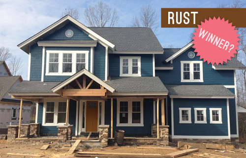
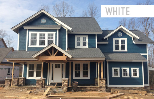
One surprise was a strong “write in” option that emerged repeatedly: white. Sherry had actually wanted to include that as one of the vote-able options, but I assumed it would show dirt too easily and wouldn’t be practical, so I talked her out of it. My bad. The good news is that the constant “what about white?” comments gave us the opportunity to ask folks with a white door if they liked it, and the resounding response was that many people with a porch/overhang like this house and a white door had no issues with it, and generally loved it.
So if the sealed beams, the porch floor tile, and other elements that we’ll be layering in start to feel too heavy, this write-in candidate could just steal the show. We like how it would integrate the white sidelights and make the whole entryway appear wider and more grand. So we’ll have to see what the builder, architect, and realtor think once the beams get sealed and we grab some paint test pots for the door. We promise to report back to you guys with all the details!
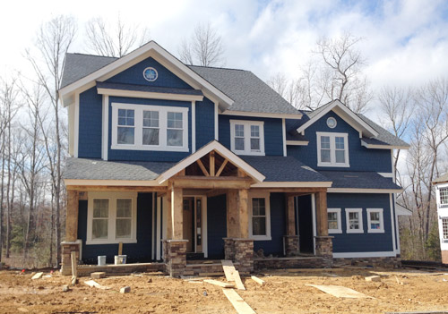
One exciting step forward, as some of you saw on Instagram, is that the porch columns are now in! It was so quite a moment to pull up and see them smiling (staring?!) back at us. They still need to be sealed, which will enrich/darken the tone of the wood, so we can’t wait to see how they look when they’re done.
Now onto the rest of the house. We’re facing a pretty constant internal debate when it comes to the choices that we’re making for this project. Do we pick the “safe” and more universally appealing option? Or do we take a risk and try something unexpected or against the grain? Since the home will eventually be put on the market, we don’t want to create a wild-card house that scares everyone off.
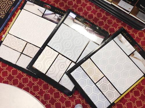
But the whole purpose of Homearama is to showcase a variety of interesting design ideas across all seven houses in the show, so they don’t all look like clones of each other – or of every other home in the neighborhood. So nearly every decision for this house has been an interesting (and sometimes paralyzing) dance between “is this too polarizing to please the masses?” and “is this too safe to make for an interesting home show?” We were even debating this yesterday while checking out some unique wall-to-wall carpet options for the kids bedrooms…
For the most part we’ve been trying to lean more towards the “risk” since the folks putting on the show have really encouraged that (along with the builder, who reminds us that the house only needs one buyer). Of course that doesn’t mean every element that we choose will be crazy, but it does mean that we’re shooting for a few showstopping choices in each room. And since there’s a whole team involved – the builder, the contractors, the architect, the Homearama coordinators, the realtor, etc – we’ve got a pretty good safety net to keep us from going off the rails.
Speaking of decisions, we’ve been checking more and more off of our TBD list. We recently picked all of the interior paint colors, and we’re starting to pin down furniture for each space. Can I just tell you how much furniture you need when you’re outfitting an entire house at once?! Our lists go on for pages. The good news is that it has been much easier to visualize what we need now that the house is all drywalled.
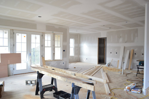
Filling this place with furniture, rugs, curtains, art, and accessories is an exciting design adventure, but also a bit of a puzzle. Things that will be sold with the house (like hardwired lighting, plumbing, tile, and paint) come out of the builder’s budget, and then each designer (or design blogger, in our case) is given a separate budget to spend on decor. But that decor budget breaks down to less than $500 per room, which could be drained by a single rug, bed, or couch.
Thankfully Homearama has arranged for each of the seven showhouses to borrow furniture from a local-ish place called Green Front Furniture (which we’ve randomly explored a few years ago here and here). So that means we can check off some of our big ticket items without bleeding the budget. Green Front is made up of twelve massive buildings with floors upon floors of options, so we road-tripped there last week and did as much shopping as Sherry’s little pregnant feet could handle.
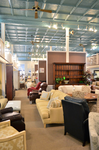
Even with that HUGE helping hand, there is a limit to how much we can get there, so like all of the design teams for each of these seven homes, we have to hustle to fill out this house. For some of the other designers it may mean borrowing items from other models they’ve decorated or calling in favors to stores they work with frequently. And for us, it means tapping some of the local artists or favorite shops that we’ve grown to know through blogging (so it’s sort of like how we recruited decor donations for The Children’s Hospital a few months back).
In the end, the more we can hustle to get donated or discounted for this house, the more it’ll help our goal of supporting Richmond’s Habitat for Humanity, because every dollar that we save from those building/decorating budgets means more can be donated to them.

We’re also donating our design fee to Habitat, and Homearama itself is collecting a bunch of generous contributions from their sponsors, vendors, and ticket sales. Oh and locals, take note – there are going to be goodies to grab at the ReStore when the show ends, since we’re also donating some furnishings and decor to them – and they’d love your business!
But this house won’t just be filled with new items. We’ve also been visiting some secondhand stores to score vintage and thrifted things that we’ll upgrade with everything from fresh paint to new upholstery. For example, we found this great wooden full-sized headboard for $9.98 that we can’t wait to paint for the girl’s bedroom (it reminded us of this $1,559 version from Ethan Allan).
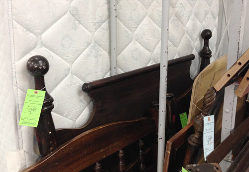
After we paint it and add a bed, it’ll sit against the right-hand wall in the picture below, which we’re also planning to treat as an accent wall with a cheery wall stencil donated from Royal Design Studio. Oh, and you can see the beginnings of the built-in desk that the carpenter (also named John) has been working on based on some very sketchy plans that we drew with him right on the wall.
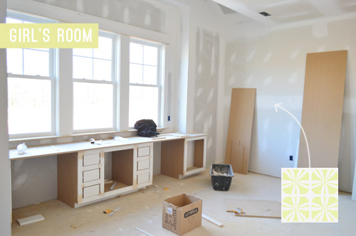
Since there’s no specific client to design the house for, we’re approaching it as if we’re accommodating a future version of us. So that might be a tweenage Clara’s space. Can you tell she’s very studious? She’s got one desk area for homework and another for artistic pursuits.
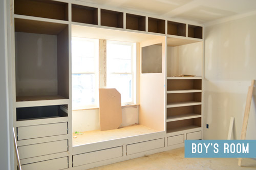
The second kids bedroom is an imagined room for the 8-year-old version of Barnacle, who is getting a sweet built-in bed/storage system. Clearly we instilled a love of built-ins in him at birth. It’s fun for the builder to add these custom creations so he can show future clients what his team can do, and it’s really fun for us to help design them since, for once, we don’t have to build them.
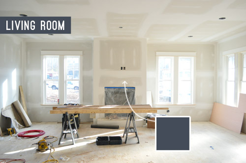
I’ll leave you with a peek at one last room: the living room, which opens to the kitchen (your back would be facing the kitchen island in this photo below). Said island will be painted navy and have some great gold pendants hanging over it, so we thought it’d be cool to pick up that same navy color on the fireplace column across the room. We think it’ll help the white mantle and the light stone surround that we’ve picked pop – sort of like this living room shot. We even have an artist friend of ours painting a big colorful portrait of Burger to hang up there. At this point we work some random Burger reference into every side project that we do, so we couldn’t resist.
We’ll do a more comprehensive overview of how each room is shaping up, well, once they’ve shaped up a bit more (perhaps with an updated video tour). Right now we have around 20 mood boards that are 40% complete, so we can’t wait to get those finished up and share all the plans with you guys. This baby boy of ours is coming in less than eight weeks, so we better get cracking.
Psst – Wanna see the finished showhouse? Click here for Our Full Showhouse Tour, which includes final pictures of every room, the floor plan, budget info, a video walk-through, and shoppable showhouse furniture & accessories.

Autumn says
Love the white door! Our front door, as well as many of our neighbors, is white, and looks great! You can always add more color outside with wreaths, flowers, etc.
Leanne says
I don’t remember what color I voted for, but now I’d say “white”! I don’t think the rust fits well.
Kezia says
Hi guys, don’t know how you’re doing it all with a baby so close to arriving! I’ve got 11 weeks till my little one arrives and am exhausted! Personally, I wasn’t a fan of any of your colour options and white seems too “safe” and a bit boring for a show house and for lovers of colour like yourselves. I’d love you to do a bright but deep dark/hot pink! I think it would play really well off the blue/grey of the house and make a statement like red, without the “traditional” feel. What do you think?
YoungHouseLove says
That could be fun too! We’re going to wait for the beams to get stained and see what the builder and realtor vote for as well :)
xo
s
carrie says
Oh White! Yes, yes! I tried so hard to love the colors you suggested in the earlier post, but I just couldn’t do it. The white is perfect!
Koliti says
Hi! This is sooooo off topic, but I couldn’t resist.
Finally, someone captured proof of what Clara is really doing during “nap time” – she’s your Web Master ;)
http://www.apartmenttherapy.com/20-resources-for-teaching-kids-how-to-program-code-200374
YoungHouseLove says
Hahaha, I wish!
xo
s
Mary says
The OBVIOUS choice for the front door is a light gray. Something in between the roof color and the trim color. White is bland and rust is putrid. How could people who choose gray as their color 99% of the time not see it.
Liz says
The rooms are so spacious! I can’t wait to see more :) My 550-square-foot apartment looks so teeny tiny in comparison!
Sarah says
I can’t wait to see the finished result and am planning to drive down one weekend from Nova where I live to see it in person! Will you guys be at Homearama at all to meet and greet?
YoungHouseLove says
We’d love to pop in if we can! We’ll have a fresh little newborn (and I’ll be on c-section recovery) but we’re hoping we can drop by at least a few times. Just to answer the door and say “welcome to our house” like dorks. Haha!
xo
s
Emily says
I’m not usually a carpet person, but I’m loving those swatches! How fun!
Gayla Glosson-Hudnell says
I’m excited to see the posts stained! It will look nice! I really like the rust! I’m going to sound silly— but please no white door!! It looks so unfinished to me!
Susan says
Re: patterned carpet in kids bedroom… Would the builder consider FLOR carpet tiles? We installed FLOR (bold pattern) as wall to wall, in a bedroom and have really loved the look. Perfect for a kid’s room since you can replace a damaged tile or wash/dry a square easily. Bonus: If prospective buyer does not like it, builder can lift and take it to another project–use as an area rug etc. We have seen this done in local ‘model’ homes.
YoungHouseLove says
That’s a really fun idea! We have already ordered the carpeting, but I’m going to tell the builder about that suggestion for a future home – such a fun alternative!
xo
e
Stephanie@Simply Swider says
I love Green Front! I went to college in Farmville and we use to spend our weekends wandering through all of the warehouses. Did you know that they are all old tobacco warehouses except for one which was a shoe factory?
YoungHouseLove says
That’s so cool!
xo
s
Jeanie says
I’m a rust voter & I believe the white is better with white trim work over all.
Will there another vote after staining is finished ? You guys should have final approval & choice on that , right? I think not having 2nd vote, as much as I appreciate keeping us up to date, is 1 not completely needed thing to cross off your huge to do list & reduce stress on Sherry.
Sooo excited for you all with new Barnacle baby.
YoungHouseLove says
Aw thanks Jeanie! The builder and realtor and other team members have votes as well, so it seems like white is the favorite from blog readers (at least according to this post), so we’ll just have to see where the team lands. I hope once the beams are stained and we do some test pots it’ll be really clear what we should do ;)
xo
s
Kelsey says
I am loving all the built ins and the fireplace in the living room. We have a dog named bisbee and want to do an art form of him for our future sons bedroom. Are you homemaking the art of burger or do you order from someone? Some advice would be much appreciated. :]
YoungHouseLove says
We have a good friend of ours painting him (she’s amazing with dog portraits). We’ll definitely share her info when we share the pic!
xo
s
Kati says
I’m one of the ones who really disliked the rust door (go plum!)and was surprised that so many folks liked it. Maybe it won because in your post it sort of seemed like you were favoring rust.
One way or another, I love the white, especially with the other components–it looks great!–so fresh, crisp, neat, clean, modern and bright–it’s my #1 choice now by far! I think it will also look great at night with the porch lights reflecting off it and will also look great with whatever landscaping and container plants you choose. “Way to go!” to the folks who suggested it!
Amanda says
I love the navy you chose for the house – it totally inspired me! I may have to steal that color when we finally get around to painting the exterior of our house. This house is shaping up beautifully – I can’t wait to see the finished product!
Sarah says
I love that headboard! It looks like it will be a sunny, light-filled home.
Kathleen says
Did you guys see this?
https://www.jossandmain.com/magazine/books-for-the-diy-home-decorator/
Cheers!
YoungHouseLove says
NO WAY! Thanks so much Kathleen!
xo
s
Xuca says
I love the blue! I was never a fan of the rust coloured door!
Cannot wait to see all of the design choices inside. Good luck!
Gigi says
Usually just a stalker, but have to cast my vote for the white door! :)
Melissa says
I’m a little late to the party, but what about a dark orange front door? Benjamin Moore Starburst Orange or Hot Spice. That would look great with the navy. Whatever you choose will look great though. You have amazing taste.
YoungHouseLove says
Thanks Melissa! That could be fun too! We’ll have to see what the realtor/builder/rest of the team vote on!
xo
s
Katherine says
Can’t wait to see more showhouse updates as the progress continues! IMO, a white front door looks really unfinished and builder-basic, like you’re going to paint it and just haven’t yet. Since the house color is somewhat bold, I think something similar to the rust but with a little less orange – like a rich taupe/ khacki/ mushroom – would be a nice choice to add color without being too loud.
Katherine says
oops.. khaki :)
Amanda says
I know I’m late to the game, but what about salmon? A more orange than pink-ish salmon. Or a goldenrod shade of yellow? Or even bright leaf green! I love colored front doors!
YoungHouseLove says
That could be fun too!
xo
s
Hanna Cage says
I wish I had thought to write in colors. I was definitely thinking white or a blue close tot he color of your siding. I love pop-of-color doors (especially all of yours), but on this house it feels like it would be competing with the awesome detail on the porch (portico?) roof. I think that should be the star of this house. It is really cool.
Clever Girl Reviews says
Things have really gotten underway since the last time I checked in, love the progress so far and I’m excited to see the result!
Jenny @ Made To Love says
So the exterior is called Newburg Green?
LOVE it!!!
YoungHouseLove says
Yes, it’s a funny name since it’s a lot more blue than green. Here it is on Ben Moore’s site (it’s part of their historic collection): http://www.benjaminmoore.com/en-us/paint-color/newburggreen
xo
s
Traci says
I hadn’t thought about white when the poll came around for the first time, but I like it much better than the rust! ;]
Tammy says
This house is looking so amazing!!! I can’t wait to see more.
kristy says
Love this plan, DO you know How can I obtain this house plan or is there info on your site with
architects info for this plan I could contact?
YoungHouseLove says
Yes, the plan is called The Clover and it’s available for purchase on the builder’s site (with a portion of proceeds going to Habitat). His site is biringerbuilders.com
xo
Stephanie says
I have a question about the columns, what type of wood are they and how did the builder order them? We are looking to redo our front porch using columns in a natural wood, but we are in Mississippi, and I’m wondering what to use. I’m guessing we would just go to our local,building supply. I’ve heard good things about cedar so I was curious as to what y’all used.
YoungHouseLove says
They’re rustic/weathered wood beams (giant! 12″ x 12″) that our builder got locally (not sure of the type of wood but cedar sounds right), so I’m not sure the same source would work in Mississippi. Maybe check out any local wood/lumber distributors and ask if they have any chunky 12″ beams or thick columns and ask what type of wood they’d recommend for an outdoor porch? We also sealed this with Sikkens (I believe the seal color was “dark cedar”) if that helps.
xo
s
Gisella Claytor says
Loved your house in Homearama! It was my favorite. Wondering when will some of the furnisuings be available at Restore for purchase? Thanks
YoungHouseLove says
We’re not sure when those donations will end up there but we hope to give you guys a heads up when they do!
xo
s
tamara day says
Im 100% in love with your color choices!
Is there a place in your blog that details out all the color choices you made in the show house? Including the white you used inside and outside? tia!!!
YoungHouseLove says
That’s Steam on the outside trim and Simply White on the inside walls/trim/doors (both by Ben Moore).
xo
s
Carrie says
Hi! Just adore this house design. Do you know if you can purchase plans for this home? If so, can you lead me in the right direction? Thanks!!
YoungHouseLove says
If you go to BiringerBuilders.com there’s a plan for sale (it’s called The Clover) with a portion of the sale going to Habitat.
xo
s
Alicia says
Could you share with me your thoughts on the door style (the traditional vs the rectangles) and the whether the door knob finishes can be a different from the faucet?
Also, solid doors vs the hollow doors?
Please provide input! Please please please