Q: I really love Clara’s room! Great color choices. Do you have a formula for mixing prints? I love how they are all so different – even the colors and yet they all compliment each other and totally make the room! For my boys room, I am mixing prints but find it gets very busy looking or I tend to go with the same color making it kind of boring looking. – Cappy
A: It’s funny that this comment came in about a day after I ran around Clara’s room photographing a bunch of the patterns going on in there in the hopes of making a little grid to show how we mixed & matched all of these Clara-inspired textures and colors:
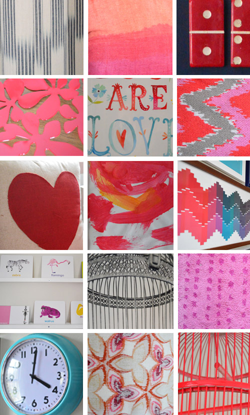
Not that there’s a foolproof formula for layering prints and patterns, but there must be some reason why we ended up with this mix of things after following the always elegant method of “just trying things and seeing how it all shakes out.” Especially since it’s not a big room by any means (it’s just 13 x 10′) and many of the choices in here were actually inspired by (and even chosen by) Clara herself, like:
- the color palette (she loves red & pink)
- some of her favorite patterns (the kid goes crazy for zig zags, hearts, and polka dots)
- the curtains that she selected with her face
- some of her favorite animals (we worked in whales, rhinos, birds, alligators, & elephants)
- some art that she made (which we hung in a little frame grouping next to the daybed)
- her favorite flash cards on the shelves (she picked the ones she liked the best)
So here’s what I came up with when I looked nice and closely at everything in the grid above…
Realization#1:
On one hand everything in that little grid looks really diverse with tons of patterns and shapes and textures – but on the other hand, when you look closer at the colors, many of them reoccur a lot, which helps tie everything together so things relate to one another without making the room feel like a circus. For example, there are four colors that keep showing up (pink, red, navy, and teal). Heck, even some of the patterns subconsciously mimic each other – the chevron paint chip art mimics the zig-zag blanket on the bed, and even the lamp shade fabric (bottom middle of the grid) looks a lot like the red Ikea bowl that sits nearby on the dresser (second row, left side of the grid).
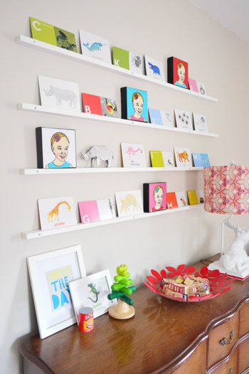
I never consciously said “this pattern on the lamp looks similar to the shape of the red bowl” but what actually happened was I thought “this red bowl might be functional and cute in there” so I plopped it down (good ol’ trial and error) and then my eyes said “sold!” – but if I stop to really analyze why, it’s probably because the lamp shade and the bowl are in the same color family and their pattern is similar, even if it’s not the first thing you notice. They’re like Adam Levine and Blake Shelton. They just look good together. And your eyes say “yup, I like that.”
Realization #2.
We also have a lot of neutral tones going on in the room to temper all those bolder patterns and colors (like the milky-tea-like wall color, the wood tone of the kids chairs, the woven baskets) and an abundance of white tones (in the daybed, the kids table, the floating shelves, the molding & trim, the pouf, etc).
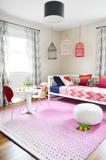
That mixed with the aforementioned solid navy tones (in the ceiling pendant, the sheet set on the daybed, the frames for much of the art, etc) definitely balances out all those bold reds/pinks/teals along with muting down the crazy zig-zags and polka dots on a few other surfaces. So although the room feels colorful, when you look closer at the furnishings and the wall color those aren’t exactly exploding with color – in fact many of them are white or wood-toned so they fall back while the brighter pops of color can shine without competing too much.
Realization #3.
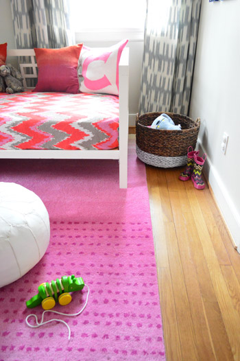
We’re total fans of the “just do what looks good to you” method (also known as trial and error) – so we’re not really ones to study formal decorating rules (we probably break those on the regular) – but I think we do end up following some of them accidentally. For example, some “traditional decorating advice” when mixing patterns and prints is to pay attention to scale: ideally you’ll mix one large scale pattern with a smaller scale/less bold one so they’re not all chaotic & compete-y. And when you look closely in here it’s definitely clear that the multicolored chevron daybed blanket plays the role of the alpha in this space (it’s large in scale and full of many colors, so things like the smaller scale two-toned ikat curtains and the polka dotted tone-on-tone rug fall in line behind it).
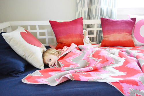
Had the rug or curtains been full of tons of colors and a larger scale pattern – like wide stripes of red, pink, navy, and teal for example – they would have competed with the bedding, so it’s funny how we subconsciously arrived at a nice mix of “best supporting patterns” while the blanket is the star (with the largest scale pattern and the wide range of colors).
We definitely didn’t go out and curtain-shop or rug-shop while thinking “I need a best supporting print or pattern that falls behind the blanket and is smaller in scale/boldness” but we seemed to gravitate towards those things when we pictured what might work in the room (well, Clara picked the curtains, so she gets all the credit there). In other words, something about the bold rug choices that we considered made our brains think “that might look crazy” – so we seemed subconsciously drawn to still-playful patterns and colors but less in-yo-face options than the largest pattern-y-est patterns.
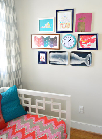
What I’m trying to say is that sometimes your instincts make sense even if you don’t fully know why (or stop to analyze everything to death). You might just think “well the walls are bright so a neutral couch and some softly-textured-but-not-too-bold curtains make sense” and that’s essentially the same concept. And of course if you end up going with something you think will be awesome but then you get home, see it in the room, and hate it with a passion – there’s always returns & craigslist. You can read more about how we deal with buyer’s remorse here.
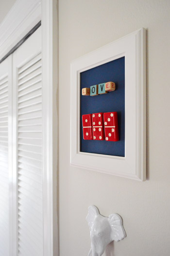
So my three quick summary tips for how we (sometimes subconsciously) mix and match patterns would be:
- Don’t be afraid to bring in tons of texture and pattern, as long as it relates in color so things sort of layer in on top of one another instead of competing (our “common denominator” was that many of the bold/patterned things were pink, red, navy, and teal so they tied into each other).
- Remember to use some larger neutral/white/non-bright items to temper all the boldness (choices like white or wood furniture, neutral walls, and even chocolate or navy furniture and fabric can balance out lots of bright and happy color in other places).
- Figure out which item is “the star” (perhaps it has the largest scale pattern and more color range than many other things in the room) and try not to bring in a bunch of other items of the same large scale & boldness. It can get chaotic and compete-y if too many things are fighting for attention, but by all means, layer in some other colors and smaller scale patterns for more interest and fun.
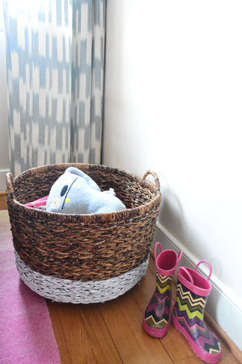
How do you guys mix and match things at your house? Do you prefer to only have one or two patterns in a room? Do you layer in a bunch? Are some bolder or larger in scale than others? I remember when I heard Sarah Richardson say that she usually uses around 10-14 fabric textiles in each room and it kinda blew my mind (in the best way possible). In fact she’s definitely one of my inspirations, right along with Clara and her enthusiastic color-palette-picking, art-making, animal-loving, and curtain-choosing ways.
Psst- Kristi, who commented right under Cappy’s question, shared this link from Ralph Lauren with ten tips for mixing fabric patterns, and it’s definitely an interesting read as well. Happy print and pattern mixing to one and all!

Madhukeshwar Anakal says
Another nice post from the author, keep up the work. I really love the way you have arranged the things. The combination and pattern mixing has done with curiosity. All doing this needs a lot of time, but i love this creativity. Color sense and simplicity is also a very factor.
Desiree C. says
First of all, Clara is obviously a genius. The room looks great and I think it’s so much more special that you two have been so welcoming to her creative thought process and preferences to create her own big girl room. :)
Secondly, this post couldn’t have come at a better time. I’m currently hitting an oh-my-gosh-am-I’m-making-a-mistake panic with our bedroom. Though I love how it’s progressed, I worry that I’m headed towards getting myself stuck, but I think I may be in the middle where it makes no sense. I just spend $90 on two adorable, solid-cherry/vintage bedside tables that clash with the mocha-colored faux-leather of our head/foot board and I’m scared I’ll be unable to get the different furniture pieces (and oak wood floors) to flow. Our walls are painted “Country Mist” by Behr (very light, warm blue), and our curtains have a slight cream color in them some navy, teal, and warm greens)–I’m thinking of painting the side tables a light cream color to pull out that neutral tone more…hopefully it works?
Sorry that was so unbelievably long.
YoungHouseLove says
I think it sounds gorgeous! Good luck Desiree! You’re right about the middle making no sense, but on the other side you’ll see it all come together hopefully!
xo
s
Alison says
I too am in the minority. I don’t think the blues fit in. Glad you all like it cause that’s what matters.
YoungHouseLove says
For some reason the navy photographs oddly (the lamp, sheets, frames and curtains are all the same navy tone- but on film some look black while others look royal blue). Come on over and see them in person :)
xo
s
Richelle says
This is so helpful… I am terrified of A) patterns and B) making a mistake. So there is exactly 1 patterned item in each room of our place. Maybe I just need to force myself to push a little farther out of my solid-color shell. You know, add 2 patterned things to each room. lol.
YoungHouseLove says
Haha, you can do it Richelle!
xo
s
Callye says
I’m a recent follower of y’all’s blog (I’m from Austin, so please excuse my excessive use of y’all), and I get more obsessed with this room every time y’all post something about it.When you first showed us the paint color, I must admit I was let down… as I was looking forward to an exciting, bold color. But wow, it looks perfect now! And I love that the rug was flipped around–it looks nice and balanced that way. And the birdcages are amazing. And everything else, really. Awesome job!
YoungHouseLove says
Aw thanks Callye!
xo
s
Jenny says
Awesome post, thank you! I’m on the bandwagon of not really having seen the vision at the start, in part because I don’t much like pink, but I love how it’s come together. This photo line-up really brought home how many different prints there are going on, and how awesome they all look jumbled up together. Thanks for the food for thought!
YoungHouseLove says
Aw thanks Jenny!
xo
s
Natalie says
So sorry if this info is elsewhere in your site, but what is the name of the paint color in Clara’s big girl room? Love it! Thanks!
YoungHouseLove says
Thanks! It’s Alaskan Skies by Benjamin Moore (we did an eggshell finish in their no-VOC Natura paint).
xo
s
Sandra @ The House Of Bing says
I love the mix of patterns. For so long, we have had neutrals and whites as the rule, it’s nice to see a happy and vibrant room designed for a happy and vibrant kid.
YoungHouseLove says
Aw thanks Sandra! Clara has definitely inspired us to embrace more color!
xo
s
Natalie says
Love that paint color but cannot afford Benjamin Moore… I noticed you had a lot of BM colors matched with Olympic paint in other rooms. Is there a reason why you didn’t do that in this case?
YoungHouseLove says
Back in 2011 we used Benjamin Moore paint for our office cabinets and then used it again for our kitchen cabinets (we really wanted them to hold up forever and it’s famous for having long-lasting durability as well as great coverage) and then we started using it in rooms too (our hall bathroom, Granny’s bathroom, our master bathroom, our bedroom, etc) because that coverage is addicting! In the sunroom we painted a brick wall in two coats (using Olympic paint in our first house it took four coats!) so after we started using better paint it was hard to go back to cheaper/thinner stuff. I would definitely go for less expensive paint if you can’t afford Benjamin Moore, but if something takes you 3-4 coats you might actually need to buy more of it than the more expensive stuff, which tends to have better coverage. Hope it helps!
Jess says
Hi YHL!
Love the bog, really takes the scary out of DIY. I’m in an apartment, don’t know how long I’ll be there, and am constantly conflicted about how much time/effort I should spend on the place. I don’t want to be living in a drab apartment, but at the same time don’t want to spend that much time just to move away.
Could you do a post with advice for renters (maybe you already have one) – around diy/home-ifying/decorating apartments?
Jess
YoungHouseLove says
Oh yes, check out this category on our Projects page for lots of inexpensive art ideas (it’s a great way to personalize your space) and there are also easy upgrades like hanging curtains (Ikea sells them for $6 a panel!) and getting some inexpensive pillows from Target or HomeGoods or even making them with no-sew hem tape! Our Projects page has hundreds of other low cost ideas, so just scroll through and see what you like :)
xo
s
Lindsay says
Hey John and Sherry!
My question is kind of related to Jess’s post, so I thought I would stick it here. I’m currently living at home (and enjoying the snow day!, and while I don’t plan on being here forever, I don’t really have a definite move date. That being said, my decor-happy, DIY self would like to start redoing my room to better suit my needs (build a headboard, find a filing cabinet, maybe even re-vamp a thrift store dresser!, etc. etc.), however practical concerns arise – such as, why should I invest time and money into items only suited for this temporary space. Any advice?
Thanks for all your help! Love your blog like Katie Bower loves bacon! :)
YoungHouseLove says
I would do stuff you can take with you anywhere (refinish cool thrift store furniture, make some homemade art, get curtains you can take with you, etc). That way no time is wasted since it can go with you, but it’ll make your room feel awesome in the meantime.
xo
s
Tara says
I love this post because it makes it seem so doable for people like us!! On another note – you’ve probably mentioned this somewhere but I cant find it. I’m wondering how much you paid for the chevron blanket on the daybed!!
YoungHouseLove says
Ooh good question – I got it from Joss & Main but their prices tend to go up and down. Maybe I paid $80 with free shipping? It was before the holidays I think!
xo
s
Janelle says
I am quite literally near pulling my hair out trying to find a rug for our living room. Modern rugs in Navy/Ivory/Green are impossible to find in Eastern Canada. Overstock ships to Canada but for a crazy high premium. I’m keeping on the hunt!
YoungHouseLove says
Oh no, hope you find it soon!
xo
s
Colleen says
Hi Janelle, I suffer from the same problem as you do with shipping on generally everything and anything I am looking for, that for some reason tends to always be out of Canada… I recently ordered a rug from rugsusa and the shipping was really fairly priced. I haven’t receieved it yet but it’s only been a week…so I will find out soon what the damage is for duty *fingerscrossed* …always the downfall of online shopping for me. And yet it doesn’t stop me. Good luck with yours, but check out that site if you haven’t!
Maggie says
When decorating my own place, things just kind of happen over time. But when i’m coming up with a plan for a design client, I loosely follow my rule of “one-of” – meaning at least one of a floral, a stripe, a small scale pattern (like dots), a geometric, and an organic (something free form, like an ikat or tie-dye). It’s a great jumping off point. I also learned my lesson early on that layering tones of your signature colors looks much more natural than having ONLY one shade of blue and one shade of brown, etc. Like you have lots of shades of pink and orange.
YoungHouseLove says
Really smart!
xo
s
candice Q says
Hi Sherry,
What happened to the framed poncho? It looked so cute!
xoxo
Candice
YoungHouseLove says
It’s in there! It’s over her play kitchen on the wall to the left of her floating flash card shelves. You can see it in this post: https://www.younghouselove.com/2013/02/mwah-hah-hah/
xo
s
Krystle @ Color Transformed Family says
I think the key to mixing and matching so much is just to make sure there is always something tying it together. There is definitely enough red and pink in this room to do that. I look forward to Clara actually moving in and letting us know what the room is like firsthand.
Needle little Balance says
To me your color choices made sense when I saw the paint chip art. Then it suddenly clicked and I thought – that might work. The result is even better than my umagination and I’m learning a lot about mixing pattern here.
Jackie says
wow that collage of snapshots is great validation of the design decisions you’ve made! sometimes it is helpful to take a step back, but in this case, it may also be helpful to get in close to see it all come together. will keep this in mind as i design and style my home, thank you!
Tish says
I’m sure you’ve mentioned this somewhere before, but I keep wondering where you got Clara’s blanket. It looks really soft.
YoungHouseLove says
Thanks! It’s from Joss & Main a while back. So warm and cozy (it’s knitted).
xo
s
Emily says
What I’ve FINALLY figured out is how important it is for me to love pretty much everything I put in a room…even if that means it takes a year (or more) to “finish” (is it ever finished?). That way, even if it’s not textbook-perfect, I’ll love it anyways.
Also, I usually start with a gut-instinct vision for a room…I find if I veer off that (usually to do something more trendy) I end up not liking it after a while. Go with your gut.
Lastly, big pieces (walls, furniture, large rugs) neutral, then pattern-up with easily changeable pieces (curtains, pillows, small rugs).
Everyone has their own system and if you love it, it’s a good system :)
Mary | lemongroveblog says
I’m totally trying to get better about mixing ans matching around the house. I absolutely love the look of layered patterns/colors/textures, but it can be hard to get the right combo sometimes. I go with a trial and error method ;)
Leigh says
I so needed this! My biggest problem is mixing patterns. My husband says I overthink things. Maybe that’s the problem and I need to be more free-spirited about my pattern mixing. I guess I should take a cue from my 20 month old son who has no problem pairing stripes, chevron, animal print and polka dots!
YoungHouseLove says
Haha, it’s true! Kids have the best eyes for color and pattern!
xo
s
Maribel says
I’m on a mission to paint my room gray…I’m at a stance come to realize gray is not just gray. I’ve come across blue gray, purple gray and green gray. I walked into my nearest Benjamin Moore store they are really helpful in there. I looked at moonshine and grayhorse and they looked green to me. How did you come to choose your grays.
YoungHouseLove says
We just brought home a ton of swatches and held them up to see what read as gray in our lighting!
xo
s
Elise says
I’m terrible at mixing colors and patterns, whether it be in my home or in my wardrobe, I need set organized rules (which I know doesn’t work really). My sister is amazing at it (that’s why she’s the one planning on going to school for interior design and I’m the administrative assistant/event planner). Also I love how you used the word “compete-y” more than once, but would that be “competitive”? haha
YoungHouseLove says
Haha, yes!
xo
s
Kathy S says
Has Clara moved into her big-girl room yet? It has been sounding like she’s getting close but she’s not quite spending the night there.
YoungHouseLove says
That’s still the case – lots of playing and pretend sleeping in there but every night she still wants to be in her crib so we’re following her lead :)
xo
s
Emily says
It looks like the comforter is the base pattern. Is bold, it includes all the colors and it’s large (not a pillow). I am finally taking a page out of your book and going big and bold with color and pattern in our living room of our new rancher.
Too bad the sequester is putting all spending and projects on hold. Fingers crossed that is over soon! Momma needs to design!!
laura says
OK, so I’m sitting in my boring flat living room, and the 10-14 different textiles comment has me baffled…and inspired. I have: 4 maybe? Furniture, carpet, pillows, curtains…. aside from more pillows, where do I go next to get to 14? And yes, all furniture is the same: one of those buyer’s mistakes that still needs to be fixed!
YoungHouseLove says
I would definitely layer in a few more pillows (not all matching, of complementary colors and tones) and then perhaps add a faux sheepskin draped over a chair and a throw on the sofa? Even a frame on the coffee table with a patterned inside (be it fabric or just a painted pattern) could layer in there along with some textured/patterned art!
xo
s
Ash says
It makes me happy to see rooms that aren’t matchy-matchy with the furniture finishes. :) My little girl actually has a white crib and rocker with a wood dresser and set of bookshelves. The wood furniture is heirloom…meaningful pieces trump coordination in my book! Plus mixing it up makes a room feel so much more real and personal.
YoungHouseLove says
Amen!
xo
s
Luz says
Can i take any of those? lol
I love all OMG I’m gonna copy it and make my place so pretty.
Needle little Balance says
From one pillow addict to another: just had to tell you that last time at Ikea I saw this pillow with a flamingo. It totally made me think of Clara´s room with the little flamingo cards and the other flamingos you framed once. It´s called Springkorn. Maybe she´d like it?
http://www.ikea.com/de/de/catalog/products/10242433/
YoungHouseLove says
LOVE IT!
xo
s
Tommie says
Now that’s a very aesthetically-pleasing room, a true eye-candy. Thanks for the tips. I really learned a lot from those three paragraphs.
Warren says
I love what you have done to your home! I have to keep my wife away from sites like these :) “Gives her too many ideas”
Jackie K. says
This has nothing to do with Clara’s big girl room (although I’m loving the way it’s turning out).
I came across this link on the internet and I thought John’s map-lovin self would be into it. Not sure exactly how accurate it is, but still fun to look at: 38 Maps You Never Knew You Needed – http://www.buzzfeed.com/awesomer/maps-you-never-knew-you-needed
YoungHouseLove says
So cool!
xo
s
Rachel says
So cute! I love this room and the color mix! The red accenting is so cheery. It’s beautiful. I often use the website Design Seeds http://design-seeds.com/ for color inspiration! So many combinations that I would never think about using together.
YoungHouseLove says
Sounds cool! Will have to check it out!
xo
s
Meg Thompson says
I love how Clara’s rooms, and your home for that matter, seem to be so well organized. I have a 3 year old step son and his toys seem to be everywhere. Seriously. His room is small and has virtually zero storage space built in, world’s smallest closet for sure. We have a 9 cube shelf thing but it doesn’t seem to even tackle half of the problem. And our poor living room! All of his “downstairs” toys are thrown into a basket…making the space seem unorganized. Any advice on how you keep Clara’s toys throughout your home while still keeping the house stylish?!?
YoungHouseLove says
We try to give her different zones just because it seems to hold her interest more (change of scenery is nice to keep her from getting wild/restless) and it also means we don’t have a giant pile of toys all mixed up on the living room rug. So by putting her play kitchen in one area with all the fake food and her dollhouse with all of the furniture in a completely different room (and a basket of toys in the living room, her bedroom, etc) it seems to help keep things categorized together and from getting all jumbled and messy. Hope it helps!
xo
s
cappy says
Thank you so much for this post!!!! Ok I have major chills (I know sounds dorky) but the last couple of days I have been playing Sir Mix Alot (baby got back) for my 3.5 y/o, along with I like to “move it move it” and we have a little dance off. The post and title for me were priceless!
YoungHouseLove says
Haha!
xo
s
nad says
I am a little surprised to see that you did not involve a picture of the poncho to show how the colors tie in
Personally I feel the colors of the poncho slightly clash as nothing else in the room has those colors. Could you kindly explain? Or did you hang it just for sentimental value?
Thanks! xo
YoungHouseLove says
Oh yes, there are dashes of greens in the room, (in the Love You More print, the wooden stacking tree on the desk, the play kitchen, and many of the stuffed animals and toys in the closet & bins, etc). I just had 100 things in the room and chose the most prominent things for the grid. So since green was just peppered into the room, it wasn’t the focus very much. But I truly believe that in a kids room any color of the rainbow can layer right in, you just have to choose a few to focus on for the more bold items so things tie together a little bit. Personally I don’t think art ever has to match, so a room full of white can have bold art and a room full of reds and pinks can have a big blue painting :).
xo
s
Alex says
Thanks so much for your link to Top Ten Tips for Mixing Fabric Patterns at http://www.home-decorating-and-staging.com/top-ten-tips-for-mixing-fabric-patterns.html.
Mixing patterns is a lot of fun and really not complicated when you know the steps to making it work. Love your blog and cute ideas!
Colleen says
Love to see how nicely it’s come together, and so grown up! Came across a fun fabric that reminded me of the palette in the big girl room, Premier Prints See Saw Flamingo.. (decently priced!) All the best
YoungHouseLove says
Sounds cool!
xo
s
Nef says
Love this room, and it is very inspiring, especially since I am working on a pink and red room for my daughter. I know the rug is from joss, but do you know the maker? Love it.
YoungHouseLove says
There’s a tag under it that says Varanas if that helps (it also says NuLoom, so maybe that’s the type? company? not sure!). Hope it helps!
xo
s
Julie says
Where did you get the clock? Love,love,love
YoungHouseLove says
That was from Hobby Lobby a while back, but I’ve seen something similar at Target and TJ Maxx :)
xo
s