First lets rewind to this post where I said “As for if the bed can move, the floor plan of this room is a definite challenge thanks to “things” on each wall (two very off-centered windows, a nook across from the door, and a nook with the sink tucked into it on another wall – and a chandelier in the exact center that looks off if the bed isn’t in the right place). So we’ve tried the bed in a bunch of spots, but the place that works best for us is where it lives now (it’s the only long flat wall in our entire room).”
Well, after seeing a few inspiring glossy mag photos, we decided it might not be the weirdest thing in the world for the bed to be right next to a window. See, moving the bed would do one major thing for us: allow us to ditch our sadly-too-small-for-our-giant-room side tables (which we couldn’t do on the old wall where they lived, since the door would swing open and hit anything larger).
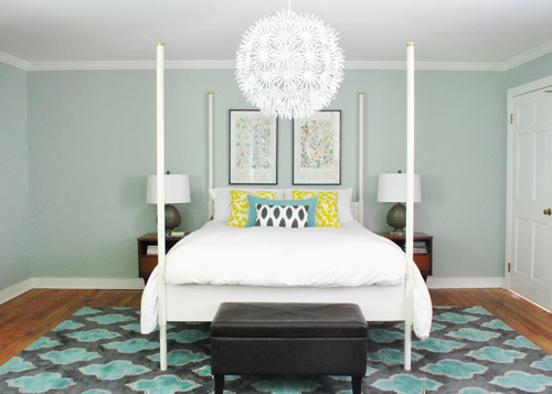
So although we weren’t 100% sure how we’d handle the odd nook to the right of the bed and the window that would nearly touch the bed on the left, we just decided to go for it and see what we could come up with. But before we moved anything, we got new curtains from Ikea for $5 a pop (Vivan panels, which are our favorites from our first house). They come two per pack for $9.99, and aren’t super heavy or super sheer, just sort of breezy and light – which we thought this room could use since it has a big dark rug on the floor (and we’d eventually love to stain the wood floors a dark mocha color).
They definitely layer right in and add some softness (we hope to reuse the old green curtains I made in the playroom). Didn’t hem the new guys yet though- but I probably will someday. Haha.
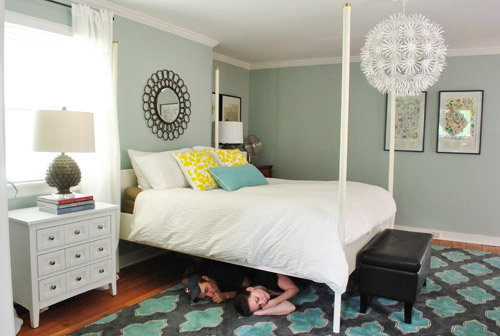
Then it was time to move stuff around. First we removed our insanely heavy organic mattress (which can best be described as the equivalent of lifting 50 dead bodies, not that we’d know…) and then we slowly inched the bed over to its new spot across from the doorway (so you can walk at least ten steps into the room instead of three before slamming into the side of it, which happened in its old position by the door).
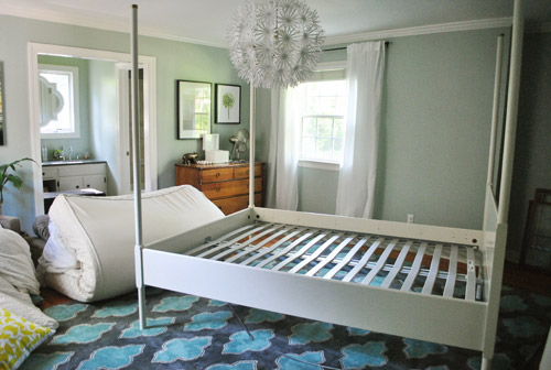
Next we shimmied the rug into position under the bed in its new spot before nearly blowing a gasket moving the mattress back onto the bed in its new spot. It still looked really really weird.
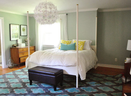
I was excited to start moving some other furniture around, but John had to duck outside to work on some deck stuff and Clara was napping so you know what I did, right? That’s right, my 5’2″ self got it done on my own. Haha. I hauled our dresser into the nook to act as a much larger bedside table and then stared at the blank space under the window on the other side of the wall for a nice long time while I caught my breath. It wasn’t functional to give up a night table and we definitely appreciate the balance of having two bedside lamps (especially along a wall with an off-centered window and an odd corner nook without any sort of symmetry going for it at all).
So I literally walked around the house (avoiding the nursery so as not to wake the dragon Clara) to see if there was something we already owned that I could bring in to use as my bedside table under the window. Sure enough, my eyes rested on this guy who has been hanging out in the dining room:
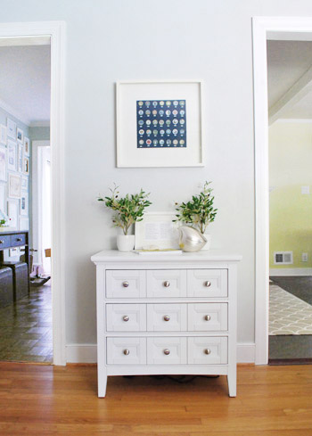
The funny thing is that this cabinet is actually meant to be a bedside table, so here I was thinking I was being a rebel to stick it in the dining room, only to drag it into the bedroom and realize that I loved it under the window. Don’t get me wrong, I loved it in the dining room too, so for one of those places we’ll have to grab something else (it might just be a placeholder in the bedroom and we’ll get another table and return it to the dining room eventually – or vice versa). Update: Folks are asking if the chandelier is still centered over the bed, since it’s hard to tell from this angle. Thankfully it’s still perfectly centered! If the nook were a foot wider this arrangement wouldn’t have worked – and if we had a king-sized bed instead of a queen it would have been no dice! Whew.
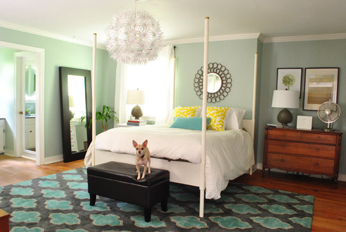
Then I hung the art that used to hang above the dresser in the nook, and put up an old oil-rubbed bronze mirror over the bed – which used to hang in our living room, but was replaced with a white mirror about six months ago. It added a little more “something” to the big blank wall above the bed, but we’re thinking that down the road we’d love to make a big upholstered headboard for that area and maybe move the mirror up so it’s closer to the height of the big round chandelier in the middle of the room since we think height in the center of that wall might be really nice and will further disguise the fact that our bed is jammed between an awkward nook and an oddly off-centered window.
Here’s Burger stretching. That is the only reason I took this shot. Cracks me up. I actually really liked the smaller white table on one side with a larger wood dresser on the other side since they both seemed to fit into those spaces well and the matching artichoke lamps added some nice balance. Ideally the white night table would be a bit taller so both lamps would be at the same height, but for now I just grabbed a stack of books to add some height to that light on my side of the bed. Maybe down the line we’ll add castors or little legs to give it a bit more lift, but for now it does the trick.
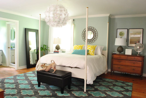
Moving that art into the nook to sort of balance the window on the other side of the bed seemed to make an instant difference since that nook no longer looked like a big blank wall, and the two frames felt rectangular and balanced with the window on the other side of the bed (admittedly more so in person since the window is blown out in this pic, but is very easy to see in real life).
I also mentioned that I dragged the leaning mirror from across the room to where the wood dresser used to be, which seemed to add even more balance to the new setup since it was a nice shot of dark wood next to the white nightstand to tie into the wood dresser on the other side of the bed. We had that guy anchored on the wall so Clara can’t pull it down on herself, but thankfully the system just uses cable ties, so we were able to reuse the same system with two new zip ties in its new spot (you can see how the whole anchoring thing works here).
Here’s another view of things. Of course those two botanical frames look crazy on the wall with no bed under them, so we’re planning to rehang them in the corner of the room that’s on the other side of the sink nook (not pictured, but there’s a chair and a side table over there). And then anything from a cabinet or console to a large piece of art could end up on that wall someday. But this view definitely looks extra weird since it’s so unfinished on that back wall.
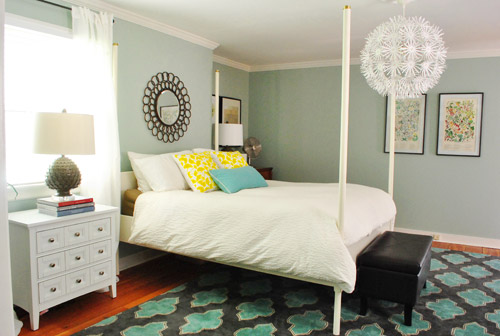
At this point we were tired but hopeful. It still looks kind of crazy to us, but not bad for about an hour of work. And we definitely have bigger plans to help it make more sense over time, so we’ll keep you posted. In the meantime, here’s Exhibit A that we’re dorks for life. Yes, we had the tripod all set up so we took a moment to pretend to be angry monsters under the bed. Although looking back John just looks like a mischievous kid and I look like a sullen teenage vampire.
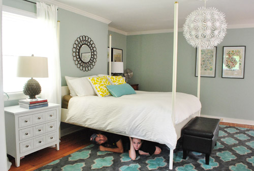
Then we pretended to sleep. Totally normal, right?
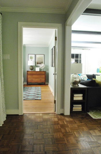
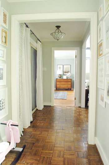
Then we thought we were done taking pictures, but later that night we found ourselves standing in the hallway – just marveling at the new view.
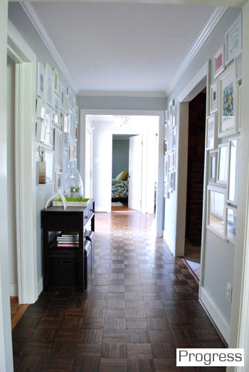
We couldn’t find a recent pic of the old view into the bedroom, but this is one from over a year ago, just to give you an idea of how the side of the bed was sort of the only thing you’d see before:
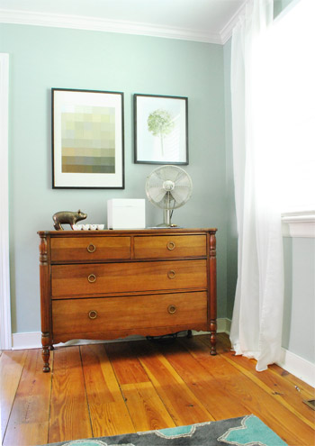
Now instead of seeing the bed, there’s just a straight shot into the room with the dresser in the nook. It’s actually really nice not to see the bed from the hall anymore, and the nook looks a lot less weird and bare when there’s actually something in it.
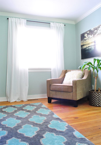
So that’s where we landed after a few hours of bedroom noodling. Although I must admit that we did something a little more DIY-heavy after this little furniture-move-a-palooza, so we’ll share those details this afternoon (just have to upload the pics and write the post). In short: we’re getting somewhere, but we’re definitely not completely there yet (but what else is new around here, haha). More soon!

laura says
Love the rug. And the colors. It’s all very calming and yet sort fun too! So not ready to tackle our bedroom, though this provides much inspiration…
Taunya Hagen says
WOW! That looks fantastic!!! Its more visually interesting.
Stacey says
Looks great!! I like how you balanced the wall space. Great bed. Mind sharing where you got it?
YoungHouseLove says
That’s Ed the bed from Ikea (formal name: Edland). Hope it helps!
xo,
s
Megan Elizabeth says
Sadly, Ed the bed is no longer sold in stores :( I had wanted it since before John and Sherry bought it, I finally decide to go buy it and poof!! No longer exists. I’m still grieving.
YoungHouseLove says
I can’t believe they stopped making Ed! He’s a classic!
xo,
s
Karen says
John and Sherry,
If you do end up making a new headboard you’ll have to auction off your Ed! Seems like there would be plenty of takers.
YoungHouseLove says
We actually have a plan to keep Ed and add a headboard! Here’s hoping we can make it happen in the next few weeks!
xo,
s
Katie says
I really like the bed turned this way! I think the whole room looks more balanced.
Mindy says
Good work guys! This arrangement gives your room more character. Now to get used to sleeping in a different place in the room, right?
YoungHouseLove says
Haha, yes! It’s so weird to wake up and think you’re facing the other direction, only to not see the window above the sink!
xo,
s
Jess @ Little House. Big Heart. says
It is weird! We’re sleeping in our guest room right now while we work on our bedroom and it’s so strange to wake up thinking you’re in your bedroom only to realize you’re in a completely different room!
I love the new arrangement. The room looks so much more balanced now!
YoungHouseLove says
Haha, exactly! It’s like you open your eyes expecting to see one thing and then you’re like “what? where am I? oh, just turned 45 degrees, hahah”
xo,
s
Riki says
I like it! I think you hit on an important part – things can look balanced even if everything isn’t symmetrical.
That really is a challenging floorplan to deal with. You guys are doing a great job!
Katrina @ 'Sota is Sexy says
Love this! That rug is totally incredible…so glad you added it in there–it’s a perfect fit!
Shannon says
I think it looks great! I love the shot from down the hall…
Ashleigh says
It looks great, I’m not sure which way I prefer but I’m all up for change. When I was younger I would spend weekends moving my bedroom around for fun!! :-) xox
Leanne says
SO much better!
Molly@TheNestingGame says
It definitely makes the room seem more majestic, making the bed more of a focal point you can see from a wider viewpoint.
(We did the same thing moving our guest room bed from the right of the door seen here to the center of the long wall seen here.)
Would y’all ever consider making the nook a built in? That way, whoever sleeps on that side would have a shelf within reach? (I’m thinking John since he has longer arms. Ha.)
YoungHouseLove says
We have thought about that as well, but just love how the dresser looks tucked in there for now. Who knows where we’ll end up!
xo,
s
Suni says
I think it looks beyond great, and I love the new view down the hallway even more. I still drool over your new rug… so in love with it.
Kristen @ Popcorn on the Stove says
I agree! I like this layout a million times more – and that when you look in the doorway, you see more than just the bed (the dresser all set up is much more interesting visually).
emily says
YES! It looks wonderful, guys! I especially love the view from the hallways. It really makes a difference in the “feel” of the house (from pics anyways).
Annnnnd now I’m going to go move some furniture around :)
Melody says
We recently moved the furniture around in our bedroom as well! Moving furniture is definitely the cheapest way to give a new feel to an old space. Loving your new look!
tiffany says
Love the changes. Can’t wait to see the tweaks!
Jess @ life, happily ever after says
I love the bed on that wall! It makes a huge difference. I can’t wait to see what you DIY’d!
Kami says
I love it!!
Trela says
You know, I never even noticed the nook… the bed did a good job of hiding it, but in person I’m sure it’s way more obvious. Agreed, the hall shot is MUCH nicer now, and now it doesn’t look like you’re just waiting for better night tables to fill the space, the room looks completely intentional. Happy accidents!
Nicole says
You guys… I love this! The room definitely looks more put together now that the side tables fit the scale of the room a bit better. And I also love the new view from the hallway. And I can’t wait until you refinish the floors… great work!
Christine says
I think the room looks much more cozy this way. I really like it!
Vidya @ Whats Ur Home Story says
Love it….Now all I can think of is, Why didn’t you think of that earlier? :) Can’t wait to see what you are going to do tot that big wall with the botanical prints. I think that might be tricky as I like the new view from the hall way. Putting any piece of furniture there would block the nice dresser view, right? What happened to the horse print?
YoungHouseLove says
That’s in the playroom, but we’re definitely planning to just keep tweaking and see where we end up! Will share the details as we go for sure!
xo,
s
Kim says
It looks awesome! Doesn’t even look like there’s a bed in there at all from the hallway. I just LOVE rearranging furniture. It’s the poor person’s way to make it feel like you got new stuff! :)
Heather says
SO SO SO much better!! A hope chest would look brilliant under the botanical prints, or some sort of small bench. Great place to put magazines, extra pillows….just a thought?
YoungHouseLove says
Oh yes, we’re just keeping an eye out for anything that would work there (console, cabinet, large art, bench, whatever we see that we like!).
xo,
s
Taya says
I love this so far!!!
Nicole says
The best part… if you forget to or don’t make your bed right away and you have someone pop by–you don’t have to rush to close the door! : )
YoungHouseLove says
Haha- it’s true! Or if I’m sleeping in and John’s parents or a delivery guy comes to the front door, no one can look in and see me snoozing. Hahahaha.
xo,
s
Heather says
I love the way the room looks now! I wish my hubby would have like us moving our bed away from view in our room. Buger is so cute stretching!
E.Lefebvre says
I like it! I especially like that your bed isn’t in front of the door. I don’t know… I just don’t like when the bed is the first thing you see when you walk in a room. It seems less private or something.
Anyway… I had a thought. I don’t know about you guys… but we have PILES of books. What if you did some kind of built in bookshelf in the nook and then put a small table (like those round fern tables) or a cute chair in front for the night stand on that side. It would fill in the space and maybe balance the window?
But I do like the way it’s progressing :-) Clever use of your space!
YoungHouseLove says
We have definitely been planning to add a built-in to that nook the whole time we have lived here, but now that the dresser is in there we think it’s so sweet! At least for now. Down the road we totally could convert that to a built-in with the dresser across from the bed though! We’ll keep you posted!
xo,
s
Emily says
Cute! IMO, the art wall looks a little lonely and the spot above the wooden dresser could balance out the window more. WHAT IF… the art over the dresser moved over to the wall with the rest of the art, and a mirror was placed over the dresser? Too much?
YoungHouseLove says
We tried it a bunch of different ways (holding stuff up in a bunch of places) and this is just what we like best for now! Who knows where we’ll end up though!
xo,
s
gesikah says
I also had this thought (mirror over dresser in nook). I like it as is, but my initial thought was adding a big mirror with a fairly substantial white frame to balance the window.
YoungHouseLove says
Always another possibility down the line! We just worked with what we had on hand for this “phase” but goodness knows we’ll keep tweaking away and sharing the pics with you guys!
xo,
s
Amanda says
I love LOVE LOVE the view from the hallway.. it’s looking sexy.
And my oh my, I never REALLY REALIZED that your bedroom was thatclose to your living room. Haha.
(and yes I purposely didn’t had a space between those two words)
YoungHouseLove says
Haha, oh yes, it was thatclose!
xo,
s
Diana says
I like it better. Looks fab!!!!
Shilan A says
I love the change! It totally works :D Great job u guys!
Monika says
I actually love moving the furniture around the room from time to time, for a nice totally updated look without spending money. I think both ways your room looks fantastic and it’s great to enjoy it from many viewpoints :) The cliffhanger though? No fair!
my honest answer says
I’m really enjoying watching this room evolve! I started reading in May 2010, so your first house was at the stage of pretty before and after pictures already. It’s great to see how long (and how many goes) it takes to get everything just right!
YoungHouseLove says
Heck yeah! It takes years! Haha. We’re just now beginning to feel a little settled, but still eons away from where we’d love to end up!
xo,
s
Vidya @ Whats Ur Home Story says
Just saw the horse print. For some reason I thought you had two of those.
YoungHouseLove says
Yes, we did have two, but one’s in the playroom since we hung those other frames over the dresser a while back!
xo,
s
Cara says
It’s amazing what a little rearranging can do. I love the new layout,especially the dresser and artwork in the nook.
Natalie @ A Turtle's Life for Me says
Love it! We did something similar with our bedroom (that’s right off the kitchen! Gah!). I was so tired of standing in my living room and seeing nothing but bed. We thought for sure we couldn’t move it to the opposite wall because it would stick out over the windows, but with a little thinking (it takes a couple years for our brains to get warmed up), we made it work and I love it so much more now! Great job and I pretty much love everything in your room!
YoungHouseLove says
Hahaha- comment of the day for sure. It’s so true! It DOES take our brains a couple of years to get warmed up in a new house! Hahahahaha.
xo,
s
Julia @Chris Loves Julia says
I never realized (after all the house tours and photos whatiswrongwithme) that your bedroom was right RIGHT next to the family room. Crazy! Another reason why I just love new angles in photos. And new angles in the bedroom, too. I am not an expert in fang shui, but I do know that one of the big rules for bed rooms is to not have your bed in direct line with the door. So, you all should be sleeping much more peacefully now. ;)
Christi says
Yes! That looks awesome! For some reason your bedroom just didn’t click with me (not that you asked :) but I know LOVE it!!! Great job!
annabelvita says
Oh I loves it! Does the white bed post look weird in front of the white curtain? (I love the white curtains and the new angle, just wondering if this placement would encourage you to get your paint on).
YoungHouseLove says
It’s actually not too bad, but we’re not closed to the idea of painting anything – still just noodling to see where we end up!
xo,
s
Izzy says
So much better! That’s what we all meant when we suggested moving the bed before :-) Sometimes it helps to have outsiders’ eyes
Reenie says
I like it!! :)
Teri says
Love it!!! Looks great and I love the mirror over the bed, the dresser in the nook, and everything about it. So cozy and balanced.
Krystle @ ColorTransformedFamily says
I really like the new layout. Bedrooms look so nice when you see the bed head on when waking into the room. Of course we aren’t able to do that in our room though. I think this is a change for the better and like the mismatched end tables. I wish all our furniture wasn’t the same collection. Oh, well.
heather says
Ahh it just *feels* better with that view! I love it. On another note – I never thought I’d say this but thanks for the “structured” posts everyday. I was just informed last night my position is being eliminated at my company come September…and we just ripped part of our house apart (and we have to put off what I emailed you about which is insanely disheartening more than I can explain). We just sat there side by side last night staring at the side of the house with the siding ripped off in complete silence.
No idea what we’re going to do. Crazy. If only I could somehow find a way to make a living homesteading, blogging and making soap. Bah.
YoungHouseLove says
Oh Heather! I totally feel for you and I’m sending you lots of love! That’s so hard, but your blog is awesome! I know it probably won’t happen overnight, but know that if you keep at it I’m sure your site will grow! We never thought we’d be here five years ago- so anything really is possible!
xo,
s
heather says
Thanks, Sherry. I appreciate it. It’s so hard because as much as one wants to truly go for it and take this crazy leap of faith – it’s just not fair when you see the stress on the face of the person you love most in the world, and know that if you do it, it’s going to seriously set back BOTH of your dreams. For now I think it’s time to find another full time job closer to home, and then see where things take us. Thank you for your thoughts.
YoungHouseLove says
Aw, best of luck with everything Heather! Keep me posted!
xo,
s
Lisa@wanderdownpennylane says
I have a slight addiction to moving furniture around in our house as well. Glad you went for it! I really can see the potential of that finished space. Now I kinda wanna change our bedroom around…
Emiles says
great that you don’t walk straight into your bed now (ooo privacy) love the new view from the hallway but it really made me want to see your chair there! the bedside table could double as the little table for the chair too!
YoungHouseLove says
I actually tried the chair in and nook and we didn’t like it! Just looked like a weird little time-out corner in the nook (go sit in the nook, you were a bad girl – haha). Who knows where we’ll end up though!
xo,
s
Emiles says
BAHAHAHAHAHAHAHA i offically need one. for my husband. go sit in the nook, you were a bad boy! YES!
uzma says
Wow …. waitinggg for more … i was thinking sumthing by considering second inspiration (blue/white) what if you put just curtains on the otherside of bed to make symetry (spell??) , then lamps on both sides …… it can give you some hidden storage??
YoungHouseLove says
We actually thought about that, but like how the dresser and the art look in the nook for now. Might do built-ins down the line, but curtaining the nook just didn’t feel like the right choice for us after we thought about it a while (I think we prefer crisper shelving or built ins or just treating the nook like a wall by hanging art and adding the dresser). Hope that makes sense!
xo,
s
yadira batres says
it looks really good guys,
I think I makes the room look less empty and more cozy.
and I like how it looks of the hall way, if people haven’t been to your house they couldn’t tell that was the bed room from there, I think.
great job.
Tamryn says
love the change, looks great.
meghan says
how does the ikea light work with the new set up? is it centered in the room?
YoungHouseLove says
Yup, miraculously it’s still centered on the bed in that new spot. If the nook had been a foot wider it wouldn’t have worked! Whew.
xo,
s