First lets rewind to this post where I said “As for if the bed can move, the floor plan of this room is a definite challenge thanks to “things” on each wall (two very off-centered windows, a nook across from the door, and a nook with the sink tucked into it on another wall – and a chandelier in the exact center that looks off if the bed isn’t in the right place). So we’ve tried the bed in a bunch of spots, but the place that works best for us is where it lives now (it’s the only long flat wall in our entire room).”
Well, after seeing a few inspiring glossy mag photos, we decided it might not be the weirdest thing in the world for the bed to be right next to a window. See, moving the bed would do one major thing for us: allow us to ditch our sadly-too-small-for-our-giant-room side tables (which we couldn’t do on the old wall where they lived, since the door would swing open and hit anything larger).
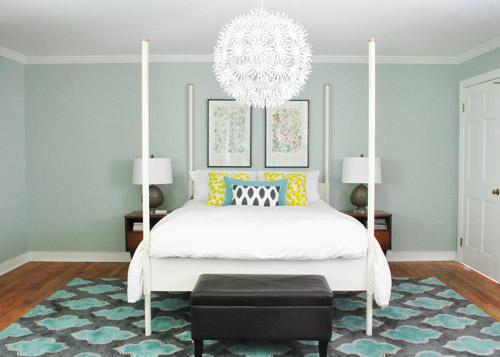
So although we weren’t 100% sure how we’d handle the odd nook to the right of the bed and the window that would nearly touch the bed on the left, we just decided to go for it and see what we could come up with. But before we moved anything, we got new curtains from Ikea for $5 a pop (Vivan panels, which are our favorites from our first house). They come two per pack for $9.99, and aren’t super heavy or super sheer, just sort of breezy and light – which we thought this room could use since it has a big dark rug on the floor (and we’d eventually love to stain the wood floors a dark mocha color).
They definitely layer right in and add some softness (we hope to reuse the old green curtains I made in the playroom). Didn’t hem the new guys yet though- but I probably will someday. Haha.
Then it was time to move stuff around. First we removed our insanely heavy organic mattress (which can best be described as the equivalent of lifting 50 dead bodies, not that we’d know…) and then we slowly inched the bed over to its new spot across from the doorway (so you can walk at least ten steps into the room instead of three before slamming into the side of it, which happened in its old position by the door).
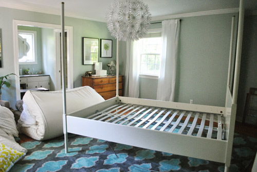
Next we shimmied the rug into position under the bed in its new spot before nearly blowing a gasket moving the mattress back onto the bed in its new spot. It still looked really really weird.
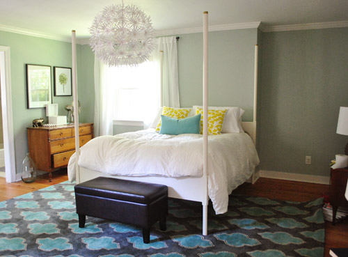
I was excited to start moving some other furniture around, but John had to duck outside to work on some deck stuff and Clara was napping so you know what I did, right? That’s right, my 5’2″ self got it done on my own. Haha. I hauled our dresser into the nook to act as a much larger bedside table and then stared at the blank space under the window on the other side of the wall for a nice long time while I caught my breath. It wasn’t functional to give up a night table and we definitely appreciate the balance of having two bedside lamps (especially along a wall with an off-centered window and an odd corner nook without any sort of symmetry going for it at all).
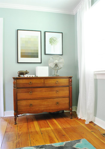
So I literally walked around the house (avoiding the nursery so as not to wake the dragon Clara) to see if there was something we already owned that I could bring in to use as my bedside table under the window. Sure enough, my eyes rested on this guy who has been hanging out in the dining room:
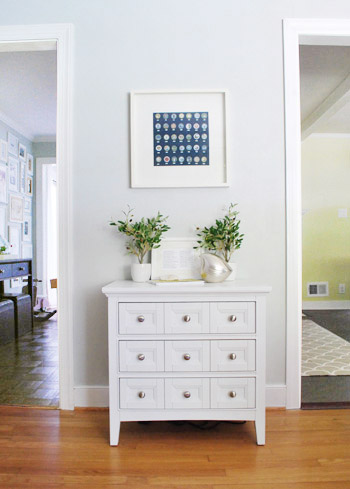
The funny thing is that this cabinet is actually meant to be a bedside table, so here I was thinking I was being a rebel to stick it in the dining room, only to drag it into the bedroom and realize that I loved it under the window. Don’t get me wrong, I loved it in the dining room too, so for one of those places we’ll have to grab something else (it might just be a placeholder in the bedroom and we’ll get another table and return it to the dining room eventually – or vice versa). Update: Folks are asking if the chandelier is still centered over the bed, since it’s hard to tell from this angle. Thankfully it’s still perfectly centered! If the nook were a foot wider this arrangement wouldn’t have worked – and if we had a king-sized bed instead of a queen it would have been no dice! Whew.
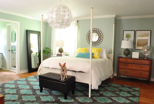
Then I hung the art that used to hang above the dresser in the nook, and put up an old oil-rubbed bronze mirror over the bed – which used to hang in our living room, but was replaced with a white mirror about six months ago. It added a little more “something” to the big blank wall above the bed, but we’re thinking that down the road we’d love to make a big upholstered headboard for that area and maybe move the mirror up so it’s closer to the height of the big round chandelier in the middle of the room since we think height in the center of that wall might be really nice and will further disguise the fact that our bed is jammed between an awkward nook and an oddly off-centered window.
Here’s Burger stretching. That is the only reason I took this shot. Cracks me up. I actually really liked the smaller white table on one side with a larger wood dresser on the other side since they both seemed to fit into those spaces well and the matching artichoke lamps added some nice balance. Ideally the white night table would be a bit taller so both lamps would be at the same height, but for now I just grabbed a stack of books to add some height to that light on my side of the bed. Maybe down the line we’ll add castors or little legs to give it a bit more lift, but for now it does the trick.
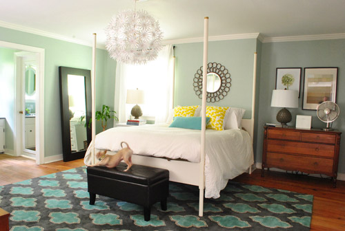
Moving that art into the nook to sort of balance the window on the other side of the bed seemed to make an instant difference since that nook no longer looked like a big blank wall, and the two frames felt rectangular and balanced with the window on the other side of the bed (admittedly more so in person since the window is blown out in this pic, but is very easy to see in real life).
I also mentioned that I dragged the leaning mirror from across the room to where the wood dresser used to be, which seemed to add even more balance to the new setup since it was a nice shot of dark wood next to the white nightstand to tie into the wood dresser on the other side of the bed. We had that guy anchored on the wall so Clara can’t pull it down on herself, but thankfully the system just uses cable ties, so we were able to reuse the same system with two new zip ties in its new spot (you can see how the whole anchoring thing works here).
Here’s another view of things. Of course those two botanical frames look crazy on the wall with no bed under them, so we’re planning to rehang them in the corner of the room that’s on the other side of the sink nook (not pictured, but there’s a chair and a side table over there). And then anything from a cabinet or console to a large piece of art could end up on that wall someday. But this view definitely looks extra weird since it’s so unfinished on that back wall.
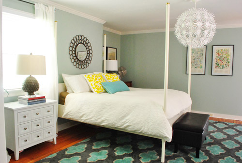
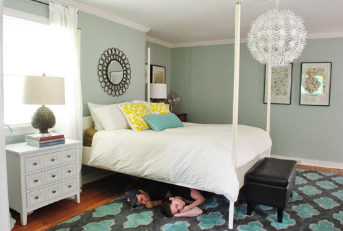
At this point we were tired but hopeful. It still looks kind of crazy to us, but not bad for about an hour of work. And we definitely have bigger plans to help it make more sense over time, so we’ll keep you posted. In the meantime, here’s Exhibit A that we’re dorks for life. Yes, we had the tripod all set up so we took a moment to pretend to be angry monsters under the bed. Although looking back John just looks like a mischievous kid and I look like a sullen teenage vampire.
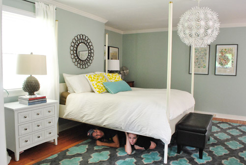
Then we pretended to sleep. Totally normal, right?
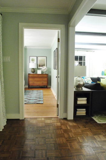
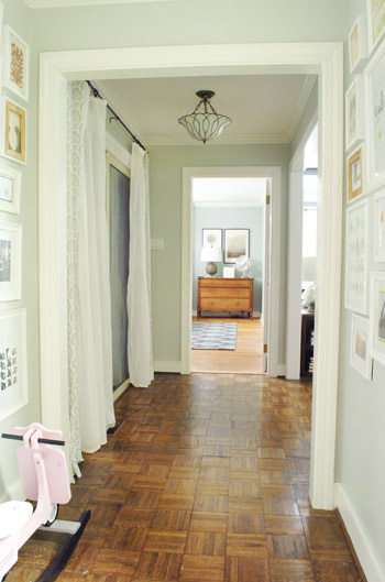
Then we thought we were done taking pictures, but later that night we found ourselves standing in the hallway – just marveling at the new view.
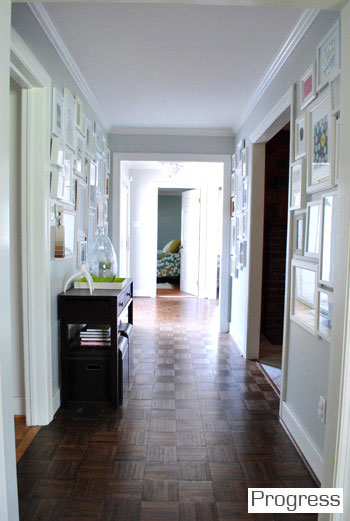
We couldn’t find a recent pic of the old view into the bedroom, but this is one from over a year ago, just to give you an idea of how the side of the bed was sort of the only thing you’d see before:
Now instead of seeing the bed, there’s just a straight shot into the room with the dresser in the nook. It’s actually really nice not to see the bed from the hall anymore, and the nook looks a lot less weird and bare when there’s actually something in it.
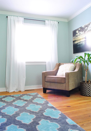
So that’s where we landed after a few hours of bedroom noodling. Although I must admit that we did something a little more DIY-heavy after this little furniture-move-a-palooza, so we’ll share those details this afternoon (just have to upload the pics and write the post). In short: we’re getting somewhere, but we’re definitely not completely there yet (but what else is new around here, haha). More soon!

MP says
So much better! This looks great :-)
Brie says
I really like it! We took the plunge and moved our bed about a year or so ago when we were sure it would look weird anywhere else and we love it. I actually have to say, I much prefer not being able to see our bed as we’re walking down the hallway. We’re not particularly good about making our bed on a regular basis and having it hidden from the hallway makes everything look neater to me. I was skeptical of the non-matching nightstands, but it totally seems to work!
Kelly says
Ever try the bed in the corner? From the minute I first saw your room (back when you moved in), I thought the bed should go at an angle! It would still line up with the light, but I think it would help break up some of the liner elements in the room!
YoungHouseLove says
Oh yes we tried that but it’s so wide it creates this giant triangle of unused space behind it. I think we’re just not bed-angle people!
xo,
s
Christina says
Love it! And please please please let us know if you decide to craigslist the old nightstands, for those of us who are local…I’ve been on the lookout for similar midcentury nightstands.
YoungHouseLove says
Will do!
xo,
s
Katy says
I was going to say the same thing! Although, I’m not local… So if you decide to eBay them- let me know! I too have been searching for the same/ similar mcm nightstands to match a dresser we already own, with no luck!
YoungHouseLove says
We’ll definitely keep you guys posted!
xo,
s
Reva says
@Katy, if you happen to be in the Bay Area, here’s some of those nightstands: http://raysmcmgarage.blogspot.com/2012/06/pair-of-nightstands-possibly-broyhill.html
Megan Geneva says
I love it! It makes the room so much more unique and gives it that collected-over-time look.
Amanda K says
Love it! We recently moved the bed to a different spot and put a dramatically different color on the walls. I thought my head was going to explode for the first few days, but after a few months, it feels like it’s always been that way.
Katalina says
love it–especially the accessory on the top of the ottoman.
Sue says
The idea of built in bookshelves/cabinets is great. Also what about building the nook out by putting a faux wall across it? I’ve seen it done with uneven fireplace nooks to create symmetry.
YoungHouseLove says
We thought about that, but we hate to do all that work to just hide a spot that could be functional (ex: it stores all of our folded clothes now with the dresser in there). Who knows where we’ll end up though!
xo,
s
Rachel says
I LOVE your new bed placement! My husband’s a soldier so we move regularly which does have it’s perks in moving/household setup-problem solving:). We’ve realized through lots of moves that even when it seems weird in the window placement or other room features, we are most pleased with our bedroom when we walk into the foot of the bed. I look forward to seeing your process as you make your new orientation your own.
Angie Lee says
I like the changes and I’m sure you have more up your sleeves! Yay to getting larger nightstands too. I still love the bright yellow pillows, they’re just so cheerful.
Did it feel weird waking up the next day all turned around?
YoungHouseLove says
Yes! Haha. We both were like “wait, where’s the mirror on the window?” since that was always what we woke up staring at!
xo,
s
Kelley says
This is absolutely awesome! There is so much more flow to the room! Gives me the fever to rearrange!
Shelly says
Love the new set up! I think that nook was born to have a dresser there!
I will say that for some reason the room looks more neutral and calming than it did in the previous set up, but for some reason it makes the yellow pillows look like too much to me. Maybe it’s b/c the art in the nook is so mellow?
YoungHouseLove says
I think it just could be that we haven’t really adjusted these pics to be as realistic as the other ones from last week (so in real life the yellow doesn’t look that bright). Will try to take more “accurate” pics as we go- but in person it’s really cute to have a pop of yellow so the whole room doesn’t feel white and blue.
xo,
s
Shelly says
I wanted to come back and say that the pillows looked better after Ed’s haircut and especially with the photoshopped back boards. :)
YoungHouseLove says
So funny! Things are always changing in there!
xo,
s
Kate says
I love it! The whole room looks so different now!
Bonus: Sarah Richardson always says a bed should be placed in a room so you face the foot of the bed – not the side – when you enter the room. Sarah is gospel for me :)
YoungHouseLove says
I totally agree with her! We wanted to walk into the foot of the bed the whole time, just didn’t think with the nook and the window it would make any sense. Duh, we should have thought about it a bit more and tried harder when we moved in. Hahah. Sarah is gospel.
xo,
s
Jenn says
I felt a wave of relief when I saw the new pix. The other arrangement didn’t sit right with me (sorry!) but this new is just amazingly different. I LOVE LOVE LOVE asymmetrical balance!
Robin @ our semi organic life says
Love the new look of it from the hallway. Looks so much bigger and less cramped.
Silke says
absolutely LOVE it !!!
Tracy says
WOW! It really warms your space up and makes it look more interesting.
Julie B. says
I love the new changes, especially moving the dresser to the nook in the room– it fits perfectly.
Christina @ The Frugal Homemaker says
I really like the new arrangement. I think with a piece of furniture along with wall where the botanical prints it will really look nice!
It already has more of a “homey” and finished look than before. :)
Anne says
Oh, I think you’re going to like this change enough to keep it! Love the hallway view. I think you might also like entering your room and viewing the bed in its entirety. Does that make sense? You’ll walk in and go: voila! Our bed! (focal point of room, usually) I also love the way you gained symmetry. That gives us all inspiration to try at home!
Bee says
The REAL big change in this post is how tan John suddenly looks, haha! The new view from the hallway really highlights what a great idea this furniture shift was.
YoungHouseLove says
Haha, he’s my little tan man. Meanwhile I’m paler than ever.
xo,
s
ella says
Loving the new arrangement. I think it makes the space feel bigger with more depth. I have to agree I think the former awkward nook really doesn’t feel/look awkward anymore, rather charming instead!
kim says
hi, i’m a first time poster, but i’ve been reading your website for a few months now – always shocked& impressed & hugely motivated by your energy level!!!
anyway – just wanted to say that i think the new arrangement “feels” better b/c it’s good feng shui to have the bed facing the door(& not have the sleeper so vulnerable to an opening door) – even w/ the rough edges you want to fix later on. thanks for your posts – you’re really an incredible couple!
YoungHouseLove says
Aw thanks Kim! You’re so sweet!
xo,
s
Emma says
Ohh, I love it! I think it’s much better than the old configuration.
Rachel from Birch + Bird says
We just moved into a new home and the previous owners had their bed on the same wall as the door but that seems like bad feng shui to me. I like to see my escape route in case of angry monsters under the bed. We’ve got the bed on the opposite wall but our setup runs into the window just a tad but now that I see your revamped master, I have hope. Good work as per usual, guys.
Lisa says
Love the new layout, especially the new view from the hall! I noticed that the artichoke lamp on the dresser nicely coordinates with the lamp behind your sofa, too. But personally, having the bedside tables and lamps more than arms-length from the bed would annoy me – I wouldn’t want to step out of bed to turn the lamp off! Yes, I’m that lazy.
I’m anxious to see the wall opposite the bed. What do you now look at when you wake up in the morning? Is the light fixture really still centered on the bed?! How great is that happy accident?!
YoungHouseLove says
Total lucky accident! It’s still centered on the bed, but if the nook had been one foot wider this whole arrangement wouldn’t have worked! Or if we had a king sized bed… no dice! Now we wake up looking out the window on the side of the house room that leads out to the future deck (which we’d love to convert to a french door someday)!
xo,
s
caroline says
Yes! It feels nice and cozy this way, although as a bit of an alignment freak (is that even an expression?) I have to say I loved the previous layout too. My bedroom is all weird-shaped and I have a hard time dealing with it, I was wondering whether to move the bed around just yesterday. Now I might just do it! Yay! Thanks for the inspiration :)
Sandy says
High five!!! That looks awesome! Fantastic! One thing though … and I’m not saying this in a mean way, but rather with lots of love … take a look at the bed pics, the four bed poles look very, well, kinda just there and skinny. There’s nothing to them. They don’t do anything for ED. Can’t you do something with them to beef up the bed a little more. Put the top pole back or something? Just asking. But everything else, FANTASTIC! Great move!
YoungHouseLove says
Oh yes, we see what you see! Stay tuned for the other tweaks we’ve done/have planned in this afternoon’s post!
xo,
s
cristina says
so so so so SO much better! it makes the house look twice as long when you’re looking at it from the hallway. and for some reason it feels more like a parents room now? it reminds me of how it felt to walk into my parent’s room when i was a little girl :)
lisa says
Looks much better! I would add a large mirror above the wood dresser, as close in size as possible to the window, and that would balance the window. Also, looking down your hallway at that view, the large mirror would be good.
Anne says
Wow! I love the changes! I often get too “set in my ways” thinking that there’s only ONE way that the furniture can be that I don’t even try to experiment–but this proves that I should switch things up on occasion!
Rachel says
YES! Love that much much better! Its funny how sometimes we can’t think outsides of our boxes.
Jen says
Wow, I love how the room is coming together. It looks so cozy, functional and lived in! Seeing this is making me actually think about getting on our master bedroom… we’ve lived here since July 2010 and still haven’t done anything to our room except hang 1 very oddly placed mirror! Anyways, looks great and I can’t wait to see what else you do with it.
Melissa Breau says
Somehow this new arrangement just feels more “you” — even to an outsider like me! Enjoy the new space; it looks great.
Anne says
Ha ha! I just noticed John miming sucking his thumb! :)
YoungHouseLove says
Haha, he was apparently channeling Clara.
xo,
s
Katie says
LOVE THIS SWITCH!!! I always liked your bedroom, but I’m loving this change even more. It seems so much cozier :) Enjoy!
Mamaw03T says
Love the new placement of the furniture. Also to brighten up that nook you could put another set of the curtains behind that dresser. Yes, I know there’s not a window there, but it might keep the room from feeling off to you, if it feels like that down the road.
brigzorn says
I love this change!! It looks great! I’m glad you went for it.
Fouzia says
I love me some visual depth!! Looks great you guys. Now you just have to get used to the new ‘first thing I see in the morning’ image so you don’t wake up thinking ‘who moved me?’ ;)
YoungHouseLove says
Haha- we’re totally still thinking that in the morning!
xo,
s
Krys72599 says
I think that’s very feng shui, isn’t it?
I sort of remember reading that your bed should face the door, not have the door next to it, like in my room, which ALSO has only one wall on which you can put the bed… And this time, there’s REALLY only one wall on which you can put the bed…
I think…
Krys72599 says
Here you go:
“The ideal bed placement allows you to see the bedroom door while laying in bed without being directly in front or in line with it. According to feng shui, having a view of the door without being too close to it gives you a sense of safety while you rest and is conducive to relaxation and sleep. Typically, this ideal bed position is in the corner of the bedroom diagonally opposite the door.”
YoungHouseLove says
So interesting!
xo,
s
Sarah says
Love the bed SO MUCH better against the far wall – it just looks wonderful when you look through the door. I read somewhere that it is better for your sleeping soul if your feet face the door, rather than the long side of you. Something to do with the energy flow….
Melissa says
I think the new arrangement is fantastic…and looks more like someone actually lives in that room! It always looked a little too perfect before for my tastes. The new shot from the hallway is a nice bonus.
milka says
Oh the rearrangements! I freak out if I don’t rearrange or change something in my own place every half a year. In my bedroom there is a winter and a summer setting. My husband isn’t eager to move stuff with me so I often drag furniture by myself too. There’s nothing that us ladies can’t do, right?
I like this arrangement better because of the hallway look (privacy). Are these new big nightstands handy? Aren’t they too far from the bed?
YoungHouseLove says
Thankfully they’re just as functional (the old ones were low and these are a bit further away but not as low so it feels sort of the same).
xo,
s
Shannon says
We have a similar problem in out house, and we ended up with a similar setup with a window on one side of the bed and wall on the other. I also don’t like walking into a bedroom and seeing the side view of the bed. Foot of the bed? OK. Side view? Not so much. You made it work!
LOVE the view from the hallway. From inside the room, I thought another storage piece would be good, but the view from the hallway is very nice. I’d stick with artwork or maybe some staggered floating shelves. Sometimes re-arranging a room gives it a fresh/new feeling. Great job!
Sara says
HUGE improvement. I really like it a lot,
Cheryl says
The chests don’t look close enough to the bed to be useful as nightstands – is that true in real life? Or do you not use them much from the bed?
I do like the view from the hallway better now – I always like it when you get full view of the bed from the doorway.
Can’t wait to hear how it works out once you’ve lived with it for a few days.
YoungHouseLove says
They’re happily as functional as the old ones (the old ones were low, these are higher but a bit further so it’s sort of the same, haha).
xo,
s
meg says
love it! wondering- how does the light work with the new set up? is it centered on the bed still or centered in the room? hard to tell from the pics.
YoungHouseLove says
Thankfully it’s perfectly centered on the bed! If the nook were a foot longer this wouldn’t have worked (or if our bed were a king instead of a queen). So thankful!
xo,
s
Jessica D. says
I am LOVING this change! It makes the room’s pieces look collected(as they are) and gives your bed a better placement on a larger wall. I felt like the bed looked larger than life on the other wall, now it looks grounded. I feel like the wall color makes more sense now too. It’s such a cozy color and that effect was lost before because of the size of the room. Now it looks like it belongs. I’m so glad you took a chance on changing the layout! Loving this room!!! Much more serene. Have you thought about adding French doors to your new deck some time down the road?
YoungHouseLove says
Yes, that’s the plan down the road! We’d wake up looking at them in the new layout, which is so nice!
xo,
s
Kristy says
I love the new layout!! I think it gives the room a more relaxed look, somehow. And the view from the hallway is great! I’ve been wanting to rearrange OUR bedroom for a little while, and looks like today’s the day.. the husband’s at work and my 5’9″ self is gonna make it happen and surprise him, lol Thanks for the inspiration to just try things out and find what works. :)
Alicia says
It looks so nice to have the bed moved to where you have a better view into the room! Y’all may have already thought of this, or maybe someone else has commented about it, but what if you built out the nook to make it a flush wall? I know it seems crazy to lose square footage behind a fake wall but if your room is already big enough and the nook is hard to work with I think that would be an easy fix. For y’all anyway, since you’re so handy with the power tools, haha!
YoungHouseLove says
We have thought about that, but think we like the function of using the nook (either as it is now with furniture in it or with built-ins) instead of just walling it off. Who knows where we’ll end up though!
xo,
s