First lets rewind to this post where I said “As for if the bed can move, the floor plan of this room is a definite challenge thanks to “things” on each wall (two very off-centered windows, a nook across from the door, and a nook with the sink tucked into it on another wall – and a chandelier in the exact center that looks off if the bed isn’t in the right place). So we’ve tried the bed in a bunch of spots, but the place that works best for us is where it lives now (it’s the only long flat wall in our entire room).”
Well, after seeing a few inspiring glossy mag photos, we decided it might not be the weirdest thing in the world for the bed to be right next to a window. See, moving the bed would do one major thing for us: allow us to ditch our sadly-too-small-for-our-giant-room side tables (which we couldn’t do on the old wall where they lived, since the door would swing open and hit anything larger).
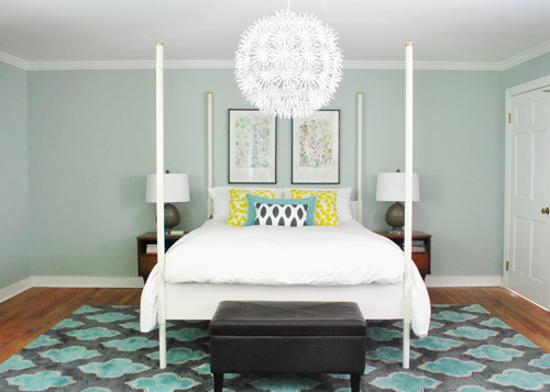
So although we weren’t 100% sure how we’d handle the odd nook to the right of the bed and the window that would nearly touch the bed on the left, we just decided to go for it and see what we could come up with. But before we moved anything, we got new curtains from Ikea for $5 a pop (Vivan panels, which are our favorites from our first house). They come two per pack for $9.99, and aren’t super heavy or super sheer, just sort of breezy and light – which we thought this room could use since it has a big dark rug on the floor (and we’d eventually love to stain the wood floors a dark mocha color).
They definitely layer right in and add some softness (we hope to reuse the old green curtains I made in the playroom). Didn’t hem the new guys yet though- but I probably will someday. Haha.
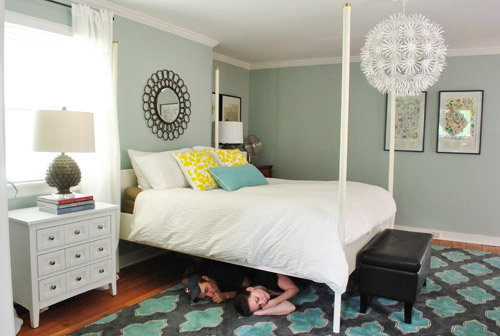
Then it was time to move stuff around. First we removed our insanely heavy organic mattress (which can best be described as the equivalent of lifting 50 dead bodies, not that we’d know…) and then we slowly inched the bed over to its new spot across from the doorway (so you can walk at least ten steps into the room instead of three before slamming into the side of it, which happened in its old position by the door).
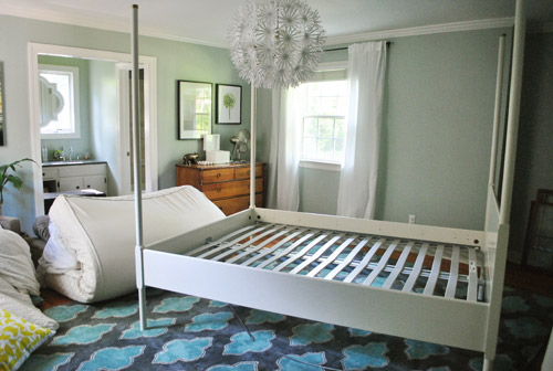
Next we shimmied the rug into position under the bed in its new spot before nearly blowing a gasket moving the mattress back onto the bed in its new spot. It still looked really really weird.
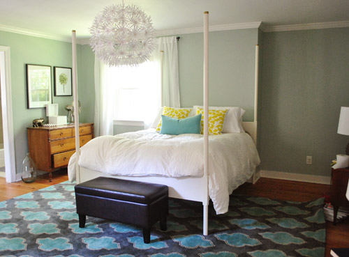
I was excited to start moving some other furniture around, but John had to duck outside to work on some deck stuff and Clara was napping so you know what I did, right? That’s right, my 5’2″ self got it done on my own. Haha. I hauled our dresser into the nook to act as a much larger bedside table and then stared at the blank space under the window on the other side of the wall for a nice long time while I caught my breath. It wasn’t functional to give up a night table and we definitely appreciate the balance of having two bedside lamps (especially along a wall with an off-centered window and an odd corner nook without any sort of symmetry going for it at all).
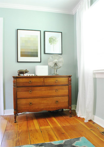
So I literally walked around the house (avoiding the nursery so as not to wake the dragon Clara) to see if there was something we already owned that I could bring in to use as my bedside table under the window. Sure enough, my eyes rested on this guy who has been hanging out in the dining room:
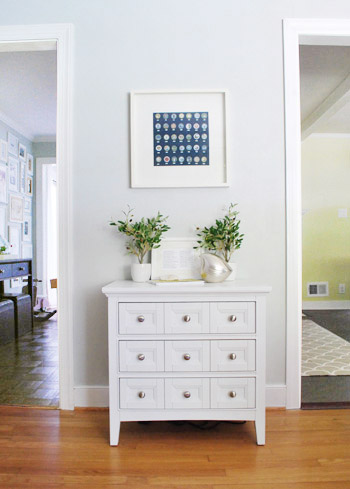
The funny thing is that this cabinet is actually meant to be a bedside table, so here I was thinking I was being a rebel to stick it in the dining room, only to drag it into the bedroom and realize that I loved it under the window. Don’t get me wrong, I loved it in the dining room too, so for one of those places we’ll have to grab something else (it might just be a placeholder in the bedroom and we’ll get another table and return it to the dining room eventually – or vice versa). Update: Folks are asking if the chandelier is still centered over the bed, since it’s hard to tell from this angle. Thankfully it’s still perfectly centered! If the nook were a foot wider this arrangement wouldn’t have worked – and if we had a king-sized bed instead of a queen it would have been no dice! Whew.
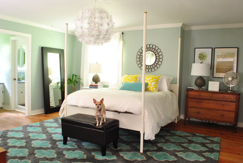
Then I hung the art that used to hang above the dresser in the nook, and put up an old oil-rubbed bronze mirror over the bed – which used to hang in our living room, but was replaced with a white mirror about six months ago. It added a little more “something” to the big blank wall above the bed, but we’re thinking that down the road we’d love to make a big upholstered headboard for that area and maybe move the mirror up so it’s closer to the height of the big round chandelier in the middle of the room since we think height in the center of that wall might be really nice and will further disguise the fact that our bed is jammed between an awkward nook and an oddly off-centered window.
Here’s Burger stretching. That is the only reason I took this shot. Cracks me up. I actually really liked the smaller white table on one side with a larger wood dresser on the other side since they both seemed to fit into those spaces well and the matching artichoke lamps added some nice balance. Ideally the white night table would be a bit taller so both lamps would be at the same height, but for now I just grabbed a stack of books to add some height to that light on my side of the bed. Maybe down the line we’ll add castors or little legs to give it a bit more lift, but for now it does the trick.
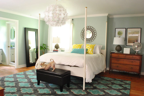
Moving that art into the nook to sort of balance the window on the other side of the bed seemed to make an instant difference since that nook no longer looked like a big blank wall, and the two frames felt rectangular and balanced with the window on the other side of the bed (admittedly more so in person since the window is blown out in this pic, but is very easy to see in real life).
I also mentioned that I dragged the leaning mirror from across the room to where the wood dresser used to be, which seemed to add even more balance to the new setup since it was a nice shot of dark wood next to the white nightstand to tie into the wood dresser on the other side of the bed. We had that guy anchored on the wall so Clara can’t pull it down on herself, but thankfully the system just uses cable ties, so we were able to reuse the same system with two new zip ties in its new spot (you can see how the whole anchoring thing works here).
Here’s another view of things. Of course those two botanical frames look crazy on the wall with no bed under them, so we’re planning to rehang them in the corner of the room that’s on the other side of the sink nook (not pictured, but there’s a chair and a side table over there). And then anything from a cabinet or console to a large piece of art could end up on that wall someday. But this view definitely looks extra weird since it’s so unfinished on that back wall.
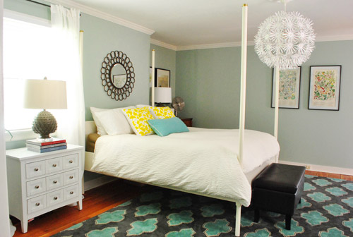
At this point we were tired but hopeful. It still looks kind of crazy to us, but not bad for about an hour of work. And we definitely have bigger plans to help it make more sense over time, so we’ll keep you posted. In the meantime, here’s Exhibit A that we’re dorks for life. Yes, we had the tripod all set up so we took a moment to pretend to be angry monsters under the bed. Although looking back John just looks like a mischievous kid and I look like a sullen teenage vampire.
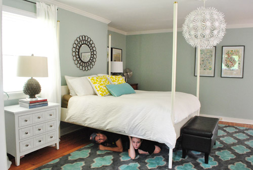
Then we pretended to sleep. Totally normal, right?
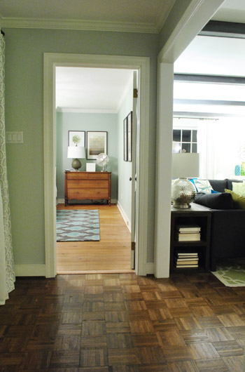
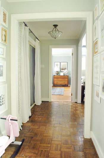
Then we thought we were done taking pictures, but later that night we found ourselves standing in the hallway – just marveling at the new view.
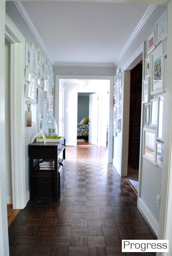
We couldn’t find a recent pic of the old view into the bedroom, but this is one from over a year ago, just to give you an idea of how the side of the bed was sort of the only thing you’d see before:
Now instead of seeing the bed, there’s just a straight shot into the room with the dresser in the nook. It’s actually really nice not to see the bed from the hall anymore, and the nook looks a lot less weird and bare when there’s actually something in it.
So that’s where we landed after a few hours of bedroom noodling. Although I must admit that we did something a little more DIY-heavy after this little furniture-move-a-palooza, so we’ll share those details this afternoon (just have to upload the pics and write the post). In short: we’re getting somewhere, but we’re definitely not completely there yet (but what else is new around here, haha). More soon!

Ashley says
This looks AWESOME. Love it love it love it. And there’s some kind of a refreshing deal to wake up near a window with the morning sun coming in, don’t you think? Glad you guys made the switch! I was hoping for it secretly… :)
Amanda Smith says
First, I am really annoyed that you rotated the rug after you told us it couldn’t be done in your first post about buying it. I still believe it would look so much better with the length of the geometric shapes playing off the length of the bed posts. Turning it the way you have it makes things look squat.
I do like the addition of the table from the dining room. It makes a great beside table in this room.
I don’t like the big black mirror, but I don’t think I would like it anywhere because it looks so heavy.
Sorry if you are offended by this comment, but you really did respond that the rug couldn’t be turned.
YoungHouseLove says
Amanda, sorry to be unclear. The rug can’t be rotated on the bed. Does that make sense? It’s a rectangle, so if we rotate the rug and not the bed (instead of rotating everything with it) there is only about a foot of rug on either side of the bed to step off on, and it feels like you’re walking on a cliff. It’s much more functional to step off with a few feet of rug on both side of the bed so it doesn’t feel crowded and cramped – it can breathe this way. Wish we took pics of it the other way for you, but it’s a lot narrower and looks totally “wrong” that way!
xo,
s
kb says
sherry, you are a saint for the way you handle some of the comments that have me rolling my eyes! :)
Reva says
Sherry, you are so nice! Seriously, I really admire the way you handle this kind of stuff.
Crystal @ 29 Rue House says
I love it when something makes you see things in a whole new light. The view into the bedroom looks sooo nice with that dresser which I love btw.
Jamie says
I really love the new layout! It looks balanced without being too matchy.
Kathryn says
Looks great!! Moving your bed there makes the whole room look more cozy and the view from the hallway is great!!
We decided to move our bedroom furniture around too. Nothing like a little change to make a bedroom happier!
Steph says
I think I might try an arrangement like this too. We’re getting AC put in today and basically the unit will go right over our bed which will be a pretty big eyesore. I think moving the bed to the window like this might help not make it such a focal point in the room. Thanks!
Sarah W. says
I was always told that your bed should be on the back wall so that you walk into an open space and then the foot of the bed, so this layout is perfect and more open. It looks great! FYI…your lamps (especially the one in the nook) look farther from your bed now, so I wanted to let you know about the remote switches. I have them by my bed, in my office and living room – LOVE!!!
i.e. http://www.homedepot.com/h_d1/N-5yc1v/R-203406420/h_d2/ProductDisplay?catalogId=10053&langId=-1&keyword=stanley+remote+switch&storeId=10051
YoungHouseLove says
Ooh fancy! That’s fun!
xo,
s
Allyn says
It looks like you and John are about to do some Twilight role play. Only you’ll be watching him sleep.
Creeeeepy.
YoungHouseLove says
Haha, seriously.
xo,
s
mribaro says
I love everything about your new bedroom layout! You were very creative with things you already had. I fondly remember the excitement I got as a child when I used to move furniture around my room every two weeks (the furniture was very light), and especially the first few days being surprised by the new layout when I came home from school or awaking in the morning to a completely new vista :)
In the photo where you two pretend sleeping under the bed John looks like he’s sucking his thumb :) Is it on purpose to evoke Clara, or is it just the camera angle plus my imagination? :)
YoungHouseLove says
Haha, yes he was apparently channeling Clara!
xo,
s
Claire says
Nice moves! ;-)
Whenever I arrange the furniture in my bedroom I try hard to keep the bed away from the door. I can totally understand your motivation to switch things up. I love how the new view from the hallway has the centered nightstand/dresser with a peep of that awesome rug.
Misty says
I had my doubts at first….. but it actually looks alright! I’m a def sell on the few from the hallway!!
So…..what are you doing with the old curtains??? I just painted my new master the same colour as yours…. :)
Misty says
view from the hallway*
YoungHouseLove says
We hope to use them in the playroom! Will keep you posted!
xo,
s
Cindy Berisic says
HOLY SMOKES!! It looks fantabulous!!! What a huge difference a simple move has made, I love it. I feel like it offers you the opportunity to do so much more with the space. Awesome, Awesome!
ruthy says
i think it looks really good! I also love all the different finishes, from the white bed posts, to the wood dresser and the brass mirror…its great to see all these finishes work together!
Morgan says
Love the more natural flow of the room!
Chelsea says
It looks good! Any photo, though, that includes your living room console lamps ruins my day because all I can think about is how much I covet them. They’re fantastic! :)
YoungHouseLove says
Aw, so sorry Chelsea! I hope they pop up at HomeGoods or Marshall’s for you soon!
xo,
s
Bethany says
It looks great! Is it hard to reach stuff on the dresser/nightstand, though? They look a little far away.
I love the view from the hallway now. That’s one of those little changes that would just make me so happy every time I see it! I love it when a little change like that makes a big impact.
YoungHouseLove says
Thankfully it’s working out just fine for us! The old ones were low and these are a bit further but higher so it seems the same!
xo,
s
emma says
love the changes. our bedroom is a straight forward plan which has ended up being a good challenge – it’s like how do we add some zest??
i know you guys have lots in the works for this room, maybe a curtain between the bedroom and sink area opening would help make it more bedroomy. even if its pulled open 99.9% of the time sometimes that’s a nice mental catch of – oh that’s washing/dressing area. this is sleeping area.
loving the dresser/door view!
Allen says
FINALLY you’re bedroom makes sense to me! I know that’s been keeping you up at night ;)
My mom compulsively rearranged furniture growing up so I can appreciate being teeny and moving huge stuff.
Great job and yay for ‘free’ make-over!
Ellen says
Hey, I think that looks great! I secretly really love mismatched bedside tables (even while we have matching ones in our bedroom…)
tae says
love this – especially the view from the hallway! can you come do my bedroom now!??? i can’t put my finger on what’s wrong with mine either!
i love the artichoke lamps, but the lack of symmetry between the two bed sides might look more intentional if you switch one of the lamps out for something different. maybe something like the task lamp from the office?
can’t wait to see the diy you have in store!
YoungHouseLove says
We actually think that the same lamp ties together the unmatched side tables, if that makes sense. I read somewhere (maybe Elle Decor) that some designer said she liked matching lamps on unmatched bedside tables or unmatched lamps on matched bedside tables, just so things related but aren’t too matchy. I thought that was so interesting!
xo,
s
Crystal @ 29 Rue House says
I read that too and thought it was interesting also! I feel like I read it out of House Beautiful.
YoungHouseLove says
Oh yes, that might have been where I saw it!
xo,
s
Jen R. says
I love the new setup! Way to use those muscles, Sherdog!
Larissa says
Yaaaaay! I’ve been wanting you to do this bed placement forever! It looks so much more master-bedroomy. In my old house’s master bedroom I had two sets of French doors on two different walls that made bed placement really hard because I didn’t think it would look right to put the bed in front of the doors. I saw one picture in Cottage Living of a bed in front of French doors and moved mine immediately. It was perfect! So even if you only keep your bed there because you just don’t want to move the mattress again it’s such an improvement!
Theresa says
Love it! Small change = big impact. I don’t crave symmetry, so I like it as is, but maybe a window-width white framed mirror over the dresser would bring more balance. Of course then you’d have to find new art to go over the bed cuz that’d be way to many mirrors in one place!
Ted says
Woohoo…YHL has fun in the bedroom.
I like the bed this orientation. I’ve always believed in the decorators rule that when you walk into a bedroom, the bed should be the focal point on the wall opposite the door you enter from.
One suggestion for the “nook” above the dresser. One tip about how to balance a single window is to get a big rectangular mirror close in size to the window. Hang it on the wall, frame it and then put similar sheers around the mirror like the window. It doesn’t put out the light the way the window does, but it often gives that “balance” to the window and still reflects back some light.
YoungHouseLove says
Oh yes, always a possibility to mimic the window with a mirror down the line for sure! Just hanging up what we have for this “stage” of things!
xo,
s
Lindsay says
LOVE THIS! I always thought your bedroom was off. I don’t like walking right into a bed when you walk in so this is 10x better! And I think the mirror looks great above it rather than those pictures.
Liz says
LOVE this! I adore not seeing the bed when you peek down the hall. For some weird reason, I always feel vulnerable if someone can see me sleeping. Also – if you have guests and you haven’t made the bed, you can still keep the door open – booyah!
Brenda says
The nook looks so great with that dresser there! I’m a big fan of rearranging furniture to freshen things up when space allows. Also, those pics of you two under the bed are just wonderful. :)
Lisa says
Looks great! One question, though: Ever thought of building out that nook next to the bed with built-ins — shelves on top and cabinets/drawers below? If the bottom section came out far enough (with the shelves recessed into the nook), it could still serve the same function as a bedside table.
YoungHouseLove says
Yes, that has always been the plan, although now we like that dresser in the nook so who knows where we’ll end up! Will keep you posted for sure!
xo,
s
J+H @ Beyond The Stoop says
i LOVE it! i like rooms that are more UN-symmetric (yes, i know it’s asymmetric, but “un-” sounds more dramatic)
this way you don’t have to have 2 of everything you buy, or get “matching” this and “matching” that. looks WAY more home-y this way :D
(jealous of your giant bedroom… mine is a tiny 7×8 right now… sigh… city life)
cheers.
Lindsay @ A Walk in the Closet says
It looks fantastic! I think putting the bed by the window really fills up the room and makes it a lot more “cozy” than how you had it before. I think the layout was a little too grand for the decor style and size of pieces.
It is such a cuter room this way, imo. Great idea!
Jeri says
Love it! Seems much more welcoming. You were never able to take a decent pic from the doorway before – always had to go way into the room. Now, you walk in the room and it’s already the perfect view. Free changes are the BEST!
Sarah W. says
Awesome. Not that the “before” was bad by any stretch, but I think the new arrangement is more interesting and feels more advanced in its design. I think a visitor would walk in and say, “I would never have thought to arrange the furniture like this, but it really works and looks wonderful.”
meghan shadrick says
Love it! Looks great: )
Erin @ One Project at a Time says
That looks so much better already. I love watching your house evolve over time. It makes me feel so much better that our house (about 14 months in) is still so far from how we want it. We did recently make some changes in our Living Room though that I’m really excited about. http://oneprojectatatime.blogspot.com/2012/06/living-room-updates.html
Thanks for me that houses are a work in progress!
Jessica @ Quirky Bookworm says
I love rearranging furniture! Makes me happy to have a whole “new” room for zero dollars.
I really like your new layout too! Bet the daytime light will be nice too, with window light coming in over your shoulders instead of more at your face.
Meredith says
looks great! have you woken up and gotten spooked after seeing yourself in the mirror first thing? haha
YoungHouseLove says
Haha, thankfully not yet, but it could happen!
xo,
s
Abby says
This is such a great change! I love it, seriously. Our bed is between two windows instead of a big blank wall like I had originally intended. But now I’m inspired to get those window panels to give help frame the space better. And get out with that view down your hall. It’s like you did it on purpose. Well done!
Melissa @ HOUSEography says
Love it! I think beds almost always look best when they are facing the door as directly as possible. It almost always makes rooms feel bigger. Great job on a freebie change!
Sherry from BC says
I liked your bedroom before but I think it looks more “finished” now, except for that back wall. I like the eclectic mix and I think it can only get better. I do think dark floors would really make everything pull together. Do you have a timeframe for when you might refinish? I need to redo my floors but it is such a pain to get everything moved and not have people walk on it. Toying with doing it this summer but not sure what to do with my cat. Barricade her in the basement? She would hate it but what else can you do?
YoungHouseLove says
We have no idea when we’ll get to refinishing the floors. Maybe in the winter since we seem to get restless and dive into big projects over Christmas? Haha.
xo,
s
Lindsay says
Love, love, love it. It seems like the room was made for the bed to go on that wall. Awesome improvement.
Amanda says
i love it! it looks much better this way!
Brianne says
Looks great!! Much more sophisticated!
mribaro says
The mustard curtains you had before in the bedroom might go nicely with the Clara rug in the playroom!
YoungHouseLove says
Yes, we thought that might work in there!
xo,
s
Melanie says
You guys are amazing! Love the new moves!
beth says
Big improvement!! I have asymmetrical windows where my bed is now and we need to hang some art over the bedside table for balance. It has been on my want-to-do list for a while. Our setup is actually like yours, sans the nook area.
It definitely feels better this way to my eye, based on your pictures.
Lilly says
Its funny when I moved into our new home a lil over a year ago I too had my mind set on the furniture arrangement very symmetrical and bla bla bla. A couple of months a go we just felt like moving the bedroom furniture to see if we liked it even thought I swore I would not like it because it wasnt as symmetrical n bla bla bla as I’m used to. It actually worked really well, we left it that way thinking we might move it in a week or two back. But we left it it works we have a bit more space and it looks more lived in. It felt a lil too perfect before like hotelly and know it feels more like our bedroom and I was able to add a makeup vanity with the free up space. Crazy huh. Well just thought I might share my experience with letting go of everything needing to be perfectly centered and what not. Good luck I actually like it somewhat better.
YoungHouseLove says
Haha, I love it! I feel the same way!
xo
s
Amanda C says
Looks great, I love it! I wish we could get creative with the furniture in our bedroom like that…
Elizabeth @ The Little Black Door says
Love it!!
The Mrs @ Success Along the Weigh says
I like the way it looks! I love the Burger yoga shot!
Liz says
Love the new arrangement! Where is your white end table from? We have been searching for end tables for over a year. Hard to find the right one! I couldn’t find it listed on your source list. Thanks!
YoungHouseLove says
That’s from Joss & Main. Hope it helps!
xo,
s