First lets rewind to this post where I said “As for if the bed can move, the floor plan of this room is a definite challenge thanks to “things” on each wall (two very off-centered windows, a nook across from the door, and a nook with the sink tucked into it on another wall – and a chandelier in the exact center that looks off if the bed isn’t in the right place). So we’ve tried the bed in a bunch of spots, but the place that works best for us is where it lives now (it’s the only long flat wall in our entire room).”
Well, after seeing a few inspiring glossy mag photos, we decided it might not be the weirdest thing in the world for the bed to be right next to a window. See, moving the bed would do one major thing for us: allow us to ditch our sadly-too-small-for-our-giant-room side tables (which we couldn’t do on the old wall where they lived, since the door would swing open and hit anything larger).
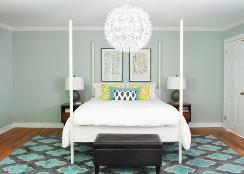
So although we weren’t 100% sure how we’d handle the odd nook to the right of the bed and the window that would nearly touch the bed on the left, we just decided to go for it and see what we could come up with. But before we moved anything, we got new curtains from Ikea for $5 a pop (Vivan panels, which are our favorites from our first house). They come two per pack for $9.99, and aren’t super heavy or super sheer, just sort of breezy and light – which we thought this room could use since it has a big dark rug on the floor (and we’d eventually love to stain the wood floors a dark mocha color).
They definitely layer right in and add some softness (we hope to reuse the old green curtains I made in the playroom). Didn’t hem the new guys yet though- but I probably will someday. Haha.
Then it was time to move stuff around. First we removed our insanely heavy organic mattress (which can best be described as the equivalent of lifting 50 dead bodies, not that we’d know…) and then we slowly inched the bed over to its new spot across from the doorway (so you can walk at least ten steps into the room instead of three before slamming into the side of it, which happened in its old position by the door).
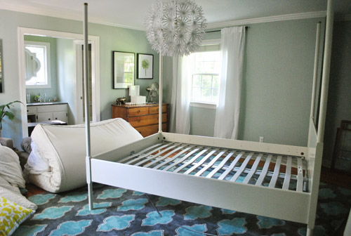
Next we shimmied the rug into position under the bed in its new spot before nearly blowing a gasket moving the mattress back onto the bed in its new spot. It still looked really really weird.
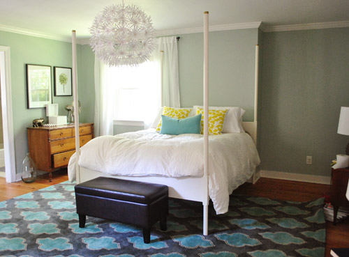
I was excited to start moving some other furniture around, but John had to duck outside to work on some deck stuff and Clara was napping so you know what I did, right? That’s right, my 5’2″ self got it done on my own. Haha. I hauled our dresser into the nook to act as a much larger bedside table and then stared at the blank space under the window on the other side of the wall for a nice long time while I caught my breath. It wasn’t functional to give up a night table and we definitely appreciate the balance of having two bedside lamps (especially along a wall with an off-centered window and an odd corner nook without any sort of symmetry going for it at all).
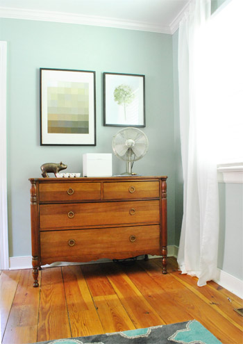
So I literally walked around the house (avoiding the nursery so as not to wake the dragon Clara) to see if there was something we already owned that I could bring in to use as my bedside table under the window. Sure enough, my eyes rested on this guy who has been hanging out in the dining room:
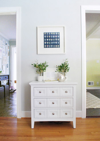
The funny thing is that this cabinet is actually meant to be a bedside table, so here I was thinking I was being a rebel to stick it in the dining room, only to drag it into the bedroom and realize that I loved it under the window. Don’t get me wrong, I loved it in the dining room too, so for one of those places we’ll have to grab something else (it might just be a placeholder in the bedroom and we’ll get another table and return it to the dining room eventually – or vice versa). Update: Folks are asking if the chandelier is still centered over the bed, since it’s hard to tell from this angle. Thankfully it’s still perfectly centered! If the nook were a foot wider this arrangement wouldn’t have worked – and if we had a king-sized bed instead of a queen it would have been no dice! Whew.
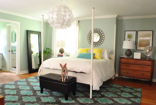
Then I hung the art that used to hang above the dresser in the nook, and put up an old oil-rubbed bronze mirror over the bed – which used to hang in our living room, but was replaced with a white mirror about six months ago. It added a little more “something” to the big blank wall above the bed, but we’re thinking that down the road we’d love to make a big upholstered headboard for that area and maybe move the mirror up so it’s closer to the height of the big round chandelier in the middle of the room since we think height in the center of that wall might be really nice and will further disguise the fact that our bed is jammed between an awkward nook and an oddly off-centered window.
Here’s Burger stretching. That is the only reason I took this shot. Cracks me up. I actually really liked the smaller white table on one side with a larger wood dresser on the other side since they both seemed to fit into those spaces well and the matching artichoke lamps added some nice balance. Ideally the white night table would be a bit taller so both lamps would be at the same height, but for now I just grabbed a stack of books to add some height to that light on my side of the bed. Maybe down the line we’ll add castors or little legs to give it a bit more lift, but for now it does the trick.
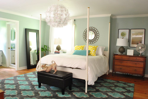
Moving that art into the nook to sort of balance the window on the other side of the bed seemed to make an instant difference since that nook no longer looked like a big blank wall, and the two frames felt rectangular and balanced with the window on the other side of the bed (admittedly more so in person since the window is blown out in this pic, but is very easy to see in real life).
I also mentioned that I dragged the leaning mirror from across the room to where the wood dresser used to be, which seemed to add even more balance to the new setup since it was a nice shot of dark wood next to the white nightstand to tie into the wood dresser on the other side of the bed. We had that guy anchored on the wall so Clara can’t pull it down on herself, but thankfully the system just uses cable ties, so we were able to reuse the same system with two new zip ties in its new spot (you can see how the whole anchoring thing works here).
Here’s another view of things. Of course those two botanical frames look crazy on the wall with no bed under them, so we’re planning to rehang them in the corner of the room that’s on the other side of the sink nook (not pictured, but there’s a chair and a side table over there). And then anything from a cabinet or console to a large piece of art could end up on that wall someday. But this view definitely looks extra weird since it’s so unfinished on that back wall.
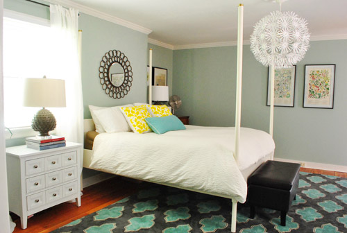
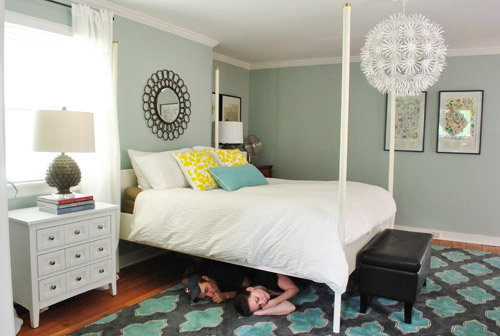
At this point we were tired but hopeful. It still looks kind of crazy to us, but not bad for about an hour of work. And we definitely have bigger plans to help it make more sense over time, so we’ll keep you posted. In the meantime, here’s Exhibit A that we’re dorks for life. Yes, we had the tripod all set up so we took a moment to pretend to be angry monsters under the bed. Although looking back John just looks like a mischievous kid and I look like a sullen teenage vampire.
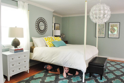
Then we pretended to sleep. Totally normal, right?
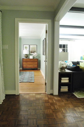
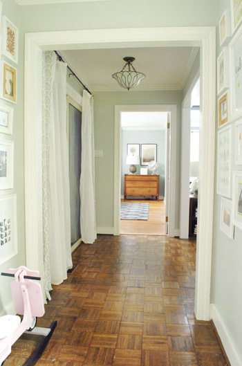
Then we thought we were done taking pictures, but later that night we found ourselves standing in the hallway – just marveling at the new view.
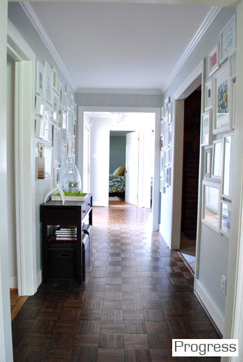
We couldn’t find a recent pic of the old view into the bedroom, but this is one from over a year ago, just to give you an idea of how the side of the bed was sort of the only thing you’d see before:
Now instead of seeing the bed, there’s just a straight shot into the room with the dresser in the nook. It’s actually really nice not to see the bed from the hall anymore, and the nook looks a lot less weird and bare when there’s actually something in it.
So that’s where we landed after a few hours of bedroom noodling. Although I must admit that we did something a little more DIY-heavy after this little furniture-move-a-palooza, so we’ll share those details this afternoon (just have to upload the pics and write the post). In short: we’re getting somewhere, but we’re definitely not completely there yet (but what else is new around here, haha). More soon!

Rachel C says
I love the new setup! I think it makes the room look more pulled together and “finished” than the original setup.
Our master has a single weird in the corner window that limits our furniture set up. Or at least I thought it did!! Now I’m wondering if I could rearrange everything! Except it mildly freaks me out to sleep directly next to a window on the first floor…
Lindsey d. says
Oooh, I love rearranging furniture. There isn’t a room in my house that hasn’t been rearranged at least twice (and that’s only because there are just a couple of pieces of furniture in my kitchen that I can move). My bed has lived on three different walls in my bedroom (all but the wall the door opens up to, since I can’t stand opening a door and running into the bed).
Jessica says
I love the new set up!
Given that you’re always showing us what a huge difference relatively small tweaks (rearranging furniture, a new rug, a new color on the stools) can make to a room – I’d love to see an occasional feature where readers send in their problem room and you give them a bit of advice. Not a full, time consuming mood board or anything, just the offhand comments you might give a friend e.g. “a picture on the left would balance things out,” “you might try bigger lamps, maybe in that teal color from your rug,” “have you tried moving the sectional over by that window and getting a cabinet for that corner?” (100 cool points to readers that send in after pictures!) I think it would help not just the individuals but maybe others who are stuck on a similar issue and would be great inspiration to just rethink things in general.
YoungHouseLove says
That would be fun! Would anyone else like something like this?
xo,
s
Heather says
I would!
Ansley says
Absolutely! I think we all get kind of stuck when we’ve had a room a certain way for awhile and just know that something is “off” but can’t figure out how to tweak it. That would be really helpful!
Bethany says
I think this is a great idea too!
Krys72599 says
GREAT idea – maybe they’ll be able to pick another wall in my bedroom for my bed!!! I’m stuck with (apparently) only one that works…
Kari says
Yes, would love to see this!!
Karen F says
YES! I have some really tricky rooms in my house!
Crystal @ 29 Rue House says
I think it’s a great idea!
Mila says
Yup!!! That would be awesome!
Amy says
Yes, please!
April says
Yes, what a great idea! And with the additional readers comments — so fantastic!
Ted says
I think this would be a great idea. And in addition to your comments, the readers get other ideas through the comments section. I like that aspect of the FB page, that someone can post a photo or problem and FB YHL friends can comment with suggestions. An occasion blog entry on that would be great!
YoungHouseLove says
Thanks for all the feedback guys! Sounds like fun!
xo,
s
Courtney says
Love the new arrangement! Had a thought though…wondering down the line if you could sort of cover that nook with framing and drywall to eliminate it totally, or put in deep lower cabinets and shelving above for books and knick-knack display. That way you’d have a lot more storage plus a built-in nightstand/dresser thingie.
YoungHouseLove says
Oh yes, we thought about walling over it but prefer to use it for something functional instead (like perhaps add some built-ins down the line). Will keep you posted as we go for sure!
xo,
s
Kristen @ LoveK says
Wow!! I really love the new furniture arrangement! The view from the hallway is definitely an improvement.
Maureen @ This (Kinda) Old House says
Two Things: 1. I ordered the book!!! SO excited. It will be THE coffee table book in my home. 2. The room looks so much cozier this way. Our bed is directly under a huge window that covers pretty much the whole wall and i love it.
YoungHouseLove says
Aw thanks for ordering Maureen! It’s so weird to see a picture on amazon now!
xo,
s
Maureen @ This (Kinda) Old House says
Is that the real cover of the book? I know you had mentioned you thought it was something different.
YoungHouseLove says
It’s not the final cover (still being revised) but it’s just funny to see anything there since it was image-less for so long!
xo,
s
Karen says
I really love the new layout! It’s making me think about my bedroom layout again. I think the leaning mirror is a little distracting in that spot, though. Everything else is very light and airy. I am a big fan of leaning mirrors, but they do have a heavier look. If you kept it in that spot, maybe a new finish? Definitely digging the progress!!
Brooke Buckingham says
Love it! I always wondered if it bugged you having the bed close enough to the door so guests could look right down the hall at you. :)
DebInNYC says
WOW it looks so much better!!! So hard to believe what a difference. FAB…U…LOUS!!
Leah says
Looks great! Goofy question, but do you ever wake up and get scared by the mirror? That sounds mean, but I’m thinking of seeing the reflection of clothes hanging on a hook, or Burger under the bed, or the curtain blowing in the breeze, just about anything that moves. I had my bedroom arranged for about two weeks where I saw the mirror on the bathroom door when I opened my eyes, and I got scared by something just about every day! Had to rearrange just to get away from that stupid mirror. Hope I don’t jinx you by even asking :)
YoungHouseLove says
Thankfully not yet! I usually face John and wake up with Burger’s face in my face most of the time. Haha.
xo,
s
Bethany says
I have the “being scared by the mirror” problem! Things that look normal in the daylight turn look so creepy in the mirror when its dark out! I’m glad I’m not the only one this happens to, haha!
Brooke @ Inside-Out Design says
It looks really really good! I like how the room looks more “filled” now and the new view from the hallway looks great. Plus the hallway shot was fun to see because I’m finally figuring out the layout of your house. Awesome job with the bedroom! I look forward to reading your blog every day! :)
marie says
I like it, and think the room is moving in the right direction. It’s funny to realize that it has almost none of the accessories (west elm duvet, curtains, rug, art, etc) are the same as they were 6 months ago! I also just realized that your green curtains also match the “clara” rug you had in your old den really well, right?
I don’t know if you’d ever consider putting the canopy rails back on the bed, but I imagine that the bed could look great there with a canopy and white curtains now that you’re going for a lighter airier feel.
YoungHouseLove says
Yes, we’d love to use those curtains and the Clara rug in the playroom! And it’s really funny how many tweaks it’s taking us in here. It’s a great reminder that our rooms usually take us years to figure out- and definitely don’t come together right away! But that’s part of the fun, right?
xo,
s
Ashley P says
I absolutely love this change! Great job, guys!
Andrea Dvorak says
I like your new arrangement a lot – mostly because it’s better feng shui. The way it was arranged before, energy would run in the door and hit you guys while you’re sleeping! Ack! Anytime you guys did a bedroom post, I would get anxious seeing the way the door and the bed were set up – gave me the willies!
But now you moved your bed to the *optimal* position in terms of feng shui! While lying in bed, you have a *view* of the door without being in line with it. I bet you will sleep more peacefully in your new arrangement! (And I will read bedroom blog posts more peacefully too!)
Just curious if you considered feng shui principles when you came up with this new arrangement? (Sure looks like you did :)
YoungHouseLove says
We didn’t but it totally makes sense! Added bonus: better feng shui! Haha.
xo,
s
Sam says
I absolutely love the new layout. The view from the hallway really makes you look fancy {since you have SO much extra space you can’t see the bed from the hallway}.
And I’m obsessed with your rug!
Melissa H says
Wow that looks great! Seems like it solved some of the empty wall space issues you guys were having on each side of the bed.
Erika says
I really like how its balanced but not too symmetrical. Plus that little peek at the dresser from the hallway is perfect! I’m sure you guys will do an awesome job tweaking the arrangement.
Margaret says
I like the little vignette of the dresser and two frames. I love getting peeks of other corners in our apartment like that too, like “ooh, I did a good job with that!” Haha, that might make me super lame. My husband always gets mad that I move furniture or stand on things to get things myself (hello, 5′ tall) – but sometimes you just can’t wait, so I totally understand!
Joelle says
What kind of mattress is that? And what size? I like how it folds up like that, we are looking to get a king in our new home, but not sure we will be able to fit it up the stairs (old old home).
thanks! Oh, looks great too…i love rearranging furniture, such a fun way to get a new feel. What about putting the bed on the other wall? Did you consider that? For me I don’t think i’d love the window right there, sun/birds singing etc. But it looks great nonetheless.
YoungHouseLove says
It’s organic so it’s a giant piece of natural rubber latex – so crazy heavy! As for the bed on the other wall, it wouldn’t have been centered on the light and you’d walk into the room and turn and hit the side of it, so the room has better flow this way. Hope that makes sense!
xo,
s
Lynn @ Our Useful Hands says
I really like this new setup you’ve got going on. I’ve never really been an “it’s gotta be centered” kind of girl (except with pictures) so the fact that some things are a little off doesn’t bother me in this space. I love how off yet functional everything looks now. The view from the hallway down Main St. into the bedroom now looks so demure. Question: Sherry from one 5’2″-er to another, how did you manage to drag everything around without scratching the floors? I’m sure someone must have asked this before but I’m now somewhere in the 200th commenting section and it’s just too much scrolling time to find out. ;o)
My best, Lynn
YoungHouseLove says
I took all the drawers out and channeled He-Man and just picked up the dresser and carried it across the room (in a few different takes, since I just got a few feet with each time I picked it up). It was much lighter without the drawers though! Then I just carried those over and put them back in!
xo,
s
Karen F says
My mom (who moves her furniture around all the time) puts towels under the ends and then pushes the furniture across the floor!
YoungHouseLove says
So smart!
xo,
s
Erin says
This looks great! Very cozy-it is amazing how you can transform a room just by moving furniture.
Amanda says
That’s definitely an odd “cut out”/alcove beside the bed where the dresser is now. Could you all fill it in to make it one flat wall? Then the bed can shift down some more. Does that make sense?
YoungHouseLove says
Oh yes we could drywall it off but we like using it for function so we’d rather possibly make a built-in down the line. If we shifted the bed over it wouldn’t be centered on the chandelier though, so we like it in the middle of the wall. Hope that makes sense!
xo,
s
Kari says
Hmm, any idea why that nook was added in the first place? Isn’t this the “newer” part of the house?
YoungHouseLove says
It makes sense from the exterior of the house (the big picture window in the living room bumps out and in order for it to look centered the nook had to be continued into our bedroom). They wanted the back of the house to have more architecture, which we’re very grateful for (peaked roof, bump outs, etc). We’d love to add that to the front of our house someday!
xo,
s
Lynn @ Our Useful Hands says
Okay I did scroll up just a tad on this last comments page…what’s this about a book now? Your book is up for pre-order?!? Did I miss a post? Am I getting excited for nothing and the commenter was just talking about one of your affiliate links??? Dish guys!
MB, Lynn
YoungHouseLove says
Yes, our book is on amazon! Ahhh, so crazy. If you search Young House Love it’ll come up (and the preorder price is better than we hoped, yay!)
xo,
s
Audrey says
i am currently keeping my eyes open to get a smaller bed (i have a king, and want to get down to queen or full). Only place i can place my king bed is in between my 2-2foot windows. i’ve tried rearranging it, but it just doesn’t make since at all. I’ve tried the 3 walls in my room that it could go, and have just given up until i get a smaller bed. I love rearranging furniture, and so does my eldest sister. we call it a good time also…
Jen says
Ooh, shag mirror! Sexy! ;)
Kristy says
Hi,
The changes look great. I’m wondering where you got your white bedside table? Thanks.
Kristy
YoungHouseLove says
That was from jossandmain.com a few months back. Hope it helps!
xo,
s
Steph says
SO.MUCH.BETTER!!! I’ll admit, (and don’t take this personally because I’m a fan of all you have done to the house) the master bedroom never seemed quite right. The bed looked lost on that wall. It’s perfect now and I love the lack of matchy, matchy with respect to the side tables. The view from the hall is enough reason to move things around but it really works. A+
Jenn@JennyFromTheBlogs says
You guys are so much fun to follow! Your house reflects who you are…it’s such a great balance. Thanks for keeping it fresh :) The bedroom looks great! Funny how tweaking a few things here and there can impact the room so much.
Marci says
I love it! It looks like a completely new room…very fresh. The dresser looks fantastic in that nook.
Paulette says
Room looks great! I’m sure you mentioned this before but where did you get the mirror hanging above the bed? I’ve been looking for something very similar. Thanks!
YoungHouseLove says
That was from Hobby Lobby during one of their 50% off sales!
xo,
s
sarahbclark! says
i LOVE the new arrangement. it looks cozy and balanced, and looking back the old one seems kind of….stark? i want a room like yours!
Brittany says
I love the rearrangement! So fun, you are inspiring me to rearrange another room in my house.
About 7 months ago I asked your advice on my chippendale dining set on what color to paint it. You gave me the idea of Navy and I went with it. I absolutely love it. Anyway, I just rearranged my dining room and decided to move the patio set inside. Here’s a link to it if you’d like to check it out!
http://www.thesundrenchedbungalow.blogspot.com/2012/06/dining-room-rearranged-reveal.html
YoungHouseLove says
I LOVE IT! LOOKS AWESOME! Thanks for sharing the pics!
xo,
s
sarahbclark! says
oh, and i love the “problem room” idea that one of the first commenters posted. but you’ll be inundated with photos for sure! free advice from $herdog is too good to pass up.
Christine says
I do like it, though can John reach anything on his dresser night stand? It looks like it might be back too far? It might be nice to put a nice round table or something there, something nice and deep?
YoungHouseLove says
Thankfully the night stands work so far! The old ones were low and these are a bit further away but not as low, so it feels sort of the same.
xo,
s
Debbie @ My Little Mess says
I love it! I think it makes the room look a lot cozier and more private since you can’t see the bed from the hallway. I love the new view of the dresser!
Sue says
OK, just totally awesome. I love the switch. Even though I really like those Alaska prints, the bed area seemed just a little too symmetrical previously. I think it looks fantastic!
Olivia says
It looks amazing and doesn’t scream “bedroom!!” from the end of the hall. It almost beckons you down the hall to see what’s in there! EVERYONE should look at their room from a few steps from the door… and it makes me want to make a trip to Ikea for some nice flowy curtains instead of my cranberry red corduroy ones. Hello, Summer!!
Kate says
Love the new lay-out! But I especially love the light in your hall. Where did you get it? I need to replace the ugly boob lights that I currently have and think that would look nice.
YoungHouseLove says
That came with the house! The old owners loved antiques so I’d guess it was from a secondhand store or antique shop!
xo,
s
Suzy says
My guess is you DIY’d the dresser in the nook. With your painting skills would look totally new and refreshed. Excited to see how it transforms.
Jaime says
This is a great improvement! Its so weird when people can walk in your house and see exactly where you sleep.
Jessica says
What do you have on the wall facing the bed? I spy a piece of furniture that I don’t recognize. : )
YoungHouseLove says
Can’t tell you or we’d have to kill you. Haha. It’s a book project that we just stuck there to store it since our playroom and sunroom are overrun with things, but it won’t stay there for long!
xo,
s
Erin says
It looks great! Huge improvement. And absolutely LOVE the view from the hall now. I know some people have mentioned a mirror over the chest, which was what I was thinking, too. Since you have a full-length mirror on the back of the bathroom door, have you considered maybe moving your huge standing mirror behind the chest and painting the trim on it white? The light bouncing off the mirror would mirror the window and, as a bonus, it would reflect the light on the chest to make it brighter in the room (old decorating trick) and would highlight the lamp. The fan on the chest I’m not crazy about. Seems to take away from the chest which is kinda elegant and has really nice lines. The room looks awesome.
YoungHouseLove says
We just didn’t want the big leaning mirror in the nook because we couldn’t have a bedside table that way. It’s more functional to have a place to put books, have a lamp, etc (and we didn’t think it would look right with the dresser in front of it since it’s a floor length mirror). But who knows where we’ll end up!
xo,
s
Lanie says
So much better! It looks so sophisticated. I love moving furniture around. Who knew it would make such a difference?
Years ago I heard that bedroom feng shui was with the foot of the bed facing the entry door of the bedroom, something about being carried in a coffin being deceased feet forward. Sounds morbid, but since then, I always like to see the bed head on when I enter a room.
Rachel says
The view from the hallway alone was worth the move. But the whole room looks more layered and balanced now. LOVE it!!
Misty says
I love it! Especially once you showed the view from down the hallway. Looks much better!
Brenda Cofer says
Oh my goodness!!! LOVE, LOVE, LOVE the new arrangement!!! It looks awesome like this — from the hallway and upon entering the room. Looks so much better walking into the room and facing the bed. The room looks much more spacious too. Great job, guys!!!
Karen says
This is much more feng shui…
Michele says
love it love it LOVE IT.
it immediately made the room feel more established to me, if you know what i mean? all the empty space around the bed before just felt totally nice, and new bedroom-y. i LOVE how this works that bed-width expanse of wall, and you dressed the nook perfectly. (the art is perfect to fill up that wall, methinks.)
also, for more things i love about this: i love the two dressers (similar in shape but different in style) acting as night stands. brilliant.
well done guys!
Brandi says
love the changes!!!