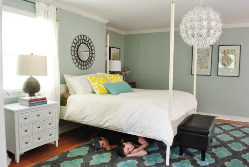
First lets rewind to this post where I said “As for if the bed can move, the floor plan of this room is a definite challenge thanks to “things” on each wall (two very off-centered windows, a nook across from the door, and a nook with the sink tucked into it on another wall – and a chandelier in the exact center that looks off if the bed isn’t in the right place). So we’ve tried the bed in a bunch of spots, but the place that works best for us is where it lives now (it’s the only long flat wall in our entire room).”
Well, after seeing a few inspiring glossy mag photos, we decided it might not be the weirdest thing in the world for the bed to be right next to a window. See, moving the bed would do one major thing for us: allow us to ditch our sadly-too-small-for-our-giant-room side tables (which we couldn’t do on the old wall where they lived, since the door would swing open and hit anything larger).
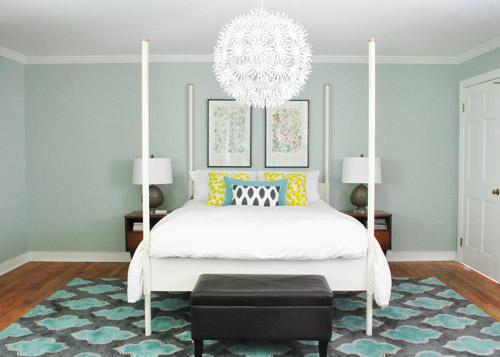
So although we weren’t 100% sure how we’d handle the odd nook to the right of the bed and the window that would nearly touch the bed on the left, we just decided to go for it and see what we could come up with. But before we moved anything, we got new curtains from Ikea for $5 a pop (Vivan panels, which are our favorites from our first house). They come two per pack for $9.99, and aren’t super heavy or super sheer, just sort of breezy and light – which we thought this room could use since it has a big dark rug on the floor (and we’d eventually love to stain the wood floors a dark mocha color).
They definitely layer right in and add some softness (we hope to reuse the old green curtains I made in the playroom). Didn’t hem the new guys yet though- but I probably will someday. Haha.
Then it was time to move stuff around. First we removed our insanely heavy organic mattress (which can best be described as the equivalent of lifting 50 dead bodies, not that we’d know…) and then we slowly inched the bed over to its new spot across from the doorway (so you can walk at least ten steps into the room instead of three before slamming into the side of it, which happened in its old position by the door).
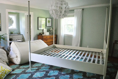
Next we shimmied the rug into position under the bed in its new spot before nearly blowing a gasket moving the mattress back onto the bed in its new spot. It still looked really really weird.
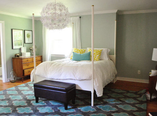
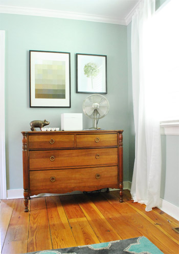
I was excited to start moving some other furniture around, but John had to duck outside to work on some deck stuff and Clara was napping so you know what I did, right? That’s right, my 5’2″ self got it done on my own. Haha. I hauled our dresser into the nook to act as a much larger bedside table and then stared at the blank space under the window on the other side of the wall for a nice long time while I caught my breath. It wasn’t functional to give up a night table and we definitely appreciate the balance of having two bedside lamps (especially along a wall with an off-centered window and an odd corner nook without any sort of symmetry going for it at all).
So I literally walked around the house (avoiding the nursery so as not to wake the dragon Clara) to see if there was something we already owned that I could bring in to use as my bedside table under the window. Sure enough, my eyes rested on this guy who has been hanging out in the dining room:
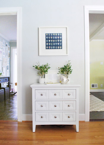
The funny thing is that this cabinet is actually meant to be a bedside table, so here I was thinking I was being a rebel to stick it in the dining room, only to drag it into the bedroom and realize that I loved it under the window. Don’t get me wrong, I loved it in the dining room too, so for one of those places we’ll have to grab something else (it might just be a placeholder in the bedroom and we’ll get another table and return it to the dining room eventually – or vice versa). Update: Folks are asking if the chandelier is still centered over the bed, since it’s hard to tell from this angle. Thankfully it’s still perfectly centered! If the nook were a foot wider this arrangement wouldn’t have worked – and if we had a king-sized bed instead of a queen it would have been no dice! Whew.
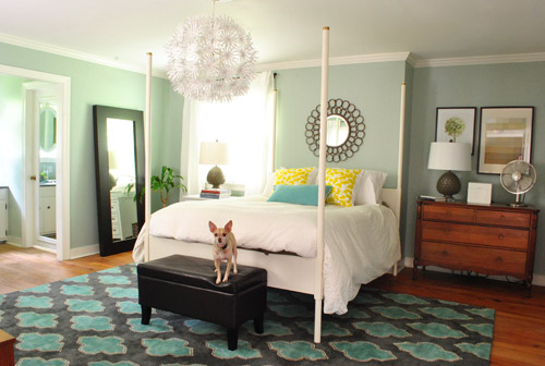
Then I hung the art that used to hang above the dresser in the nook, and put up an old oil-rubbed bronze mirror over the bed – which used to hang in our living room, but was replaced with a white mirror about six months ago. It added a little more “something” to the big blank wall above the bed, but we’re thinking that down the road we’d love to make a big upholstered headboard for that area and maybe move the mirror up so it’s closer to the height of the big round chandelier in the middle of the room since we think height in the center of that wall might be really nice and will further disguise the fact that our bed is jammed between an awkward nook and an oddly off-centered window.
Here’s Burger stretching. That is the only reason I took this shot. Cracks me up. I actually really liked the smaller white table on one side with a larger wood dresser on the other side since they both seemed to fit into those spaces well and the matching artichoke lamps added some nice balance. Ideally the white night table would be a bit taller so both lamps would be at the same height, but for now I just grabbed a stack of books to add some height to that light on my side of the bed. Maybe down the line we’ll add castors or little legs to give it a bit more lift, but for now it does the trick.
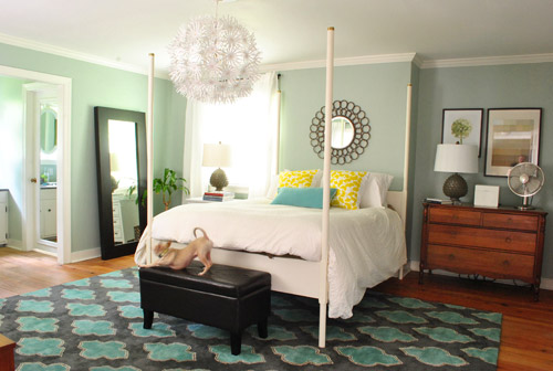
Moving that art into the nook to sort of balance the window on the other side of the bed seemed to make an instant difference since that nook no longer looked like a big blank wall, and the two frames felt rectangular and balanced with the window on the other side of the bed (admittedly more so in person since the window is blown out in this pic, but is very easy to see in real life).
I also mentioned that I dragged the leaning mirror from across the room to where the wood dresser used to be, which seemed to add even more balance to the new setup since it was a nice shot of dark wood next to the white nightstand to tie into the wood dresser on the other side of the bed. We had that guy anchored on the wall so Clara can’t pull it down on herself, but thankfully the system just uses cable ties, so we were able to reuse the same system with two new zip ties in its new spot (you can see how the whole anchoring thing works here).
Here’s another view of things. Of course those two botanical frames look crazy on the wall with no bed under them, so we’re planning to rehang them in the corner of the room that’s on the other side of the sink nook (not pictured, but there’s a chair and a side table over there). And then anything from a cabinet or console to a large piece of art could end up on that wall someday. But this view definitely looks extra weird since it’s so unfinished on that back wall.
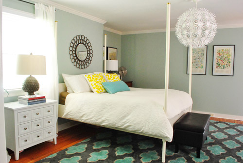
At this point we were tired but hopeful. It still looks kind of crazy to us, but not bad for about an hour of work. And we definitely have bigger plans to help it make more sense over time, so we’ll keep you posted. In the meantime, here’s Exhibit A that we’re dorks for life. Yes, we had the tripod all set up so we took a moment to pretend to be angry monsters under the bed. Although looking back John just looks like a mischievous kid and I look like a sullen teenage vampire.
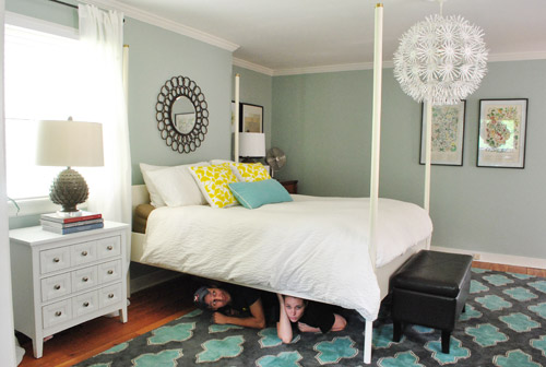
Then we pretended to sleep. Totally normal, right?
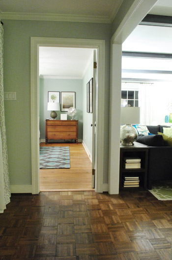
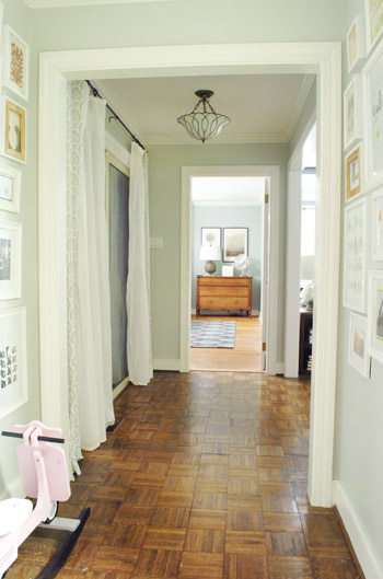
Then we thought we were done taking pictures, but later that night we found ourselves standing in the hallway – just marveling at the new view.
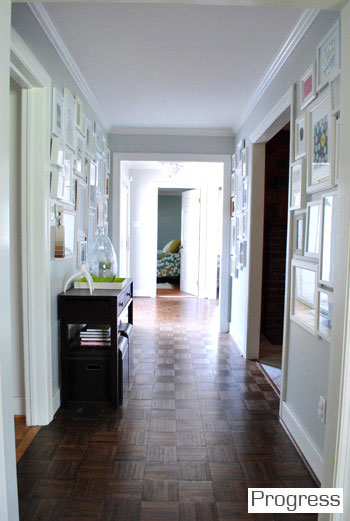
We couldn’t find a recent pic of the old view into the bedroom, but this is one from over a year ago, just to give you an idea of how the side of the bed was sort of the only thing you’d see before:
Now instead of seeing the bed, there’s just a straight shot into the room with the dresser in the nook. It’s actually really nice not to see the bed from the hall anymore, and the nook looks a lot less weird and bare when there’s actually something in it.
So that’s where we landed after a few hours of bedroom noodling. Although I must admit that we did something a little more DIY-heavy after this little furniture-move-a-palooza, so we’ll share those details this afternoon (just have to upload the pics and write the post). In short: we’re getting somewhere, but we’re definitely not completely there yet (but what else is new around here, haha). More soon!

Jennifer says
I love your decorating taste and furniture mixing! and those are the same colors that I have in my bedroom; it’s all so calming
Please tell me where you bought your rug. I love those colors and shapes!
Thank you!!!!!
:)
YoungHouseLove says
That’s from a local outlet called The Decorating Outlet. Hope it helps!
xo,
s
tracie says
I would be sorely tempted to drywall in that niche. Love the new layout, somehow it makes me love the rug even more! (And I would be happy to provide a wonderful home for those fantastic endtables!)
…And yes, you kind of look like Bella in the underbed pic.
Jenny B says
Ooh I love the bed by the window! Ed looked great where he was before but the new set-up looks somehow softer and more comfy.
Emily says
I love this — and it gives me inspiration that we will find just the right solution for our bedroom too! Totally gorgeous, especially that nook with the dresser.
Kat Wachter says
Yay! I love rearranging furniture, even if it’s not my own! I like the new arrangement a lot. I think you guys did a great job, but if you should ever want to change it, I have two ideas for balancing out the nook with the window: 1) put a mirror on the wall roughly the same shape as the window to fool the eye and bring in more light; or 2) make the nook into built-in shelves! I imagine that would be really easy for you two. I’m picturing some nice weighty wood shelves filled with books and ceramic animals. ;) P.S. I love the blog! Obviously… I probably wouldn’t be reading and commenting if I didn’t, right?
YoungHouseLove says
Both are definitely options we’re considering for down the line!
xo,
s
Sara says
Would the rug not work turned the other way? Everytime I see your bedroom pic I wonder about how it would work with the shapes on the rug running long ways.
YoungHouseLove says
Nah, sadly it’s rectangular, so the wide side needs to line up this way so we step out of the bed onto the rug and not onto an odd sliver of rug that looks too skinny for the bed.
xo,
s
Colleen P. says
Ooooh that’s nice!!! The room flows a lot better now, looks like-I had honestly never noticed that nook that is now to the right of your bed but that is an odd little thing, isn’t it? The view from the hall is so much better now, in fact the whole room looks more open and inviting.
Lindsay@Tell'er All About It says
This looks great! I say BIG WIN for the bed move. I also like how the dresser is now centered in that nook! Sometimes it’s amazing to just switch up the furniture a little bit to see how it all flows better…LOVE it!
Miranda says
Ya’ll may have talked about this before but have you ever considered (long term) building out the nook to be even with the rest of the wall and adding a window for full symmetry? Is there anything behind the nook? It would be a bigger project but it would solve the entire nook problem.
YoungHouseLove says
We have thought about building out the nook but can’t add a window since it wouldn’t make sense from the exterior of the house (there’s a giant living room window, which is why that nook is there, so from the outside a bedroom window in the same bump out as the big living room window would look crazy). We’re starting to embrace the nook with the dresser in it though- feels cozy now!
xo,
s
Emily says
Whose side of the bed is the dresser/nook on? And does it (or might it?) bother them to not be able to reach the dresser/bedside table while in bed?
YoungHouseLove says
It’s John’s! Thankfully he has long arms so it works!
xo,
s
karen says
Much better feng shui!
Ally says
I never pictured JBoom as a thumb-sucker…or did he get a nasty leetle boo-boo while working on the deck? :)
xox
YoungHouseLove says
Haha- he was channeling Clara I think!
xo,
s
Emily says
LOVE!! …and those floors are AMAZING.
Stacy says
Love the new lay out! Especially the view from the hallway through the door.
Jen says
I love the new furniture placement!! And the view from the hallway is so much better. You really don’t notice the off-center window by the bed. Everything is balanced so well. Great job!!
cara says
I think it looks much better. Love it!
Heather says
I love this! It’s funny, when the bed was on the other wall, I would always think of Big Bang Theory. Sheldon got on Penny’s case for sleeping with her head closest to the door. “A bed, even a temporary bed, is always oriented with the headboard away from the door. It serves the ancient imperative of protecting oneself against marauders.”
Penny risks it, and I always figured it was just a wives tale. But now everyone is saying they feel so much more comfortable and less vulnerable with your bed moved away from the doorway. Maybe Sheldon was on to something!
Anyway, I love the new layout, and I’m so excited to see the other updates to the room. And stay safe against the marauders. :)
YoungHouseLove says
Haha- that’s hilarious. Marauders = my word of the day.
xo,
s
Amanda says
I like it! I think it’s a fantastic change!
Kaci B says
LOVE IT!! It looks so finished now. Funny how it takes awhile to get things just so and with a little move here or there “Voila! There it is!”
Deb says
love it! it looks fabulous! And I am digging the look of the nook from the hallway!
Liz says
Love the new arrangement. I think it’s so much better!
Megan says
I love the new layout!
Drea says
I LOVE IT! I am now inspired to change my bedroom!!! LOVE! LOVE!
Lindsay says
I love the changes – and furniture rearranging in general! I kid you not – when I was growing up I would rearrange my room every couple of months to try and get the most functionality – clearly a precursor to my love of DIY now! A quick (random) question: one of the biggest headaches during all of the furniture swaps was that outlets would not always be in a convenient place for the new arrangement. Often I would run extension cords, but they were a less than ideal (and unattractive) fix. Are you guys just blessed with great outlet placement, or do you have to work around it?
YoungHouseLove says
This house is crazy… CRAZY!… when it comes to outlets. They are everywhere. Seriously every few feet or so. It’s extremely excessive sometimes, but other times we’re thankful for them!
xo,
s
Kelly says
Wow! Looks great. Once you put the wood dresser on the other side, it looks right at home. The room must feel so much more balanced :-).
Stephanie says
I love the placement of the bed where you moved it. It definitely looks so much better on that big wall. I love how you guys just go for it and see what happens. The worst that can happen is that you have to redo it!
As for that nook, if it were me, I’d totally turn it into a closet. But I have a LOT of clothes.
Amanda says
This looks sooo much better! Great job Sherry! lol And like others said, the room doesn’t look so empty anymore. Whoo-hoo!
Karen F says
Love it! And how lucky are you that both the bed and the dresser fit perfectly this way? Sometimes things are just meant to be.
Karen F says
and this furniture configuration also makes the room seem a lot bigger – bonus!
Abby says
That dresser is SO beautiful in that nook! Love it.
Gina says
I love the new arrangement. It seems so much more yummy and cozy!!! Do you find that having that chest pushed back into the nook makes it difficult to reach things since it’s not exactly like a nightstand right next to the bed?
YoungHouseLove says
Thankfully John has long arms so he doesn’t have an issue. Our old night tables were low so they weren’t always easy to use, so these are a bit further away, but higher so it’s about the same!
xo,
s
Wrenaria says
Looking good! Your under the bed pictures are adorable.
Donna says
This is so much more feng shui! Love it!
Rebe says
Looks like a fun change – I’d love to move my bedroom furniture around but can’t because I live in a small built in 1900’s house and there’s only 1 way the stuff fits – especially when I don’t want to cover the radient heating that runs along one wall of the room. The price you pay for character!
On another note – not sure if it’s something I can fix or a policy change on your end, but I’ve been getting some ads that play sound. It’s always a Carnival Cruise Line ad – and it’s always in the very first ad spot. Again, if it’s something that’s changed on your end, no worries I can always turn the sound off – but if not I wanted to let you know. :-)
YoungHouseLove says
Ugh- so sorry- that’s rogue code that we don’t allow – it must have somehow sneaked in there. We hate pop ups and ads with sound, so thanks for telling us about them whenever you see them! We never know about these things on our end until they sneak through and someone tells us! We’ll block all Carnival Cruise Line ads so it hopefully stops happening!
xo,
s
Becky says
The room looks very cozy with this arrangement. The curtains are a great change too!
Sarah says
Looks awesome!! I know I’m only seeing pictures and they can read differently than in person, but I think the dresser in the nook completely disguises the fact that it’s a nook altogether! The room looks great, yay for free sweat equity and an exciting new view!
Teri says
Nice new set-up. It amazes me how the smallest of changes can make such a huge impact!! I was wondering if it weird for you sleeping next to the mirror. I think it would freak me out waking up to a reflection of myself (maybe Sherry is cuter in the AM than I am?). Also, I never noticed before the color on the walls kinda has a little green in it, always looked blue to me before. What color is that?
YoungHouseLove says
Thankfully I haven’t spooked myself yet. I usually face towards John and wake up with a dog face in my face. Haha. The walls are sort of an ambiguous blue-green called Carolina Inn Club Aqua by Valspar. Hope it helps!
xo,
s
georgia says
Love it!!!! It makes the room look so balanced! Yay me likey!
Alicia says
I LOVE IT!!
Kristal says
I’m loving the new look! Much more pleasing to the eye and less…traditional.
Leah says
Looks awesome! Have you guys ever thought about adding sheers to Ed?
YoungHouseLove says
We have but we’re not sold on it (John loves a cleaner more modern look, so I don’t want to push those on him, ya know?)
xo,
s
Katie C says
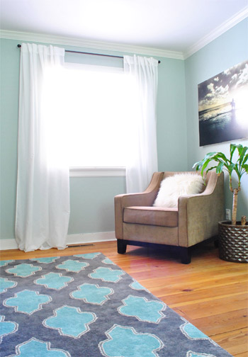
I love the new set-up, but am completely fixated on the chair you have in your bedroom. I’m sure I’ve seen it before, but must not have really noticed it before until now…most likely since I’m on high alert looking for a new chair to add to my living room. Do you guys remember where you got it? Thanks! :)
YoungHouseLove says
That’s from overstock.com a while back – maybe a year? I forget the name, but hopefully it helps!
xo,
s
Coran says
LOVE it!!!! I love how it all just works… And the view from the hall. Does the room feel bigger with the bed moved?
YoungHouseLove says
Yes! It really does since you can walk into the room a bunch of steps before bumping into the bed!
xo,
s
eRin @ growing up senge says
Great job with the bedroom Tetris, it looks great! I totally prefer having the door open into a walkway in the bedroom, instead of the bed. It’s just awkward to have the door open right into your peaceful slumber!
karen says
I really like this change!! I really like the vista from the hallway. And that you are walking into your room and not your bed.
I am designing my house and vista’s are extremely important to me. There has to be something nice to look at from every entrance/exit.
Did you patch up the holes and paint over them?
YoungHouseLove says
We have yet to patch all the holes we made from moving art- haha. Someday we’ll do it though! I think. Haha.
xo,
s
Chelsea @ Chelsea Eats Treats says
Love it!!! The switch looks awesome :)
Amy says
I was wondering where the white bedside table was bought at? Thanks!
YoungHouseLove says
That was from jossandmain.com a while back- maybe a few months ago?
xo,
s
MJB says
Much prefer the layout this way. I always like to walk in a room and see the bed from the foot – maybe because ads always show the bed that way? Our tiny bedroom looks bigger if the bed isn’t two steps inside the room. I love that this layout extends the hall and feels so much more open.
(Love the monsters under the bed. So Calvin and Hobbes ;)
Jillian {Her Split Ends} says
OMG!! I love it!! Such a great flip…don’t you love the “new” feel you get from just changing things around!!
Cheers
~ Jillian
http://www.hersplitends.com
Audrey P says
I love it! It’s so awkward having such a personal space that open to the front door. I had to have it that way at my last place (there was no other way to fit my furniture into the room), so at my new place, I opted for the smaller room to be the “master” to avoid it happening again. You got to keep the bedroom AND get better flow. I’m jealous :)
Briel K. says
I love the moves! Looks much better from the hallway too! :)